Lesson 7
Using Histograms to Answer Statistical Questions
7.1: Which One Doesn’t Belong: Questions (5 minutes)
Warm-up
The purpose of this warm-up is to encourage students to connect the ideas they learned earlier about statistical questions and types of data (categorical and numerical) to the work on describing distributions (center and spread).
There are many ways to interpret the questions and identify how each one is unique. For example, they could say that Question A is about retirement, Question B about jobs, etc. If students begin to depart from thinking in statistical terms, remind them to think about how we might go about answering the questions and what the answers might involve.
Launch
Arrange students in groups of 2–4. Display the questions for all to see. Give students 1 minute of quiet think time and ask students to indicate when they have noticed one question that does not belong and can explain why. When the minute is up, give students 2 minutes to share with their group their reasoning on why a question doesn't belong, and then, together, find at least one reason each question doesn't belong.
Student Facing
Here are four questions about the population of Alaska. Which question does not belong? Be prepared to explain your reasoning.
- In general, at what age do Alaska residents retire?
- At what age can Alaskans vote?
- What is the age difference between the youngest and oldest Alaska residents with a full-time job?
- Which age group is the largest part of the population: 18 years or younger, 19–25 years, 25–34 years, 35–44 years, 45–54 years, 55–64 years, or 65 years or older?
Student Response
For access, consult one of our IM Certified Partners.
Activity Synthesis
Ask each group to share one reason why a particular question does not belong. Record and display the responses for all to see. After each response, ask the class if they agree or disagree. Since there is no single correct answer for why a question does not belong, attend to students’ explanations and ensure the reasons given are correct.
If students use terms that are essential in this unit (such as center, spread, statistical, non-statistical, numerical data, categorical data, etc.), ask them to explain their meanings in their own words; these are opportunities to reinforce their understanding of the terms and to note any misconceptions. If students give unsubstantiated claims, ask them to substantiate them.
7.2: Measuring Earthworms (20 minutes)
Activity
In a previous lesson, students had a primer on histograms—how they are drawn, how they differ from dot plots, and what information they can tell us. In this activity, students practice drawing a histogram for a given data set and using it to answer statistical questions. To help students understand the lengths involved in the data set, students are asked to draw various lengths used to group the worms in the first histogram.
As students organize the data set and draw their histogram, notice any challenges or questions students come across. If a question is raised by multiple groups, consider discussing it with the whole class. Also pay attention to how students use the histogram to identify a “typical” length—some might describe it in terms of the size of the bins (e.g., “a typical length is between 20 and 40 mm”); others might choose a value within a bin or a boundary between bins. Invite them to share their reasonings later.
Launch
Arrange students in groups of 2. Provide access to centimeter rulers.
Consider giving students a brief overview of the context for the problems in the activity. Tell students that there are nearly 6,000 species of earthworms in the world. Some earthworms help the environment, while others (generally not native to the region in which they are found) may harm the environment. Earthworms that are native to a particular region of the world are often raised, by farmers, in terrariums (a container or bin similar to an aquarium but it contains soil and leaves). The terrarium-raised earthworms provide bait for people who fish, provide food for various wildlife, and decompose food waste into soil. Food waste and water are added to the terrariums as food for raising and growing worms. Soil produced by the worms as they eat the food waste is often used as fertilizer.
Explain that the lengths of the worms in the bins provide information about the ages of the worms, which can be useful for the farmer. In this activity, students will organize the lengths of the earthworms in several terrariums or bins.
Give students 8–10 minutes of quiet work time, and then 3–4 minutes to discuss their work and complete the activity with a partner.
Supports accessibility for: Memory; Conceptual processing
Student Facing
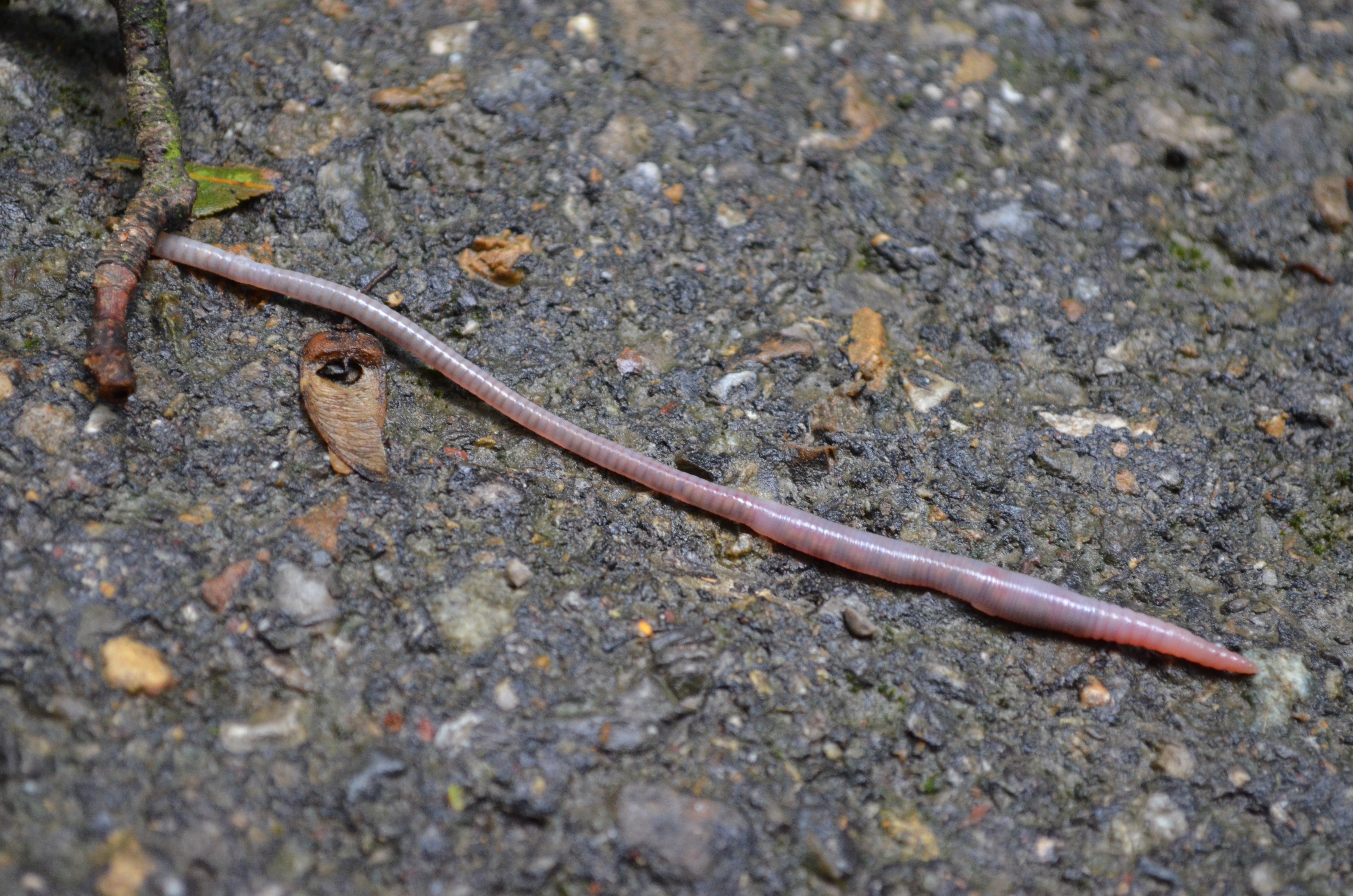
An earthworm farmer set up several containers of a certain species of earthworms so that he could learn about their lengths. The lengths of the earthworms provide information about their ages. The farmer measured the lengths of 25 earthworms in one of the containers. Each length was measured in millimeters.

-
Using a ruler, draw a line segment for each length:
-
20 millimeters
-
40 millimeters
-
60 millimeters
-
80 millimeters
-
100 millimeters
-
-
Here are the lengths, in millimeters, of the 25 earthworms.
- 6
- 11
- 18
- 19
- 20
- 23
- 23
- 25
- 25
- 26
- 27
- 27
- 28
- 29
- 32
- 33
- 41
- 42
- 48
- 52
- 54
- 59
- 60
- 77
- 93
Complete the table for the lengths of the 25 earthworms.
length frequency 0 millimeters to less than 20 millimeters 20 millimeters to less than 40 millimeters 40 millimeters to less than 60 millimeters 60 millimeters to less than 80 millimeters 80 millimeters to less than 100 millimeters -
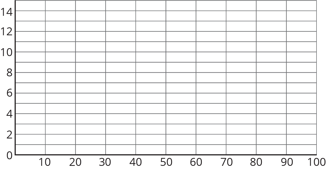
Use the grid and the information in the table to draw a histogram for the worm length data. Be sure to label the axes of your histogram.

- Based on the histogram, what is a typical length for these 25 earthworms? Explain how you know.
-
Write 1–2 sentences to describe the spread of the data. Do most of the worms have a length that is close to your estimate of a typical length, or are they very different in length?
Student Response
For access, consult one of our IM Certified Partners.
Student Facing
Are you ready for more?
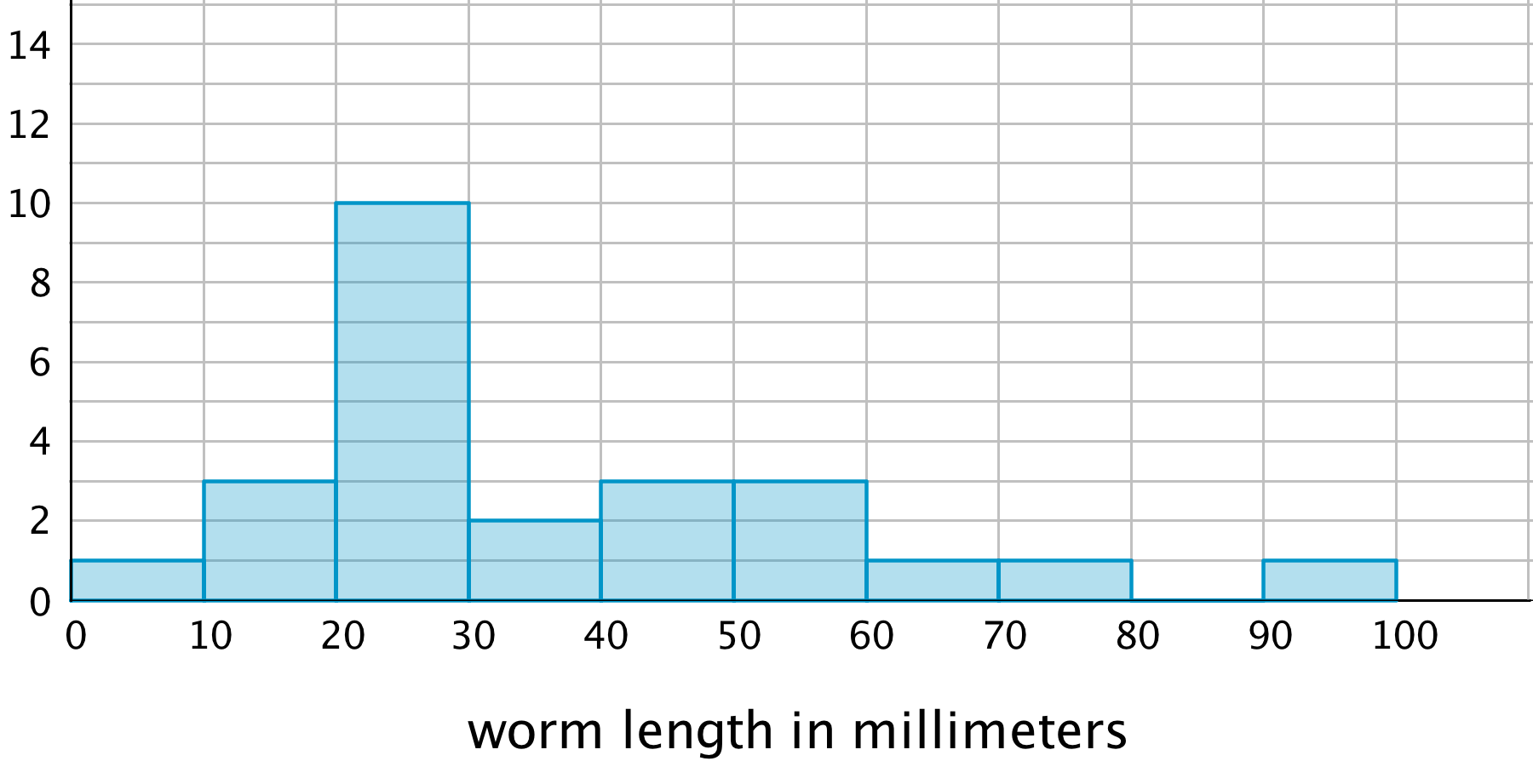
Here is another histogram for the earthworm measurement data. In this histogram, the measurements are in different groupings.

- Based on this histogram, what is your estimate of a typical length for the 25 earthworms?
- Compare this histogram with the one you drew. How are the distributions of data summarized in the two histograms the same? How are they different?
- Compare your estimates of a typical earthworm length for the two histograms. Did you reach different conclusions about a typical earthworm length from the two histograms?
Student Response
For access, consult one of our IM Certified Partners.
Anticipated Misconceptions
When determining frequencies of data values, students might lose track of their counting. Suggest that they use tally marks to keep track of the number of occurrences for each bin.
When drawing the histogram, students might mistakenly use bar graphs as a reference and leave spaces between the bars. Ask them to look at the bars in other histograms they have seen so far and to think about what the gaps might mean considering that the bars are built on a number line.
Activity Synthesis
Ask one or two students to display their completed histograms for all to see and briefly describe the overall distribution. Then, select a few other previously identified students to share their responses and explanations for the last two questions.
Focus the discussion on how identifying center and spread using a histogram is different than doing so using a dot plot. Discuss:
- “In a histogram, are we able to see clusters of values in the distribution?”
- “Can we see the largest and smallest values? Can we tell the overall spread?”
- “How do we identify the center of a distribution?”
From the various estimates that students give for a typical earthworm length (and from earlier exercises), students should begin to see that identifying a typical value of a distribution is not a straightforward or precise process so far. Explain that in upcoming lessons they will explore how to describe a typical value and characterize a distribution more systematically.
Design Principle(s): Maximize meta-awareness; Support sense-making
7.3: Tall and Taller Players (10 minutes)
Activity
Now that students have some experience drawing and interpreting histograms, they use histograms to compare distributions of two populations. In a previous activity, students compared the two dot plots of students in a keyboarding class—one for the typing speeds at the beginning of the course and the other showing the speeds at the end of the course. In this activity, they recognize that we can compare distributions displayed in histograms in a similar way—by studying shapes, centers, and spreads.
Launch
Arrange students in groups of 2. Give students 4–5 minutes of quiet work time and 1–2 minutes to share their responses with a partner.
Supports accessibility for: Language; Social-emotional skills
Student Facing
Professional basketball players tend to be taller than professional baseball players.
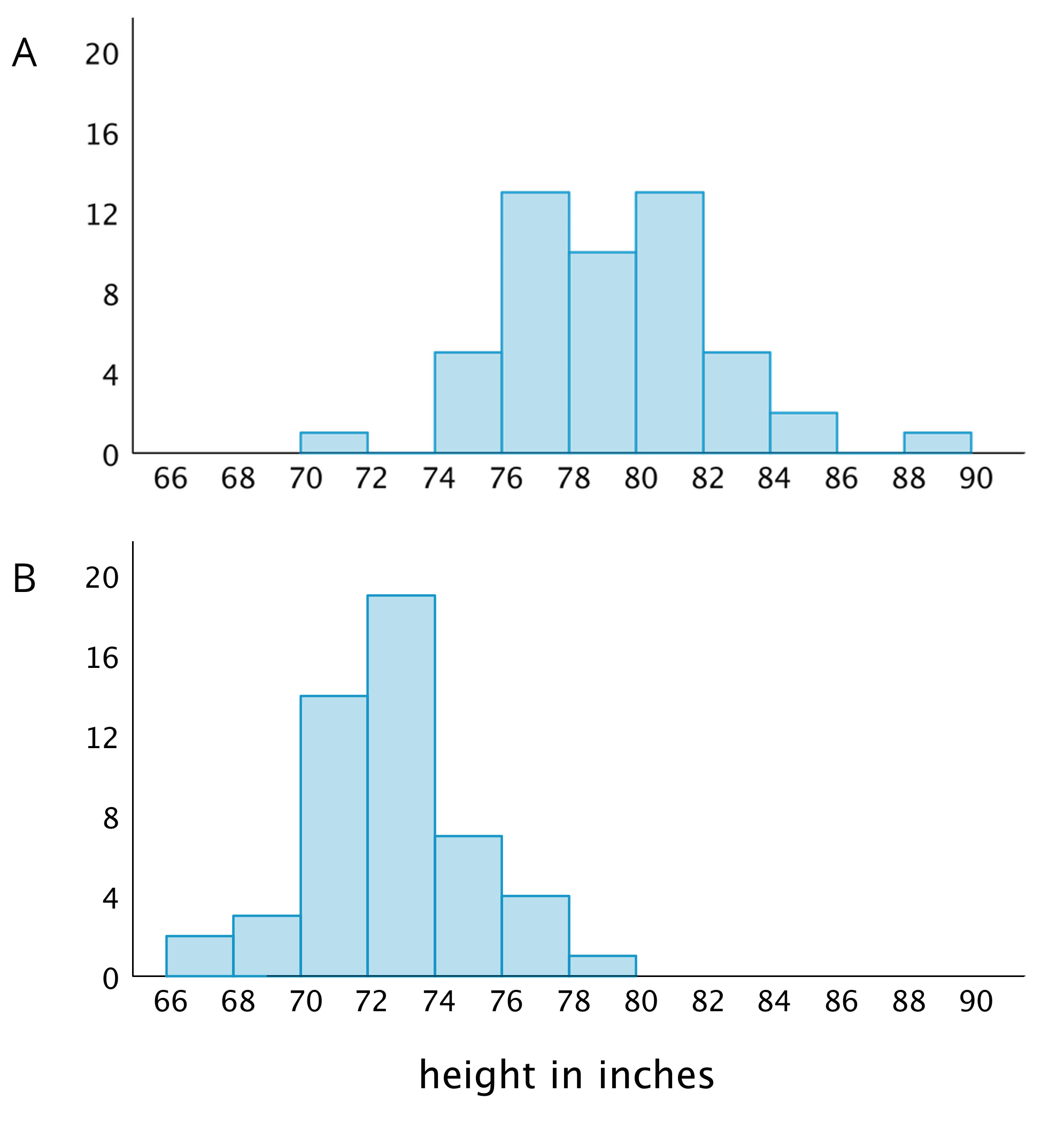
Here are two histograms that show height distributions of 50 male professional baseball players and 50 male professional basketball players.
- Decide which histogram shows the heights of baseball players and which shows the heights of basketball players. Be prepared to explain your reasoning.

- Write 2–3 sentences that describe the distribution of the heights of the basketball players. Comment on the center and spread of the data.
- Write 2–3 sentences that describe the distribution of the heights of the baseball players. Comment on the center and spread of the data.
Student Response
For access, consult one of our IM Certified Partners.
Activity Synthesis
Select a few students to share their descriptions about basketball players and baseball players. After each student shares, ask others if they agree with the descriptions and, if not, how they might revise or elaborate on them. In general, students should recognize that the distributions of the two groups of athletes are quite different and be able to describe how they are different.
Highlight the fact that students are using approximations of center and different adjectives to characterize a distribution or a typical height, and that, as a result, there are variations in our descriptions. In some situations, these variations might make it challenging to compare groups more precisely. We will study specific ways to measure center and spread in upcoming lessons.
Design Principle(s): Optimize output (for explanation); Maximize meta-awareness
Lesson Synthesis
Lesson Synthesis
In this lesson, we learn how to draw a histogram and how to use it to describe characteristics of a data set.
- “What are some decisions we should think about and make before drawing a histogram?”
- “Does the width of each bar have to represent a distance of 5 units, or can it represent other number of units?”
- “What does the horizontal axis of a histogram tell us? What about the vertical axis?”
- “How do we know how tall to make each bar?”
Once we have a histogram drawn, we can use it to answer some questions about a data set.
- “How would you describe a typical weight for this group of dogs?”
- “What can we say about the spread of the dog weights based on this histogram?”

7.4: Cool-down - A Tale of Two Seasons (5 minutes)
Cool-Down
For access, consult one of our IM Certified Partners.
Student Lesson Summary
Student Facing
Here are the weights, in kilograms, of 30 dogs.
- 10
- 11
- 12
- 12
- 13
- 15
- 16
- 16
- 17
- 18
- 18
- 19
- 20
- 20
- 20
- 21
- 22
- 22
- 22
- 23
- 24
- 24
- 26
- 26
- 28
- 30
- 32
- 32
- 34
- 34
Before we draw a histogram, let’s consider a couple of questions.
-
What are the smallest and largest values in our data set? This gives us an idea of the distance on the number line that our histogram will cover. In this case, the minimum is 10 and the maximum is 34, so our number line needs to extend from 10 to 35 at the very least.
(Remember the convention we use to mark off the number line for a histogram: we include the left boundary of a bar but exclude the right boundary. If 34 is the right boundary of the last bar, it won't be included in that bar, so the number line needs to go a little greater than the maximum value.)
-
What group size or bin size seems reasonable here? We could organize the weights into bins of 2 kilograms (10, 12, 14, . . .), 5 kilograms, (10, 15, 20, 25, . . .), 10 kilograms (10, 20, 30, . . .), or any other size. The smaller the bins, the more bars we will have, and vice versa.
Let’s use bins of 5 kilograms for the dog weights. The boundaries of our bins will be: 10, 15, 20, 25, 30, 35. We stop at 35 because it is greater than the maximum.
Next, we find the frequency for the values in each group. It is helpful to organize the values in a table.
| weights in kilograms | frequency |
|---|---|
| 10 to less than 15 | 5 |
| 15 to less than 20 | 7 |
| 20 to less than 25 | 10 |
| 25 to less than 30 | 3 |
| 30 to less than 35 | 5 |
Now we can draw the histogram.

The histogram allows us to learn more about the dog weight distribution and describe its center and spread.