Lesson 16
Box Plots
16.1: Notice and Wonder: Puppy Weights (5 minutes)
Warm-up
This warm-up encourages students to analyze a data set carefully and reason about its distribution. It also gives them a chance to use the language they have acquired in this unit in an open-ended setting.
As students discuss their observations and questions with their partners, identify a few who notice or wonder about the features, center, and spread of the distribution.
Launch
Arrange students in groups of 2. Display the table for all to see. Give students 1 minute of quiet time to look at the data set and identify at least one thing they notice and at least one thing they wonder about the distribution of the data. Ask students to give a signal when they have noticed or wondered about something. When the minute is up, give students 1 minute to discuss their observations and questions with their partner. Follow with a whole-class discussion.
Student Facing
Here are the birth weights, in ounces, of all the puppies born at a kennel in the past month.
- 13
- 14
- 15
- 15
- 16
- 16
- 16
- 16
- 17
- 17
- 17
- 17
- 17
- 17
- 17
- 18
- 18
- 18
- 18
- 18
- 18
- 18
- 18
- 19
- 20
What do you notice and wonder about the distribution of the puppy weights?
Student Response
For access, consult one of our IM Certified Partners.
Activity Synthesis
While students may notice and wonder about many aspects of the data set, focus the discussion on observations and questions about the features, center, and spread of the distribution. Select previously identified students to share their responses. After each person shares, ask if others noticed or wondered about the same thing.
If students commented on or wondered about the shape of the distribution, consider displaying the following dot plot for all to see and discussing questions such as:
- “Can you use the dot plot to answer what you wondered about?”
- “Did you anticipate the distribution to have this shape?”
- “What do you notice about the distribution here that you did not notice in the table?”
- “Which representation of data—the table or the dot plot—allows you see the center and spread of the distribution more easily? Why?”
- “Which representation allows you to to find the mean more easily? What about the median?”

16.2: Human Box Plot (15 minutes)
Activity
Previously, students learned to identify the median, quartiles, and five-number summary of data sets. They also calculated the range and interquartile range of distributions. In this activity, students rely on those experiences to make sense of box plots. They explore this new representation of data kinesthetically: by creating a human box plot to represent class data on the lengths of student names, which they collected in the Finding the Middle activity in an earlier lesson.
Launch
Before the lesson, use thin painter’s tape to make a number line on the ground. If the floor is tiled with equal-sized tiles, consider using the tiles for the intervals of the number line. Otherwise, mark off equal intervals on the tape. The number line should cover at least the distance between least data value (the fewest number of letters in a student's name) to the greatest (the most number of letters).
Provide each student with a copy of the data on the lengths of students’ names from the Finding the Middle activity. If any students were absent then, add their names and numbers of letters to the data set.
Give students 4–5 minutes to find the quartiles and write the five-number summary of the data. Then, invite several students to share their findings and come to an agreement on the five numbers. Record and display the summary for all to see.
Explain to students that the five-number summary can be used to make another visual representation of a data set called a box plot. Tell students that they will create a human box plot in a similar fashion as when they were finding the median.
-
Return to students the index cards from the lesson on finding the median. If any students were absent when the cards were made, give them each an index card and ask them to record on the card their full name and the number of letters in their name. If any student who made a card is absent, have another student with the same number of letters in their name hold the card of the absent student.
-
Ask students to stand up, holding their index card in front of them, and place themselves on the point on the number line that corresponds to their number. (Consider asking students to do so without speaking at all.) Students who have the same number of letters should stand one in front of the other.
-
Hold up the index cards that have been labeled with “minimum.” Ask students who should claim the card, then hand the card to the appropriate student. Do the same for the other labels of a five-number summary. If any of the quartiles falls between two students' numbers, write that number of the index card and have both students hold that card together.
Now that the five numbers are identified and each associated with one or more students, use wide painter's tape to construct a box plot.
- Form a rectangle on the ground by affixing the tape around the group of students between Q1 and Q3. If a quartile is between two people, put the tape down between them. If a quartile has the value of a student's number, put the tape down at that value and have the student stand on it.
- Put a tape segment at Q2, from the top side of the rectangle to the bottom side, to subdivide the rectangle into two smaller rectangles. If Q2 is a student's number, have the student stand on the tape.
- For the left whisker, affix the end of tape to the Q1 end of the rectangle; extend it to where the student holding the “minimum” card is standing. Do the same for the right whisker, from Q3 to the maximum.
- Tape the five-number summary cards and students’ cards that correspond to them in the right locations.
This image shows an example of a completed human box plot.
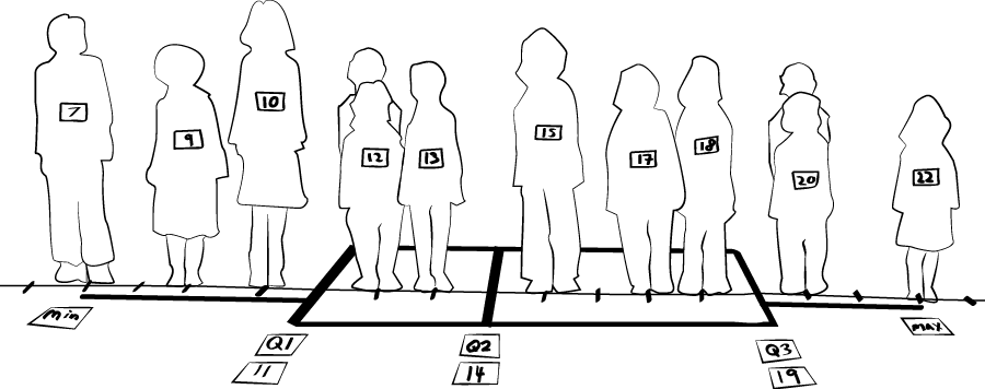
Explain to students that they have made a human box plot. Consider taking a picture of the box plot for reference and discussion later.
Supports accessibility for: Language; Organization
Student Facing
Your teacher will give you the data on the lengths of names of students in your class. Write the five-number summary by finding the data set's minimum, Q1, Q2, Q3, and the maximum.
Pause for additional instructions from your teacher.
Student Response
For access, consult one of our IM Certified Partners.
Activity Synthesis
Tell students that a box plot is a representation of a data set that shows the five-number summary. Discuss:
- “Where can the median be seen in the box plot?” (It is the line inside the box.) What about the first and third quartiles? (The left and right sides of the box.)
- “Where can the IQR be seen in the box plot?” (It is the length of the box.)
- “The two segments of tape on the two ends are called ‘whiskers.’ What do they represent?” (The lower one-fourth of the data and the upper one-fourth of data.)
- “How many people are part of the box, between Q1 and Q3? Approximately what fraction of the data set is that number?” (About half. Note that the number of people that are part of the box may not be exactly one half of the total number of people, depending on whether the number of data points is odd or even, and depending on how the values are distributed.)
- “Why might it be helpful to summarize a data set with a box plot?” (It could help us see how close together or spread out the values are, and where they are concentrated.)
Explain to students that we will draw and analyze box plots in upcoming activities and further explore why they might be useful.
Design Principle(s): Support sense-making; Maximize meta-awareness
16.3: Studying Blinks (15 minutes)
Activity
In the last activity, students constructed a box plot based on the five-number summary of their name length data. In this activity, they learn to draw a box plot and they explore the connections between a dot plot and a box plot of the same data set.
Launch
Tell students that they will now draw a box plot to represent another set of data. For their background information, explain that scientists believe people blink their eyes to keep the surface of the eye moist and also to give the brain a brief rest. On average, people blink between 15 and 20 times a minute; some blink less and others blink much more.
Arrange students in groups of 2. Give 4–5 minutes of quiet work time for the first set of questions and a minute to discuss their work with their partner. Ask students to pause afterwards.
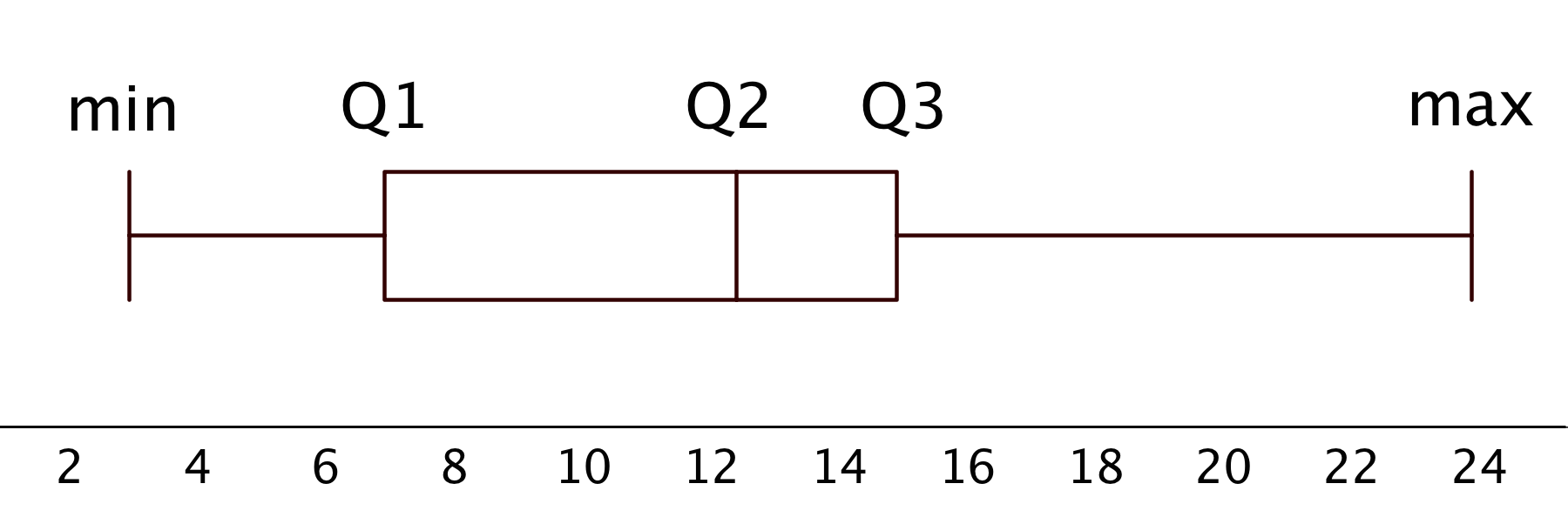
Display the box plot for all to see. Reiterate that a box plot is a way to represent the five-number summary and the overall distribution. Explain:
-
“The left and right sides of the box are drawn at the first and third quartiles (Q1 and Q3).”
-
“A vertical line inside the box is drawn at the median (Q2).”
-
“The two horizontal lines (or 'whiskers') extend from the first quartile to the minimum and from the third quartile to the maximum.”
-
“The height of the box does not give additional information about the data, but should be tall enough to distinguish the box from the whiskers.”
Ask students to now draw a box plot on the same grid, above their dot plot. Give students 4–5 minutes to complete the questions. Follow with a whole-class discussion.
Supports accessibility for: Organization; Attention
Student Facing
Twenty people participated in a study about blinking. The number of times each person blinked while watching a video for one minute was recorded. The data values are shown here, in order from smallest to largest.
- 3
- 6
- 8
- 11
- 11
- 13
- 14
- 14
- 14
- 14
- 16
- 18
- 20
- 20
- 20
- 22
- 24
- 32
- 36
- 51
-
- Use the grid and axis to make a dot plot of this data set.
- Find the median (Q2) and mark its location on the dot plot.
- Find the first quartile (Q1) and the third quartile (Q3). Mark their locations on the dot plot.
-
What are the minimum and maximum values?
- Use the grid and axis to make a dot plot of this data set.
-
A box plot can be used to represent the five-number summary graphically. Let’s draw a box plot for the number-of-blinks data. On the grid, above the dot plot:
- Draw a box that extends from the first quartile (Q1) to the third quartile (Q3). Label the quartiles.
- At the median (Q2), draw a vertical line from the top of the box to the bottom of the box. Label the median.
- From the left side of the box (Q1), draw a horizontal line (a whisker) that extends to the minimum of the data set. On the right side of the box (Q3), draw a similar line that extends to the maximum of the data set.
-
You have now created a box plot to represent the number of blinks data. What fraction of the data values are represented by each of these elements of the box plot?
- The left whisker
- The box
- The right whisker
Student Response
For access, consult one of our IM Certified Partners.
Student Facing
Are you ready for more?
Suppose there were some errors in the data set: the smallest value should have been 6 instead of 3, and the largest value should have been 41 instead of 51. Determine if any part of the five-number summary would change. If you think so, describe how it would change. If not, explain how you know.
Student Response
For access, consult one of our IM Certified Partners.
Activity Synthesis
Display the dot plot and the box plot for all to see.
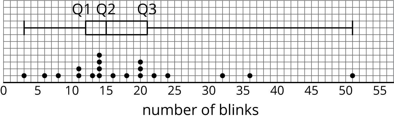
Discuss:
- “How many data values are included in each part of the box plot?” (5 data values in each part.)
- “If you just look at the box plot, can you tell what any of the data values are?” (Only the minimum and the maximum values.)
- “If you just look at the dot plot, can you tell where the median is? Can you tell which values of the data make up the middle half of the data? Can you tell where each quarter of the data values begin and end?” (It is possible to tell, but it is not straightforward; it requires some counting.)
The focus of this activity is on constructing a box plot and understanding its parts, rather than on interpreting it in context. If students seem to have a good grasp of the drawing process and what the parts entail and mean, consider asking them to interpret the plots in the context of the research study. Ask: “Suppose you are the scientist who conducted the research and are writing an article about it. Write 2–3 sentences that summarize your findings, based on your analyses of the dot plot and the box plot.”
Design Principle(s): Maximize meta-awareness; Cultivate conversation
Lesson Synthesis
Lesson Synthesis
In the lesson we see another way to graphically represent a numerical data set. Review with students:
- “How is a box plot made?” (The box is a rectangle with the left side at Q1 and the right side at Q3. The line inside the box is the median. The “whiskers” on the sides extend to the minimum and maximum values of the data set.)
- “What does a box plot tell you about the shape, center, and spread of a distribution?” (The median is the line in the middle, which tells you about the center. The IQR is the width of the box in the middle, which tells you about the spread. You can also tell if the distribution is roughly symmetrical.)
- “Why is it useful to use a dot plot and a box plot together?” (The dot plot shows the actual data values while the box plot tells the story of the data in fourths.)
- “How can the box plot be helpful in comparing two data sets?” (You could compare the minimum and maximum values, where the median falls, and how the data is distributed among the four quarters.)
16.4: Cool-down - Boxes and Dots (5 minutes)
Cool-Down
For access, consult one of our IM Certified Partners.
Student Lesson Summary
Student Facing
A box plot represents the five-number summary of a data set.
It shows the first quartile (Q1) and the third quartile (Q3) as the left and right sides of a rectangle or a box. The median (Q2) is shown as a vertical segment inside the box. On the left side, a horizontal line segment—a “whisker”—extends from Q1 to the minimum value. On the right, a whisker extends from Q3 to the maximum value.
The rectangle in the middle represents the middle half of the data. Its width is the IQR. The whiskers represent the bottom quarter and top quarter of the data set.
Earlier we saw dot plots representing the weights of pugs and beagles. The box plots for these data sets are shown above the corresponding dot plots.

We can tell from the box plots that, in general, the pugs in the group are lighter than the beagles: the median weight of pugs is 7 kilograms and the median weight of beagles is 10 kilograms. Because the two box plots are on the same scale and the rectangles have similar widths, we can also tell that the IQRs for the two breeds are very similar. This suggests that the variability in the beagle weights is very similar to the variability in the pug weights.