Lesson 18
Using Data to Solve Problems
18.1: Wild Bears (5 minutes)
Warm-up
This warm-up allows students to review two important ideas of this unit: interpreting data in a box plot and writing statistical questions based on a data set. Students write statistical questions based on given box plots, then trade questions to answer questions written by another student.
Launch
Arrange students in groups of 2. Tell students that, for the first question, one partner should write two questions about the head lengths and the other partner should write two questions about the head widths. For the second question, they should exchange and review each other's questions. If their partner's question does not seem to be a statistical question, suggest a revision so that it becomes a statistical question, and then answer the question. Remind students to consider units of measurement.
Give students 2 minutes of quiet work time for the first question and 2 minutes for collaboration afterwards.
Student Facing
In one study on wild bears, researchers measured the head lengths and head widths, in inches, of 143 wild bears. The ages of the bears ranged from newborns (0 years) to 15 years. The box plots summarize the data from the study.

- Write four statistical questions that could be answered using the box plots: two questions about the head length and two questions about the head width.
-
Trade questions with your partner.
- Decide if each question is a statistical question.
- Use the box plots to answer each question.
Student Response
For access, consult one of our IM Certified Partners.
Activity Synthesis
Ask several students to share their questions about the head width and head length. Record and display their responses for all to see. After each student shares, ask the class if they agree or disagree it is a statistical question. If they agree, ask how they would find the answer, or for the answer itself. If they disagree, ask how they could rewrite the question so it is a statistical question.
18.2: Math Homework (Part 1) (15 minutes)
Optional activity
In this activity, students compare and contrast different measures of center and variability for data sets that have gaps and are not symmetrical. They interpret mean, MAD, median, and IQR in the context of a situation. Unlike many of the data sets students have seen so far, this one shows values that could roughly divide into three parts: the days when there is little or no homework, the days when there is a moderate number of homework problems, and the days when the assignment is relatively large. Because of this distribution, finding a typical number of homework problems (or whether it would be helpful to identify a typical number) is not obvious, prompting students to interpret measures of center and spread more carefully (MP2).
As students work and discuss, identify at least one student or group that decides that the mean and MAD are appropriate measures of center and spread and can explain their reasoning, and another that decides to go with the median and IQR and could support their choice. Invite them to share during whole-class discussion.
Launch
Keep students in groups of 2. Give students a moment of quiet time to look at the data on homework problems and identify at least one thing they notice and one thing they wonder. Give them another brief moment to share their observation and question with their partner. Then, ask a few students to share their responses with the class.
Students are likely to notice that the data values are quite different, that there are some days with no homework and others with quite a few problems, that there is not an obvious cluster, or that the number of problems could be roughly grouped into three kinds (a little, moderate, and a lot). They are likely to wonder why the numbers are so spread out and varied.
Briefly discuss the following questions to encourage students to think about the data contextually:
- “Why might the homework assignment data show this distribution? What are some possible explanations?” (When only one problem was assigned, the problem might be particularly challenging or might require considerable work or collaboration. Another possibility: there might be an upcoming exam, so the homework load was reduced. When many problems were assigned, the problems might be quick exercises with short answers, or the assignment might be review materials for an entire chapter.)
- “How might we describe ‘a typical number of homework problems’ in this case?”
- “Which do you predict would be higher: the mean or the median number of problems? Why?”
Next, give students 8–10 minutes to complete the task, either independently or collaboratively. Ask students to think quietly about the last question before discussing their response with their partner.
If students are using the digital activities, they will need to enter the data points in the column “A” for the applet to “list”, “sort”, etc. The applet allows for students to populate their own mean, Q1 and Q3 values.
Student Facing
Over a two-week period, Mai recorded the number of math homework problems she had each school day.
- 2
- 15
- 20
- 0
- 5
- 25
- 1
- 0
- 10
- 12
-
Calculate the following. Show your reasoning.
- The mean number of math homework problems.
- The mean absolute deviation (MAD).
- Interpret the mean and MAD. What do they tell you about the number of homework problems Mai had over these two weeks?
-
Find or calculate the following values and show your reasoning.
- The median, quartile, maximum, and minimum of the same data on Mai’s math homework problems.
- The interquartile range (IQR).
- Which pair of measures of center and variability—mean and MAD, or median and IQR—do you think summarize the distribution of Mai’s math homework assignments better? Explain your reasoning.
You may use the applet below to help if you choose to. Begin by dragging the left edge across the screen until you see only one column in the spreadsheet. Enter the values needed to calculate the IQR and the mean when prompted.
Student Response
For access, consult one of our IM Certified Partners.
Launch
Keep students in groups of 2. Give students a moment of quiet time to look at the data on homework problems and identify at least one thing they notice and one thing they wonder. Give them another brief moment to share their observation and question with their partner. Then, ask a few students to share their responses with the class.
Students are likely to notice that the data values are quite different, that there are some days with no homework and others with quite a few problems, that there is not an obvious cluster, or that the number of problems could be roughly grouped into three kinds (a little, moderate, and a lot). They are likely to wonder why the numbers are so spread out and varied.
Briefly discuss the following questions to encourage students to think about the data contextually:
- “Why might the homework assignment data show this distribution? What are some possible explanations?” (When only one problem was assigned, the problem might be particularly challenging or might require considerable work or collaboration. Another possibility: there might be an upcoming exam, so the homework load was reduced. When many problems were assigned, the problems might be quick exercises with short answers, or the assignment might be review materials for an entire chapter.)
- “How might we describe ‘a typical number of homework problems’ in this case?”
- “Which do you predict would be higher: the mean or the median number of problems? Why?”
Next, give students 8–10 minutes to complete the task, either independently or collaboratively. Ask students to think quietly about the last question before discussing their response with their partner.
If students are using the digital activities, they will need to enter the data points in the column “A” for the applet to “list”, “sort”, etc. The applet allows for students to populate their own mean, Q1 and Q3 values.
Student Facing
Over a two-week period, Mai recorded the number of math homework problems she had each school day.
2
15
20
0
5
25
1
0
10
12
-
Calculate the following. Show your reasoning.
- The mean number of math homework problems
- The mean absolute deviation (MAD)
- Interpret the mean and MAD. What do they tell you about the number of homework problems Mai had over these two weeks?
-
Find or calculate the following values and show your reasoning.
- The median, quartiles, maximum, and minimum of Mai’s data
- The interquartile range (IQR)
- Which pair of measures of center and variability—mean and MAD, or median and IQR—do you think summarizes the distribution of Mai’s math homework assignments better? Explain your reasoning.
Student Response
For access, consult one of our IM Certified Partners.
Activity Synthesis
Briefly discuss students’ interpretations of the measures they just calculated:
- “What do the mean of 9 and MAD of 7.4 tell us? How can we interpret them in this context?”
- “What do the median of 7.5 and IQR of 14 tell us?”
Then, select two or more previously identified students to share their responses about which measures of center and spread are appropriate for summarizing the data set. After each person shares, briefly poll the class to see if others reasoned about the measures the same way. Sum up by asking:
- “Now that you have two pairs of measures of center and spread, how would you respond if someone asked you, ‘What is a typical number of homework problems for Mai’s class?’ Is the question easier to answer now?”
Students should walk away with increased awareness that, in some cases, measures of center and spread do not always paint a full picture of what the actual data set entails, and that the measures should be interpreted with care.
18.3: Math Homework (Part 2) (15 minutes)
Optional activity
In the previous activity, students considered appropriate measures of center and spread for describing distributions. Here, they show the same data set using three different kinds of graphical representations—a dot plot, a box plot, and histograms using different bin sizes—and decide which are more useful or more appropriate for communicating the distribution.
As students work and discuss, identify those who draw clear graphical displays, those who noticed that the different displays offer different insights about the data distribution, and those who advocate for using different representations to display Jada's data. Ask them to share with the class later.
Launch
Arrange students in groups of 3–4. Provide access to straightedges.
Explain to students that they will now represent Jada's homework data graphically and think about which representation(s) might appropriately communicate the distribution of her data. Give students 4–5 quiet minutes to draw a dot plot and a box plot (the first two questions), and then another 4–5 minutes to collaborate on drawing histograms with different bin sizes. Ask each student in a group to be in charge of one histogram with a particular bin size. After all representations are drawn, students should analyze them and discuss the last question in their group.
Classes using the digital version have an applet to create the statistical graphs. Data must be entered as a list, in curved brackets, separated by commas. Choices for histogram settings appear when that graph is selected.
Student Facing
Jada wanted to know whether a dot plot, a histogram, or a box plot would best summarize the center, variability, and other aspects of her homework data.
- 2
- 15
- 20
- 0
- 5
- 25
- 1
- 0
- 10
- 12
-
Use the axis to make a dot plot to represent the data. Mark the position of the mean, which you calculated earlier, on the dot plot using a triangle (\(\Delta\)). From the triangle, draw a horizontal line segment to the left and right sides to represent the MAD.

-
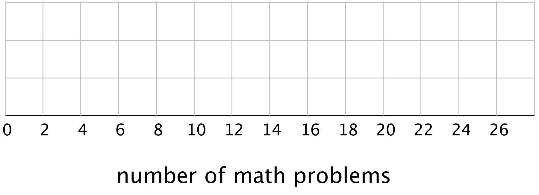
Use the five-number summary from the previous task and the grid to draw a box plot that represents Jada’s homework data.
-
Work with your group to draw three histograms to represent Jada’s homework data. The width of the bars in each histogram should represent a different number of homework problems, as specified.
- The width of one bar represents 10 problems.
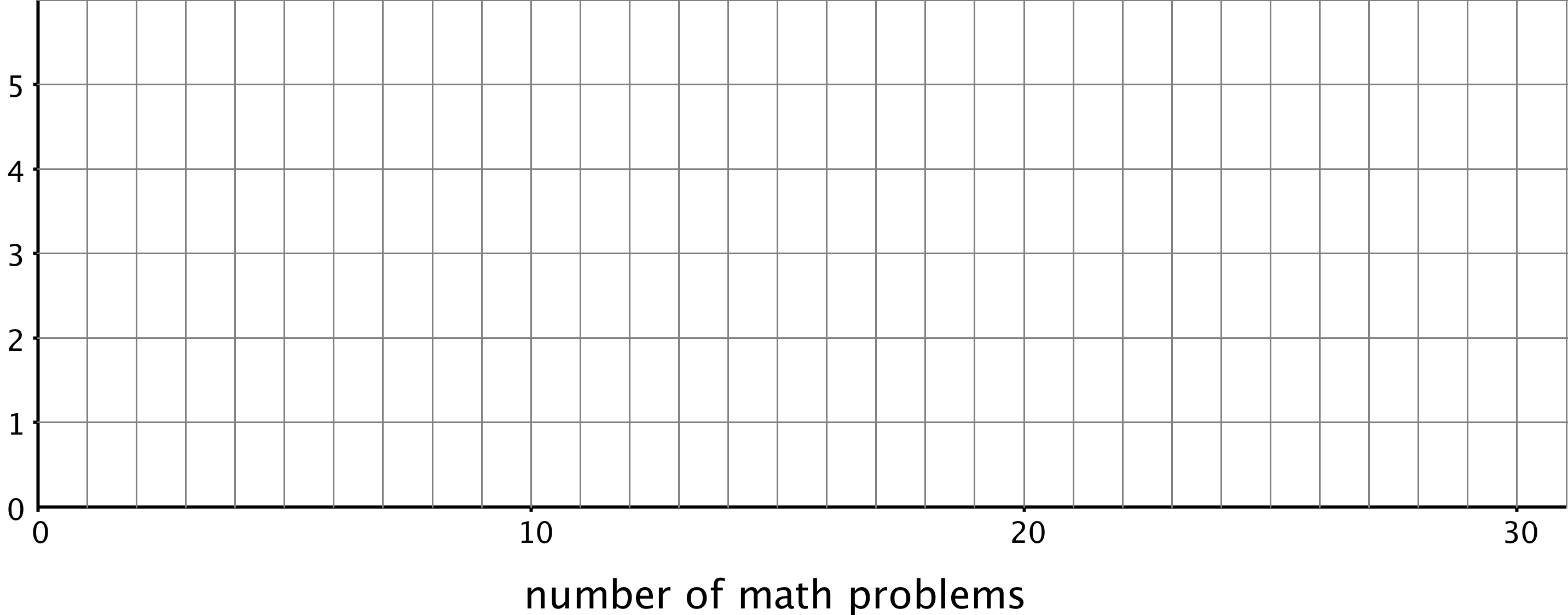
- The width of one bar represents 5 problems.

- The width of one bar represents 2 problems.
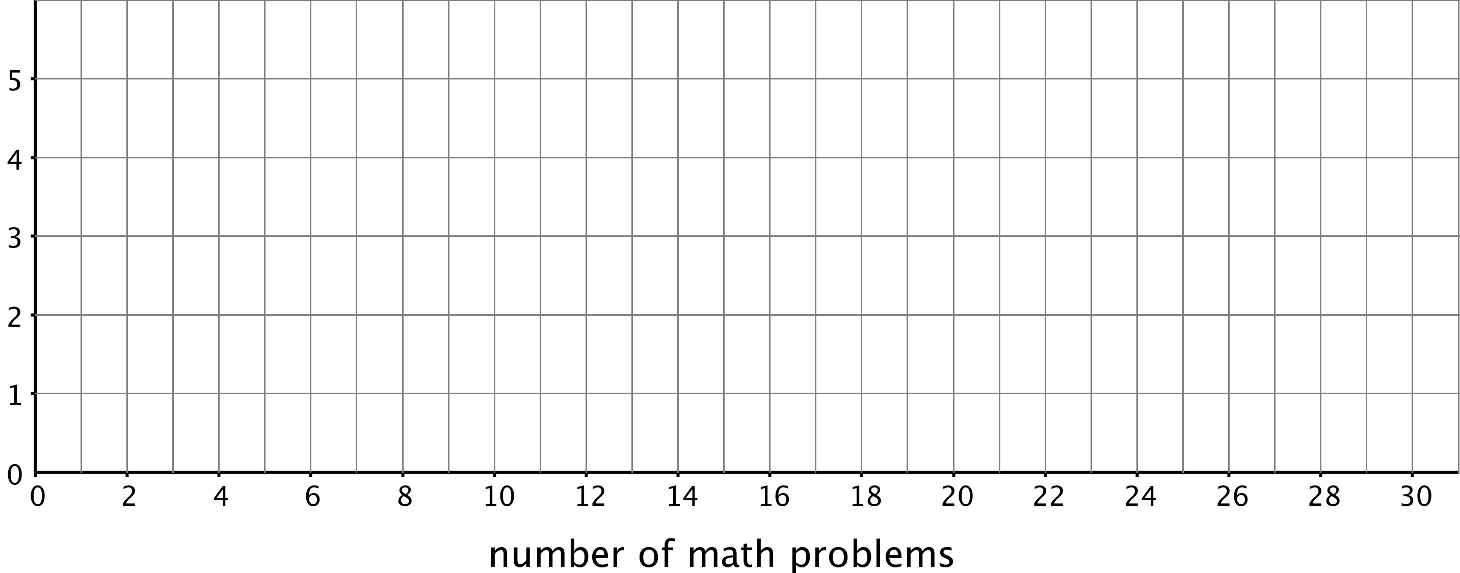
- The width of one bar represents 10 problems.
- Which of the five representations should Jada use to summarize her data? Should she use a dot plot, box plot, or one of the histograms? Explain your reasoning.
You can use the applet to make each type of graph if you choose to. Begin by dragging the gray bar from the top of the applet down until you see all of the command boxes.
Student Response
For access, consult one of our IM Certified Partners.
Launch
Arrange students in groups of 3–4. Provide access to straightedges.
Explain to students that they will now represent Jada's homework data graphically and think about which representation(s) might appropriately communicate the distribution of her data. Give students 4–5 quiet minutes to draw a dot plot and a box plot (the first two questions), and then another 4–5 minutes to collaborate on drawing histograms with different bin sizes. Ask each student in a group to be in charge of one histogram with a particular bin size. After all representations are drawn, students should analyze them and discuss the last question in their group.
Classes using the digital version have an applet to create the statistical graphs. Data must be entered as a list, in curved brackets, separated by commas. Choices for histogram settings appear when that graph is selected.
Student Facing
Jada wanted to know whether a dot plot, a histogram, or a box plot would best summarize the center, variability, and other aspects of her homework data.
2
15
20
0
5
25
1
0
10
12
-
Use the axis to make a dot plot to represent the data. Mark the position of the mean, which you calculated earlier, on the dot plot using a triangle (\(\Delta\)). From the triangle, draw a horizontal line segment to the left and right sides to represent the MAD.

-
Draw a box plot that represents Jada’s homework data.

-
Work with your group to draw three histograms to represent Jada’s homework data. The width of the bars in each histogram should represent a different number of homework problems, which are specified as follows.
- The width of one bar represents 10 problems.

- The width of one bar represents 5 problems.

- The width of one bar represents 2 problems.

- The width of one bar represents 10 problems.
- Which of the five representations should Jada use to summarize her data? Should she use a dot plot, box plot, or one of the histograms? Explain your reasoning.
Student Response
For access, consult one of our IM Certified Partners.
Activity Synthesis
Invite previously identified students to share their dot plot, box plot, and histograms. Display their drawings for all to see. Then, select several students or groups to share their response to the last question (which representation should Jada choose?) and their explanation. If not already mentioned by students, discuss the different insights that each display offers, or different challenges it poses. (Some possible observations are listed under Student Response section.) For instance, consider asking the following questions about each data display:
- “What information can we get from this display?”
- “Does it give us a meaningful snapshot of the distribution?”
- “What characteristics of a different data set would make this representation more useful?”
Help students see that, in this case, none of the representations here are ill-suited to represent the data set, but a couple of them (e.g. the box plot, or the first histogram with a bin size of 10) allow us to describe the distribution the data set more easily because of how they summarize the data values in some ways.
Supports accessibility for: Visual-spatial processing
Design Principle(s): Support sense-making; Maximize meta-awareness
18.4: Will the Yellow Perch Survive? (30 minutes)
Optional activity
In this culminating activity, students use what they have learned in the unit to answer statistical questions about a species of fish in the Great Lakes region. They use a histogram to represent the given data distribution, decide on appropriate measures of center and variability, and use their analyses to draw conclusions about a certain fish population.
Launch
Tell students that they will now look at an example in which data analysis could be used to help conservation efforts. Provide students with the following background information.
The yellow perch is a freshwater fish that is a popular food for people in the Great Lakes region (Minnesota, Wisconsin, Michigan, Illinois, Indiana, Ohio, Pennsylvania, and New York). In past research, samples of yellow perch taken from the Great Lakes seemed to be mostly male and mostly old. People worried that yellow perch might not survive and efforts were made to limit commercial and individual fishing in order to try to increase in the number of younger fish. An important part of these efforts is to periodically check the typical age of the fish in the Great Lakes.
The Wisconsin Department of Natural Resources and the Great Lakes Water Institute collected data from samples of yellow perch in Lake Michigan. Students at Rufus King High School in Milwaukee, Wisconsin participated in the research. They evaluated the data and presented their findings in a student-conducted press conference. Explain to students that, in this task, they will investigate some of the same questions that these students addressed in their research.
Arrange students in groups of 3–4. Provide access to straightedges. Give students 7–8 minutes of quiet work time for the first three questions, and then 10–12 minutes to discuss their responses, complete the remainder of the task, and prepare a brief presentation on their response to the last set of questions.
Give each group access to tools for creating a visual display. Ask them to support their conclusions with specific pieces of evidence, such as their histogram, their analysis of the distribution, measures of center and spread, etc.
Student Facing
Scientists studying the yellow perch, a species of fish, believe that the length of a fish is related to its age. This means that the longer the fish, the older it is. Adult yellow perch vary in size, but they are usually between 10 and 25 centimeters.
Scientists at the Great Lakes Water Institute caught, measured, and released yellow perch at several locations in Lake Michigan. The following summary is based on a sample of yellow perch from one of these locations.
| length of fish in centimeters | number of fish |
|---|---|
| 0 to less than 5 | 5 |
| 5 to less than 10 | 7 |
| 10 to less than 15 | 14 |
| 15 to less than 20 | 20 |
| 20 to less than 25 | 24 |
| 25 to less than 30 | 30 |
-
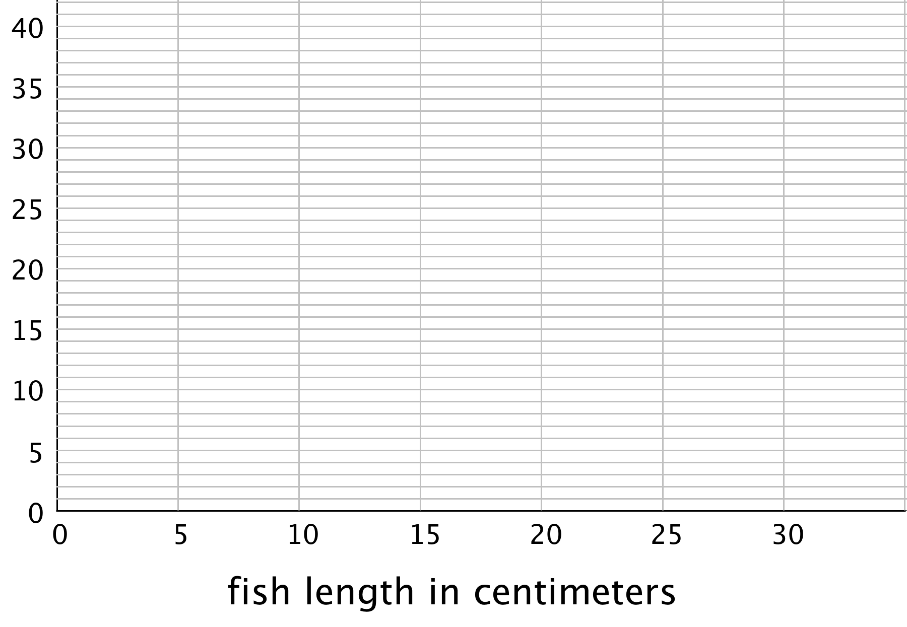
Use the data to make a histogram that shows the lengths of the captured yellow perch. Each bar should contain the lengths shown in each row in the table.
- How many fish were measured? How do you know?
-
Use the histogram to answer the following questions.
-
How would you describe the shape of the distribution?
- Estimate the median length for this sample. Describe how you made this estimate.
- Predict whether the mean length of this sample is greater than, less than, or nearly equal to the median length for this sample of fish? Explain your prediction.
- Would you use the mean or the median to describe a typical length of the fish being studied? Explain your reasoning.
-
-
Based on your work so far:
- Would you describe a typical age for the yellow perch in this sample as: “young,” “adult,” or “old”? Explain your reasoning.
- Some researchers are concerned about the survival of the yellow perch. Do you think the lengths (or the ages) of the fish in this sample are something to worry about? Explain your reasoning.
Student Response
For access, consult one of our IM Certified Partners.
Activity Synthesis
To allow all groups a chance to present, consider putting 2–3 groups together and asking them to present their work to each other. Groups that are not the first to present should focus on sharing new insights that have not been mentioned by the preceding groups. Invite students who are not presenting to attend carefully to the reasoning of the presenting group and to ask clarifying questions.
If time permits, highlight some conclusions that students drew about whether the fish in the sample were young, adult age, or old, and whether researchers should be worried.
Tell students that several years after the students at Rufus King High School participated in the research, newer samples of yellow perch showed more favorable length-age distributions: more of the the fish were smaller or younger.
Design Principle(s): Support sense-making; Maximize meta-awareness
Lesson Synthesis
Lesson Synthesis
In this lesson we practice finding measures of center and variability (mean, MAD, median, and IQR) and making sense of them in the context of the given situation. We notice that they give us different insights into the distribution of a data set.
- “What do the mean and MAD tell us?” (The mean tells us the fair share or balance point of the distribution and the MAD tells us the average distance a value is from the mean.)
- “How do we interpret this statement: ‘Noah's mean number of homework problems per day is 10 and the MAD is 6.’?” (If we were to distribute Noah’s assignments so that the number of problems he has each day is the same, he would have 10 per day. The MAD of 6 tells us that there is some variability in the number of problems assigned, so not all days have exactly 10 problems assigned. The average distance between the number of problems assigned and the mean of 10 is 6.)
- “What do the median and IQR tell us?” (The median tells us the value for which half the data set is equal to or greater and half the data set is equal to or less and the IQR tells us the range for the middle half of the data set.)
- “How do we interpret this statement: ‘Lin's median number of homework problems per day is 10 and the IQR is 6.’?” (One half of Lin’s assignments involve 10 or fewer problems, and the other half involve 10 or more problems. The IQR tells us that half of Lin's assignments are between 7 and 13 problems.)
We also looked at different ways to graphically represent a numerical distribution.
- “What are the ways we can represent a data set?” (Dot plot, histogram, box plot.)
- “Which representations are helpful for summarizing a distribution?” (It varies depending on the distribution we're studying and what information we want to know.)
18.5: Cool-down - Time Spent on Chores (5 minutes)
Cool-Down
For access, consult one of our IM Certified Partners.
Student Lesson Summary
Student Facing
The dot plot shows the distribution of 30 cookie weights in grams.

The mean cookie weight, marked by the triangle, is 21 grams. This tells us that if the weights of all of the cookies were redistributed so they all had the same weight, each cookie would weigh 21 grams. The MAD is 5.6 grams, which suggests that a cookie typically weighs between 15.4 grams and 26.6 grams.
The box plot for the same data set is shown above the dot plot. The median shows that half of the weights are greater than or equal to 20.5 grams, and half are less than or equal to 20.5 grams. The box shows that the IQR is 10 and that the middle half of the cookies weigh between 16 and 26 grams.
In this case, the median weight is very close to the mean weight, and the IQR is about twice the MAD. This tells us that the two pairs of measures of center and spread are very similar.
Now let’s look at another example of 30 different cookies.

Here the mean is 21 grams, and the MAD is 3.4 grams. This suggests that a cookie typically weighs between 17.6 and 24.4 grams. The median cookie weight is 23 grams, and the box plot shows that the middle half of the data are between 20 and 24 grams. These two pairs of measures paint very different pictures of the variability of the cookie weights.
The median (23 grams) is closer to the middle of the big cluster of values. If we were to ignore the smaller cookies, the median and IQR would give a more accurate picture of how much a cookie typically weighs.
When a distribution is not symmetrical, the median and IQR are often better measures of center and spread than the mean and MAD. However the decision on which pair of measures to use depends on what we want to know about the group we are investigating.