Lesson 3
Representing Data Graphically
3.1: Curious about Caps (5 minutes)
Warm-up
The purpose of this warm-up is to reinforce the distinction between statistical and non-statistical questions. Students write a statistical question and articulate why it qualifies as statistical. Students’ explanations should focus on the variability in the data used to answer the question. The context will be used again in the next activity, so this also gets students familiar with the object.
Launch
Arrange students in groups of 3–4. Give students 1 minute of quiet work time. Then, tell students to share their question and reasoning within their group. Tell the groups to decide if each question is statistical or non-statistical. If the group disagrees, discuss the question further and revise it until an agreement is reached.
Student Facing
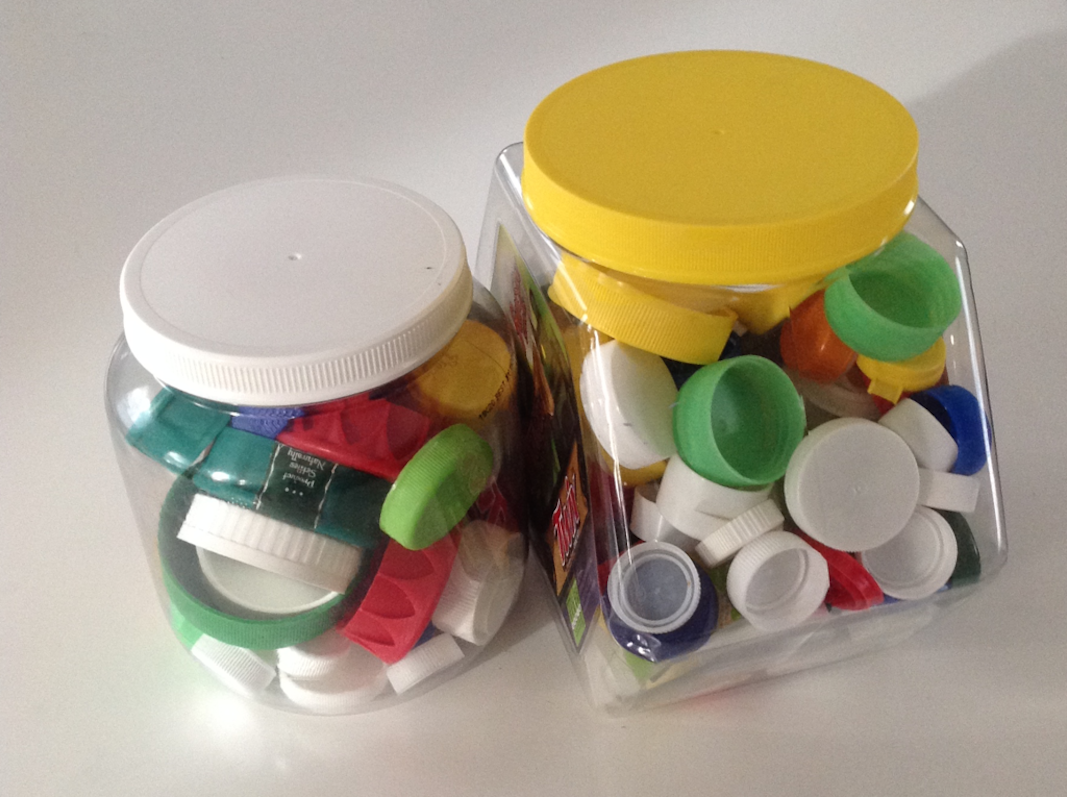
Clare collects bottle caps and keeps them in plastic containers.

Write one statistical question that someone could ask Clare about her collection. Be prepared to explain your reasoning.
Student Response
For access, consult one of our IM Certified Partners.
Activity Synthesis
The purpose of the discussion is to ensure students are comfortable constructing statistical and non-statistical questions.
Ask students to share their statistical questions and reasoning. If possible, ask students to refer back to the image as they share. Record and display their responses for all to see.
To involve more students in the conversation, consider asking some of the following questions:
- “Were there any questions your group had in common?”
- “Were there any questions your group could not agree were statistical? Why?”
- “Were there any questions your group decided were non-statistical? What made that question non-statistical?”
3.2: Estimating Caps (15 minutes)
Activity
In this activity, students are motivated to create a dot plot by identifying a statistical question and collecting data from the class to answer the question. When the data is initially presented, it is messy and difficult to analyze in an unorganized form. Students are then asked to choose an appropriate representation to use for the data (MP5) in a way that can be understood better by using a dot plot. Once the data is organized, students attempt to find a typical value from the data. In addition, students will be practicing their estimation skills by guessing the number of items in a jar.
Launch
If any groups in the warm-up asked how many caps were included in the jar, use that as a way to transition into this activity.
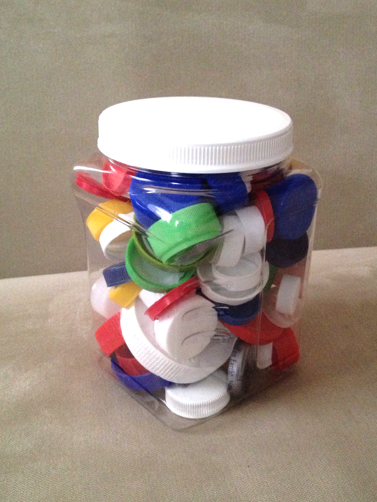
Tell students to keep their materials closed for this discussion. Give each student a sticky note and a dot sticker. Display the image and questions for all to see.

- Question 1: How many caps are in the jar?
- Question 2: In this class, what is a common estimate for the number of caps in the jar?
- Question 3: What is the teacher's estimate for the number of caps in the jar?
Give students a minute of quiet think time to determine if each question is a statistical question and their reasoning. Invite students to share their responses. Once the class agrees that Question 2 is the only statistical question and has a good reason, ask students to write down an estimate for the number of caps in the jar on a sticky note and remember their answer. Next, ask them to affix their sticky notes on a wall or a board for all to see, and then use the display to answer the statistical question.
Students should recognize that the data cannot be easily interpreted in this format. Discuss other ways the estimates can be displayed so that they can be easily seen and understood. If no students suggest placing the sticky notes along a number line like a dot plot, suggest this idea to them.
Next, look for the smallest and largest estimates (either by asking students or skimming through the sticky notes). Draw or display a number line that spans those two numbers, large enough so that students could affix their dot stickers along it. Have each student put their dot sticker on the right place along the number line. If more than one person made the same estimate, the second person should put theirs higher up on the board in the same horizontal position. When the dot plot is complete, tell students to open their materials and answer the questions.
Student Facing
- Write down the statistical question your class is trying to answer.
- Look at the dot plot that shows the data from your class. Write down one thing you notice and one thing you wonder about the dot plot.
- Use the dot plot to answer the statistical question. Be prepared to explain your reasoning.
Student Response
For access, consult one of our IM Certified Partners.
Activity Synthesis
The purpose of this discussion is to see why a dot plot can be useful to visualize and quickly understand a large amount of data.
Ask students what they noticed about the display and for any questions they had about the display. Ask students what advantages this display might have over other ways of arranging the sticky notes.
Tell students that the actual number of bottle caps in the jars is 82. Ask students how this number relates to the dot plot created by the class.
In general, the average from a group of individual guesses can be more accurate than any individual guess. This phenomenon is called “wisdom of the crowd” and is relied on for things such as reviews for products sold online.
Design Principle(s): Cultivate conversation; Maximize meta-awareness
3.3: Been There, Done That! (15 minutes)
Activity
In the previous activity, the class created a dot plot together. In this activity, students create a dot plot on their own. The work of drawing dot plots is not new, but students are asked to describe their analysis of the data broadly and with limited scaffolding. They also learn to use the term frequency to describe the number of occurrences associated with each numerical value or category.
As students work and discuss, identify those who are able to describe the distribution of the data clearly and succinctly, as well as students who can articulate why a dot plot is an appropriate representation. Ask them to share later.
Launch
Keep students in groups of 3–4. Explain that the term frequency associated with a particular item represents the number of times an item occurs in the data set. For example, in the set of numbers 1, 2, 1, 4, 5, 1, 1, the number 1 has a frequency of 4 since it appears 4 times in the data set. In the same data set, the number 2 has a frequency of 1 and the number 3 has a frequency of 0 since it does not appear in the data set at all. Additionally explain that the distribution refers to a description of how the data are arranged (or distributed) in the dot plot.
Give groups 5–6 minutes to work together to organize the given data and draw their dot plots. Then, give them 2–3 minutes of quiet time to analyze the dot plots and answer the last two questions, and time for a brief small-group discussion about their responses. Reconvene as a whole class afterwards.
Supports accessibility for: Memory; Language
Student Facing
Priya wants to know if basketball players on a men’s team and a women’s team have had prior experience in international competitions. She gathered data on the number of times the players were on a team before 2016.
men's team
3
0
0
0
0
1
0
0
0
0
0
0
women's team
2
3
3
1
0
2
0
1
1
0
3
1
- Did Priya collect categorical or numerical data?
-
Organize the information on the two basketball teams into these tables.
Men’s Basketball Team Players
number of prior
competitionsfrequency
(number)0 1 2 3 4 Women’s Basketball Team Players
number of prior
competitionsfrequency
(number)0 1 2 3 4 -
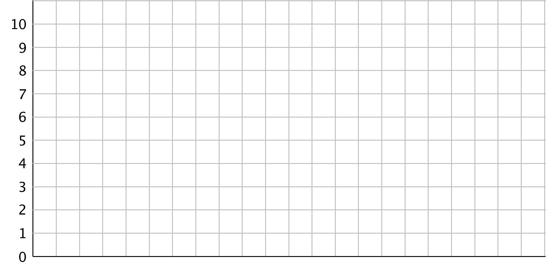
Make a dot plot for each table.
Men’s Basketball Team Players

Women’s Basketball Team Players

-
Study your dot plots. What do they tell you about the competition participation of:
- the players on the men’s basketball team?
- the players on the women’s basketball team?
- Explain why a dot plot is an appropriate representation for Priya’s data.
Student Response
For access, consult one of our IM Certified Partners.
Student Facing
Are you ready for more?
Combine the data for the players on the men’s and women’s teams and represent it as a single dot plot. What can you say about the repeat participation of the basketball players?

Student Response
For access, consult one of our IM Certified Partners.
Anticipated Misconceptions
When drawing dot plots, some students might use dots of different sizes or neglect to stack the dots in a straight column. Remind students to use uniform dots and to stack them vertically, using a straightedge as a guide, if needed. For some students, the use of graph paper may be helpful.
Activity Synthesis
Select previously identified students to share their comments on the competition participation of the male and female athletes and why a dot plot is an appropriate representation. Then, invite them to compare the features and merits of the representations they used in this lesson. Discuss:
- “In what ways might bar graphs and dot plots be more useful than lists and tables?” (Bar graphs and dot plots both give us a visual snapshot of the data so that we can see patterns or anything unusual.)
- “How are bar graphs and dot plots alike? How are they different?” (They both show frequencies of data vertically–the more frequent a data value occurs, the taller the stack or bar. They are different in that the horizontal axis of a dot plot shows numbers, while the one for a bar graph shows different labels.)
- “Could a dot plot be used to represent the first letter of the last names of the players represented on these teams? Why or why not?” (No, because a dot plot uses a number line. Each point on the number line represents a number, so where a data point is placed matters. A bar graph could be used where the categories could be shown in any order, and the width of the bars is flexible.)
Explain to students that a frequency table, bar graph, and dot plot all tell us about the distribution of a data set: each of them lists or shows all the possible values or categories in a data set and how often each one occurs. Throughout the unit, we will investigate distributions closely and use them to learn more about data and the groups or situations they represent.
Design Principle(s): Support sense-making; Maximize meta-awareness
3.4: Favorite Summer Sports (15 minutes)
Optional activity
This activity is marked optional since it goes beyond the expectations of the standards. The activity helps students think about how bar graphs compare to dot plots and are useful in contrast to future lessons working with histograms.
In this activity, students organize categorical data into frequency tables and represent them as a bar graph. Neither task is new to the grade level, but students approach data analysis with a new awareness of data types and they use data to answer questions that are more open-ended. Later, they will contrast the representation for categorical data with those for numerical data. Students also learn to use the term frequency to describe the number of times a data value occurs.
As students draw and analyze their bar graphs, listen for the questions they might ask one another about drawing decisions. For example, they might wonder about the order in which the categories are displayed, the width of the bars, or whether certain sports might belong in the same category (e.g., swimming and diving). Also notice the arguments students make about whether a dot plot would be a suitable representation for the data.
Launch
Keep students in groups of 3–4. Provide access to straightedges.
Explain to students that they will organize some data and represent them by drawing a bar graph. Ask a few students to share what they know or remember about bar graphs. Draw or display a sample bar graph for all to see. Solicit some comments about what features bar graphs have, what the bars represent, and what their heights tell us. When discussing the heights of the bars, tell students that we can use the term “frequency” for “the number of occurrences.”
Give groups 5–6 minutes to work together to organize the given data and draw their bar graph. Then, give them 2–3 minutes of quiet time to analyze the bar graph and answer the last two questions, and time for a brief small-group discussion about their responses. Reconvene as a whole class afterwards.
Supports accessibility for: Memory; Organization
Student Facing
Kiran wants to know which three summer sports are most popular in his class. He surveyed his classmates on their favorite summer sport. Here are their responses.
swimming
gymnastics
track and field
volleyball
swimming
swimming
diving
track and field
gymnastics
basketball
basketball
volleyball
track and field
track and field
volleyball
gymnastics
diving
gymnastics
volleyball
rowing
track and field
track and field
soccer
swimming
gymnastics
track and field
swimming
rowing
diving
soccer
- Did Kiran collect categorical or numerical data?
- Organize the responses in a table to help him find which summer sports are most popular in his class.
sport frequency -
Represent the information in the table as a bar graph.

-
- How can you use the bar graph to find how many classmates Kiran surveyed?
- Which three summer sports are most popular in Kiran’s class?
- Use your bar graph to describe at least one observation about Kiran’s classmates’ preferred summer sports.
- Could a dot plot be used to represent Kiran’s data? Explain your reasoning.
Student Response
For access, consult one of our IM Certified Partners.
Anticipated Misconceptions
When determining the frequencies of different sports students might loose track of their counting. If this happens, urge students to check off each sport as they account for them and then double-check their counts afterwards.
Activity Synthesis
The purpose of the discussion is for students to recognize when it is appropriate to use a bar graph and how they compare to dot plots.
Focus the whole-class discussion on the decisions that students made when drawing their bar graph and on the last two questions. Some discussion questions:
- “How did you know which sport to represent first, second, and so on? Does the order in which the sports are listed matter?”
- “Does the width of the bars matter?”
- If some students combined two or more sports into a single category: “How might the bar graph change if we combine two sports, say swimming and diving, into a single bar?”
Select a couple of students to share their observations about favorite summer sports in Kiran's class. Ask the class to see if they agree with those observations. If they don't find those conclusions to be reasonable, ask for their reasoning and alternative conclusions.
End by polling the class about whether a dot plot could be used to represent the data. Ask a student who thinks so to explain their reasoning. Dot plots should only be used to represent numerical data along a number line and not categorical data.
Lesson Synthesis
Lesson Synthesis
In this lesson, we look at how to organize and represent data. When working with data, we’re often particularly interested in the distribution of data.
- “What is the distribution of data?”
- “How do we tell the frequency of a data value from a data set? What about from a table?”
- “How do we tell the frequencies of different data values from a dot plot?”
If the optional activity was completed:
- “What kind of graphical representation can we use to show the distribution of categorical data? What about for numerical data?”
- “How do we tell the frequencies of different data values from a bar graph?”
- “Both the dot plot and the bar graph are built on a horizontal line. How are the horizontal lines different?”
3.5: Cool-down - Swimmers and Swimming Class (5 minutes)
Cool-Down
For access, consult one of our IM Certified Partners.
Student Lesson Summary
Student Facing
When we analyze data, we are often interested in the distribution, which is information that shows all the data values and how often they occur.
In a previous lesson, we saw data about 10 dogs. We can see the distribution of the dog weights in a table such as this one.
| weight in kilograms | frequency |
|---|---|
| 6 | 1 |
| 7 | 3 |
| 10 | 2 |
| 32 | 1 |
| 35 | 2 |
| 36 | 1 |
The term frequency refers to the number of times a data value occurs. In this case, we see that there are three dogs that weigh 7 kilograms, so “3” is the frequency for the value “7 kilograms.”
Recall that dot plots are often used to to represent numerical data. Like a frequency table, a dot plot also shows the distribution of a data set. This dot plot, which you saw in an earlier lesson, shows the distribution of dog weights.

A dot plot uses a horizontal number line. We show the frequency of a value by the number of dots drawn above that value. Here, the two dots above the number 35 tell us that there are two dogs weighing 35 kilograms.
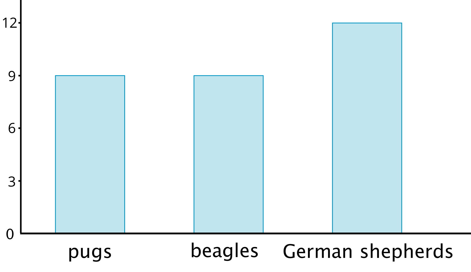
The distribution of categorical data can also be shown in a table. This table shows the distribution of dog breeds.
| breed | frequency |
|---|---|
| pug | 9 |
| beagle | 9 |
| German shepherd | 12 |
We often represent the distribution of categorical data using a bar graph.

A bar graph also uses a horizontal line. Above it we draw a rectangle (or “bar”) to represent each category in the data set. The height of a bar tells us the frequency of the category. There are 12 German shepherds in the data set, so the bar for this category is 12 units tall. Below the line we write the labels for the categories.
In a dot plot, a data value is placed according to its position on the number line. A weight of 10 kilograms must be shown as a dot above 10 on the number line.
In a bar graph, however, the categories can be listed in any order. The bar that shows the frequency of pugs can be placed anywhere along the horizontal line.