Lesson 17
Using Box Plots
17.1: Hours of Slumber (5 minutes)
Warm-up
This warm-up allows students to practice creating a box plot from a five-number summary and think about the types of questions that can be answered using the box plot. To develop questions based on the box plot prompts students to put the numbers of the five-number summary into context (MP2).
As students work, identify a student who has clearly and correctly drawn the box plot to share during the whole-class discussion.
For the second question, some students may write decontextualized questions that are simply about parts of the box plot (e.g., “What is the IQR?” or “What is the range?”). Others might write contextualized questions that the box plot could help to answer (e.g., “What is the least amount of sleep in this data set?” or “What is the median number of hours of sleep for this group?”). Identify a few students from each group so that they can share later.
Launch
Arrange students in groups of 2. Give students 2 minutes of quiet work time, followed by a whole-class discussion.
Student Facing
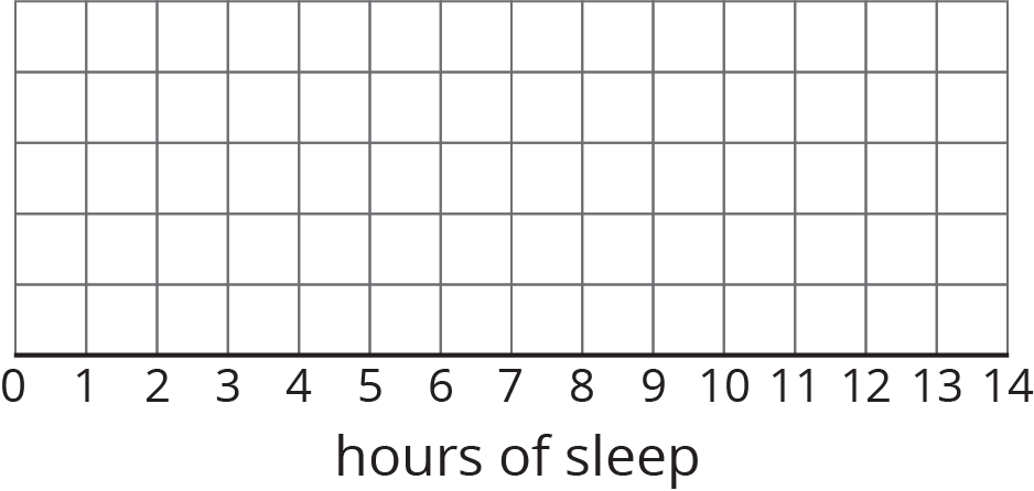
Ten sixth-grade students were asked how much sleep, in hours, they usually get on a school night. Here is the five-number summary of their responses.
- Minimum: 5 hours
- First quartile: 7 hours
- Median: 7.5 hours
- Third quartile: 8 hours
- Maximum: 9 hours
-
On the grid, draw a box plot for this five-number summary.

- What questions could be answered by looking at this box plot?
Student Response
For access, consult one of our IM Certified Partners.
Activity Synthesis
Select the previously identified student with a correct box plot to display it for all to see. If that is not possible, ask them to share how they drew the box plot and record and display the drawing based on their directions.
Select other previously identified students to share questions that could be answered by looking at the box plot first those that can be answered without the context followed by questions that rely on the context. Record and display these questions for all to see. After each question, ask the rest of the class if they agree or disagree that the answer can be found using the box plot. If time permits, ask students for the answer to each shared question.
Point out questions that are contextualized versus those that are not. Explain that a box plot can help to make sense of a data set in context and answer questions about a group or a characteristic of a group in which we are interested. The different measures that we learned to identify or calculate help to make sense of data distribution in context.
17.2: Info Gap: Sea Turtles (15 minutes)
Activity
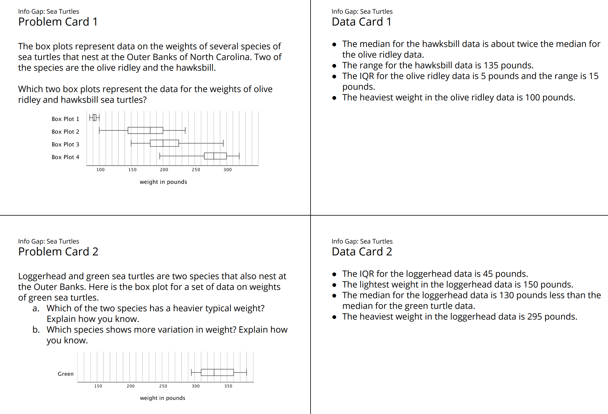
In this info gap activity, students practice analyzing box plots and thinking carefully about what questions they could help to answer. They connect features of box plots to information about IQR, range, median, and minimum and maximum values of several data sets on sea turtles (MP7). Along the way, they see the usefulness of box plots in comparing distributions and characteristics of different populations.
The info gap structure requires students to make sense of problems by determining what information is necessary, and then to ask for information they need to solve it. This may take several rounds of discussion if their first requests do not yield the information they need (MP1). It also allows them to refine the language they use and ask increasingly precise questions until they get the information they need (MP6).
Here is the text of the cards for reference and planning:

Launch
Tell students that they will now practice using box plots to answer questions about populations of sea turtles. Provide students with the following background information: Sea turtles are air-breathing amphibians that spend most of their time floating in seaweed beds. Females come on shore to lay their eggs. One nesting place for several species of sea turtles is the Outer Banks of North Carolina. All sea turtles are considered to be endangered and only about 1 in 1,000 newly hatched sea turtles survives, which is why their nesting areas are protected.
Arrange students in groups of 2. Give each group a pair of cut-up cards from the blackline master—a Problem Card for one partner and a Data Card for the other. Remind students of the protocol for asking and answering questions, as shown on the task statement. Give students 10 minutes to complete the activity. If any groups finish early, offer a second pair of cards and ask the partners to switch roles.
Supports accessibility for: Memory; Organization
Design Principle(s): Cultivate Conversation
Student Facing
Your teacher will give you either a Problem Card or a Data Card about sea turtles that nest on the Outer Banks of North Carolina. Do not show or read your card to your partner.

If your teacher gives you the problem card:
-
Silently read your card and think about what information you need to be able to answer the question.
-
Ask your partner for the specific information that you need.
-
Explain how you are using the information to solve the problem.
Continue to ask questions until you have enough information to solve the problem.
-
Share the problem card and solve the problem independently.
-
Read the data card and discuss your reasoning.
If your teacher gives you the data card:
-
Silently read your card.
-
Ask your partner “What specific information do you need?” and wait for them to ask for information.
If your partner asks for information that is not on the card, do not do the calculations for them. Tell them you don’t have that information.
-
Before sharing the information, ask “Why do you need that information?” Listen to your partner’s reasoning and ask clarifying questions.
-
Read the problem card and solve the problem independently.
-
Share the data card and discuss your reasoning.
Pause here so your teacher can review your work. Ask your teacher for a new set of cards and repeat the activity, trading roles with your partner.
Student Response
For access, consult one of our IM Certified Partners.
Activity Synthesis
Invite students to share their experiences with the Info Gap activity. Consider discussing some of the following questions.
- For students who had a Problem Card:
- “How did you decide what information to ask for? How did the information on your card help?”
- “How easy or difficult was it to explain why you needed the information you were asking for?”
- “Give an example of a question that you asked, the clue you received, and how you made use of it.”
- “How many questions did it take for you to be able to solve the problem? What were those questions?”
- “Was anyone able to solve the problem with a different set of questions?”
- For students who had a Data Card:
- “When you asked your partner why they needed a specific piece of information, what kind of explanations did you consider acceptable?”
- “Were you able to tell from their questions what statistical question they were trying to answer? If so, how? If not, why might that be?”
17.3: Paper Planes (15 minutes)
Activity
In this lesson, students continue to create box plots from data sets. They compare and interpret box plots for distributions with the same median but very different IQRs, and use the plots to answer questions.
As students work, make sure that they correctly identify the five-number summary of each data set. If students have trouble making comparisons, prompt them to study the medians, IQRs, and ranges the data sets. Then, notice how they compare the box plots and whether they interpret the different measures in the context of the given situation. If they make comparisons only in abstract terms (e.g., “The median for both data sets are the same”), push them to specify what the comparisons mean in this situation (e.g., “What does the equal median tell us in this context?”). Identify students who made sense of these numbers in terms of typical distances and consistency of the flights of each person's plane. Ask them to share later.
Launch
Tell students that they will analyze data sets about flight distances of paper airplanes. To familiarize students with the context of this activity, consider preparing a few different styles or sizes of paper airplanes. Before students begin working, fly each paper plane a couple of times and ask students to observe their flight distances.
Arrange students in groups of 3–4. Provide access to straightedges. Give groups 8–10 minutes to complete the activity. Ask each group member to find the five-number summary and draw the box plot for one student (Andre, Lin, or Noah) and then share their summaries and drawings. Ask them to pause and have their summaries and drawings reviewed before answering the last two questions. Consider posting somewhere in the classroom the five-number summaries and the box plots so that students can check their answers. Ask students to be prepared to explain how Andre, Lin, and Noah's flight distances are alike or different.
Supports accessibility for: Memory; Organization
Student Facing
Andre, Lin, and Noah each designed and built a paper airplane. They launched each plane several times and recorded the distance of each flight in yards.
Andre
25
26
27
27
27
28
28
28
29
30
30
Lin
20
20
21
24
26
28
28
29
29
30
32
Noah
13
14
15
18
19
20
21
23
23
24
25
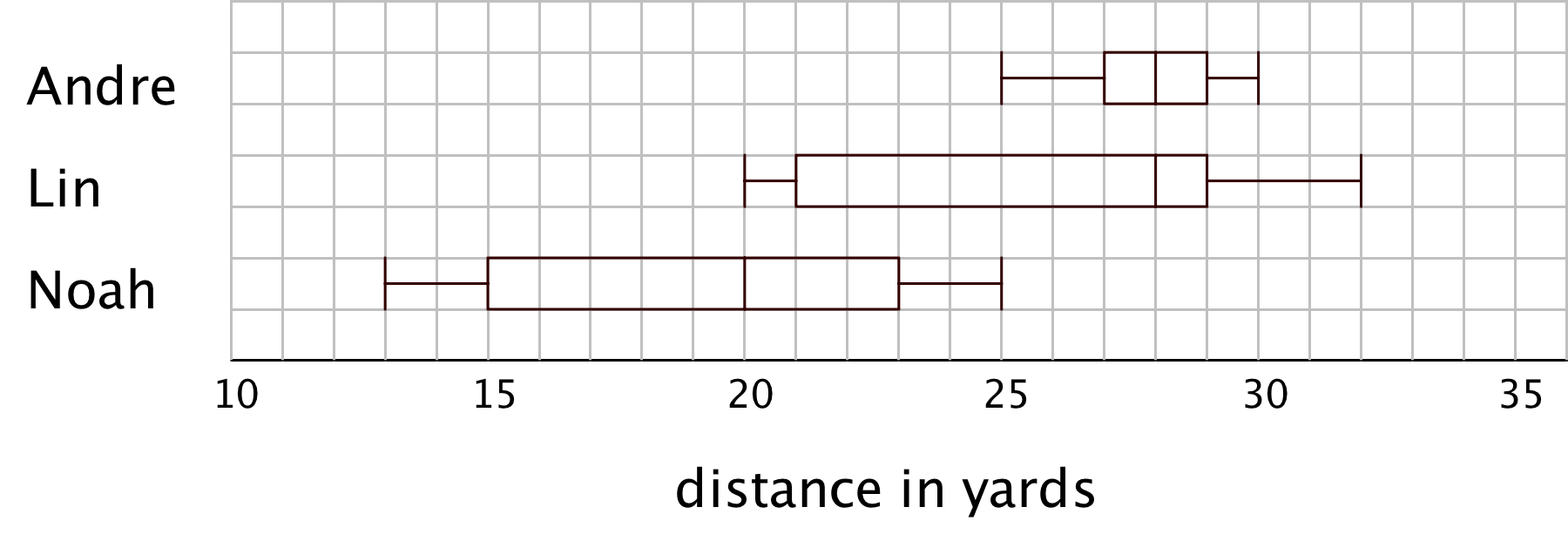
Work with your group to summarize the data sets with numbers and box plots.
- Write the five-number summary for the data for each airplane. Then, calculate the interquartile range for each data set.
min Q1 median Q3 max IQR - Draw three box plots, one for each paper airplane. Label the box plots clearly.

-
How are the results for Andre and Lin’s planes the same? How are they different?
-
How are the results for Lin and Noah’s planes the same? How are they different?
Student Response
For access, consult one of our IM Certified Partners.
Student Facing
Are you ready for more?
Priya joined in the paper-plane experiments. She launched her plane eleven times and recorded the lengths of each flight. She found that her maximum and minimum were equal to Lin’s. Her IQR was equal to Andre’s.
Draw a box plot that could represent Priya’s data.

With the information given, can you estimate the median for Priya’s data? Explain your reasoning.
Student Response
For access, consult one of our IM Certified Partners.
Activity Synthesis
Focus the whole-class discussion on students’ analyses and interpretations of the box plots. Display the box plots for all to see.

Select a few students or groups to share their responses comparing Andre’s and Lin’s data. Be sure to discuss what it means when two data sets have the same median but different IQRs, as in Andre’s and Lin’s cases. If no students connect these values to the center and spread and data, ask them to do so.
- “What can you say about the center of Andre’s data and that of Lin’s data?” (They have the same center of 28 yards.)
- “What does the same center tell us in this context?” (The same number could be used to describe a typical flight distance for both Andre’s and Lin’s flight distances.)
- “What can you say about about the spread of Andre’s data and that of Lin’s data?” (Andre’s data are far more concentrated than Lin’s, which are quite spread out. The range of her data is 12 yards, which tells us there is much more variability in her flight distances. For Andre the range is only 5 yards, less than half of Lin’s, and his IQR is a quarter of Lin’s. Overall, there is much less variability in his data.)
- “Which of the two planes—Andre’s or Lin’s—flies a more consistent distance? How do you know?”(Andre’s, because the spread of his data is much smaller.)
Then, select a few other students or groups to compare Lin’s and Noah’s data. Be sure to discuss what it means when two data sets have the same spread (IQR) but different medians.
- “What do the two very different centers tell us in this context?” (Generally speaking, a typical flight distance for Lin's plane is quite different than that for Noah’s.)
- “What can you say about the spreads of Lin’s and Noah’s data?” (Both sets have the same range and the same IQR, though the values of the quartiles are different for the two sets of data.)
- “What does the same range tell us in this case?” (The difference between the shortest flight distance and the longest one is the same for both data sets.)
- “What does the same IQR tell us in this case?” (The middle half of the two sets of data cover the same distance.)
- “Whose plane—Lin’s or Noah’s—flies a more consistent distance?” (Their planes fly with very similar consistency, or inconsistency. The identical IQR and range tell us that their data have very similar variability.)
Design Principle(s): Optimize output (for comparison); Maximize meta-awareness
Lesson Synthesis
Lesson Synthesis
In this lesson, we see that box plots can tell us stories about the center and spread of data sets.
- “What are some questions you can ask to match box plots to data?” (Questions about the 3 quartiles, maximum, or minimum will help distinguish the different box plots.)
- “What does it mean when two box plots show the same median but different IQRs?” (The data they summarize have the same center but different spreads.)
- “How can we see this in a box plot?” (The lines inside the box will be at the same place, but the widths of the boxes will be different.)
- “What does the same median, different IQRs' mean in context?” (It means that we can use the same number to describe what is typical for each group, but the variability in the data is different.)
- “What does it mean when two box plots show the same IQR but different medians?” (The data they summarize have different centers but the same spread.)
- “How can we see this in a box plot?” (The Q2 segments in the boxes are located in different positions along the number line, but the boxes have the same width.)
- “What does ‘the same IQR, different medians’ tell us in context?” (It means that what is typical for each group is different, but the variability is similar for the two groups.)
17.4: Cool-down - Humpback Whales (5 minutes)
Cool-Down
For access, consult one of our IM Certified Partners.
Student Lesson Summary
Student Facing
Box plots are useful for comparing different groups. Here are two sets of plots that show the weights of some berries and some grapes.


Notice that the median berry weight is 3.5 grams and the median grape weight is 5 grams. In both cases, the IQR is 1.5 grams. Because the grapes in this group have a higher median weight than the berries, we can say a grape in the group is typically heavier than a berry. Because both groups have the same IQR, we can say that they have a similar variability in their weights.
These box plots represent the length data for a collection of ladybugs and a collection of beetles.

The medians of the two collections are the same, but the IQR of the ladybugs is much smaller. This tells us that a typical ladybug length is similar to a typical beetle length, but the ladybugs are more alike in their length than the beetles are in their length.