Lesson 6
Interpreting Histograms
6.1: Dog Show (Part 1) (5 minutes)
Warm-up
The purpose of this warm-up is to connect the analytical work students have done with dot plots in previous lessons with statistical questions. This activity reminds students that we gather, display, and analyze data in order to answer statistical questions. This work will be helpful as students contrast dot plots and histograms in subsequent activities.
Launch
Arrange students in groups of 2. Give students 1 minute of quiet work time, followed by 2 minutes to share their responses with a partner. Ask students to decide, during partner discussion, if each question proposed by their partner is a statistical question that can be answered using the dot plot. Follow with a whole-class discussion.
If students have trouble getting started, consider giving a sample question that can be answered using the data on the dot plot (e.g., “How many dogs weigh more than 100 pounds?”)
Student Facing
Here is a dot plot showing the weights, in pounds, of 40 dogs at a dog show.

- Write two statistical questions that can be answered using the dot plot.
- What would you consider a typical weight for a dog at this dog show? Explain your reasoning.
Student Response
For access, consult one of our IM Certified Partners.
Activity Synthesis
Ask students to share questions they agreed were statistical questions that could be answered using the dot plot. Record and display their responses for all to see. If there is time, consider asking students how they would find the answer to some of the statistical questions.
Ask students to share a typical weight for a dog at this dog show and why they think it is typical. Record and display their responses for all to see. After each student shares, ask the class if they agree or disagree.
6.2: Dog Show (Part 2) (10 minutes)
Activity
This activity introduces students to histograms. By now, students have developed a good sense of dot plots as a tool for representing distributions. They use this understanding to make sense of a different form of data representation. The data set shown on the first histogram is the same one from the preceding warm-up, so students are familiar with its distribution. This allows them to focus on making sense of the features of the new representation and comparing them to the corresponding dot plot.
Note that in all histograms in this unit, the left-end boundary of each bin or bar is included and the right-end boundary is excluded. For example, the number 5 would not be included in the 0–5 bin, but would be included in the 5–10 bin.
Launch
Explain to students that they will now explore histograms, another way to represent numerical data. Give students 3–4 minutes of quiet work time, and then 2–3 minutes to share their responses with a partner. Follow with a whole-class discussion.
Student Facing
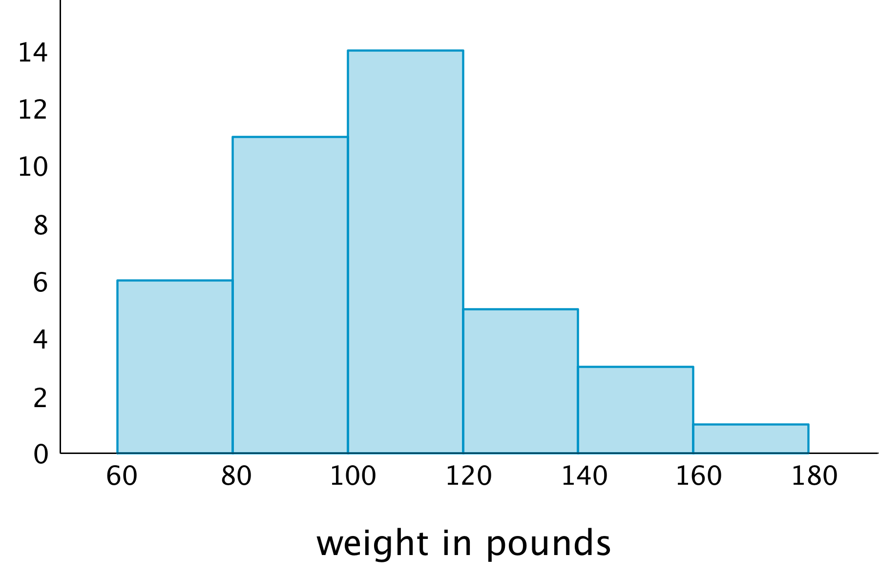
Here is a histogram that shows some dog weights in pounds.

Each bar includes the left-end value but not the right-end value. For example, the first bar includes dogs that weigh 60 pounds and 68 pounds but not 80 pounds.
-
Use the histogram to answer the following questions.
-
How many dogs weigh at least 100 pounds?
-
How many dogs weigh exactly 70 pounds?
-
How many dogs weigh at least 120 and less than 160 pounds?
-
How much does the heaviest dog at the show weigh?
- What would you consider a typical weight for a dog at this dog show? Explain your reasoning.
-
-
Discuss with a partner:
-
If you used the dot plot to answer the same five questions you just answered, how would your answers be different?
-
How are the histogram and the dot plot alike? How are they different?
-
Student Response
For access, consult one of our IM Certified Partners.
Activity Synthesis
Ask a few students to briefly share their responses to the first set of questions to make sure students are able to read and interpret the graph correctly.
Focus the whole-class discussion on the last question. Select a few students or groups to share their observations about whether or how their answers to the statistical questions would change if they were to use a dot plot to answer them, and about how histograms and dot plots compare. If not already mentioned by students, highlight that, in a histogram:
- Data values are grouped into “bins” and represented as vertical bars.
- The height of a bar reflects the combined frequency of the values in that bin.
- A histogram uses a number line.
At this point students do not yet need to see the merits or limits of each graphical display; this work will be done in upcoming lessons. Students should recognize, however, how the structures of the two displays are different (MP7) and start to see that the structural differences affect the insights we are able to glean from the displays.
Supports accessibility for: Memory; Language
Design Principle(s): Support sense-making; Maximize meta-awareness
6.3: Population of States (20 minutes)
Activity
In this activity, students continue to develop their understanding of histograms. They begin to notice that a dot plot may not be best for representing a data set with a lot of variability (or where few values are repeated) or when a data set has a large number of values. Histograms may help us visualize a distribution more clearly in these situations. Students organize a data set into “bins” and draw a histogram to display the distribution.
As students work and discuss, listen for explanations for why certain questions might be easy, hard, or impossible to answer using each graphical display.
Launch
Give students a brief overview of census and population data, as some students may not be familiar with them. Refer to the dot plot of the population data and discuss questions such as:
- “How many total dots are there?” (51)
- “What's the population of the state with the largest population? Do you know what state that is?” (Between 37 and 38 million. It's California.)
- “Look at the leftmost dot. What state might it represent? Approximately what is its population?” (The leftmost dot represents Wyoming, with a population of around half a million.)
- “Do you know the approximate population of our state? Where do you think we are in the dot plot?”
Explain to students that they will now draw a histogram to represent the population data. Remind them that histograms organize data values into “bins” or groups. In this case, the bins sizes are already decided for them. Then, arrange students in groups of 3–4. Provide access to straightedges. Give students 10–12 minutes to complete the activity. Encourage them to discuss their work within their group as needed.
Supports accessibility for: Organization; Attention
Student Facing
Every ten years, the United States conducts a census, which is an effort to count the entire population. The dot plot shows the population data from the 2010 census for each of the fifty states and the District of Columbia (DC).

-
Here are some statistical questions about the population of the fifty states and DC. How difficult would it be to answer the questions using the dot plot?
In the middle column, rate each question with an E (easy to answer), H (hard to answer), or I (impossible to answer). Be prepared to explain your reasoning.
statistical question using the dot plot using the histogram a. How many states have populations greater than 15 million? b. Which states have populations greater than 15 million? c. How many states have populations less than 5 million? d. What is a typical state population? e. Are there more states with fewer than 5 million people or more states with between 5 and 10 million people? f. How would you describe the distribution of state populations? -
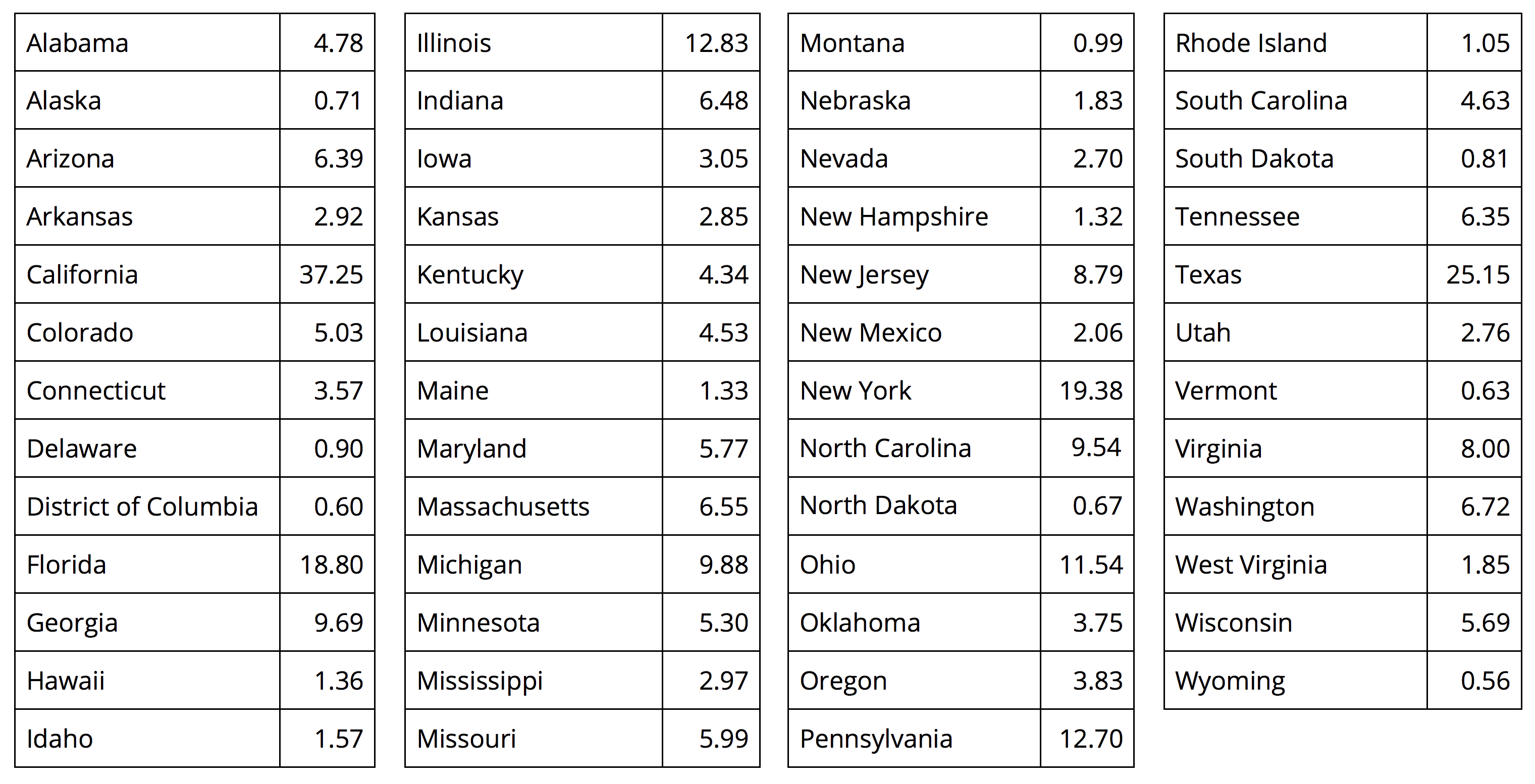
Here are the population data for all states and the District of Columbia from the 2010 census. Use the information to complete the table.

population (millions) frequency 0–5 5–10 10–15 15–20 20–25 25–30 30–35 35–40 -
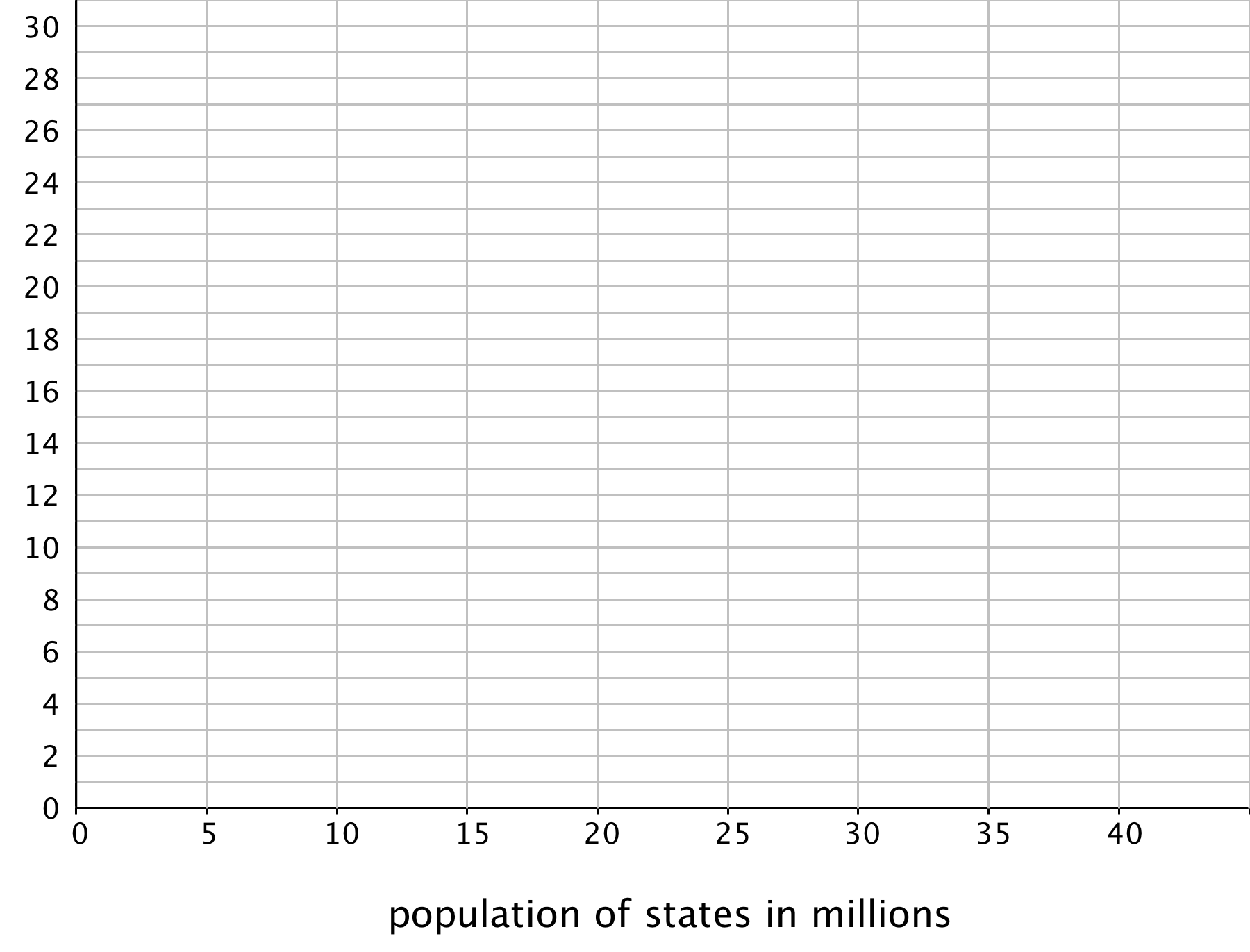
Use the grid and the information in your table to create a histogram.

-
Return to the statistical questions at the beginning of the activity. Which ones are now easier to answer?
In the last column of the table, rate each question with an E (easy), H (hard), and I (impossible) based on how difficult it is to answer them. Be prepared to explain your reasoning.
Student Response
For access, consult one of our IM Certified Partners.
Student Facing
Are you ready for more?
Think of two more statistical questions that can be answered using the data about populations of states. Then, decide whether each question can be answered using the dot plot, the histogram, or both.
Student Response
For access, consult one of our IM Certified Partners.
Activity Synthesis
Much of the discussion about how to construct histograms should have happened in small groups. Address unresolved questions about drawing histograms if they are relatively simple. Otherwise, consider waiting until students have more opportunities to draw histograms in upcoming lessons.
Focus the discussion on comparing the effectiveness of dot plots and histograms to help us answer statistical questions.
Select a few students or groups to share how their ratings of “easy,” “hard,” and “impossible,” changed when they transitioned from using dot plots to using histograms to answer statistical questions about populations of states. Then, discuss and compare the two displays more generally. Solicit as many ideas and observations as possible to these questions:
- “What are some benefits of histograms?”
- “When might histograms be preferable to dot plots?”
- “When might dot plots be preferable to histograms?”
Students should walk away from the activity recognizing that in cases when a data set has many numerical values, especially if the values do not repeat, a histogram can give us a better visualization of the distribution. In such a case, creating a dot plot can be very difficult to do including finding a scale that can meaningfully display the data while a histogram will be easier to create and display the information in a way that is easier to understand at a glance.
Design Principle(s): Optimize output (for generalization)
Lesson Synthesis
Lesson Synthesis
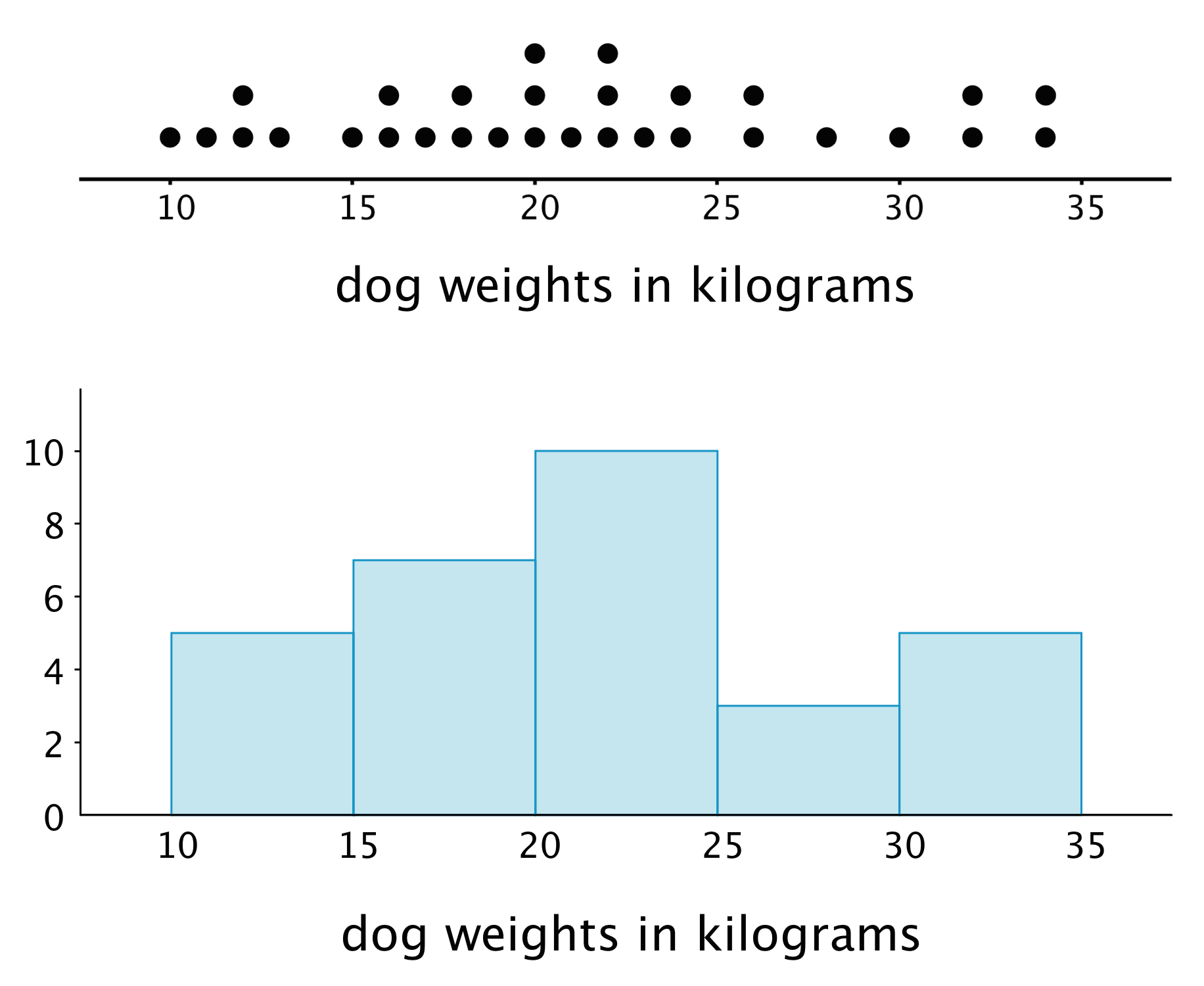
In this lesson, we learn about a different way to represent the distribution of numerical data—using a histogram. This histogram, for instance, represents the distribution for the weights of some dogs.

- “What could the smallest dog weigh? The largest?” (10 kilograms up to almost 40 kilograms)
- “What does the bar between 25 and 30 tell you?” (5 dogs weigh between 25 and just under 30 kilograms)
- “What can you say about the dogs who weigh between 10 and 20 kg?” (There are 16 total dogs in this range including 7 dogs between 10 and 15 kg and 9 between 15 and 20 kg)
- “In general, what information does a histogram allow us to see? How is it different from a dot plot?” (A bigger picture of the distribution is shown in the histogram, but some of the detail is lost when compared to a dot plot. For example, this histogram does not show the weight of any individual dogs.)
- “When might it be more useful to use a histogram than a dot plot?” (When the data is very spread out, when there are not very many data points with the same value, or when an overall idea of the distribution is more important than a detailed view.)
6.4: Cool-down - Rain in Miami (5 minutes)
Cool-Down
For access, consult one of our IM Certified Partners.
Student Lesson Summary
Student Facing
In addition to using dot plots, we can also represent distributions of numerical data using histograms.
Here is a dot plot that shows the weights, in kilograms, of 30 dogs, followed by a histogram that shows the same distribution.

In a histogram, data values are placed in groups or “bins” of a certain size, and each group is represented with a bar. The height of the bar tells us the frequency for that group.
For example, the height of the tallest bar is 10, and the bar represents weights from 20 to less than 25 kilograms, so there are 10 dogs whose weights fall in that group. Similarly, there are 3 dogs that weigh anywhere from 25 to less than 30 kilograms.
Notice that the histogram and the dot plot have a similar shape. The dot plot has the advantage of showing all of the data values, but the histogram is easier to draw and to interpret when there are a lot of values or when the values are all different.
Here is a dot plot showing the weight distribution of 40 dogs. The weights were measured to the nearest 0.1 kilogram instead of the nearest kilogram.

Here is a histogram showing the same distribution.

In this case, it is difficult to make sense of the distribution from the dot plot because the dots are so close together and all in one line. The histogram of the same data set does a much better job showing the distribution of weights, even though we can’t see the individual data values.