Lesson 17
More about Sampling Variability
17.1: Average Reactions (10 minutes)
Warm-up
Students calculate the mean of a sample collected in a previous lesson to compare with their partners. Students experience first-hand that different samples from the same population can produce different results. In the following activities of this lesson, students will use the data they have collected here to develop a deeper understanding of sampling variability.
Launch
Arrange students in groups of 2 so that different partners are used from the ones used in the Reaction Times activity in the previous lesson.
Remind students that the numbers came from a survey of all 120 seniors from a certain school. The numbers represent their reaction time in seconds from an activity in which they clicked a button as soon as they noticed that a square changed color. These 120 values are the population for this activity.
Give students 2 minutes of quiet work time followed by partner work time and a whole-class discussion.
Student Facing
The other day, you worked with the reaction times of twelfth graders to see if they were fast enough to help out at the track meet. Look back at the sample you collected.
- Calculate the mean reaction time for your sample.
- Did you and your partner get the same sample mean? Explain why or why not.
Student Response
For access, consult one of our IM Certified Partners.
Activity Synthesis
The purpose of the discussion is for students to think about how the data they collected relates to the population data.
Some questions for discussion:
- “Based on the information you currently know, estimate the mean of the population. Explain your reasoning.” (Since both my partner and I got means close to 0.4, I think the population mean will be a little greater than 0.4.)
- “If each person selected 40 reaction times for their sample instead of 20, do you think this would provide a better estimate for the population mean?” (Since the sampling method is random, and thus fair, it should produce a better estimate.)
17.2: Reaction Population (15 minutes)
Optional activity
In the warm-up, students computed the mean of a sample. In this activity, a dot plot is created by the class that includes all of the calculated sample means. Students then compare that display to the data from the entire population to better understand the information that can be gained from a sample mean (MP7). In the discussion that follows the activity, students look at similar displays of sample means for samples of different sizes (MP8). Students should see that larger samples tend to more accurately estimate the population means than smaller samples.
Launch
Display the basis for a dot plot of sample means for all to see.

Allow students 5 minutes to create the class dot plot and complete the first set of questions.
Ask students to include their sample means from the previous task to the display for all to see (since the samples were originated in pairs, there will be many repeats. It is ok to include the repeats or ensure only 1 of the original partners includes their point on the display). They may do this by adding a dot to the display on the board, placing a sticky note in the correct place, or passing a large sheet of paper around the class.
After students have had a chance to answer the first set of questions, pause the class to display the dot plot of the the reaction times for the entire population of 120 seniors for all to see.

Provide students 5 minutes to complete the problems. Follow with a whole-class discussion.
Student Facing
Your teacher will display a blank dot plot.
- Plot your sample mean from the previous activity on your teacher's dot plot.
-
What do you notice about the distribution of the sample means from the class?
- Where is the center?
- Is there a lot of variability?
- Is it approximately symmetric?
-
The population mean is 0.442 seconds. How does this value compare to the sample means from the class?
Pause here so your teacher can display a dot plot of the population of reaction times.
-
What do you notice about the distribution of the population?
- Where is the center?
- Is there a lot of variability?
- Is it approximately symmetric?
-
Compare the two displayed dot plots.
-
Based on the distribution of sample means from the class, do you think the mean of a random sample of 20 items is likely to be:
- within 0.01 seconds of the actual population mean?
- within 0.1 seconds of the actual population mean?
Explain or show your reasoning.
Student Response
For access, consult one of our IM Certified Partners.
Anticipated Misconceptions
The center of the dot plot created by the class can be thought of as a mean of sample means. The phrase can be difficult for students to think through, so remind them what the dot they added to the dot plot represents and how they calculated that value. Consider displaying the class dot plot for the rest of the unit to help students remember this example to understand similar dot plots.
Activity Synthesis
Display the dot plot of sample means for all to see throughout the unit. It may be helpful to refer to this display when viewing dot plots of sample means in future lessons.
The purpose of the discussion is for students to understand that the centers of the two dot plots in the activity are close (if not the same), but the sample means have less variability and the shapes of the population distribution and the sample mean distribution are probably different. Additionally, students should use the dot plots shown here to see that larger samples have sample means that are still centered around the population mean, but have less variability than smaller samples. Therefore, larger samples should provide better estimates of the population mean than smaller samples do.
Items for further discussion:
- “If the sample size were increased to 30 instead of 20, what do you think the distribution might look like?”
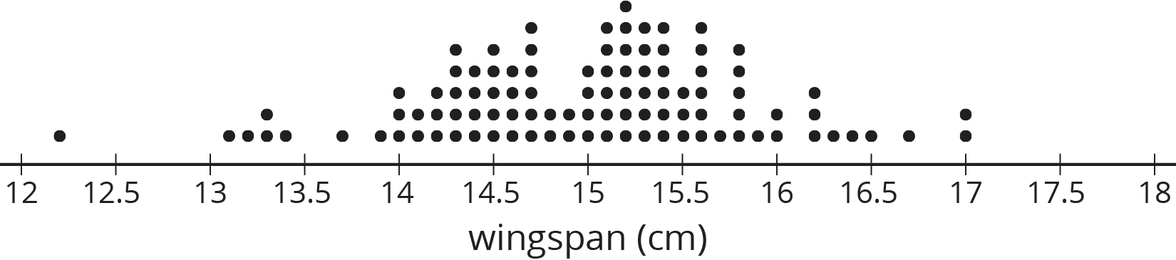
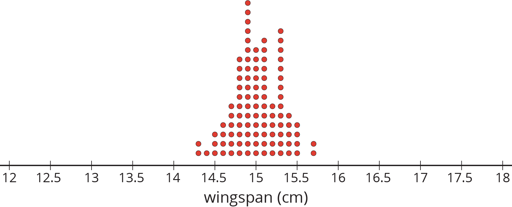
For a different set of data representing the wingspan in centimeters of a certain species of bird, compare the following dot plots.
- Here is a dot plot of the population data.
- Here is a dot plot of the sample means for 100 different random samples each of size 10
- Here is a dot plot of the sample means for 100 different random samples each of size 30.
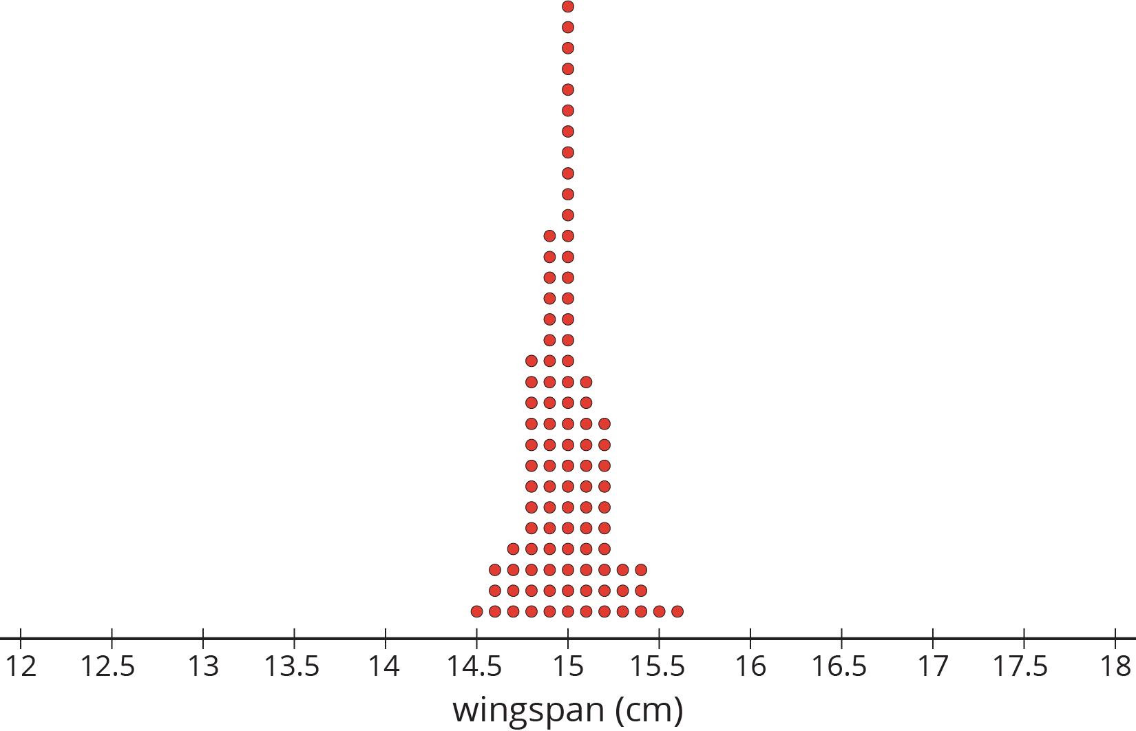
- “What do you notice about the distributions of the sample means as the sample size increases?” (The variability decreases, but the center stays in about the same place.)
- “Use the dot plots to explain why the sample mean from a random sample of size 30 would be a better estimate of the population mean than the sample mean from a random sample of size 10.” (Since the variability is less, the sample mean is probably closer to the true mean with size 30 than with size 10.)
Supports accessibility for: Conceptual processing; Organization
Design Principle(s): Support sense-making; Cultivate conversation
17.3: How Much Do You Trust the Answer? (10 minutes)
Optional activity
This activity is a follow-up to the context used in the activities Three Different TV Shows and Who's Watching What?, but also follows the ideas of sample means from this lesson.
In this activity, students continue to look at how variability in the sample means can be used to think about the accuracy of an estimate of a population mean. If the means from samples tend to be very spread out, then there is reason to believe that the mean from a single sample may not be especially close to the mean for the population. If the means from samples tend to be tightly grouped, then there is reason to believe that the mean from a single sample is a good estimate of the mean for the population (MP7).
Launch
Arrange students in groups of 2.
Tell students that, although the dot plots seem to have a similar shape, attention should be given to the scale of the horizontal axis.
Allow students 3–5 minutes of quiet work time followed by partner and whole-class discussions.
Supports accessibility for: Organization; Attention
Student Facing
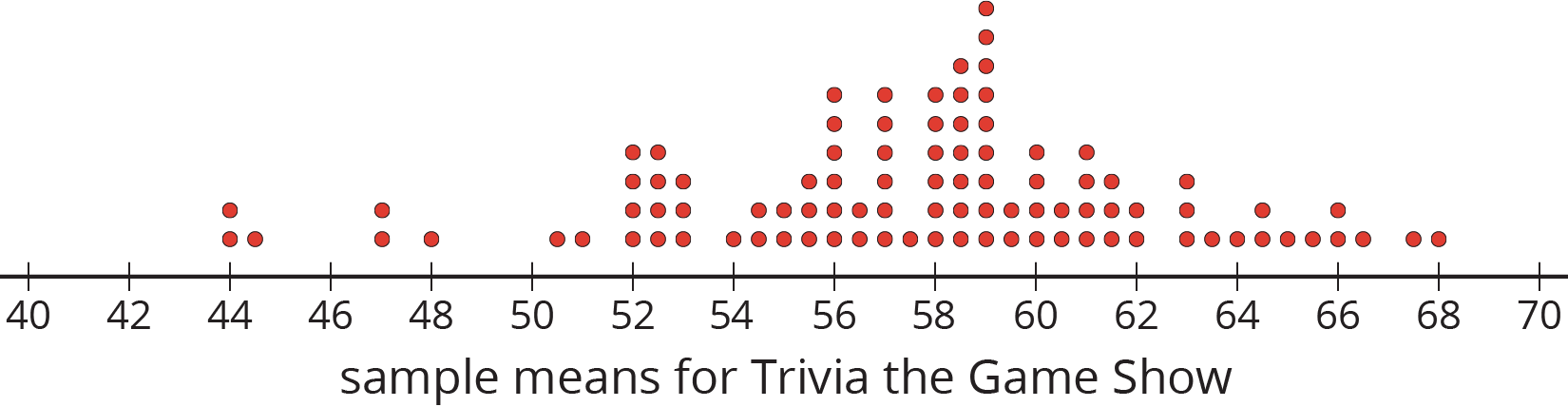
The other day you worked with 2 different samples of viewers from each of 3 different television shows. Each sample included 10 viewers. Here are the mean ages for 100 different samples of viewers from each show.
-
For each show, use the dot plot to estimate the population mean.
-
Trivia the Game Show
-
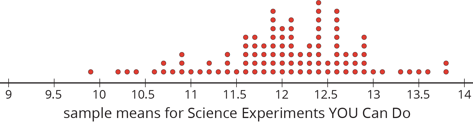
Science Experiments YOU Can Do
-
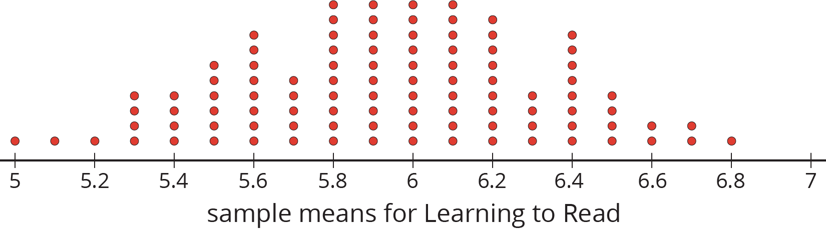
Learning to Read
-
- For each show, are most of the sample means within 1 year of your estimated population mean?
- Suppose you take a new random sample of 10 viewers for each of the 3 shows. Which show do you expect to have the new sample mean closest to the population mean? Explain or show your reasoning.
Student Response
For access, consult one of our IM Certified Partners.
Student Facing
Are you ready for more?
Market research shows that advertisements for retirement plans appeal to people between the ages of 40 and 55. Younger people are usually not interested and older people often already have a plan. Is it a good idea to advertise retirement plans during any of these three shows? Explain your reasoning.
Student Response
For access, consult one of our IM Certified Partners.
Anticipated Misconceptions
Students may get confused about what the dot plots represent. Refer to the class dot plot of sample means from the reaction time activity to help them understand that a single dot on the dot plot represents a mean from a single sample. Each dot plot shows means from several different samples.
Activity Synthesis
The purpose of the discussion is to think about what the information in the given dot plots tells us about the accuracy of an estimate of a population mean based on the sample mean from a single sample.
Consider asking these questions for discussion:
- “In the first dot plot for ‘Trivia the Game Show,’ what does the dot at 68 represent?” (There is a sample of 10 viewers that has a mean age of 68 years.)
- “Based on the dot plot shown for ‘Learning to Read,’ do you think any 7 year olds were included in the data?” (Yes. Since one of the sample means is 6.8, there are probably a few 7 year olds and some 6 year olds in that sample.)
- “Why is this kind of dot plot useful?” (It shows how variable the means from samples can be, so it gives a good idea of how accurate a sample mean might be as an estimate of a population mean.)
- “Why might it be difficult to obtain a dot plot like this?” (Each dot represents a sample of 10. It might be hard to get 100 different samples of size 10.)
Design Principle(s): Support sense-making: Maximize meta-awareness
Lesson Synthesis
Lesson Synthesis
Consider asking these discussion questions to emphasize the main ideas of the lesson:
- “Do different samples always have the same measure of center?” (No, but they should be relatively close.)
- “If multiple researchers select their own random samples and compute the mean of their sample, how can this collection of means be used to estimate the mean for the population?” (They could create a dot plot with their sample means and find the center of that distribution to estimate the true population mean.)
- “Explain why larger samples are generally better than smaller ones.” (Larger samples tend to produce more accurate estimates for the population mean since the sample means have less variability than sample means computed from smaller samples.)
17.4: Cool-down - How Much Mail? (5 minutes)
Cool-Down
For access, consult one of our IM Certified Partners.
Student Lesson Summary
Student Facing
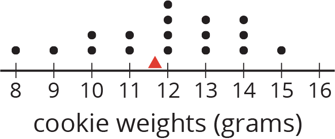
This dot plot shows the weights, in grams, of 18 cookies. The triangle indicates the mean weight, which is 11.6 grams.
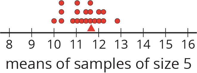
This dot plot shows the means of 20 samples of 5 cookies, selected at random. Again, the triangle shows the mean for the population of cookies. Notice that most of the sample means are fairly close to the mean of the entire population.
This dot plot shows the means of 20 samples of 10 cookies, selected at random. Notice that the means for these samples are even closer to the mean for the entire population.
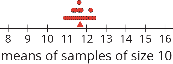
In general, as the sample size gets bigger, the mean of a sample is more likely to be closer to the mean of the population.