Lesson 18
What a Point in a Scatter Plot Means
18.1: The Giant Panda (5 minutes)
Warm-up
The purpose of this warm-up is for students to interpret the meaning of a single point in a scatter plot by looking at the point's coordinates and the graph's axis labels (MP2).
Launch
Display the graph for all to see. Give students 1 minute of quiet think time followed by a whole-class discussion.
Student Facing
A giant panda lives in a zoo. What does the point on the graph tell you about the panda?


Student Response
For access, consult one of our IM Certified Partners.
Activity Synthesis
Ask students to share their responses. Record and display their responses for all to see. If all of the students responds, “At 36 months of age, the panda weighed 82 kilograms,” ask them the following questions to clarify where they found that information in the graph:
- "What did the first coordinate of the point tell you?" (The first coordinate shows how far to go on the horizontal axis.)
- "What did the second coordinate of the point tell you?" (The second coordinate shows how far to go on the vertical axis.)
- "How did you know the meaning of each of the numbers?" (You can read the meaning of the numbers by looking at the labels on the axes.)
- "What specific information did each axis give you?" (The labels on the axes indicate attribute, age or weight, and the units in which each attribute is measured, months or kilograms.)
18.2: Weight and Fuel Efficiency (15 minutes)
Activity
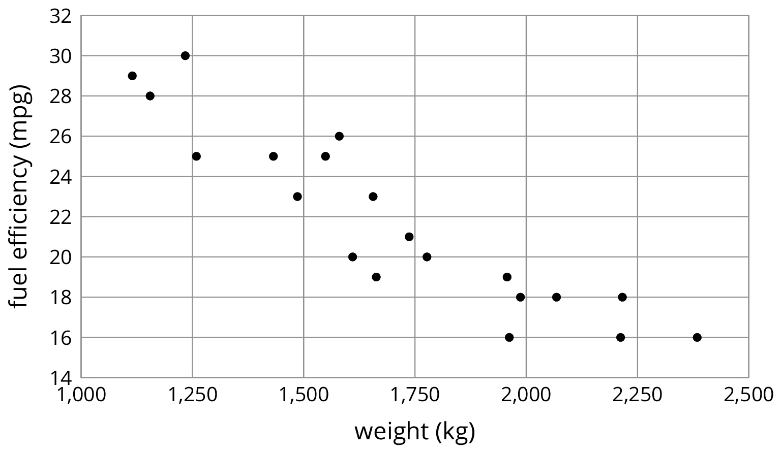
The analysis of scatter plots continues with data about the mass of automobiles and their fuel efficiency. Again, students connect points in the scatter plot with rows of data in a table, but now there is a third column that gives a name to each pair.
After picking out information about points in the scatter plot and table, students make their first foray into thinking about how scatter plots can help them make predictions. Specifically, when looking at two particular points in the scatter plot, students are asked if the results are surprising given the overall trend of the data. In later lessons, students develop more sophisticated tools for answering questions like this (specifically, by fitting lines to the data), so a heuristic discussion is all that is expected at this point.
Launch
Explain a bit about fuel efficiency so that students understand this measurement. “Fuel efficiency” is a measure of the average distance a car will travel using a certain amount of gas. Commonly this is measured in "miles per gallon." For example, a car that has a fuel efficiency of 25 miles per gallon (mpg) should be able to drive approximately 25 miles while using up a gallon of gas. Many factors can influence fuel efficiency, including the way an engine is engineered (to produce more power, an engine may use more gasoline), driving conditions (more frequent stopping and starting or hills will use fuel less efficiently), and what accessories are being used (air conditioning requires energy that is not used for actually driving the car).
Before beginning the activity, ask “What would a scatter plot including these two variables look like?” to encourage students to predict how a car's mass might influence fuel efficiency.
If using the digital version of the activity, after completing the launch discussion, students will use an applet to analyze a scatter plot, identify points, and draw conclusions about the data. The digital activity mirrors the analog activity.
Design Principle(s): Maximize meta-awareness; Support sense-making
Student Facing
The table shows the weight and fuel efficiency of 18 different cars.
| car | weight (kg) | fuel efficiency (mpg) |
|---|---|---|
| A | \(1,\!549\) | 25 |
| B | \(1,\!610\) | 20 |
| C | \(1,\!737\) | 21 |
| D | \(1,\!777\) | 20 |
| E | \(1,\!486\) | 23 |
| F | \(1,\!962\) | 16 |
| G | \(2,\!384\) | 16 |
| H | \(1,\!957\) | 19 |
| I | \(2,\!212\) | 16 |
| J | \(1,\!115\) | 29 |
| K | \(2,\!068\) | 18 |
| L | \(1,\!663\) | 19 |
| M | \(2,\!216\) | 18 |
| N | \(1,\!432\) | 25 |
| O | \(1,\!987\) | 18 |
| P | \(1,\!580\) | 26 |
| Q | \(1,\!234\) | 30 |
| R | \(1,\!656\) | 23 |
The data points in the table are shown in this scatter plot.
You can hide the expressions list using the double arrow. You can click on a point to see its coordinates.
-
Which point in the scatter plot represents Car L’s measurements? Drag the circle around the correct point.
-
What is the fuel efficiency of the car with the greatest weight?
-
What is the weight of the car with the greatest fuel efficiency?
-
Car S weighs 1,912 kilograms and gets 16 miles per gallon. On the scatter plot, plot a point that represents Car S’s measurements.
-
Cars N and O, shown in the scatter plot, are made by the same company. Compare their weights and fuel efficiencies. Does anything surprise you about these cars?
-
A different company makes Cars F and G. Compare their weights and fuel efficiencies. Does anything surprise you about these cars?
Student Response
For access, consult one of our IM Certified Partners.
Launch
Explain a bit about fuel efficiency so that students understand this measurement. “Fuel efficiency” is a measure of the average distance a car will travel using a certain amount of gas. Commonly this is measured in "miles per gallon." For example, a car that has a fuel efficiency of 25 miles per gallon (mpg) should be able to drive approximately 25 miles while using up a gallon of gas. Many factors can influence fuel efficiency, including the way an engine is engineered (to produce more power, an engine may use more gasoline), driving conditions (more frequent stopping and starting or hills will use fuel less efficiently), and what accessories are being used (air conditioning requires energy that is not used for actually driving the car).
Before beginning the activity, ask “What would a scatter plot including these two variables look like?” to encourage students to predict how a car's mass might influence fuel efficiency.
If using the digital version of the activity, after completing the launch discussion, students will use an applet to analyze a scatter plot, identify points, and draw conclusions about the data. The digital activity mirrors the analog activity.
Design Principle(s): Maximize meta-awareness; Support sense-making
Student Facing
The table and scatter plot show weights and fuel efficiencies of 18 cars.
| car | weight (kg) |
fuel efficiency |
|---|---|---|
| A | 1,549 | 25 |
| B | 1,610 | 20 |
| C | 1,737 | 21 |
| D | 1,777 | 20 |
| E | 1,486 | 23 |
| F | 1,962 | 16 |
| G | 2,384 | 16 |
| H | 1,957 | 19 |
| I | 2,212 | 16 |
| J | 1,115 | 29 |
| K | 2,068 | 18 |
| L | 1,663 | 19 |
| M | 2,216 | 18 |
| N | 1,432 | 25 |
| O | 1,987 | 18 |
| P | 1,580 | 26 |
| Q | 1,234 | 30 |
| R | 1,656 | 23 |

-
Which point in the scatter plot represents Car L’s measurements?
-
What is the fuel efficiency of the car with the greatest weight?
-
What is the weight of the car with the greatest fuel efficiency?
-
Car S weighs 1,912 kilograms and gets 16 miles per gallon. On the scatter plot, plot a point that represents Car S’s measurements.
-
Cars N and O, shown in the scatter plot, are made by the same company. Compare their weights and fuel efficiencies. Does anything surprise you about these cars?
-
A different company makes Cars F and G. Compare their weights and fuel efficiencies. Does anything surprise you about these cars?
Student Response
For access, consult one of our IM Certified Partners.
Student Facing
Are you ready for more?
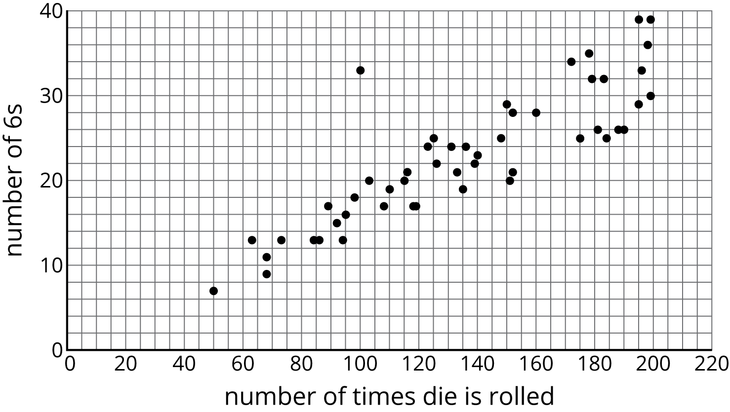
After a board game competition, the tournament director collects 50 dice from the games played and rolls each one until he gets bored and tries a different one. The scatter plot shows the number of times he rolled each die and the number of 6s that resulted during those rolls.

Select a point in the scatter plot and give its approximate coordinates, then tell the story of that point in the context of the problem.
Student Response
For access, consult one of our IM Certified Partners.
Activity Synthesis
The purpose of the discussion is for students to compare pairs of data in both representations and to begin thinking about trends in the data. Ask students to share their thinking about the last two questions. Draw out the fact that cars N and O seem to fit the overall trend that an increase in mass typically corresponds to a decrease in fuel efficiency but cars F and G don't fit that trend when compared with each other. Mention that we will see many examples of trends that don't necessarily apply to individuals in a population.
Consider asking some of the following questions to conclude the discussion:
- “How did you find the automobile with the greatest weight?” (I looked for the point farthest to the right.)
- “How did you find the automobile with the greatest fuel efficiency?” (I looked for the point that is highest.)
- “The data in this table is from automobiles that run solely on gasoline. Where do you think a hybrid car would appear on the graph?” (A hybrid car would use less gas for the same weight, so it's point would be below the other points with a similar weight.)
- “Did the scatter plot match your prediction?”
18.3: Coat Sales (15 minutes)
Activity
In this activity, students continue to identify points on a scatter plot as representatives of a single month when two variables are measured. Students are also asked to explain the meaning of some abstract points in the context of the problem and identify when it does not make sense to extrapolate information from the graph based on the context (MP2).
Monitor for students who understand that 60 degrees Celsius is unreasonable for an average monthly temperature in most parts of the world, as well as those who identify the trend to predict negative sales which does not make sense in this context either.
Launch
Arrange students in groups of 2. Allow students 5 minutes quiet work time followed by 5 minutes partner discussion and whole-class discussion.
Ask students to predict what a scatter plot might look like when the temperature is along the \(x\)-axis and the sales of coats at a store is along the \(y\)-axis.
Supports accessibility for: Visual-spatial processing
Student Facing
A clothing store keeps track of the average monthly temperature in degrees Celsius and coat sales in dollars.
| temperature (degrees Celsius) | coat sales (dollars) |
|---|---|
| -5 | 1,550 |
| -3 | 1,340 |
| 3 | 1,060 |
| 8 | 1,070 |
| 15 | 680 |
| 21 | 490 |
| 23 | 410 |
| 21 | 510 |
| 17 | 600 |
| 11 | 740 |
| 6 | 940 |
| -2 | 1,390 |

- What does the point \((15, 680)\) represent?
- For the month with the lowest average temperature, estimate the total amount made from coat sales. Explain how you used the table to find this information.
- For the month with the smallest coat sales, estimate the average monthly temperature. Explain how you used the scatter plot to find this information.
- If there were a point at \((0, A)\) what would it represent? Use the scatter plot to estimate a value for \(A\).
- What would a point at \((B, 0)\) represent? Use the scatter plot to estimate a value for \(B\).
- Would it make sense to use this trend to estimate the value of sales when the average monthly temperature is 60 degrees Celsius? Explain your reasoning.
Student Response
For access, consult one of our IM Certified Partners.
Activity Synthesis
The purpose of the discussion is for students to understand that each point in the graph represents a single month in which two measurements are made. Select students to share their responses, including those identified for the last problem.
Consider asking some of the following questions:
- “When discussing functions, what is a point of the form \((0,A)\) called? What about a point of the form \((B,0)\)?” (The \(y\)-intercept. The \(x\)-intercept.)
- “In a scatter plot is there a \(y\)-intercept?” (It depends on the context. For some situations, it may not make sense for the variable represented along the \(x\)-axis to be zero. For example if the variable is the height of a building. On other situations, there may be more than one point along the \(y\)-axis. For example, in a situation like the one in the task, there may be multiple months where the average temperature is 0 degree Celsius.)
- “When the average monthly temperature goes up, what seems to be happening to sales?” (They are decreasing.)
Design Principle(s): Optimize output (for explanation)
Lesson Synthesis
Lesson Synthesis
Revisit the idea that a point in a scatter plot represents an individual in a population. Ask students:
- "What kind of information does a point in a scatter plot represent?" (Two measurements for an individual in a population.)
- "How do we know what information is captured by a point in a scatter plot?" (The axis labels tell us how to interpret the coordinates of the points.)
- "Do trends in a scatter plot necessarily apply to individuals in the population?" (No.)
18.4: Cool-down - Quarterbacks (5 minutes)
Cool-Down
For access, consult one of our IM Certified Partners.
Student Lesson Summary
Student Facing
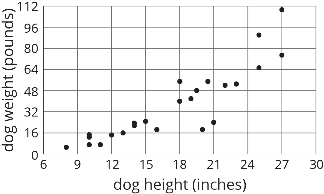
Scatter plots show two measurements for each individual from a group. For example, this scatter plot shows the weight and height for each dog from a group of 25 dogs.

We can see that the tallest dogs are 27 inches, and that one of those tallest dogs weighs about 75 pounds while the other weighs about 110 pounds. This shows us that dog weight is not a function of dog height because there would be two different outputs for the same input. But we can see a general trend: Taller dogs tend to weigh more than shorter dogs. There are exceptions. For example, there is a dog that is 18 inches tall and weighs over 50 pounds, and there is another dog that is 21 inches tall but weighs less than 30 pounds.
When we collect data by measuring attributes like height, weight, area, or volume, we call the data numerical data (or measurement data), and we say that height, weight, area, or volume is a numerical variable. Upcoming lessons will discuss how to identify and describe trends in data that has been collected.