Lesson 20
Describing Trends in Scatter Plots
20.1: Which One Doesn’t Belong: Scatter Plots (5 minutes)
Warm-up
The purpose of this warm-up is to introduce students to positive and negative associations by comparing scatter plots with best-fit lines.
Launch
Display the image of the three scatter plots for all to see. Ask students to indicate when they have noticed one scatter plot that does not belong and can explain why it does not belong. Give students 1 minute of quiet think time.
Student Facing
Which one doesn’t belong?

Student Response
For access, consult one of our IM Certified Partners.
Activity Synthesis
Poll the class for opinions on which scatter plot doesn’t belong. Select one student for each scatter plot to explain their reasoning. Draw out reasons for each figure, attending to appropriate vocabulary and precise use of language (MP6). Record and display their reasoning for all to see, referencing the scatter plot when appropriate.
The bottom left plot can be contrasted using how well the line fits, but students do not have access to this language yet, so they might say something like, “The points are farther away from the line.” The data points in the bottom left plot can also be described as “more variable” than the data in the other two scatter plots, which is a term that students might know from previous work in statistics.
During the discussion, introduce new vocabulary:
- A scatter plot that can be modeled by a line with a positive slope can be said to show a positive trend or a positive association.
- A scatter plot that can be modeled by a line with a negative slope can be said to show a negative trend or a negative association.
20.2: Fitting Lines (20 minutes)
Activity
In this activity, students draw their own linear model to fit the data in a scatter plot. In one scatter plot, the data points are nearly linear, and in another there is much more variation in the data. A discussion follows about what makes some lines a better fit than others (MP3).
While students are working, monitor for different approaches to deciding where to draw the line. Approaches might include:
- Drawing the line that connects the leftmost point to the rightmost point (or the topmost point to the bottommost point).
- Drawing the line that passes directly through as many points as possible.
- Making a visual estimate of an appropriate slope, and then ensuring half the points lie above the line and half the points lie below the line.
Launch
Arrange students in groups of 2. Provide each student a piece of dried pasta and a straightedge.
Tell students that they may use the pasta to try different lines to see what might fit the data best before actually drawing a line with their straightedge and pencil.
If using the digital activity, students can work in groups of two and create their lines of best fit digitally.
Supports accessibility for: Language; Organization
Student Facing
Experiment with finding lines to fit the data. Drag the points to move the line. You can close the expressions list by clicking on the double arrow.
-
Here is a scatter plot. Experiment with different lines to fit the data. Pick the line that you think best fits the data. Compare it with a partner’s.
- Here is a different scatter plot. Experiment with drawing lines to fit the data. Pick the line that you think best fits the data. Compare it with a partner’s.
- In your own words, describe what makes a line fit a data set well.
Student Response
For access, consult one of our IM Certified Partners.
Launch
Arrange students in groups of 2. Provide each student a piece of dried pasta and a straightedge.
Tell students that they may use the pasta to try different lines to see what might fit the data best before actually drawing a line with their straightedge and pencil.
If using the digital activity, students can work in groups of two and create their lines of best fit digitally.
Supports accessibility for: Language; Organization
Student Facing
Your teacher will give you a piece of pasta and a straightedge.
-
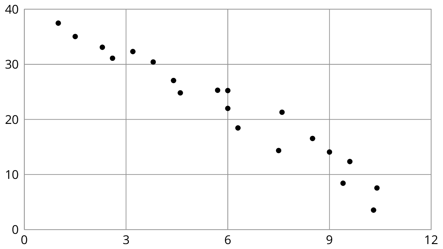
Here are two copies of the same scatter plot. Experiment with drawing lines to fit the data. Pick the line that you think best fits the data. Compare it with a partner’s.

-
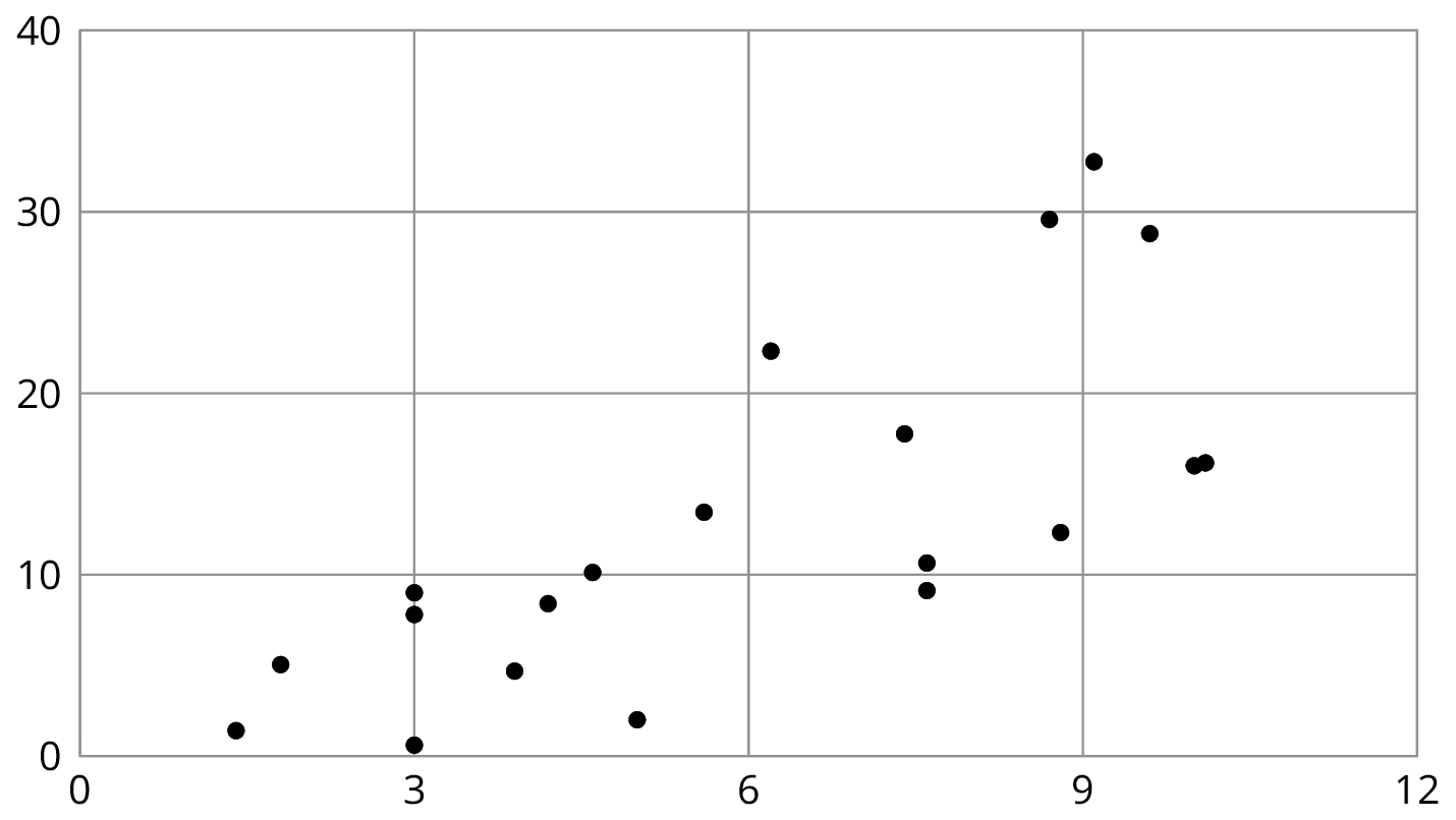
Here are two copies of another scatter plot. Experiment with drawing lines to fit the data. Pick the line that you think best fits the data. Compare it with a partner’s.

- In your own words, describe what makes a line fit a data set well.
Student Response
For access, consult one of our IM Certified Partners.
Activity Synthesis
The purpose of this discussion is to look at some strategies for drawing a line that fits the data well.
Select students to share their approaches to drawing a line to fit the data using the sequence listed in the Activity Narrative. If any of these strategies are not represented in student's work, bring them up as possibilities for the class to critique.
The first two approaches often result in a model that does not fit the data well. Display these examples and select students to connect how the lines do and do not fit the data. Focus on the last approach as a preferred method. Emphasize that when deciding how to draw a line to model a scatter plot, it’s important to consider the whole data set, not just a few points.
If desired and time allows, demonstrate this procedure:
- Enclose all of the points in the scatter plot with a blob.
- Use a straightedge to draw a line “through the middle” of the blob. Some students find it helpful to think of the blob as a hot dog bun, and the line as the hot dog.

Design Principle(s): Maximize meta-awareness
20.3: Good Fit Bad Fit (15 minutes)
Optional activity
If students understand what makes a for a good fit from the previous activity, then this activity may be considered optional. The next activity will give students less scaffolded practice deciding if a line fits the data well.
Students have seen linear models for data in a previous lesson. In this activity, students begin to determine what makes a good model for data. They compare two different lines with the same data set to determine which model fits the data better. A formal, quantitative discussion of lines that best fit data will come in later grades. At this stage, students are only asked to informally determine whether the line fits the data well based on how close the points are to the line.
Launch
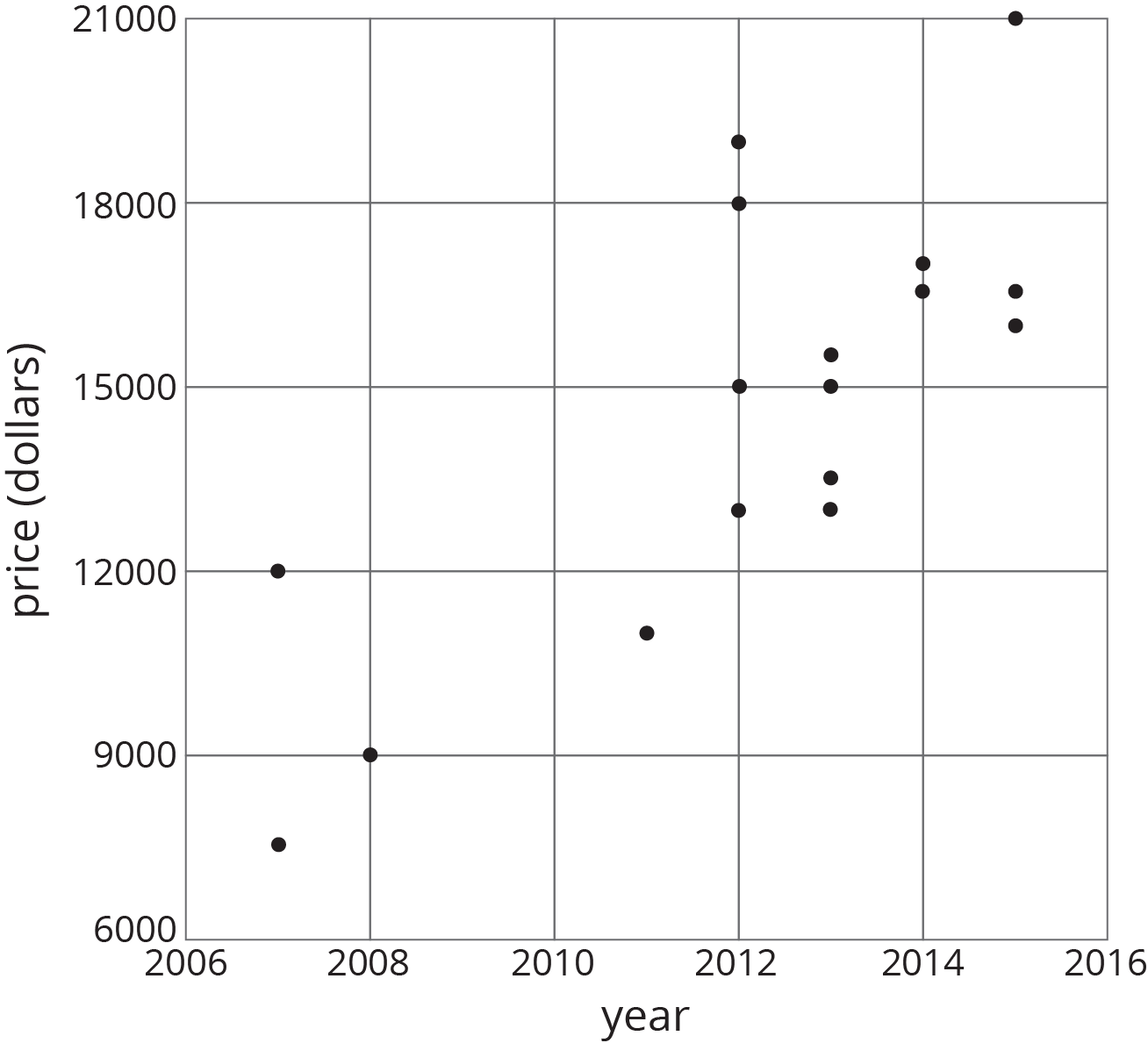
Display the scatter plot for all to see and ask students, “What do you notice? What do you wonder?”
Students might notice:
- There are 17 points plotted.
- The scatter plot shows a positive association (or a positive trend).
- The horizontal axis represents years, and the vertical axis represents price.
Students might wonder:
- What are these the prices of?
- Why do later years have a higher price?
Tell students that these are all prices of used cars that are all the same make and model that are for sale. For each car, the scatter plot shows its year of manufacture and the price at which it is being sold. Ask students a few questions to familiarize themselves with the graph, like:
- "What do we mean when we say 'used car?'" (It is not a new car; it has already been owned by someone.)
- "How many of these cars were made in 2012?" (4)
- "What is the price of the car made in 2008?" ($9,000)
- "The data show a positive association. What does that mean in this situation?" (Cars made in a later year tend to have a higher price.)
Tell students that in this task, they are going to see two different models for this set of data.
Student Facing
The scatter plots both show the year and price for the same 17 used cars. However, each scatter plot shows a different model for the relationship between year and price.
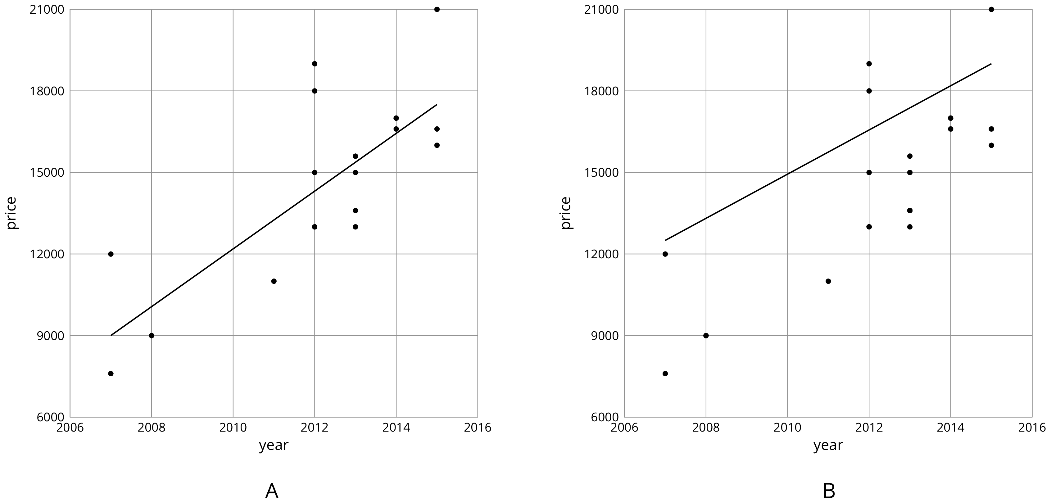
- Look at Diagram A.
-
For how many cars does the model in Diagram A make a good prediction of its price?
-
For how many cars does the model underestimate the price?
-
For how many cars does it overestimate the price?
-
- Look at Diagram B.
-
For how many cars does the model in Diagram B make a good prediction of its price?
-
For how many cars does the model underestimate the price?
-
For how many cars does it overestimate the price?
-
-
For how many cars does the prediction made by the model in Diagram A differ by more than $3,000? What about the model in Diagram B?
- Which model does a better job of predicting the price of a used car from its year?
Student Response
For access, consult one of our IM Certified Partners.
Activity Synthesis
The purpose of this discussion is for students to see some strategies for evaluating the fit of a model.
Some questions for discussion:
- "Which model did a better job of fitting with the data?" (Model A)
- "What were some things that helped you determine which model was better for this data?" (The line went through the "middle" of the data. There were some points on each side of the line, so that it looks to be in the middle. The model predicts the values fairly well for most points.)
- "If a person was looking to buy a used car made in 2006 and incorrectly used Model B, approximately how much money would they be predicting to pay? If they used Model A?" (Model B predicts the cost to be about $12,000 instead of $8,000 from Model A, which is a $4,000 difference. A 50% increase in price!)
We say that Model A fits the data better than Model B, or that model A is a better fit.
Design Principle(s): Optimize output (for explanation)
20.4: Practice Fitting Lines (10 minutes)
Activity
This activity gives students additional practice finding linear models that match the association of the data. In the first scatter plot, students are given a linear model that has a good slope, but is shifted up from the center of the data. In the second set of data, students are given a linear model that goes through the middle of the data, but has a slope that is too steep. Students are given the opportunity to correct these issues by drawing their own linear models on the same scatter plots.
Launch
Arrange students in groups of 2. Give students 2 minutes quiet work time followed by partner discussion and whole-class discussion.
Ask students why a line might be added to a scatter plot. (To help predict additional values, to show a positive or negative association.) Tell students that they will have a chance to practice adding lines to scatter plots by first critiquing a given line and then improving the linear model by drawing their own line for the same scatter plot.
Design Principle(s): Optimize output (for justification); Maximize meta-awareness
Student Facing
- Is this line a good fit for the data? Explain your reasoning.

- Draw a line that fits the data better.

- Is this line a good fit for the data? Explain your reasoning.

- Draw a line that fits the data better.

Student Response
For access, consult one of our IM Certified Partners.
Student Facing
Are you ready for more?


These scatter plots were created by multiplying the \(x\)-coordinate by 3 then adding a random number between two values to get the \(y\)-coordinate. The first scatter plot added a random number between -0.5 and 0.5 to the \(y\)-coordinate. The second scatter plot added a random number between -2 and 2 to the \(y\)-coordinate. The third scatter plot added a random number between -10 and 10 to the \(y\)-coordinate.
- For each scatter plot, draw a line that fits the data.
- Explain why some were easier to do than others.
Student Response
For access, consult one of our IM Certified Partners.
Activity Synthesis
The purpose of the discussion is for students to recognize the important aspects of a linear model for a set of data.
Consider asking some of the following questions.
- "Compare the given lines to the ones you drew in terms of their slopes and vertical positions." (In the first scatter plot, they should have about the same slope, but the given line is shifted up. In the second scatter plot, they should both go through a point near the center of the data, but have different slopes.)
- "What are some ways you thought about trying to find a good line to draw?"
Lesson Synthesis
Lesson Synthesis
Display the scatter plot for all to see.
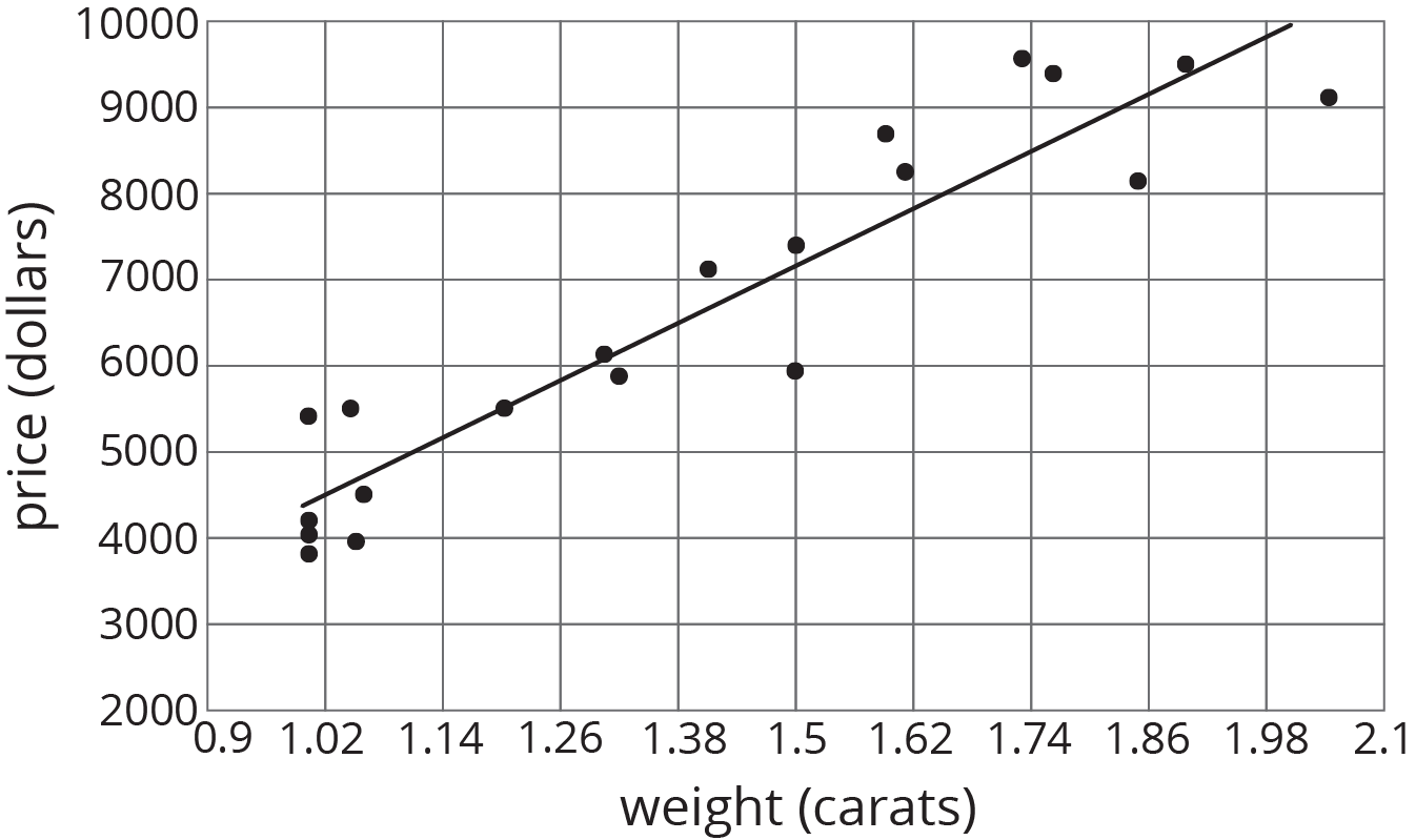
To highlight the main ideas from today's lesson about associations and trend lines, ask:
- “How would you describe the relationship between the weight of a diamond and its price?” (There is a positive association. Or, as the weight increases, the price tends to increase.)
- “How can we tell if a line is a good fit for the data in a scatter plot?” (It goes through the "middle" of the data. The sign of the slope matches the sign of the association. The points are as close as possible to the line.)
20.5: Cool-down - This is One Way to Do It (5 minutes)
Cool-Down
For access, consult one of our IM Certified Partners.
Student Lesson Summary
Student Facing
When a linear function fits data well, we say there is a linear association between the variables. For example, the relationship between height and weight for 25 dogs with the linear function whose graph is shown in the scatter plot.
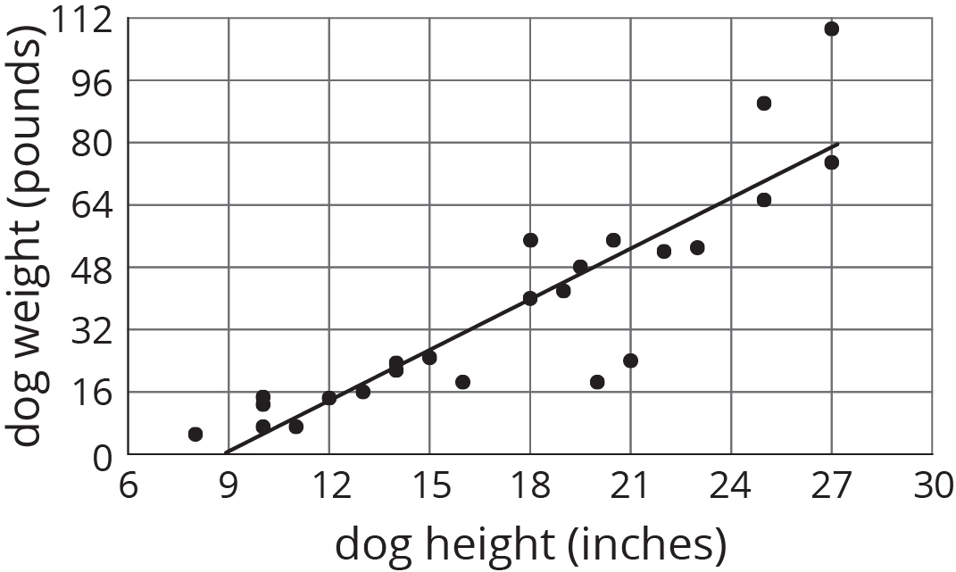
Because the model fits the data well and because the slope of the line is positive, we say that there is a positive association between dog height and dog weight.
What do you think the association between the weight of a car and its fuel efficiency is?
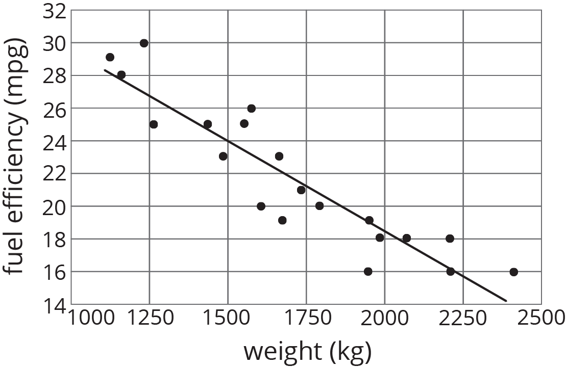
Because the slope of a line that fits the data well is negative, we say that there is a negative association between the fuel efficiency and weight of a car.