Lesson 17
Organizing Data
17.1: Notice and Wonder: Messy Data (5 minutes)
Warm-up
The purpose of this warm-up is to elicit useful ideas for the following activities. While students may notice and wonder many things about the table, the most important discussion points are thinking about any associations or patterns.
Launch
Arrange students in groups of 2. Tell students that they will look at a table. Their job is to think of at least one thing they notice and at least one thing they wonder. Display the table for all to see. Ask students to give a signal when they have noticed or wondered about something. Give students 1 minute of quiet think time and then 1 minute to discuss the things they notice with their partner, followed by a whole-class discussion.
Student Facing
Here is a table of data. Each row shows two measurements of a triangle.
| length of short side (cm) | length of perimeter (cm) |
|---|---|
| 0.25 | 1 |
| 2 | 7.5 |
| 6.5 | 22 |
| 3 | 9.5 |
| 0.5 | 2 |
| 1.25 | 3.5 |
| 3.5 | 12.5 |
| 1.5 | 5 |
| 4 | 14 |
| 1 | 2.5 |
What do you notice? What do you wonder?
Student Response
For access, consult one of our IM Certified Partners.
Activity Synthesis
Ask students to share the things they noticed and wondered. Record and display their responses for all to see. If possible, record the relevant reasoning near the table. After each response, ask the class if they agree or disagree and to explain alternative ways of thinking, referring back to the table each time. If patterns or associations do not come up during the conversation, ask students to discuss these ideas.
17.2: Seeing the Data (10 minutes)
Activity
In this activity, students continue to look for patterns and associations for variables by sorting the values in a table. They use the table to make predictions about data that is not included in the table (MP2). In the discussion following the activity, students are asked to consider other methods of finding patterns within the data and see a graphical representation that more clearly shows the strong relationship between the variables. The graphical representation can also help improve predictions over those made with only the tables.
Launch
Keep students in the same groups of 2 from the warm-up. Explain that the data in the warm-up came from fourth grade students who were practicing drawing isosceles right triangles and measuring their perimeters. Display an example of an isosceles right triangle.

Ask students to recall what it means for a triangle to be isosceles and right as well as how to measure the perimeter of a triangle. Ask students if they think there should be a relationship between the length of the two short sides and the entire perimeter. Remind students that specifying 2 sides and the angle between them does determine a unique triangle, so we might expect that knowing the two side lengths and the right angle would be closely related to the length of the perimeter.
Student Facing
Here is the table of isosceles right triangle measurements from the warm-up and an empty table.
| length of short sides (cm) | length of perimeter (cm) |
|---|---|
| 0.25 | 1 |
| 2 | 7.5 |
| 6.5 | 22 |
| 3 | 9.5 |
| 0.5 | 2 |
| 1.25 | 3.5 |
| 3.5 | 12.5 |
| 1.5 | 5 |
| 4 | 14 |
| 1 | 2.5 |
| length of short sides (cm) | length of perimeter (cm) |
|---|---|
- How can you organize the measurements from the first table so that any patterns are easier to see? Write the organized measurements in the empty table.
- For each of the following lengths, estimate the perimeter of an isosceles right triangle whose short sides have that length. Explain your reasoning for each triangle.
- length of short sides is 0.75 cm
- length of short sides is 5 cm
- length of short sides is 10 cm
Student Response
For access, consult one of our IM Certified Partners.
Student Facing
Are you ready for more?
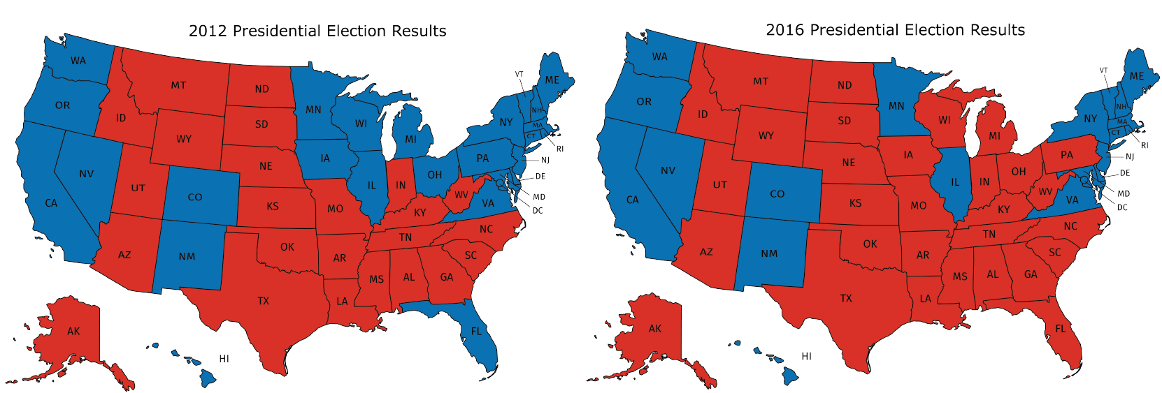
In addition to the graphic representations of data you have learned, there are others that make sense in other situations. Examine the maps showing the results of the elections for United States president for 2012 and 2016. In red are the states where a majority of electorate votes were cast for the Republican nominee. In blue are the states where a majority of the electorate votes were cast for the Democrat nominee.

- What information can you see in these maps that would be more difficult to see in a bar graph showing the number of electorate votes for the 2 main candidates?
- Why are these representations appropriate for the data that is shown?
Student Response
For access, consult one of our IM Certified Partners.
Activity Synthesis
Select students to share their arrangements of the data, the patterns they noticed, and their predictions for the triangles with short side lengths. Display the predictions for all to see.
Ask students to share ideas for other ways to look at the data that might lead to better predictions.
Display a graph of the data for all to see.

To highlight features of the graph, ask:
- "What patterns do you see in the data when it is graphed?" (It is close to linear.)
- "How could you use the graph to estimate the perimeter for the isosceles, right triangles with a short side lengths of 0.75 cm, 5 cm, or 10 cm?" (It is okay for students to not be precise in their answer at this point. Future lessons will give more instruction in how to do this.)
Tell students that this graphical representation of data is called a scatter plot. A scatter plot is when two numerical variables are graphed by using one variable as the \(x\)-coordinate and the other as the \(y\)-coordinate. Data pairs are represented as plotted points.
Note that there is a difference between time series graphs and scatter plots. In time series graphs, a single variable is recorded at multiple time points and plotted on a graph. In a scatter plot, two variables are measured and plotted on a graph. For scatter plots, time may be one of the variables, but it should be possible to have more than one measurement for the second variable for the same time measurement. For example, when comparing the price of a car to its model year uses the year as one of the variables, but two cars made in the same year could have two different prices. The price for a single car throughout different years would be represented in a time series graph since it only has one price at any given time.
Design Principle(s): Support sense-making; Optimize output (for explanation)
17.3: Tables and Their Scatter Plots (15 minutes)
Activity
An essential part of creating and understanding scatter plots is interpreting the meaning of the points (MP2). In this activity, students match tables of data with scatter plots representing the same information (MP7). After matching appropriately, students are asked to include titles for the axes of the scatter plots. Following the activity, the importance of the axis labels is discussed.
Launch
Arrange students in groups of 2. Distribute 1 copy of the tables from the blackline master to each group and resolve any clarifying questions about the data in the tables. In particular, students may wish to know about particular terminology. For example, “kilowatt hours” are a unit of electrical energy that most electricity companies use to measure how much electricity a customer used to determine how much to charge them. Another example is “carat” which is a unit of weight equal to 200 milligrams used for measuring precious stones.
Supports accessibility for: Memory; Organization
Design Principle(s): Maximize meta-awareness; Support sense-making
Student Facing
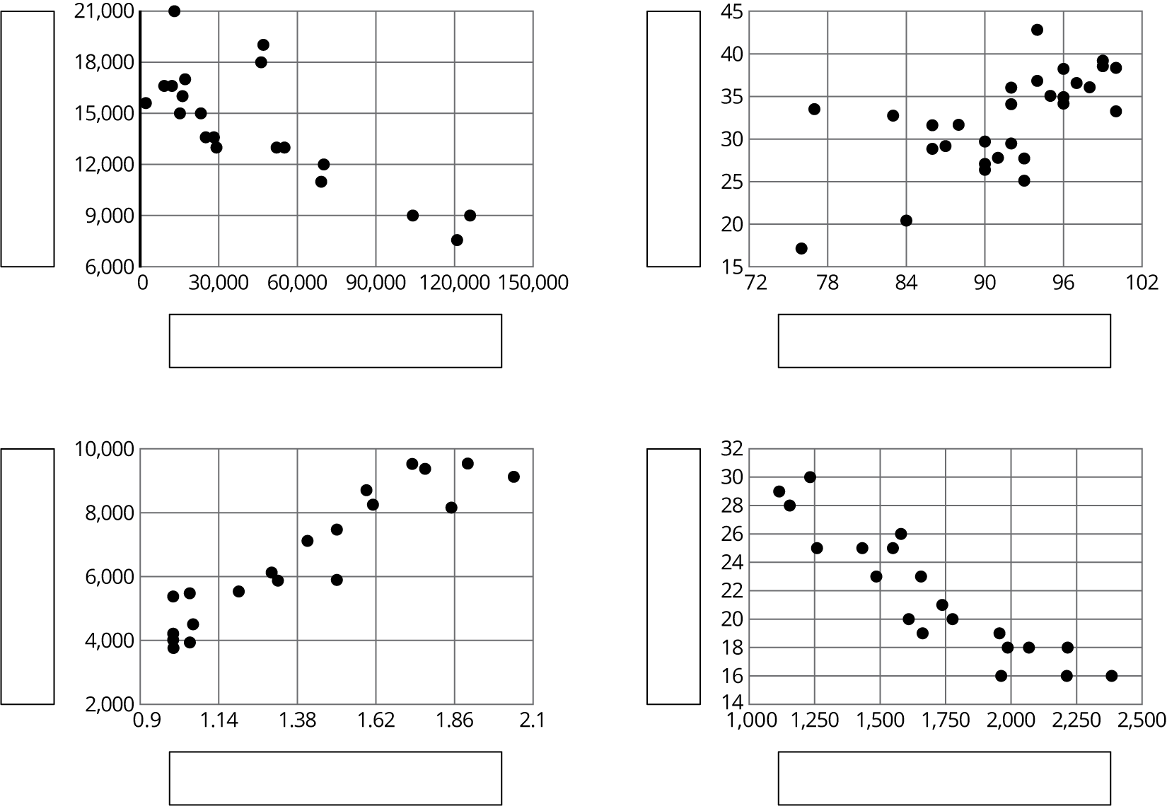
Here are four scatter plots. Your teacher will give you four tables of data.
- Match each table with one of the scatter plots.
- Use information from the tables to label the axes for each scatter plot.

Student Response
For access, consult one of our IM Certified Partners.
Activity Synthesis
The goal of this discussion is for students to develop strategies for relating different representations of data as well as to see the importance of labeling and numbering the axes.
To highlight the axis numbering in preparation for later lessons where students will draw their own scatter plots and need to select a good interval and range, ask:
- "What are some things you notice about the numbers on the axes for the different scatter plots?" (They don't all start at 0 and go up by 1s, 5s, or 10s.)
- "Why do you think it makes sense for the graph comparing temperature and energy to start at 72 and go to 102?" (The minimum temperature is 77 and the maximum temperature is 100.)
- "Why do the numbers for the graph comparing temperature and energy go up by 6 rather than 1 or 10." (The numbers would be too close together if it were 1 and too far apart if they were 10.)
Ask partners to select one of the other axes in the graphs (including vertical axes) and discuss why they may have been chosen the way they were. Select 1–2 groups to share their ideas with the class.
Tell students that they should think about the maximum and minimum values as well as the range (the distance between the maximum and minimum values) when setting the scale for the different axes. For the graphs in this unit, it is not usually essential to include the point \((0,0)\) in the graph, so that makes the axis labels even more important.
To conclude the discussion, consider asking some of the following questions:
- "How did you match the tables to the scatter plots?"
- "Why is it important to include labels for the axes on scatter plots?" (So that any patterns that are found can be recognized from the scatter plot without having to go back to the table.)
- "Why is it important to include units in the axis labels?" (So that the patterns found can be understood easily)
- "The same data is presented in the tables as in the scatter plots. Which is easier to understand? Explain your reasoning."
Lesson Synthesis
Lesson Synthesis
To highlight the progression of representations seen today (unorganized table, ordered table, scatter plot) that help to highlight any patterns that may be present in data, ask:
- "Why would sorting the information in the table be helpful?" (It makes it easier to see the minimum and maximum values of the value you sort by.)
- "When looking for relationships between two variables, what are some graphic representations that might be helpful to use?" (An organized table helps show trends of one variable while another goes from smallest to largest. A scatter plot also shows how one variable changes in relation to the other.)
- "What is a scatter plot and how is it different from plotting points for a function?" (For a function, every input has a single output, but a scatter plot uses data that does not have an input or output and a single value for one variable could have multiple values in the second variable.)
Remind students that, when reorganizing data, it is important to continue to label what the information represents. A table without titles or a scatter plot without labels may show some relationship between numbers, but is meaningless outside of the context.
17.4: Cool-down - Squashed Spheres (5 minutes)
Cool-Down
For access, consult one of our IM Certified Partners.
Student Lesson Summary
Student Facing
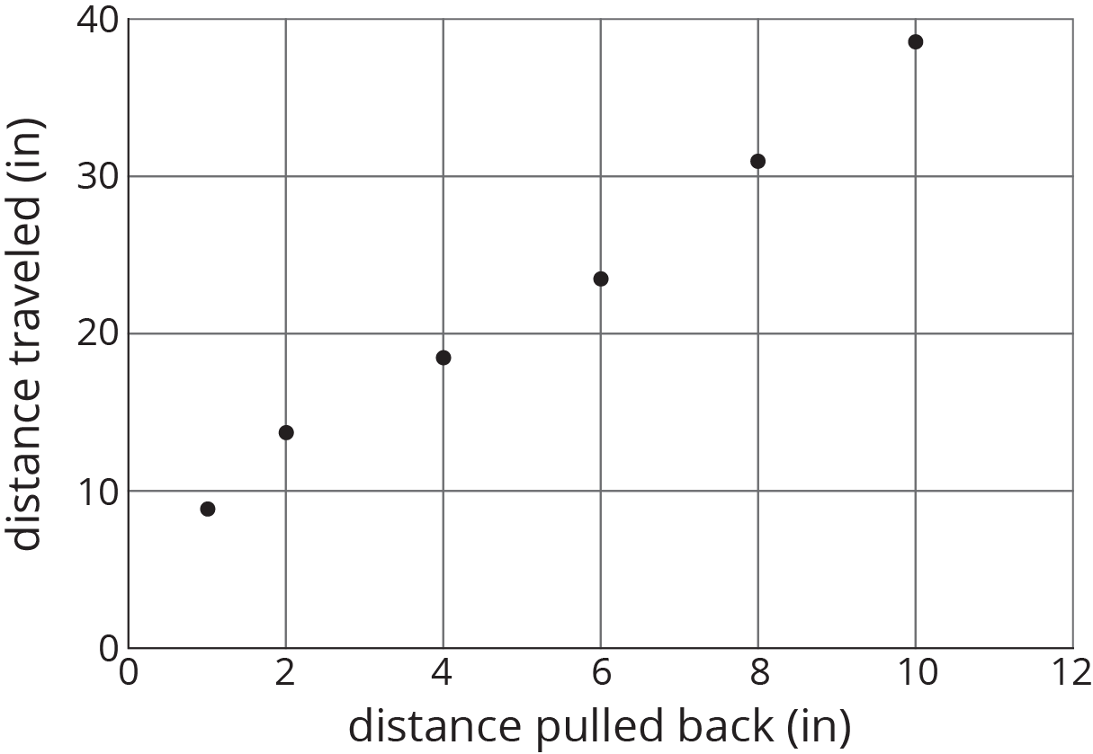
Consider the data collected from pulling back a toy car and then letting it go forward. In the first table, the data may not seem to have an obvious pattern. The second table has the same data and shows that both values are increasing together.
Unorganized table
| distance pulled back (in) | distance traveled (in) |
|---|---|
| 6 | 23.57 |
| 4 | 18.48 |
| 10 | 38.66 |
| 8 | 31.12 |
| 2 | 13.86 |
| 1 | 8.95 |
Organized table
| distance pulled back (in) | distance traveled (in) |
|---|---|
| 1 | 8.95 |
| 2 | 13.86 |
| 4 | 18.48 |
| 6 | 23.57 |
| 8 | 31.12 |
| 10 | 38.66 |
A scatter plot of the data makes the pattern clear enough that we can estimate how far the car will travel when it is pulled back 5 inches.
Patterns in data can sometimes become more obvious when reorganized in a table or when represented in scatter plots or other diagrams. If a pattern is observed, it can sometimes be used to make predictions.
