Lesson 23
Looking for Associations
23.1: Notice and Wonder: Bar Association (5 minutes)
Warm-up
The purpose of this warm-up is for students to become familiar with a bar graph by noticing and wondering things about it. While reading a bar graph is a review of a previous grade's work, it is an important for students to look for patterns of association in categorical data.
Launch
Tell students you are going to show them a graph and that their job is to find at least one thing they notice and one thing they wonder about the graph. Give students 1 minute of quiet think time followed by a whole-class discussion.
Student Facing
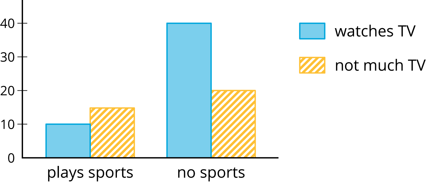
What do you notice? What do you wonder?
Student Response
For access, consult one of our IM Certified Partners.
Activity Synthesis
Ask students to share things they noticed and wondered. Record and display their responses for all to see. If students wondered who the data represents, tell them the data was collected from a survey of students. They were asked whether they played a sport or not and whether they watched more or less than 1 hour of TV each night.
If they did not wonder these things, tell them this information and then ask, “Based on the graph, do you think playing a sport and the amount of time watching TV are related?” (Yes. Among people who watch more than an hour of TV, there are a lot more who do not play a sport than people who do. For people who play a sport, more do not watch TV than do and this is reversed for those who do not play a sport.)
23.2: Card Sort: Matching Representations (20 minutes)
Activity
In this activity students become familiar with two-way tables, clustered bar graphs, and segmented bar graphs by matching different situations. They label the diagrams to match the data given and create a table to match the data shown in one of the bar graphs.
Launch
Arrange students in groups of 2–3. Display the two-way table from the activity for all to see. Use MLR 2 (Collect and Display) to gather student language used to describe two-way tables, bar graphs, and segmented bar graphs to be referenced and revised throughout later activities.
| has cell phone | does not have cell phone | total | |
|---|---|---|---|
| 10 to 12 years old | 25 | 35 | 60 |
| 13 to 15 years old | 40 | 10 | 50 |
| 16 to 18 years old | 50 | 10 | 60 |
| total | 115 | 55 | 170 |
Ask students:
- “Why do you think this is called a 'two-way table'?” (The table represents 2 variables. You can think of the people who were surveyed either by age group or by whether or not the person has a cell phone.)
- “What does the 25 mean?” (25 people 10 to 12 years old have cell phones.)
- “What does the 55 mean?” (55 of the people who were surveyed do not have a cell phone.)
- “How many people are represented in this table?” (170 people.)
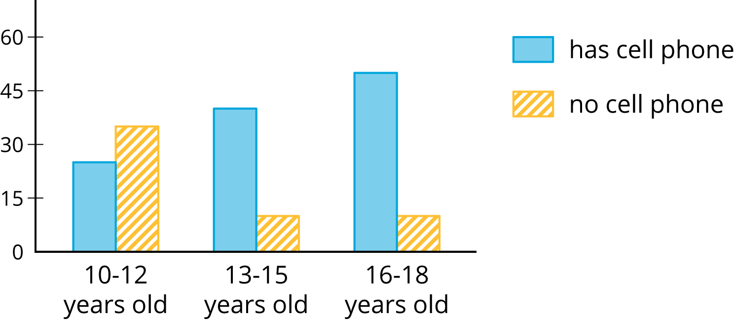
Display the bar graph from the activity for all to see.
Ask students:
- “Why do you think this is called a 'bar graph?'” (Each bar represents how many people are in each group named on the bottom.)
- “What do the blue bars represent? How do you know?” (The blue bars represent how many people in each group have cell phones. I can tell by the key on the right.)
- “Where does the 25 from the table show up in this bar graph?” (The first blue bar shows that 25 10–12 year olds have cell phones.)
Display the segmented bar graph from the activity for all to see.

Ask students:
- “Why do you think this is called a 'segmented bar graph?'” (Each bar is segmented into pieces.)
- “What do you think the vertical axis represents?” (The percentage in each section.)
Distribute 1 set of the pre-cut cards from the blackline master to each group.
Supports accessibility for: Conceptual processing; Organization
Student Facing
Your teacher will hand out some cards.
Some cards show two-way tables like this:
| has cell phone | does not have cell phone | total | |
|---|---|---|---|
| 10 to 12 years old | 25 | 35 | 60 |
| 13 to 15 years old | 40 | 10 | 50 |
| 16 to 18 years old | 50 | 10 | 60 |
| total | 115 | 55 | 170 |
Some cards show bar graphs like this:

Some cards show segmented bar graphs like this:

The bar graphs and segmented bar graphs have their labels removed.
-
Put all the cards that describe the same situation in the same group.
-
One of the groups does not have a two-way table. Make a two-way table for the situation described by the graphs in the group.
-
Label the bar graphs and segmented bar graphs so that the categories represented by each bar are indicated.
-
Describe in your own words the kind of information shown by a segmented bar graph.
Student Response
For access, consult one of our IM Certified Partners.
Student Facing
Are you ready for more?
One of the segmented bar graphs is missing. Construct a segmented bar graph that matches the other representations.
Student Response
For access, consult one of our IM Certified Partners.
Activity Synthesis
The purpose of this activity is to help students understand the connections among the three representations of data. It also helps students see the importance of labeled visual representations.
To highlight the connections, ask:
- “What were some strategies you used to match the cards?” (The book table had the same number for those who liked the movie and those who did not like the movie among those who did not read the book, so I knew the two graphs would show equal sized bars.)
- “Were some cards easier to match than others? Explain.” (The cards showing the actual numbers were easier to match than the cards showing the percentages.)
- “What strategy did you use to create the two-way data table?” (I started by thinking of two yes or no questions that could be asked and use those to label the rows and columns of the table.)
Design Principle(s): Support sense-making
23.3: Building Another Type of Two-Way Table (10 minutes)
Activity
In this activity, students create two-way tables displaying relative frequency. The relative frequency table converts the actual frequency data to percentages which can be useful when comparing groups that include different totals. Finally, students use the relative frequencies to look for a pattern in the data. In the following lesson, students will work with associations in categorical data more explicitly. In this activity, students should use an informal understanding of association to think about whether one is present in the data based on the relative frequency table.
Launch
Keep students in groups of 2–3. After an introduction to relative frequency tables, allow students 3 minutes quiet work time followed by partner discussion and whole-class discussion.
Display the table for all to see.
| watch the news daily | does not watch the news daily | total | |
|---|---|---|---|
| younger than 18 | 30 | 80 | 110 |
| 18 or older | 10 | 5 | 15 |
| total | 40 | 85 | 125 |
Ask students, "Based on this data, who is more likely to watch the news daily: someone who is younger than 18 or someone who is 18 or older?"
Tell students that, based on the numbers in the table, there are more younger people who watch the news (30) than older (10). On the other hand, the survey reached out to 110 young people and only 15 older people. Without looking at the whole table, that information may have been missed.
In cases like this, finding a relative frequency including percentages can be more helpful than looking at the actual frequency, which is what they are going to do now.
Use MLR 2 (Collect and Display) to co-create a graphic organizer with students comparing and contrasting the definitions and characteristics of “actual frequency” and “relative frequency” to be referenced and revised throughout this and later activities.
Design Principle(s): Support sense-making; Maximize meta-awareness
Student Facing
Here is a two-way table that shows data about cell phone usage among children aged 10 to 18.
| has cell phone | does not have cell phone | total | |
|---|---|---|---|
| 10 to 12 years old | 25 | 35 | 60 |
| 13 to 15 years old | 40 | 10 | 50 |
| 16 to 18 years old | 50 | 10 | 60 |
| total | 115 | 55 | 170 |
-
Complete the table. In each row, the entries for “has cell phone” and “does not have cell phone” should have the total 100%. Round entries to the nearest percentage point.
has cell phone does not have cell phone total 10 to 12 years old 42% 13 to 15 years old 100% 16 to 18 years old 17% This is still a two-way table. Instead of showing frequency, this table shows relative frequency.
- Two-way tables that show relative frequencies often don’t include a “total” row at the bottom. Why?
- Is there an association between age and cell phone use? How does the two-way table of relative frequencies help to illustrate this?
Student Response
For access, consult one of our IM Certified Partners.
Student Facing
Are you ready for more?
A pollster attends a rally and surveys many of the participants about whether they associate with political Party A or political Party B and whether they are for or against Proposition 3.14 going up for vote soon. The results are sorted into the table shown.
| for | against | |
|---|---|---|
| party A | 832 | 165 |
| party B | 80 | 160 |
- A news station reports these results by saying, “A poll shows that about the same number of people from both parties are voting against Proposition 3.14.”
- A second news station shows this graphic.
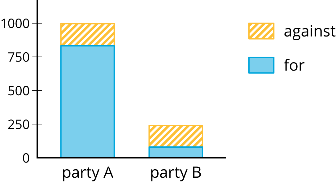
- Are any of the news reports misleading? Explain your reasoning.
- Create a headline, graphic, and short description that more accurately represents the data in the table.
Student Response
For access, consult one of our IM Certified Partners.
Anticipated Misconceptions
Students may not calculate relative frequencies correctly. Look to see if they are dividing into the total for each row, instead of some other number in the row, or the total for the entire table.
Activity Synthesis
The purpose of this discussion is to help students see the usefulness of two-way tables that display relative frequency.
Some questions for discussion:
- “What does the 42% in table mean?” (42% of people 10 to 12 years old have a cell phone.)
- “What is the total of the percentages in the first column? What's wrong with that answer?” (205%. It doesn't make sense since it is greater than 100%. It is combining percentages of different wholes, so it doesn't make sense to add them.)
- “Did you say there was or was not an association between age and cell-phone use? Explain your reasoning.” (There is an association since the percentages for the 10 to 12 year olds is very different from the other two age groups.)
- “What did the relative frequency table show you that was harder to see in the original two-way table?” (It was much easier to see the association with the percentages than the numbers. For example, the number of people without a cell phone for the older 2 age groups was the same, but the percentages were a little different.)
Lesson Synthesis
Lesson Synthesis
Display the graphs and tell students to refer to the data from the tables in the Building Another Type of Two-Way Table activity.


Consider asking these discussion questions to emphasize the main ideas from the lesson:
- "Which graphical representation do you prefer for the data?" (It is easier to see the association with the segmented bar graph, but the actual values are lost.)
- "In the original table, what did the number 40 represent? How is that group of people represented in the other table and the two graphs?" (There are 40 people who are 13 to 15 years old that have a cell phone. In the relative frequency table, this is represented by the 80%. In the bar graph, this is represented by the taller, blue bar for set of bars labeled 13–15 years old. In the segmented bar graph, this is represented by the bottom, blue segment of the bar labeled 13–15 years old.)
- "What values in the tables represent the same information as the tallest, yellow-striped bar in the bar graph?" (The tallest yellow-striped bar represents the number of people who are 10–12 years old who do not have cell phones. In the original table, this is the 35 value and in the relative frequency table this is about 58%.)
23.4: Cool-down - Guitar and Golf (5 minutes)
Cool-Down
For access, consult one of our IM Certified Partners.
Student Lesson Summary
Student Facing
When we collect data by counting things in various categories, like red, blue, or yellow, we call the data categorical data, and we say that color is a categorical variable.
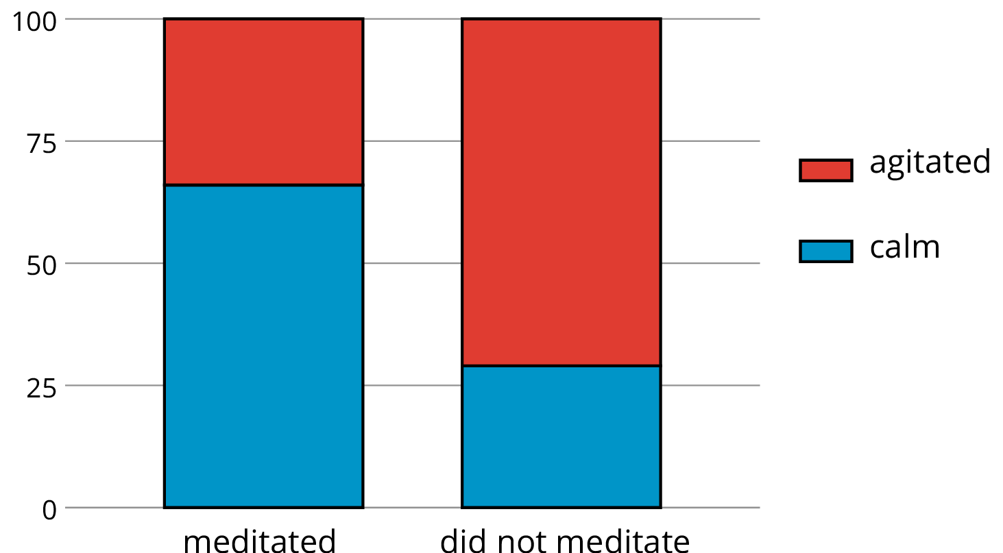
We can use two-way tables to investigate possible connections between two categorical variables. For example, this two-way table of frequencies shows the results of a study of meditation and state of mind of athletes before a track meet.
| meditated | did not meditate | total | |
|---|---|---|---|
| calm | 45 | 8 | 53 |
| agitated | 23 | 21 | 44 |
| total | 68 | 29 | 97 |
If we are interested in the question of whether there is an association between meditating and being calm, we might present the frequencies in a bar graph, grouping data about meditators and grouping data about non-meditators, so we can compare the numbers of calm and agitated athletes in each group.
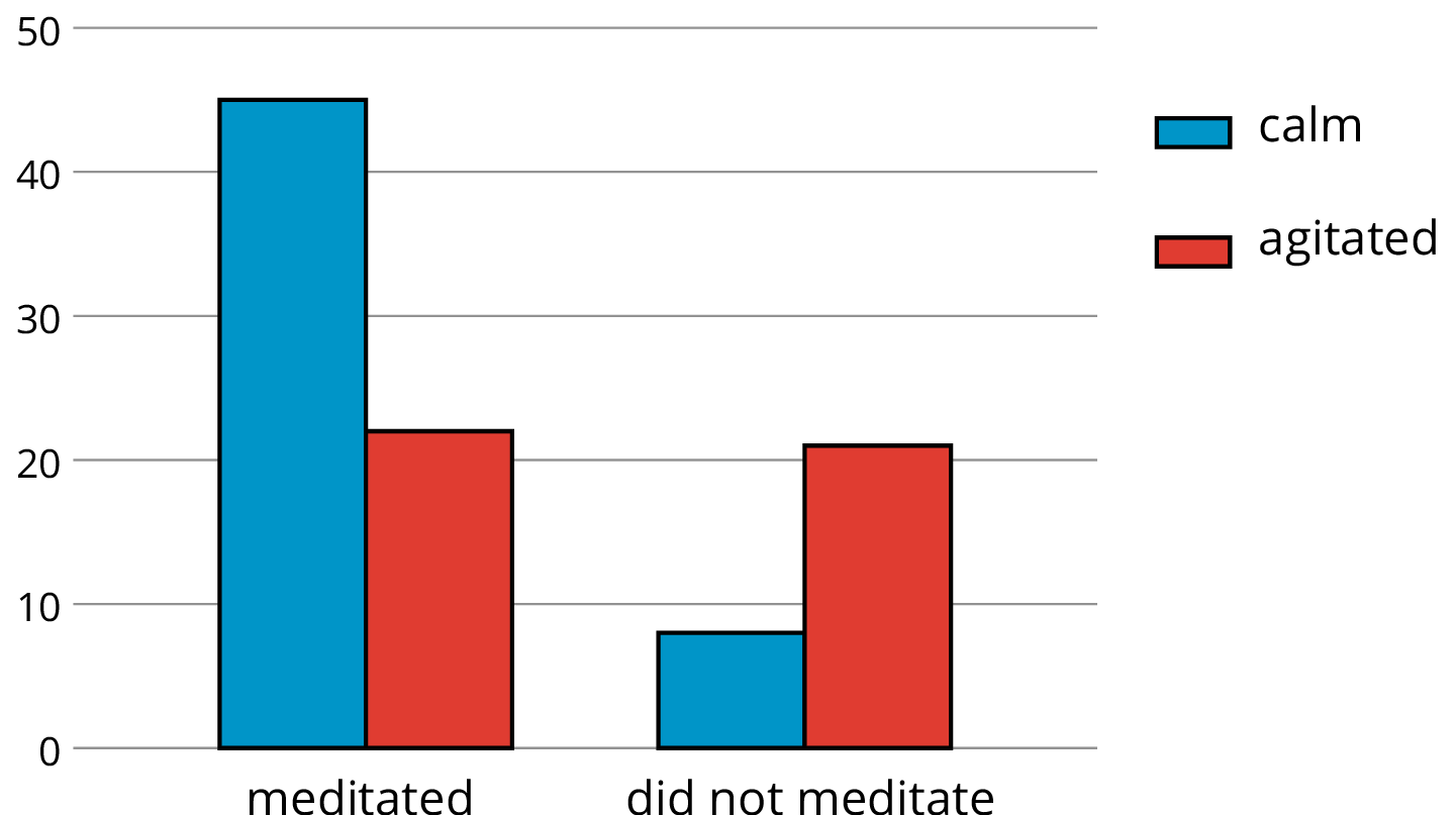
Notice that the number of athletes who did not meditate is small compared to the number who meditated (29 as compared to 68, as shown in the table).
If we want to know the proportions of calm meditators and calm non-meditators, we can make a two-way table of relative frequencies and present the relative frequencies in a segmented bar graph.
| meditated | did not meditate | |
|---|---|---|
| calm | 66% | 28% |
| agitated | 34% | 72% |
| total | 100% | 100% |
