Lesson 7
Observing More Patterns in Scatter Plots
7.1: Notice and Wonder: Nonlinear Scatter Plot (5 minutes)
Warm-up
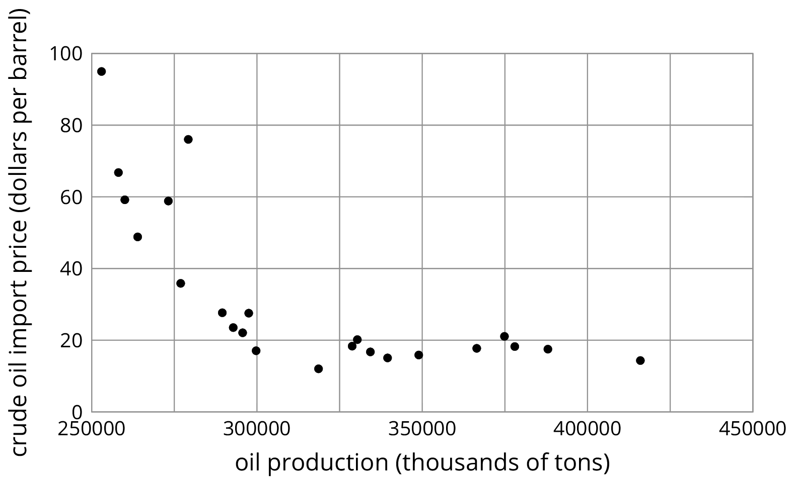
The purpose of this warm-up is for students to analyze a scatter plot by noticing things and asking questions (MP1). This scatter plot gives students the opportunity to observe a relationship that is not described well with a linear model. As production increases, price tends to decrease. However, there is a lower limit to the price, so the model tends to level out after a certain amount of production is reached.
Launch
Display the scatter plot for all to see. Tell students that oil production and price are shown. Production is measured in “thousand tons,” so a point on the left side of this graph represents 250,000 thousand tons (or 250,000,000 tons). Price is measured in “dollars per barrel.” A barrel of oil is equivalent to 42 gallons. The prices in this chart are for crude oil which would still need to be processed to be made useful for gasoline, plastics, or other oil-based materials.
Tell students to signal when they have at least one thing they notice or one thing they wonder. Give students 1 minute of quiet think time followed by whole-class discussion.
Student Facing
What do you notice? What do you wonder?
Student Response
For access, consult one of our IM Certified Partners.
Activity Synthesis
Ask students to share things they noticed and wondered. Record and display their responses for all to see.
To help focus students on the non-linearity of the association, ask "How is this scatter plot different from ones we have seen so far?" (The data appear to be grouped along a curve and not a straight line.)
Tell students that, even when a linear association seems to be present, it may only fit the data very close to the data that is present. For example, if we cover up the scatter plot to the right of 300,000, there may appear to be a linear association that would fit the data, but it would not apply to the data on the right side of the scatter plot. Additionally, in this particular situation, a linear model does not make sense in the long term, since a linear model would eventually have a value of zero and then become negative, something that would probably not happen to the price of oil.
7.2: Scatter Plot City (20 minutes)
Activity
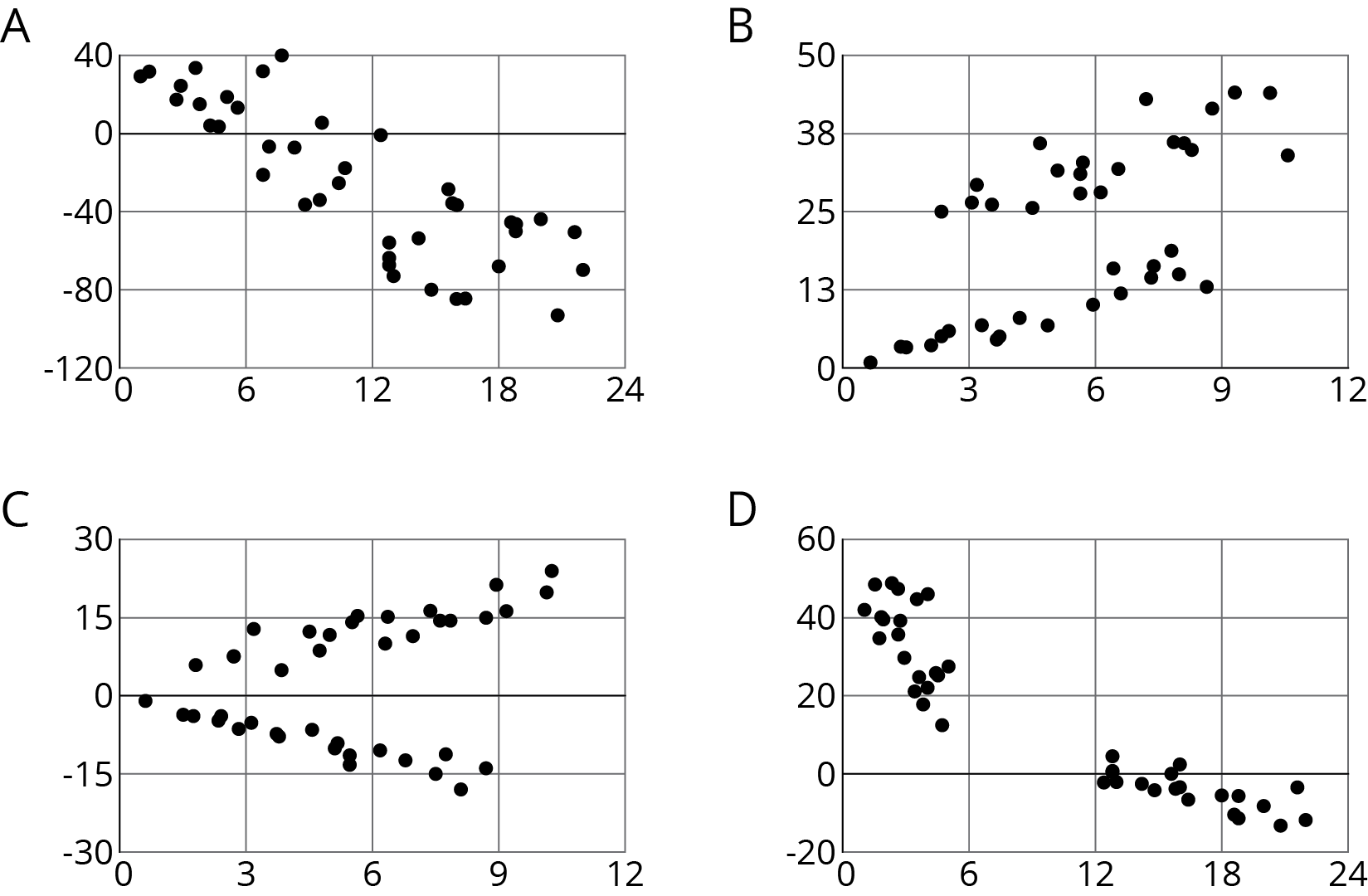
In previous lessons, data was fit with a linear model, but is not appropriate in all cases. In this activity, students individually sort cards of different scatter plots then discuss with a partner. They then re-sort the cards based on linearity and then again by positive or negative association (MP4).
Launch
Arrange students in groups of 2, and give each student a set of cards. Give 5 minutes of quiet work time for the first question followed by partner discussion. For the final two questions, ask students to take turns sorting the cards by putting one card into one of the categories, then explaining their reasoning for putting it there. After both partners have agreed on the placement of that card, the other partner may repeat these steps to sort one more card. Repeat this process until all cards are sorted.
Tell the students that there is a third category for the last two parts of the activity: neither. It is possible for data to have absolutely no association and appear completely random which would not be a linear association or a non-linear association. It is also possible for data to not have a strictly positive or negative association if, for example, the scatter plot seems to increase and then decrease.
Supports accessibility for: Conceptual processing; Organization
Design Principle(s): Support sense-making; Optimize output for (explanation)
Student Facing
Your teacher will give you a set of cards. Each card shows a scatter plot.
- Sort the cards into categories and describe each category.
- Explain the reasoning behind your categories to your partner. Listen to your partner’s reasoning for their categories.
- Sort the cards into two categories: positive associations and negative associations. Compare your sorting with your partner’s and discuss any disagreements.
- Sort the cards into two categories: linear associations and non-linear associations. Compare your sorting with your partner’s and discuss any disagreements.
Student Response
For access, consult one of our IM Certified Partners.
Activity Synthesis
To help clarify the meaning of linear and non-linear associations as well as positive and negative associations, consider asking some of the following questions:
- “How did you originally group the cards?”
- “Which graphs did you sort into the 'positive association' group?” (F and G)
- “Are there any cards that did not fit with either positive or negative association?” (Yes, the points for card A form an arc that first goes up and then down.)
- “Which graphs did you sort into the 'linear association' group?” (C and E)
- “If a scatter plot has no association at all (neither linear nor non-linear), what might its scatter plot look like?” (A lot of random dots scattered all around the plot with no obvious trend.)
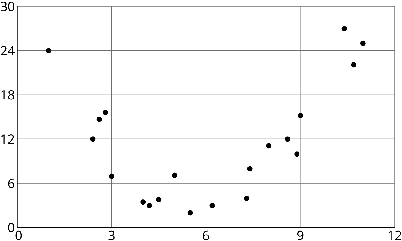
7.3: Clustering (10 minutes)
Activity
In addition to the type of model appropriate for the data represented in a scatter plot and the positive or negative association, there are other patterns that can be worth noticing before performing a more in-depth analysis. In this activity, students compare scatter plots that have more than one pattern embedded in them. In the discussion following the activity, this feature is identified as clustering.
As students compare the scatter plots in this activity, monitor for students who notice clustering of the data and name it in their own words.
Launch
Keep students in groups of 2. Allow 2 minutes quiet think time followed by partner and whole-class discussion.
Supports accessibility for: Language; Social-emotional skills
Design Principle(s): Support sense-making; Maximize meta-awareness
Student Facing
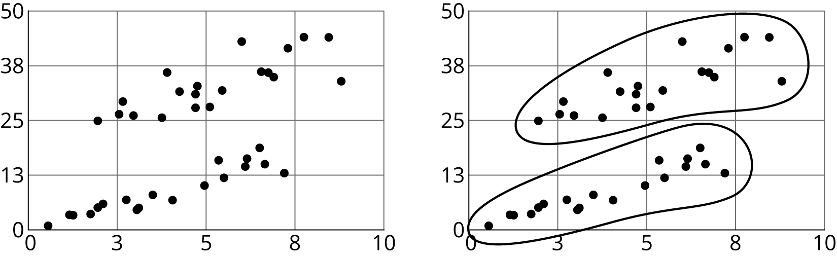
How are these scatter plots alike? How are they different?
Student Response
For access, consult one of our IM Certified Partners.
Activity Synthesis
The purpose of this discussion is for students to understand what it means for data to appear in clusters and recognize when they might appear.
Select previously identified students to share their observations about the scatter plots. Tell students that when data seems to have more than one pattern, it is called clustering. Clustering of the data like in graph B, C, and D can reveal hidden patterns. Usually, clustering means there are subgroups within our data that may represent different trends.
For example, in Plot B, the data may represent body measurements of a certain species of bird. Although the data originally came from a group that made sense (a single species), there appear to be subgroups that have a large influence on the data as well. The lower half of the data may represent females and the upper half may represent males, so we can see that there are different patterns within the different subgroups.
When clustering is present, it may be helpful to investigate the cause of the separation and analyze the data within the subgroups rather than as a whole.
Lesson Synthesis
Lesson Synthesis
To help summarize the lesson, ask:
- “In your own words, what is a non-linear association?” (The points in a scatter plot do not lie along a straight line.)
- “What does a non-linear association mean?” (There is not a constant increase or decrease of one variable based on the other.)
- “In your own words, what are clusters in data?” (The points in a scatter plot are clumped together in different groups.)
- “What do clusters usually mean?” (There may be multiple patterns present within the data. Perhaps there are subgroups that show different patterns.)
7.4: Cool-down - Make Your Own Scatter Plot (5 minutes)
Cool-Down
For access, consult one of our IM Certified Partners.
Student Lesson Summary
Student Facing
Sometimes a scatter plot shows an association that is not linear:
We call such an association a non-linear association. In later grades, you will study functions that can be models for non-linear associations.
Sometimes in a scatter plot we can see separate groups of points.
We call these groups clusters.