Lesson 4
Fitting a Line to Data
4.1: Predict This (5 minutes)
Warm-up
In previous lessons, students were asked to interpret individual points in a scatter plot or compare two points with each other. In this warm-up, students are asked think about a point in the context of the entire data set. They compare two different possible predictions for the dependent variable, given a value for the independent variable. This sets them up to understand and interpret a linear model for the relationship between independent and dependent variables. They use the potential location of a point not included in the scatter plot to answer a question about the context, based on the visual structure of the scatter plot (MP7, MP2).
Launch
Arrange students in groups of 2. Give 1 minute of quiet work time followed by 1 minute to check their solution with their partner. Follow with a whole-class discussion.
Student Facing
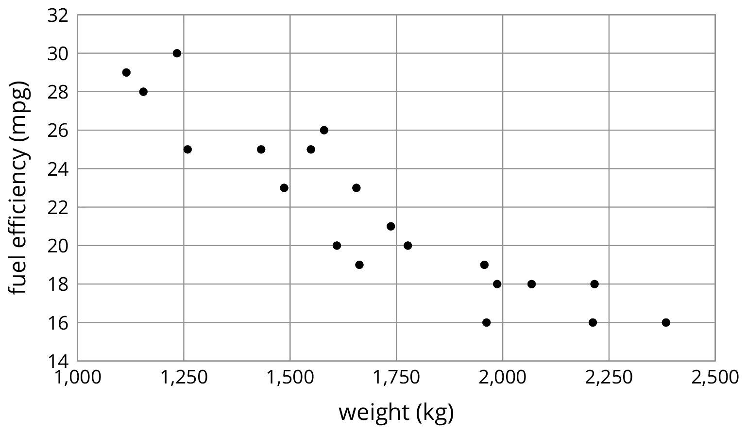
Here is a scatter plot that shows weights and fuel efficiencies of 20 different types of cars.
Student Response
For access, consult one of our IM Certified Partners.
Activity Synthesis
Display the graph for all to see. Poll the class to see if they think the fuel efficiency is closer to 22 mpg or 28 mpg. If they are all in agreement that the answer is closer to 22 mpg, ask a few students to share their reasoning. If there is disagreement, ask students to share their reasoning and come to an agreement. If it does not come up in the discussion, ask students to look at cars whose fuel efficiency is close to 28 mpg and note that their weights are quite a bit less. Then look at cars with a weight close to 1,750 kg, and note that their fuel efficiency is between 18 and 22 mpg. As a whole class, decide where to plot both potential points, and point out that one is close to the other nearby values and one is very far away.
4.2: Shine Bright (15 minutes)
Activity
In this lesson, the meaning of the words model and modeling are explained in terms of a linear model. Students are not expected to define the words, but should be comfortable understanding and using them. A model is used to predict prices for diamonds not included in the data as well as compare existing data points to the model.
Launch
Keep students in groups of 2. Allow students 5 minutes quiet work time followed by partner and whole-class discussion.
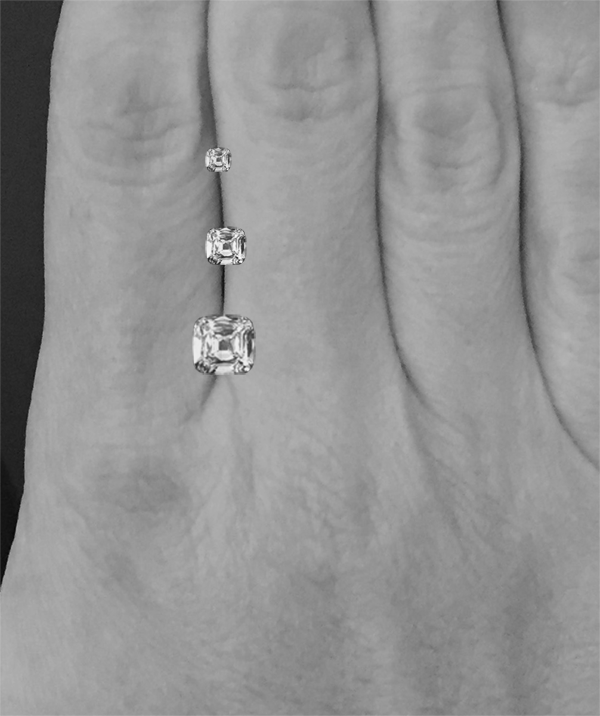
Show the first image for all to see. Ask students, “Which diamond do you think has the highest price? Which diamond do you think has the lowest price?” Most likely, they will guess that the largest has the highest price and the smallest has the lowest price. Validate this intuition and let them know that the size of a diamond is one thing that its price is based on. Tell students that the size of a diamond is commonly measured in carats, which is a measure of weight. (One carat is equivalent to 200 milligrams.)
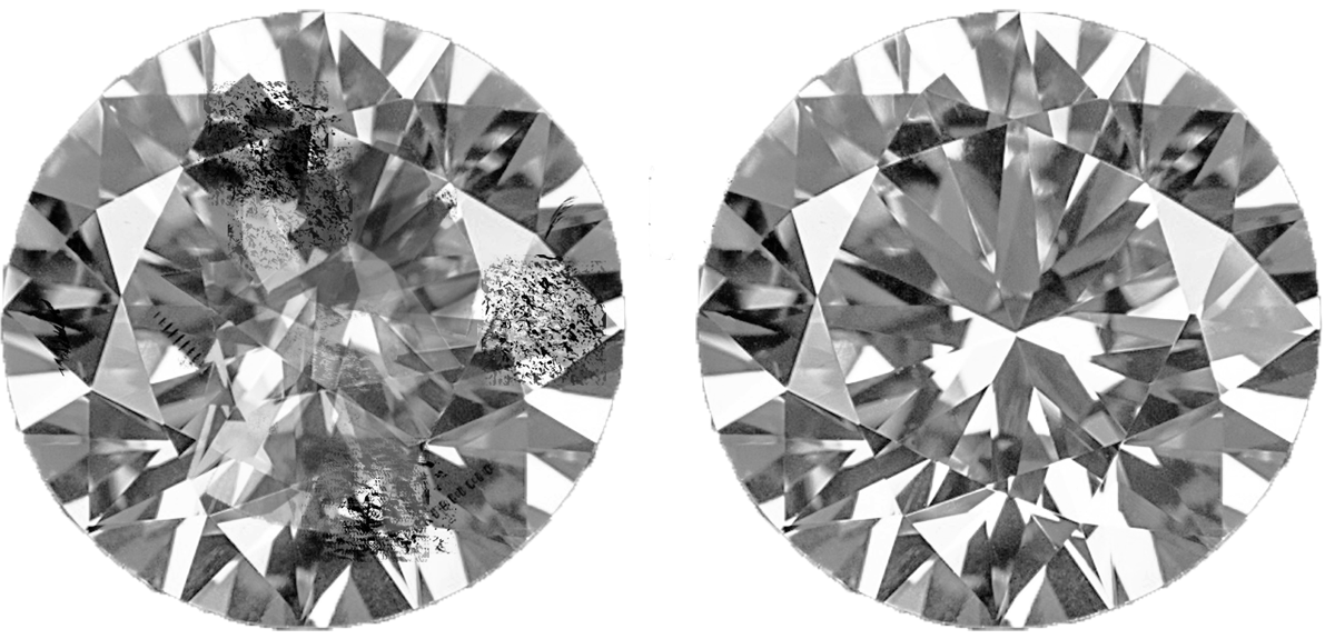
Show the second image for all to see. Ask students, “Which diamond do you think has the higher price?” Poll the class, and ask a few students to share their reasoning. Tell students that these diamonds are the same size, but they are not the same price. The price of a diamond is not just based on size, but also on how many flaws are inside the stone. Since the diamond on the right has fewer flaws (which makes it more sparkly), it has a higher price than the diamond on the left.
Tell students, “You will look at some data for the prices of diamonds of different sizes. You have used mathematics to analyze real-world situations, identifying variables in a situation and describing their relationships mathematically. This process is called modeling, and the mathematical description is called a model. Sometimes you made assumptions about the situation or ignored some features so that the model would be simpler.”
Supports accessibility for: Language; Organization
Design Principle(s): Support sense-making; Optimize output for (explanation)
Student Facing
Here is a table that shows weights and prices of 20 different diamonds.
| weight (carats) | actual price (dollars) | predicted price (dollars) |
|---|---|---|
| 1 | 3,772 | 4,429 |
| 1 | 4,221 | 4,429 |
| 1 | 4,032 | 4,429 |
| 1 | 5,385 | 4,429 |
| 1.05 | 3,942 | 4,705 |
| 1.05 | 4,480 | 4,705 |
| 1.06 | 4,511 | 4,760 |
| 1.2 | 5,544 | 5,533 |
| 1.3 | 6,131 | 6,085 |
| 1.32 | 5,872 | 6,195 |
| 1.41 | 7,122 | 6,692 |
| 1.5 | 7,474 | 7,189 |
| 1.5 | 5,904 | 7,189 |
| 1.59 | 8,706 | 7,686 |
| 1.61 | 8,252 | 7,796 |
| 1.73 | 9,530 | 8,459 |
| 1.77 | 9,374 | 8,679 |
| 1.85 | 8,169 | 9,121 |
| 1.9 | 9,541 | 9,397 |
| 2.04 | 9,125 | 10,170 |
The scatter plot shows the prices and weights of the 20 diamonds together with the graph of \(y = 5,\!520x- 1,\!091\).
The function described by the equation \(y = 5,\!520x- 1,\!091\) is a model of the relationship between a diamond’s weight and its price.
This model predicts the price of a diamond from its weight. These predicted prices are shown in the third column of the table.
- Two diamonds that both weigh 1.5 carats have different prices. What are their prices? How can you see this in the table? How can you see this in the graph?
- The model predicts that when the weight is 1.5 carats, the price will be $7,189. How can you see this in the graph? How can you see this using the equation?
- One of the diamonds weighs 1.9 carats. What does the model predict for its price? How does that compare to the actual price?
- Find a diamond for which the model makes a very good prediction of the actual price. How can you see this in the table? In the graph?
- Find a diamond for which the model’s prediction is not very close to the actual price. How can you see this in the table? In the graph?
Student Response
For access, consult one of our IM Certified Partners.
Launch
Keep students in groups of 2. Allow students 5 minutes quiet work time followed by partner and whole-class discussion.

Show the first image for all to see. Ask students, “Which diamond do you think has the highest price? Which diamond do you think has the lowest price?” Most likely, they will guess that the largest has the highest price and the smallest has the lowest price. Validate this intuition and let them know that the size of a diamond is one thing that its price is based on. Tell students that the size of a diamond is commonly measured in carats, which is a measure of weight. (One carat is equivalent to 200 milligrams.)

Show the second image for all to see. Ask students, “Which diamond do you think has the higher price?” Poll the class, and ask a few students to share their reasoning. Tell students that these diamonds are the same size, but they are not the same price. The price of a diamond is not just based on size, but also on how many flaws are inside the stone. Since the diamond on the right has fewer flaws (which makes it more sparkly), it has a higher price than the diamond on the left.
Tell students, “You will look at some data for the prices of diamonds of different sizes. You have used mathematics to analyze real-world situations, identifying variables in a situation and describing their relationships mathematically. This process is called modeling, and the mathematical description is called a model. Sometimes you made assumptions about the situation or ignored some features so that the model would be simpler.”
Supports accessibility for: Language; Organization
Design Principle(s): Support sense-making; Optimize output for (explanation)
Student Facing
Here is a table that shows weights and prices of 20 different diamonds.
| weight (carats) | actual price (dollars) | predicted price (dollars) |
|---|---|---|
| 1 | 3,772 | 4,429 |
| 1 | 4,221 | 4,429 |
| 1 | 4,032 | 4,429 |
| 1 | 5,385 | 4,429 |
| 1.05 | 3,942 | 4,705 |
| 1.05 | 4,480 | 4,705 |
| 1.06 | 4,511 | 4,760 |
| 1.2 | 5,544 | 5,533 |
| 1.3 | 6,131 | 6,085 |
| 1.32 | 5,872 | 6,195 |
| 1.41 | 7,122 | 6,692 |
| 1.5 | 7,474 | 7,189 |
| 1.5 | 5,904 | 7,189 |
| 1.59 | 8,706 | 7,686 |
| 1.61 | 8,252 | 7,796 |
| 1.73 | 9,530 | 8,459 |
| 1.77 | 9,374 | 8,679 |
| 1.85 | 8,169 | 9,121 |
| 1.9 | 9,541 | 9,397 |
| 2.04 | 9,125 | 10,170 |
The scatter plot shows the prices and weights of the 20 diamonds together with the graph of \(y = 5,\!520x- 1,\!091\).
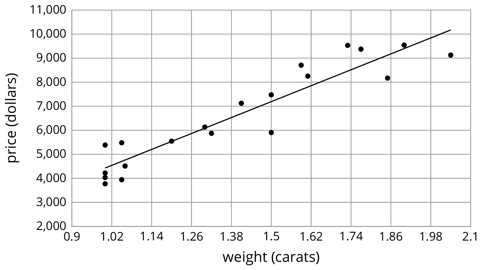
The function described by the equation \(y = 5,\!520x- 1,\!091\) is a model of the relationship between a diamond’s weight and its price.
This model predicts the price of a diamond from its weight. These predicted prices are shown in the third column of the table.
- Two diamonds that both weigh 1.5 carats have different prices. What are their prices? How can you see this in the table? How can you see this in the graph?
-
The model predicts that when the weight is 1.5 carats, the price will be $7,189. How can you see this in the graph? How can you see this using the equation?
- One of the diamonds weighs 1.9 carats. What does the model predict for its price? How does that compare to the actual price?
- Find a diamond for which the model makes a very good prediction of the actual price. How can you see this in the table? In the graph?
- Find a diamond for which the model’s prediction is not very close to the actual price. How can you see this in the table? In the graph?
Student Response
For access, consult one of our IM Certified Partners.
Activity Synthesis
The goal of this discussion is to help students understand the relationship between the data and a linear model of the data.
To highlight there relationship, ask:
- "What does a point in the scatter plot represent?" (The actual weight and price of a diamond.)
- "What does the line represent?" (The predicted price of a diamond based on its weight.)
- "What does it mean when a point is close to the line? When it is far away from the line?" (When it is close, the model predicts the price well. The farther away in the vertical direction, the worse the prediction.)
- "How can you use the graph to predict the price of a diamond that weighs 1.1 carats? How can you use the equation?" (Find the point on the line that lines up with \(x = 1.1\) or substitute \(x = 1.1\) into the model equation.)
4.3: The Agony of the Feet (15 minutes)
Activity
A scatter plot is shown and the points interpreted in context. Later, a linear model is graphed with the scatter plot to help students see an obvious outlier (MP7). In the discussion, the term outlier is introduced.
Launch

Ask students, “What do you notice? What do you wonder?” Ideally, they will notice that these are pictures of a foot of three different people. All three feet are approximately the same length but different widths. Tell students that all of these feet are a size 8. However, they wouldn’t all necessarily find the same shoe equally comfortably, because of the varying widths. (Besides the numerical size, some shoes also come in different widths.) Students should understand that human feet can vary in both length and width.
If using the digital activity, after this discussion, clarify for students that a scatter plot has been created for them to anaylze feet dimensions, using technology. Students can then work to complete the digital task which includes using a line of best fit to identify outliers.
Supports accessibility for: Language; Conceptual processing
Design Principle(s): Support sense-making
Student Facing
Here is a scatter plot that shows lengths and widths of 20 different left feet. Use the double arrows to show or hide the expressions list.
-
Estimate the widths of the longest foot and the shortest foot.
-
Estimate the lengths of the widest foot and the narrowest foot.
-
Click on the gray circle next to the words “The Line” in the expressions list. The graph of a linear model should appear. Find the data point that seems weird when compared to the model. What length and width does that point represent?

Student Response
For access, consult one of our IM Certified Partners.
Launch

Ask students, “What do you notice? What do you wonder?” Ideally, they will notice that these are pictures of a foot of three different people. All three feet are approximately the same length but different widths. Tell students that all of these feet are a size 8. However, they wouldn’t all necessarily find the same shoe equally comfortably, because of the varying widths. (Besides the numerical size, some shoes also come in different widths.) Students should understand that human feet can vary in both length and width.
If using the digital activity, after this discussion, clarify for students that a scatter plot has been created for them to anaylze feet dimensions, using technology. Students can then work to complete the digital task which includes using a line of best fit to identify outliers.
Design Principle(s): Support sense-making
Student Facing
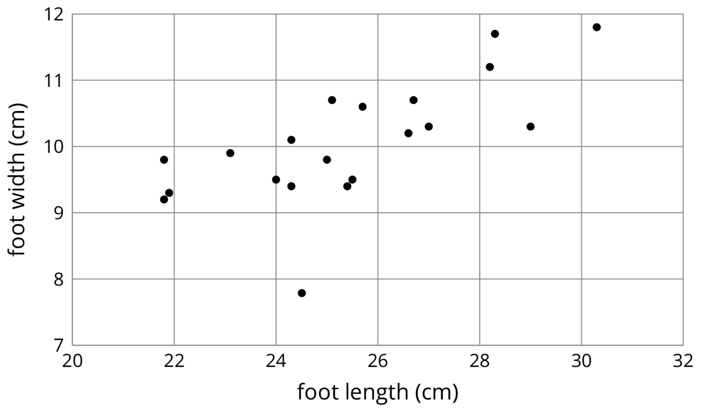
Here is a scatter plot that shows lengths and widths of 20 different left feet.
-
Estimate the widths of the longest foot and the shortest foot.
-
Estimate the lengths of the widest foot and the narrowest foot.
-
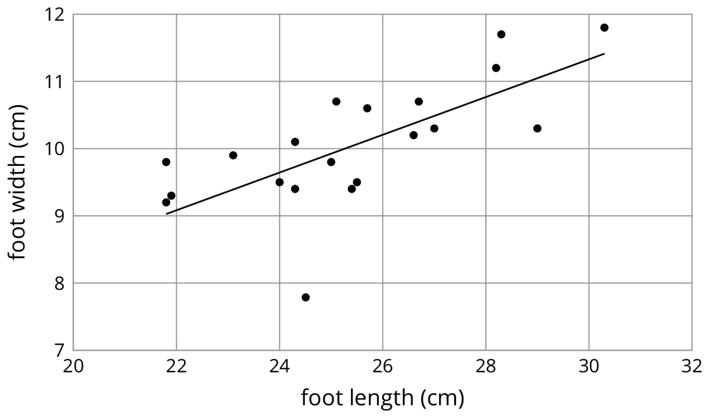
Here is the same scatter plot together with the graph of a model for the relationship between foot length and width.
Student Response
For access, consult one of our IM Certified Partners.
Activity Synthesis
Introduce the term outlier. An outlier is a point that is separated from the rest of the data. Sometimes data sets have outliers. Sometimes that’s because there really is a data point that is very different than the others. Sometimes it is because there was an error in collecting the data. Sometimes it is because there was an error in entering the data. When there are outliers, one has to make a judgement about whether to include it in the analysis or not.
Lesson Synthesis
Lesson Synthesis
To help students see the connection between a scatter plot and a linear model for a data set, ask:
- "What kind of model for a data set did we investigate today?" (A linear model.)
- "What does this kind of model help us do?" (See the trend in the data more clearly and make predictions.)
- "What does it mean when a data point is closer in the vertical direction to the line that represents a linear model? What does it mean when a data point is farther from the line in the vertical direction?" (When the data point is closer in the vertical direction to the line, it represents data that fits the prediction well. When the point is farther from the line, the data does not fit the prediction well.)
- "In your own words, how can you identify an outlier from a scatter plot?" (A point that is far from the other points in the scatter plot represents an outlier.)
4.4: Cool-down - A 1 Foot Foot (5 minutes)
Cool-Down
For access, consult one of our IM Certified Partners.
Student Lesson Summary
Student Facing
Sometimes, we can use a linear function as a model of the relationship between two variables. For example, here is a scatter plot that shows heights and weights of 25 dogs together with the graph of a linear function which is a model for the relationship between a dog’s height and its weight.
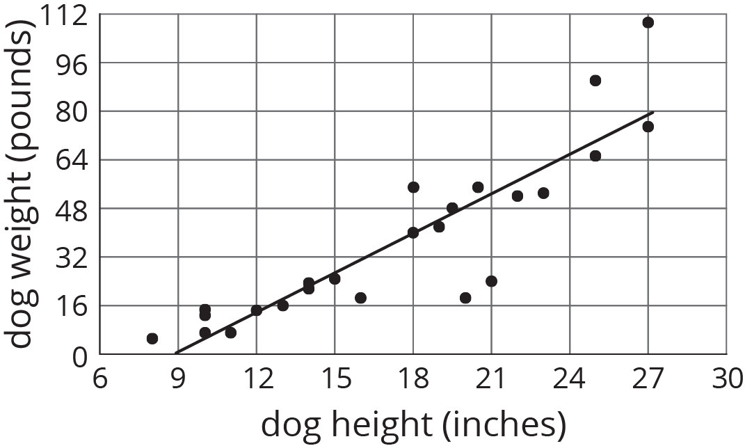
We can see that the model does a good job of predicting the weight given the height for some dogs. These correspond to points on or near the line. The model doesn’t do a very good job of predicting the weight given the height for the dogs whose points are far from the line.
For example, there is a dog that is about 20 inches tall and weighs a little more than 16 pounds. The model predicts that the weight would be about 48 pounds. We say that the model overpredicts the weight of this dog. There is also a dog that is 27 inches tall and weighs about 110 pounds. The model predicts that its weight will be a little less than 80 pounds. We say the model underpredicts the weight of this dog.
Sometimes a data point is far away from the other points or doesn’t fit a trend that all the other points fit. We call these outliers.