Lesson 10
Using Data Displays to Find Associations
10.1: Sports and Musical Instruments (5 minutes)
Warm-up
The purpose of this warm-up is for students to answer questions about relative frequency of items after finding missing information in a two-way table.
Monitor for students who find the percentages for the final two questions using different strategies to share during the whole-class discussion.
Launch
Give students 2 minutes of quiet work time followed by a whole-class discussion.
Student Facing
For a survey, students in a class answered these questions:
- Do you play a sport?
- Do you play a musical instrument?
-
Here is a two-way table that gives some results from the survey. Complete the table, assuming that all students answered both questions.
plays instrument does not play instrument total plays sport 5 16 does not play sport total 15 25 -
To the nearest percentage point, what percentage of students who play a sport don’t play a musical instrument?
-
To the nearest percentage point, what percentage of students who don’t play a sport also don’t play a musical instrument?
Student Response
For access, consult one of our IM Certified Partners.
Activity Synthesis
Ask students to share the missing information they found for the table. Record and display their responses for all to see.
Select students previously identified to explain how they found the percentages for the final two questions and what that percentage represents.
- Students who find a percentage using the values given (for example 31% since \(\frac{5}{16} \approx 0.31\)), then subtract from 100% (for example 69% since \(100 - 31 = 69\)) to answer the question.
- Students who find the actual values first by subtracting (for example \(16 - 5 = 11\)) then compute the percentage (for example 69% because \(\frac{11}{16}=0.6875\)).
Ask the rest of the class if they agree or disagree with the strategies and give time for any questions they have.
10.2: Sports and Music Association (20 minutes)
Activity
Now that students are more familiar with two-way tables showing relative frequency, they are ready to create their own segmented bar graphs. In this activity, students create two segmented bar graphs based on the same two-way table by considering percentages of the rows and columns separately. After creating the segmented bar graphs, they are analyzed to determine if there is an association present in the data.
Launch
Arrange students in groups of 2. After a brief introduction, give 5–10 minutes of quiet work time. Ask students to compare their answers with their partner and try to resolve any differences. Finish with a whole-class discussion.
Display the two-way table from the previous lesson's cool-down activity containing the data collected about the class's playing sports and musical instruments. If the data is unavailable, the data from this lesson's warm-up can be used.
Tell students they should work with their partners to each work on one of the graphs. One student should work on problems 1 and 2 while their partner should work on 3 and 4. After they have completed their graphs, they should work together to understand their partners graphs and complete the last problem together.
Supports accessibility for: Organization; Attention
Student Facing
Your teacher will give you a two-way table with information about the number of people in your class who play sports or musical instruments.
-
Complete this table to make a two-way table for the data from earlier. The table will show relative frequencies by row.
plays instrument does not play instrument row total plays sport 100% does not play sport 100%
-
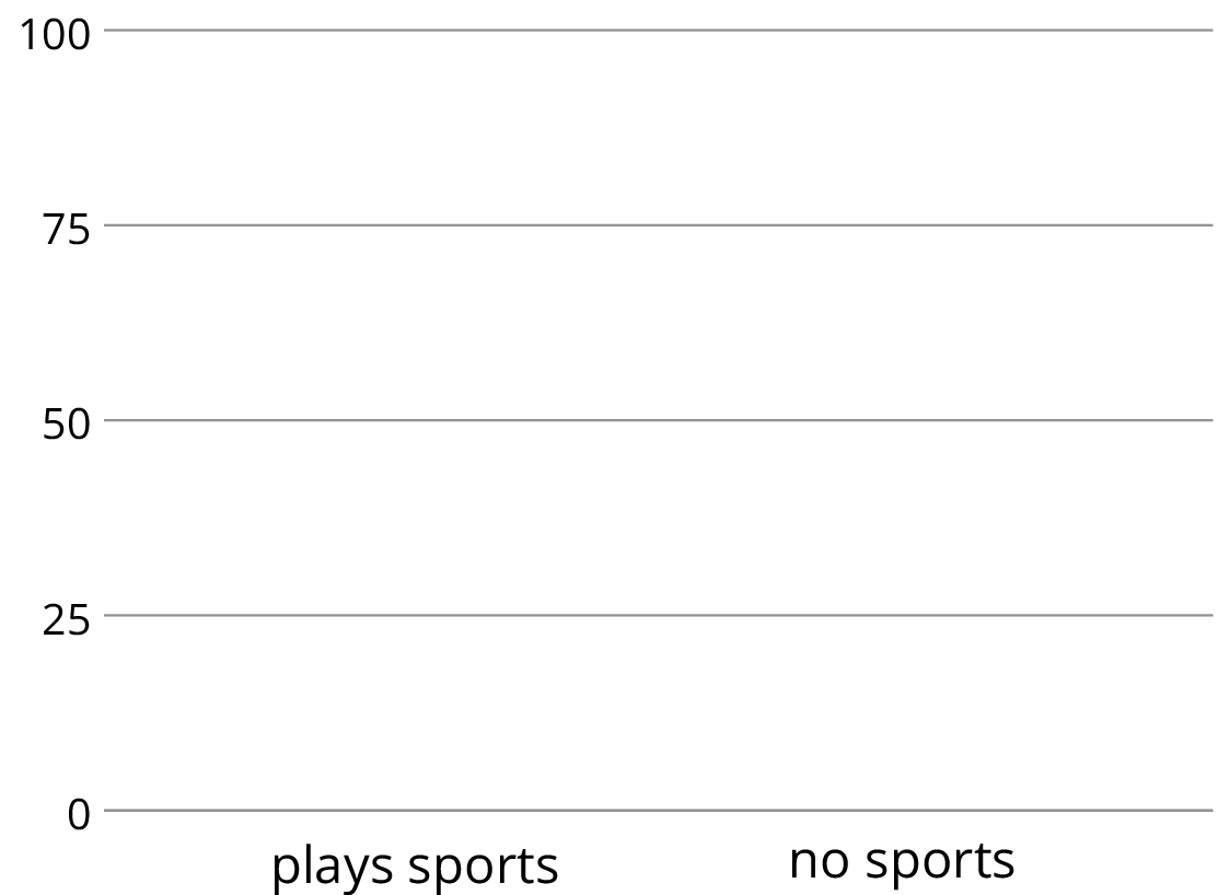
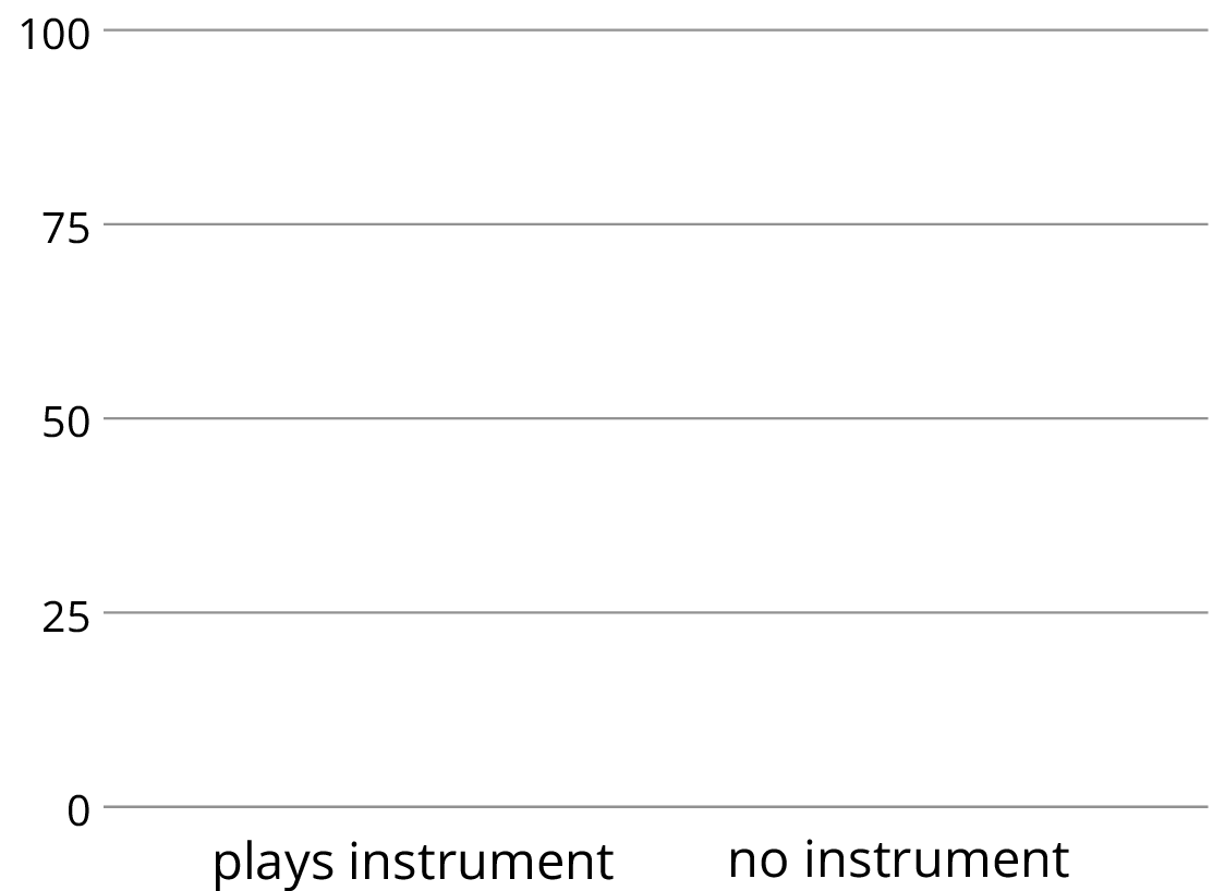
Make a segmented bar graph for the table. Use one bar of the graph for each row of the table.

-
Complete the table to make a two-way table for the data from earlier. The table will show relative frequencies by column.
plays instrument does not play instrument plays sport does not play sport column total 100% 100%
-
Using the values in the table, make a segmented bar graph. Use one bar of the graph for each column of the table.

-
Based on the two-way tables and segmented bar graphs, do you think there is an association between playing a sport and playing a musical instrument? Explain how you know.
Student Response
For access, consult one of our IM Certified Partners.
Anticipated Misconceptions
Students may draw the segmented bar graph incorrectly. Most likely, they will accidentally graph frequency instead of relative frequency. They may also graph relative frequencies, but without stacking them. Both segmented bars should go from 0 to 100.
Activity Synthesis
To clarify how to create and interpret segmented bar graphs, ask:
- “What different information can be seen by the two segmented bar graphs?”
- “Why are the numbers in the top left box in the two tables different? What do they mean?” (In the first table it represents the percentage who also play musical instruments out of all the people who play sports. In the second table it represents the percentage of people who also play sports out of all the people who play musical instruments.)
- “Is there an association between the two variables? Explain or show your reasoning.” (The answer will depend on class data, but the reasoning should include an analysis of the relative frequencies within categories. There is an association if the percentages within one category are very different from the percentages in another category.)
If there is an association, ask what the segmented bar graphs would look like if there was no association. If there is not an association, ask what the segmented bar graphs would look like if there was one.
Design Principle(s): Optimize output (for explanation)
10.3: Colored Erasers (15 minutes)
Activity
This activity provides students less structure for their work in creating segmented bar graphs to determine an association (MP4). In addition, the data in this activity is split into more than two options. Students work individually to create a segmented bar graph based on either columns or rows and then share their information with a partner who has created the other segmented bar graph. Together, partners discuss the segmented bar graphs to determine if there is an association between the variables (MP3). In particular, students should notice that there is evidence of an association is the relative frequencies within a category are very different from the relative frequencies in another category.
As students work, identify groups that use the different segmented bar graphs to explain why there is an association between the color of the eraser and flaws.
Launch
Keep students in groups of 2. Give 5 minutes quiet work time followed by 5 minutes of partner discussion and then a whole-class discussion.
Provide students access to colored pencils. Either assign or have partners choose which will make a graph for each row and which will make a graph for each column.
Supports accessibility for: Language
Student Facing
An eraser factory has five machines. One machine makes the eraser shapes. Then each shape goes through the red machine, blue machine, yellow machine, or green machine to have a side colored.
The manager notices that an uncolored side of some erasers is flawed at the end of the process and wants to know which machine needs to be fixed: the shape machine or some of the color machines. The manager collected data on the number of flawed and unflawed erasers of each color.
| unflawed | flawed | total | |
|---|---|---|---|
| red | 285 | 15 | 300 |
| blue | 223 | 17 | 240 |
| yellow | 120 | 80 | 200 |
| green | 195 | 65 | 260 |
| total | 823 | 177 | 1000 |
-
Work with a partner. Each of you should make one segmented bar graph for the data in the table. One segmented bar graph should have a bar for each row of the table. The other segmented bar graph should have one bar for each column of the table.
- Are the flawed erasers associated with certain colors? If so, which colors? Explain your reasoning.
Student Response
For access, consult one of our IM Certified Partners.
Student Facing
Are you ready for more?
Based on the federal budgets for 2009, the table shows where some of the federal money was expected to go. The values are in billions of U.S. Dollars.
| United States | Japan | United Kingdom | |
|---|---|---|---|
| defense | 718.4 | 42.8 | 49.2 |
| education | 44.9 | 47.5 | 113.9 |
- Why would a segmented bar graph be more useful than the table of data to see any associations between the country and where the money is spent?
-
Create a segmented bar graph that represents the data from the table.
- Is there an association between the country’s budget and their spending in these areas? Explain your reasoning.
Student Response
For access, consult one of our IM Certified Partners.
Activity Synthesis
The purpose of this discussion is to identify strategies for creating segmented bar graphs and for analyzing them to determine if there is an association among variables.
Ask, “What strategies did you use to create the segmented bar graphs?” (First, we created a new table of the relative frequencies. Then we approximated the heights of the segments based on the percentages from the table.)
Select previously identified groups to share their explanation for noticing an association.
- Groups that use the segmented bar graph based on rows.
- Groups that use the segmented bar graph based on columns.
After both explanations are shared, ask students, "Do you think that noticing the association was easier with one of the graphs?" (Likely the segmented bar graph based on rows is easier since there are only 2 segments and it is easier to see that the yellow and green erasers are more flawed.)
Finally, ask students, "If there was not an association between color and flaws, what might the segmented bar graph based on the rows look like? What might the segmented bar graph based on the columns look like?” (The segmented bar graph based on the rows would have each segmented bar look about the same. That is, the line dividing the two segments would be at about the same height in each bar. The segmented bar graph based on the columns would have segments that are all approximately equal. That is, each segment should represent about 25% of the entire bar.)
Lesson Synthesis
Lesson Synthesis
Remind students that we have been looking for associations in categorical data, and that there is evidence of an association if the relative frequencies of some characteristic are very different from each other in the different groups. Ask:
- “Is it easier to see evidence of an association in a frequency table or a relative frequency table?” (It depends on the data. If the two groups are approximately the same size, it doesn't matter very much, but when they are different sizes, it is usually easier to compare using relative frequencies.)
- “How can we see evidence of an association in a two-way table of either kind?” (By numerically comparing the proportions between the two groups.)
- “How can we see evidence of an association in a bar graph or segmented bar graph?” (By visually comparing the proportions between the two groups.)
10.4: Cool-down - Class Preferences (5 minutes)
Cool-Down
For access, consult one of our IM Certified Partners.
Student Lesson Summary
Student Facing
In an earlier lesson, we looked at data on meditation and state of mind in athletes.


Is there an association between meditation and state of mind?
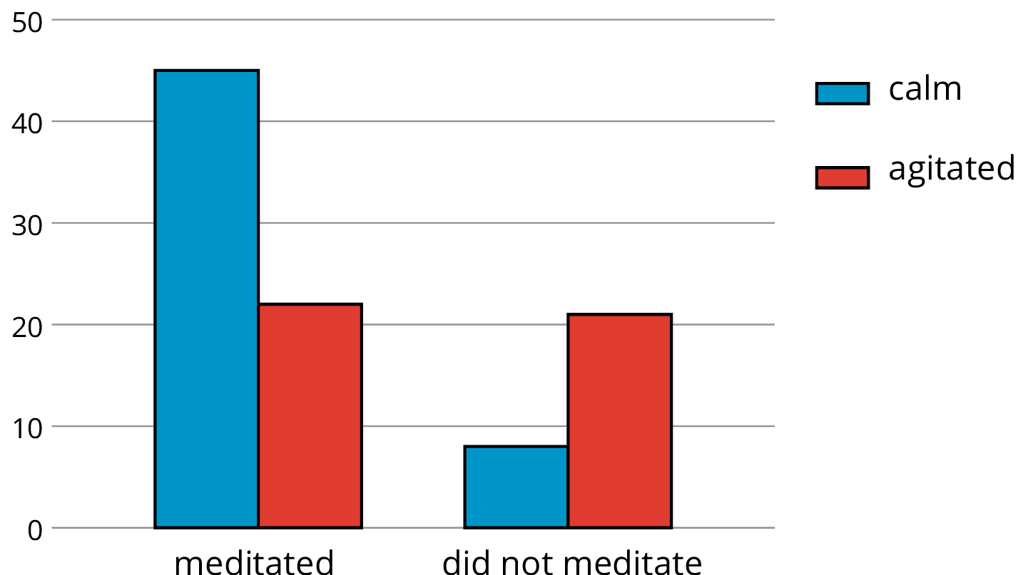
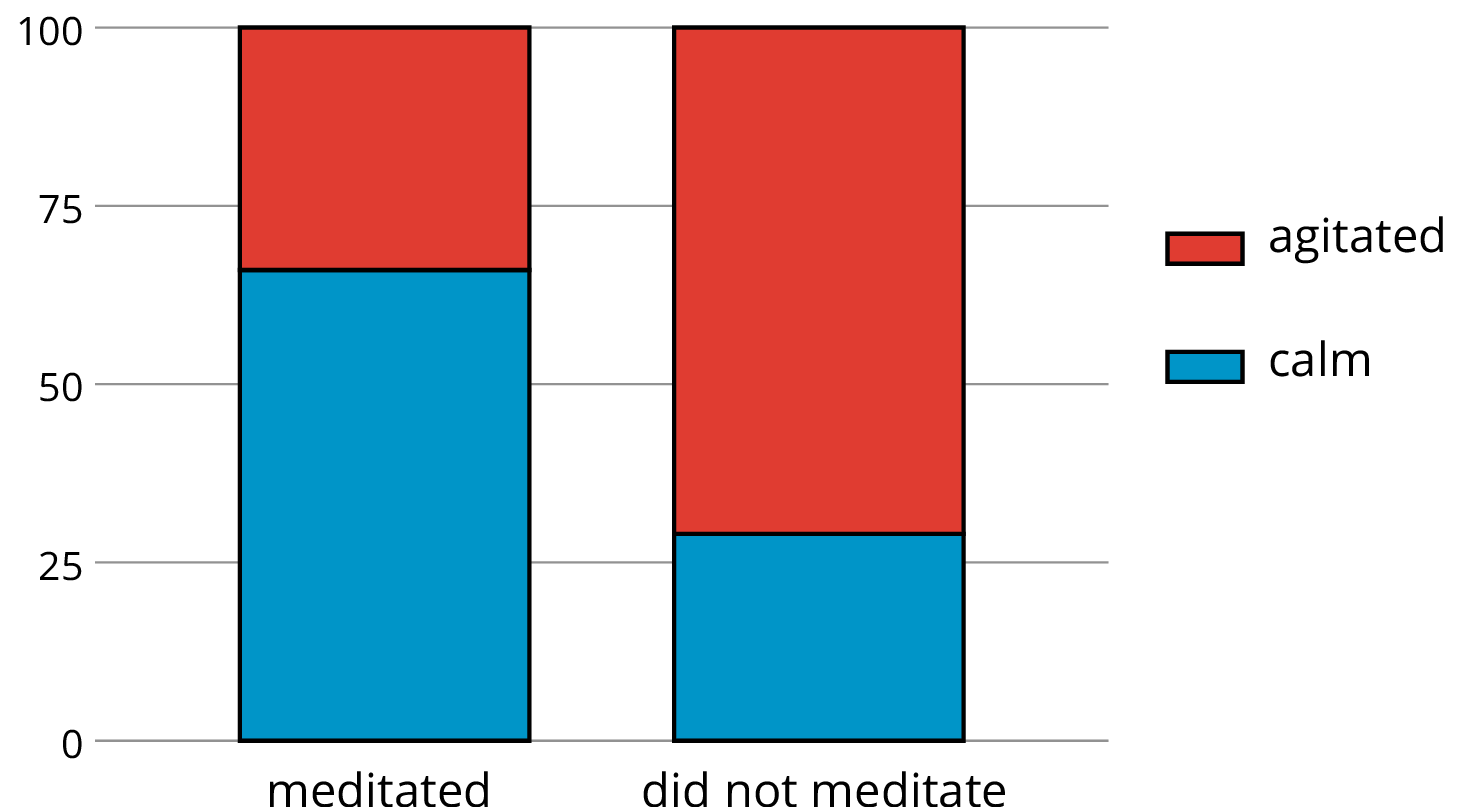
The bar graph shows that more athletes were calm than agitated among the group that meditated, and more athletes were agitated than calm among the group that did not. We can see the proportions of calm meditators and calm non-meditators from the segmented bar graph, which shows that about 66% of athletes who meditated were calm, whereas only about 27% of those who did not meditate were calm.
This does not necessarily mean that meditation causes calm; it could be the other way around, that calm athletes are more inclined to meditate. But it does suggest that there is an association between meditating and calmness.