Lesson 8
Analyzing Bivariate Data
8.1: Speed vs. Step Length (5 minutes)
Warm-up
The purpose of this warm-up is for students to interpret the rate of change of a function to describe a trend (MP2). It is used to help students recall the role of slope in showing associations for data that can be fit with a linear model in anticipation of looking for associations in this lesson.
Launch
Give students 2 minutes of quiet work time followed by a whole-class discussion.
Student Facing
A researcher found an association between a dog’s stride length and its speed: the longer a dog’s steps, the faster it goes. The predicted speed in meters per second, \(s\), as a function of step length in meters, \(l\), is
\(\displaystyle s = 4l-1.6\)
What does the rate of change of the function tell you about the association between stride length and speed?
Student Response
For access, consult one of our IM Certified Partners.
Activity Synthesis
Ask students to share what the rate of change of this function tells them about the trend. Record and display their responses for all to see. To include more students in the conversation, consider asking some of the following questions:
- “Does anyone agree or disagree with this reasoning? Why?”
- “Did anyone reason about the rate of change in a different way?”
- “Did anyone reason about the rate of change in the same way but would describe the trend differently?”
- “Does anyone want to add on to ____'s reasoning?”
8.2: Animal Brains (15 minutes)
Activity
All of the information from this section about scatter plots comes into play as students analyze data about animal body and brain weights. Students begin with a table of data and create a scatter plot. After seeing the scatter plot, students pick out any outliers and fit a line to the scatter plot. Finally, the slope of the line is estimated and its meaning interpreted in context (MP2).
Launch
Arrange students in groups of 2. Give students 5 minutes of quiet work time followed by 5 minutes of partner discussion and 5 minutes of whole-class discussion.
If using the digital activity, students can still work independently to analyze the scatter plot and answer the prompts. Then students can discuss their thinking in groups of 2 followed by whole-class discussion.
Student Facing
Is there an association between the weight of an animal’s body and the weight of the animal’s brain?
| animal | body weight (kg) | brain weight (g) |
|---|---|---|
| cow | 465 | 423 |
| grey wolf | 36 | 120 |
| goat | 28 | 115 |
| donkey | 187 | 419 |
| horse | 521 | 655 |
| potar monkey | 10 | 115 |
| cat | 3 | 26 |
| giraffe | 529 | 680 |
| gorilla | 207 | 406 |
| human | 62 | 1320 |
| rhesus monkey | 7 | 179 |
| kangaroo | 35 | 56 |
| sheep | 56 | 175 |
| jaguar | 100 | 157 |
| chimpanzee | 52 | 440 |
| pig | 192 | 180 |
Use the data to make a scatter plot. Are there any outliers?
Experiment with the line to fit the data. Drag the points to move the line. You can close the expressions list by clicking on the double arrow.
- Without including any outliers, does there appear to be an association between body weight and brain weight? Describe the association in a sentence.
- Adjust the line by moving the green points, fitting the line to your scatter plot, and estimate its slope. What does this slope mean in the context of brain and body weight?
- Does the fitted line help you identify any other outliers?
Student Response
For access, consult one of our IM Certified Partners.
Launch
Arrange students in groups of 2. Give students 5 minutes of quiet work time followed by 5 minutes of partner discussion and 5 minutes of whole-class discussion.
If using the digital activity, students can still work independently to analyze the scatter plot and answer the prompts. Then students can discuss their thinking in groups of 2 followed by whole-class discussion.
Student Facing
Is there an association between the weight of an animal’s body and the weight of the animal’s brain?
Use the data in the table to make a scatter plot. Are there any outliers?
| animal | body weight (kg) | brain weight (g) |
|---|---|---|
| cow | 465 | 423 |
| grey wolf | 36 | 120 |
| goat | 28 | 115 |
| donkey | 187 | 419 |
| horse | 521 | 655 |
| potar monkey | 10 | 115 |
| cat | 3 | 26 |
| giraffe | 529 | 680 |
| gorilla | 207 | 406 |
| human | 62 | 1,320 |
| rhesus monkey | 7 | 179 |
| kangaroo | 35 | 56 |
| sheep | 56 | 175 |
| jaguar | 100 | 157 |
| chimpanzee | 52 | 440 |
| pig | 192 | 180 |
- After removing the outliers, does there appear to be an association between body weight and brain weight? Describe the association in a sentence.
- Using a piece of pasta and a straightedge, fit a line to your scatter plot, and estimate its slope. What does this slope mean in the context of brain and body weight?
- Does the fitted line help you identify more outliers?
Student Response
For access, consult one of our IM Certified Partners.
Student Facing
Are you ready for more?
Use one of the suggestions or find another set of data that interested you to look for associations between the variables.
- Number of wins vs number of points per game for your favorite sports team in different seasons
- Amount of money grossed vs critic rating for your favorite movies
- Price of a ticket vs stadium capacity for popular bands on tour
After you have collected the data,
- Create a scatter plot for the data.
- Are any of the points very far away from the rest of the data?
- Would a linear model fit the data in your scatter plot? If so, draw it. If not, explain why a line would be a bad fit.
- Is there an association between the two variables? Explain your reasoning.
Student Response
For access, consult one of our IM Certified Partners.
Anticipated Misconceptions
When estimating slope, some students won’t use the scales of the axes correctly, so the slope is reported incorrectly. Some students may not notice the different units of weight used on each axis.
Activity Synthesis
The goal of this discussion is to ensure students can make sense of the data given all the tools from this unit.
Consider asking some of the following questions:
- "Which data did you consider outliers?" (human and chimpanzee)
- "How did you determine your fitted line?"
- "Let's assume the trend you found continues past the end of the scatter plot. A Tyrannosaurus Rex is a dinosaur that is estimated to have a body weight of about 8,000 kg. What do you expect its brain weight to be?" (About 8,000 g or 8 kg)
Design Principle(s): Support sense-making
8.3: Equal Body Dimensions (15 minutes)
Activity
In this activity students create another scatter plot to analyze the data they collected about their classmates in a previous lesson (MP4). A suggested linear model is compared to the data and a particular point is identified in both the scatter plot and data table.
Although the scatter plots are left to students to organize, the only linear model considered is \(y = x\) which is symmetric when switching which variable is represented on each axis. If possible, identify any groups who have axes switched to bring up in the discussion.
Note: Some students may be sensitive about their body measurements and providing alternate data allows the class to work with actual values without making students uncomfortable. Depending on your class, consider providing a similar data set to the one collected in the earlier lesson (measurements from the staff, a different class, or invented data that is similar to the data collected).
Launch
Give students 10 minutes of quiet work time followed by 5 minutes of whole-class discussion.
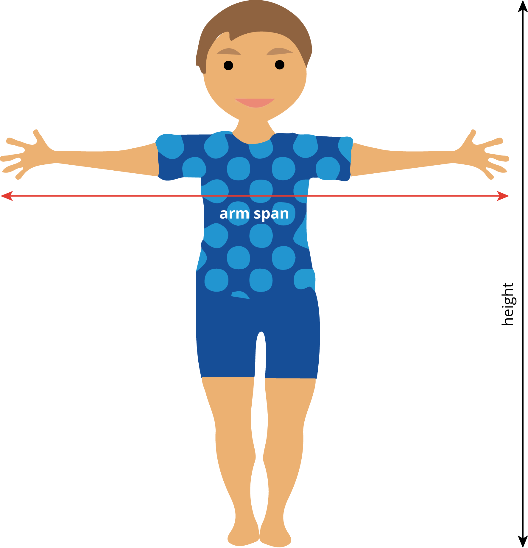
Display the class data collected earlier in the unit. Display this image to remind students what their data represents.
If using the digital activity, students will create their scatter plots using technology.
Supports accessibility for: Visual-spatial processing; Conceptual processing; Organization
Design Principle(s): Optimize output (for generalization)
Student Facing
Earlier, your class gathered data on height and arm span.
- Sometimes a person’s arm span is the same as their height. Is this true for anyone in the class?
- Make a scatter plot for the arm span and height data, and describe any association. Click on the plus sign to get a menu and add a table, if you choose.

- Is the line \(y = x\) a good fit for the data? If so, explain why. If not, find the equation of a line that fits the data better.
- Examine the scatter plot. Which person in your class has the largest ratio between their arm span and their height? Explain or show your reasoning.
Student Response
For access, consult one of our IM Certified Partners.
Launch
Give students 10 minutes of quiet work time followed by 5 minutes of whole-class discussion.
Display the class data collected earlier in the unit. Display this image to remind students what their data represents.
If using the digital activity, students will create their scatter plots using technology.
Supports accessibility for: Visual-spatial processing; Conceptual processing; Organization
Design Principle(s): Optimize output (for generalization)
Student Facing
Earlier, your class gathered data on height and arm span.
-
Sometimes a person’s arm span is the same as their height. Is this true for anyone in the class?
- Make a scatter plot for the arm span and height data, and describe any association.

- Is the line \(y = x\) a good fit for the data? If so, explain why. If not, find the equation of a line that fits the data better.
- Examine the scatter plot. Which person in your class has the largest ratio between their arm span and their height? Explain or show your reasoning.
Student Response
For access, consult one of our IM Certified Partners.
Activity Synthesis
The goal of this activity is for students to use the methods they have learned in this unit to explore data they have collected. To highlight some of the main points, select 2–3 students to respond to each question:
- “What is the slope of the line that best fit the data?” (Answers vary based on class data, but should be close to 1.)
- If any groups had axes switched, select these groups to show their scatter plots. "What would a point on the line \(y = x\) represent in each graph?" (A person whose arm span and height are identical. It does not matter which way the axes are drawn for this line.)
- “What does it mean about a person whose point is above the line \(y=x\)? What does it mean about a person whose point is below the line?” (Depending on the axes, a person whose point is off of the line has a longer arm span than expected for their height or is taller than expected for their arm span.)
- “Suppose you measure height and arm span for people in you neighborhood. When you make a scatter plot, you notice two clusters of data: one group of data in the lower left of the scatter plot and another group in the upper right. What does this mean? Why do you think there may be these clusters?” (It may mean there are a lot of small children and taller adults.)
Lesson Synthesis
Lesson Synthesis
The goal of this discussion is to help students reflect on all of the things they have learned about bivariate data in this unit. Consider asking some of the following questions:
- “What does a point in a scatter plot tell you?” (Two measurements about an individual in a population).
- “What is an association between variables?” (A trend that suggests that as one variable increases, the other variable tends to increase if it is a positive association or decrease if it is a negative association.)
- “What does a fitted line tell you about the data?” (It represents a model that can be used to make predictions about the dependent variable based on the value of the independent variable.)
- “What does the slope of a fitted line tell you about the data?” (The amount the dependent variable will increase (or decrease) for a one-unit increase in the independent variable.)
8.4: Cool-down - Drawing a Line (5 minutes)
Cool-Down
For access, consult one of our IM Certified Partners.
Student Lesson Summary
Student Facing
People often collect data in two variables to investigate possible associations between two numerical variables and use the connections that they find to predict more values of the variables. Data analysis usually follows these steps:
- Collect data.
- Organize and represent the data, and look for an association.
- Identify any outliers and try to explain why these data points are exceptions to the trend that describes the association.
- Find a function that fits the data well.
Although computational systems can help with data analysis by graphing the data, finding a function that might fit the data, and using that function to make predictions, it is important to understand the process and think about what is happening. A computational system may find a function that does not make sense or use a line when the situation suggests that a different model would be more appropriate.