Lesson 6
The Slope of a Fitted Line
6.1: Estimating Slope (5 minutes)
Warm-up
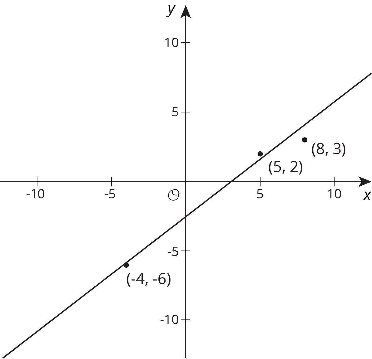
The purpose of this warm-up is for students to estimate the slope of a line given points that are close to the line, but not on the line. This prepares students for thinking about the model's fit to data in the rest of the lesson.
Launch
Arrange students in groups of 2. Give 1 minute of quiet work time followed by 1 minute to discuss their solution with their partner. Follow with a whole-class discussion.
Student Facing
Estimate the slope of the line.
Student Response
For access, consult one of our IM Certified Partners.
Activity Synthesis
Poll the class and ask students if their estimated slope was close to their partner's estimate. Select 2–3 groups who had close estimates to share their solutions and explain their reasoning. Display the graph with the single line and record the students' responses next to the graph for all to see.
If students do not mention that it is better to use points that are far apart rather than close together for estimating the slope, consider displaying this graph for all to see:
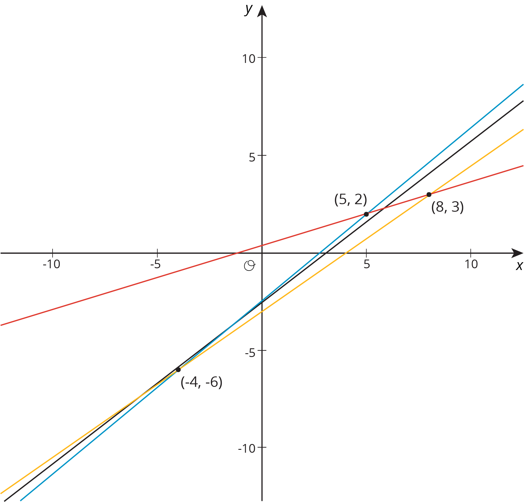
To remind students of previous work, draw a slope triangle whose horizontal side has a length of 1, demonstrating that the length of the vertical side is equal to the slope of the line.
6.2: Describing Linear Associations (10 minutes)
Activity
Students practice using precise wording (MP6) to describe the positive or negative association between two variables given scatter plots of data.
Launch
Display the scatterplot for all to see. Remind students that we investigated the relationship between car weight and fuel efficiency earlier.
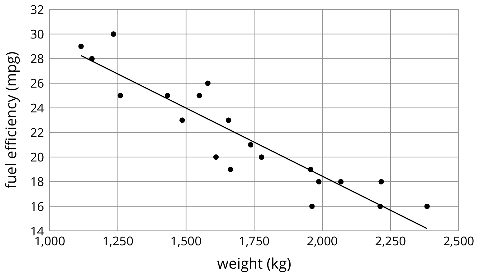
Ask students how they would describe the relationship between weight and fuel efficiency. After 30 seconds of quiet think time, select 1–2 students to share their responses. (The scatter plot shows that for these cars, as the weight of a car increases, its fuel efficiency decreases.)
Give students 3–5 minutes to construct similar sentences to describe scatter plots of three other data sets followed by a whole-class discussion.
Student Facing
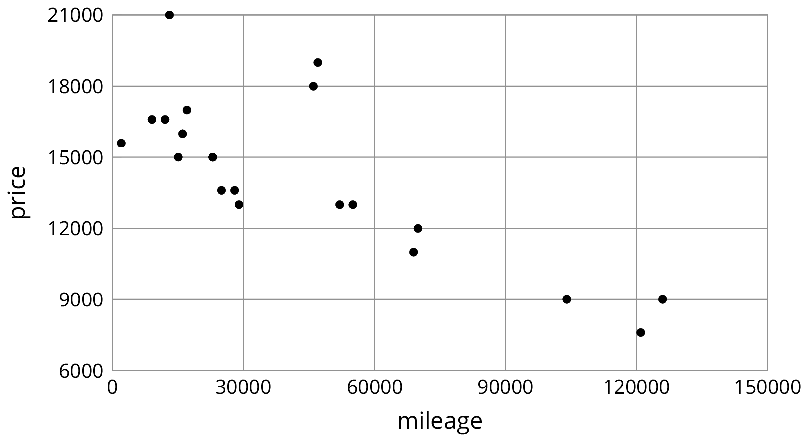
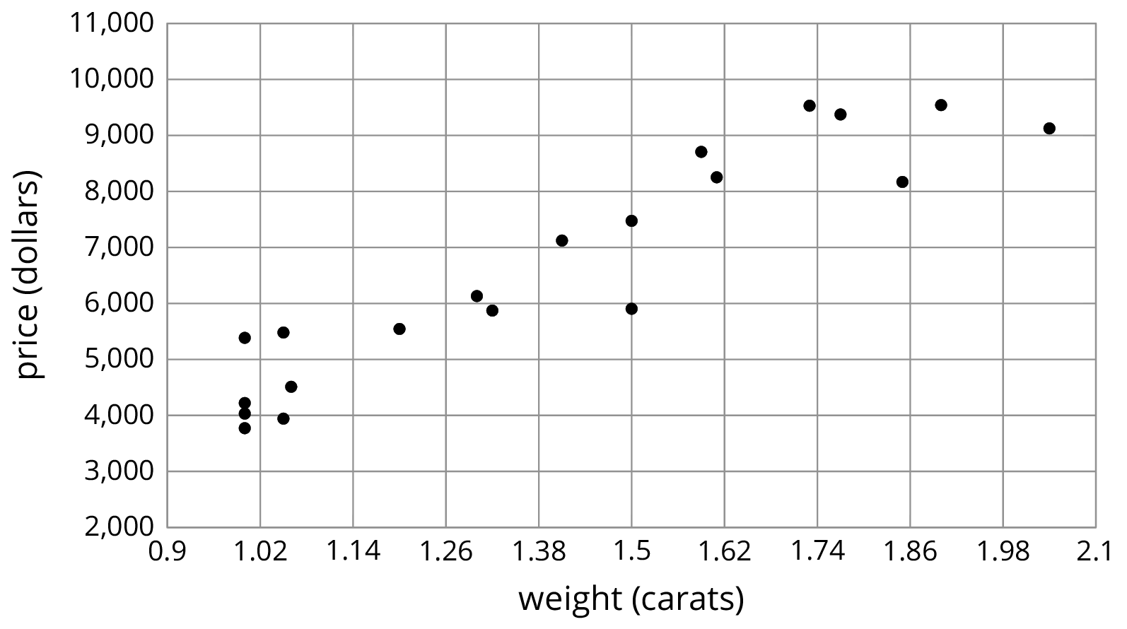
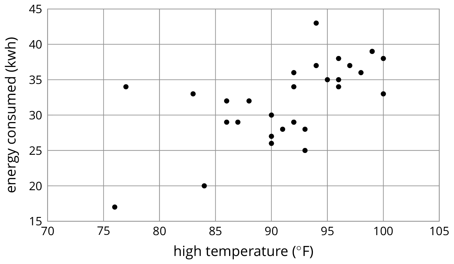
For each scatter plot, decide if there is an association between the two variables, and describe the situation using one of these sentences:
- For these data, as ________________ increases, ________________ tends to increase.
- For these data, as ________________ increases, ________________ tends to decrease.
- For these data, ________________ and ________________ do not appear to be related.
Student Response
For access, consult one of our IM Certified Partners.
Anticipated Misconceptions
Students may assume they need to use each sentence exactly one time. Let them know it is acceptable to use a sentence more than once and that it is acceptable to not use a sentence.
Activity Synthesis
The purpose of the discussion is to talk about trends in data based on the representations in scatter plots.
Consider asking some of the following questions:
- “Is it surprising that the price decreases as mileage increases? Why doesn’t mileage predict price perfectly?” (There are other factors, like whether the car has any damage or has any extra features.)
- “Is it surprising that heavier diamonds cost more? Why doesn’t weight predict price perfectly?” (There are other factors, like the cut, the clarity, etc.)
- “Is it surprising that energy consumption goes up as the temperature increases?” (No, because of air conditioning.)
For the last scatter plot, highlight the outliers by asking:
- “What might cause more energy consumption on a cool day?” (Laundry, using power tools, etc.)
- “What might cause less energy consumption on a hot day?” (Being gone from home, etc.)
Students may notice that the association between high temperature and energy consumed is more variable than the other situations. There is still a positive association or positive trend, but we would describe the association as “weaker.”
Design Principle(s): Support sense-making; Optimize output (for explanation)
6.3: Interpreting Slopes (10 minutes)
Activity
In the previous activity, students noticed trends in the data from the scatter plot. In this activity, the association is made more precise by looking at equations and graphs of linear models for the data to determine the slope. The numerical value of the slope is then interpreted in the context of the problem (MP2).
Launch
Remind students that earlier we looked at the price and mileage of some used cars. We saw that for these used cars, the price tends to decrease as the mileage increases. Display the scatter plot and linear model for the data.
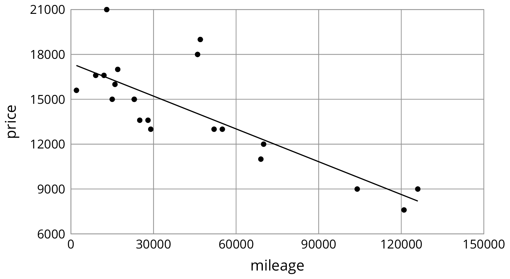
Tell students that an equation for the line is \(y=\text-0.073x+17,\!404.485\). From the equation we can identify the slope of the line as -0.073. Ask students to think about what that slope tells us and give quiet think time. Select 1–2 students to share their thinking. (It means that for every increase of one mile, the model predicts that the price of the car will decrease by $0.073.) Tell students that in this activity they will determine what the slope of the model means for three different sets of data.
Supports accessibility for: Organization; Attention
Design Principle: Maximize meta-awareness; Optimize output (for explanation)
Student Facing
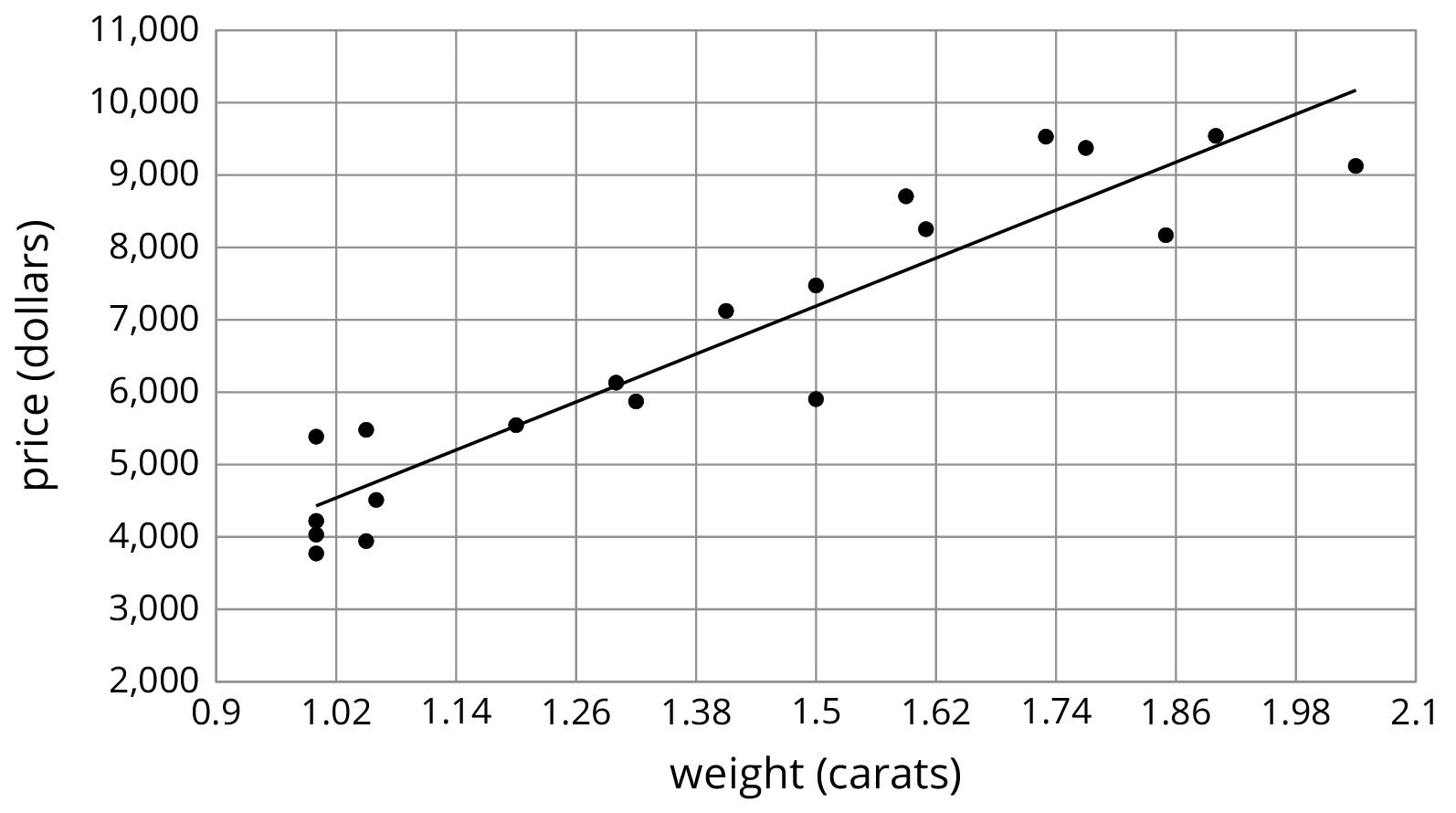
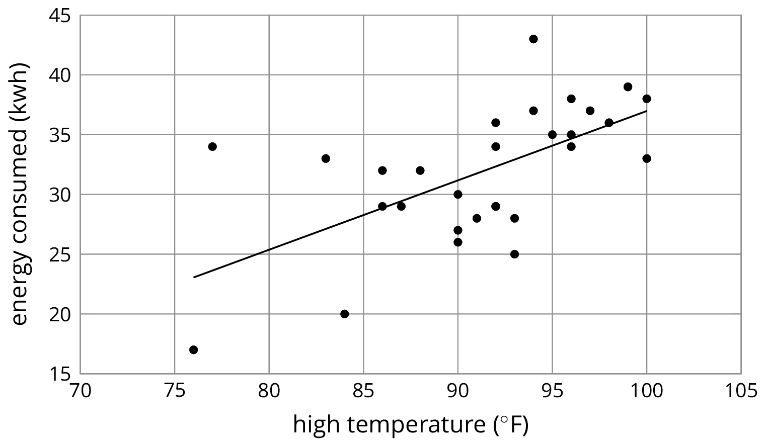
For each of the situations, a linear model for some data is shown.
- What is the slope of the line in the scatter plot for each situation?
- What is the meaning of the slope in that situation?
\(y=5,\!520.619x-1,\!091.393\)
\(y=\text-0.011x+40.604\)

\(y=0.59x-21.912\)
Student Response
For access, consult one of our IM Certified Partners.
Student Facing
Are you ready for more?
The scatter plot shows the weight and fuel efficiency data used in an earlier lesson along with a linear model represented by the equation \(y = \text-0.0114 x +41.3021\).

- What is the value of the slope and what does it mean in this context?
- What does the other number in the equation represent on the graph? What does it mean in context?
- Use the equation to predict the fuel efficiency of a car that weighs 100 kilograms.
- Use the equation to predict the weight of a car that has a fuel efficiency of 22 mpg.
- Which of these two predictions probably fits reality better? Explain.
Student Response
For access, consult one of our IM Certified Partners.
Activity Synthesis
The purpose of this discussion is to develop a quantitative sense of trends based on linear models of the data.
Consider asking some of the following questions:
- “What was the easiest way to find the slope for each situation?” (The coefficient of the \(x\)-coordinate in the equation.)
- “Do the answers for the meaning of the slopes make sense in the contexts of the problem?” (Yes. Diamonds are usually expensive, so a 1 carat increase is likely to cost a lot more. A 1 kilogram difference in the weight of a car is not very much, so it may lower the gas mileage, but not by much. A 1 degree temperature increase is not significant, so it should not need a lot more energy to cool off a building, but some would be needed.)
- “What is the difference between a positive slope and negative slope in your interpretations?” (A positive slope means both variables increase together. A negative slope means that when one variable increases, the other decreases.)
- “The model for energy consumption and temperature predicted a 0.59 kilowatt hour increase in energy consumption for every 1 degree increase in temperature. Estimate how much the temperature would need to increase to raise energy consumption by 6 kilowatt hours.” (A little more than 10 degrees.)
6.4: Positive or Negative? (10 minutes)
Activity
This activity returns to scatter plots without linear models given. Students determine whether the data seems to have a linear association or not. If it does, students are asked to decide whether the variables have a positive or negative association (MP4).
Launch
Tell students that while some data sets have a linear association, others do not. A linear association is present when the points in a scatter plot suggest that a linear model would fit the data well. Some data sets have a non-linear association when the scatter plot suggests that a non-linear curve would fit the data better. Still other data sets have no association when the data appears random and no curve would represent the data well.
In this activity, students first need to identify if data has a linear association or not and, if it does, what type of slope a linear model of the data would have.
Supports accessibility for: Memory; Language
Student Facing
-
For each of the scatter plots, decide whether it makes sense to fit a linear model to the data. If it does, would the graph of the model have a positive slope, a negative slope, or a slope of zero?

- Which of these scatter plots show evidence of a positive association between the variables? Of a negative association? Which do not appear to show an association?
Student Response
For access, consult one of our IM Certified Partners.
Activity Synthesis
The purpose of this discussion is to solidify understanding of trends in scatter plots and look for associations in the data.
Some questions for discussion:
- “What strategy did you use to determine if the data had a linear association?” (If a single line was fairly close to all of the points, I said it has a linear association.)
- “Would you be able to notice a linear association from the data in a table?” (It might be possible by finding the slope between each pair of points and seeing if they are close, but would be very difficult. Using a scatter plot is much easier.)
- “What does it mean to have a positive association?” (When one of the variables increases, the other does, too.)
- “How did you determine if the data had a positive association?” (When the points generally go from the bottom left to the top right, there should be a positive association.)
- “What are other pairs of things that you conjecture would have a negative, linear association?”
Design Principle(s): Optimize output (for explanation)
Lesson Synthesis
Lesson Synthesis
Display the scatter plot for all to see.
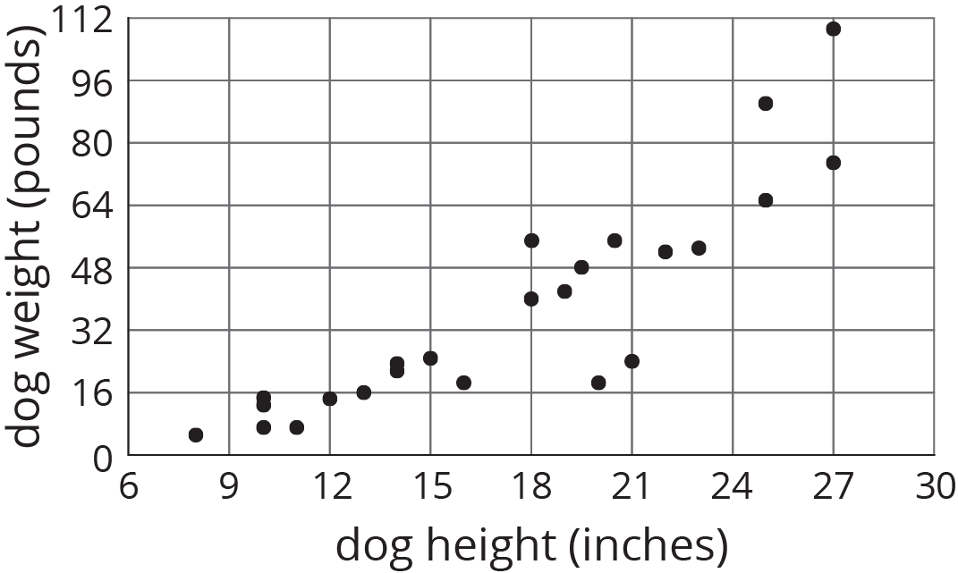
To highlight the main ideas from the lesson about the meaning of the slope of a fitted line, ask:
- “How would you describe the trend in the scatter plot?” (As a the height of a dog increases, its weight tends to increase.)
- “When there is an association between two variables, how can we tell if it is a positive association or a negative one?” (If the dependent variable tends to increase as the independent variable increases, it is a positive association, and if the dependent variable tends to decrease, it is a negative association. Also, a line that is a good fit for the data will have a positive slope (negative slope, respectively).)
- “The slope of a line that models the data is 4.25. What does that tell us about the dogs?” (For every 1 inch increase in dog height, the predicted weight increase is 4.25 pounds.)
6.5: Cool-down - Trends in the Price of Used Cars (5 minutes)
Cool-Down
For access, consult one of our IM Certified Partners.
Student Lesson Summary
Student Facing
Here is a scatter plot that we have seen before. As noted earlier, we can see from the scatter plot that taller dogs tend to weigh more than shorter dogs. Another way to say it is that weight tends to increase as height increases. When we have a positive association between two variables, an increase in one means there tends to be an increase in the other.

We can quantify this tendency by fitting a line to the data and finding its slope. For example, the equation of the fitted line is \(\displaystyle w = 4.27h -37\) where \(h\) is the height of the dog and \(w\) is the predicted weight of the dog.
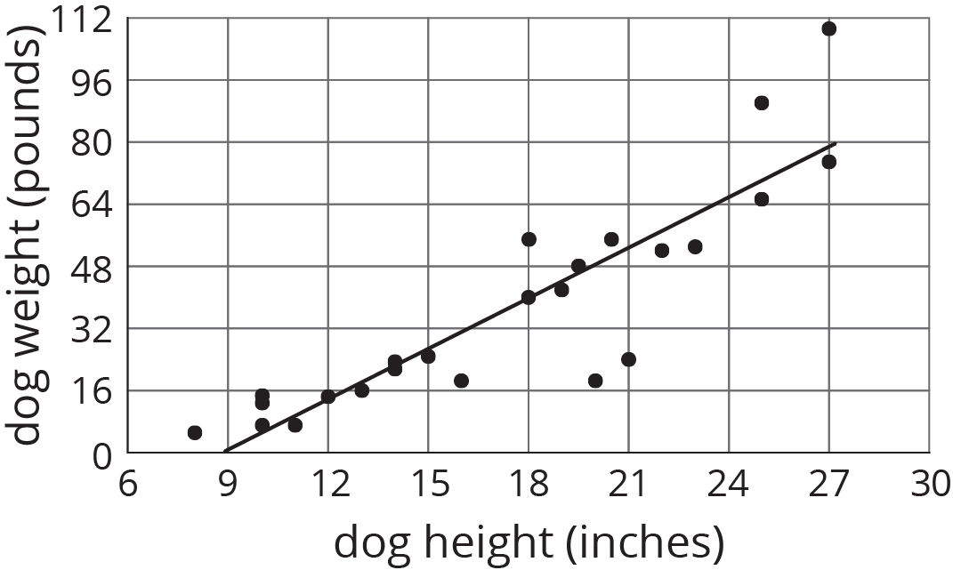
The slope is 4.27, which tells us that for every 1-inch increase in dog height, the weight is predicted to increase by 4.27 pounds.
In our example of the fuel efficiency and weight of a car, the slope of the fitted line shown is -0.01.
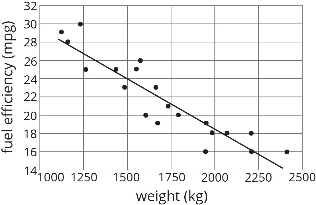
This tells us that for every 1-kilogram increase in the weight of the car, the fuel efficiency is predicted to decrease by 0.01 miles per gallon. When we have a negative association between two variables, an increase in one means there tends to be a decrease in the other.