Lesson 2
Plotting Data
2.1: Representing Data (5 minutes)
Warm-up
In prior grades, students studied different ways of representing sets of data. The purpose of this warm-up is for students to recall ways that two different sets of data can be represented. Data visualization is very useful for understanding patterns that are not visible in other ways. Different representations can highlight different aspects of the data and lead the viewer to see different patterns (MP7).
Students are given two scenarios and asked for appropriate representations. One scenario contains quantitative data (distance run) while the other has categorical data (favorite color). Each scenario can be represented in more than one way. As students work, monitor for different students using a variety of display choices.
Launch
Give students 2 minutes of quiet work time followed by a whole-class discussion.
Ask students to brainstorm different graphical representations of data they have used or seen in the past. Record and display answers for all to see.
Student Facing
Lin surveyed 30 students about the longest time they had ever run. Andre asked them about their favorite color. How could Lin and Andre represent their data sets? Would they represent them in the same way? Why or why not?
Student Response
For access, consult one of our IM Certified Partners.
Activity Synthesis
The purpose of the discussion is for students to think about different representations of data and to emphasize the difference in categorical and numerical data types.
Select previously identified students to share their responses and record for all to see. To highlight the differences between the representations, after each student shares ask:
- "What patterns would Lin be able to see if she represented her data in that way?" (A dot plot would show all of the data, so would be good for showing details. A histogram would give a good overall picture of the data, but would hide details. A box plot would also be useful for showing an overview of the data and would highlight the median, but would not show the individual data values.)
- "What patterns would Andre be able to see if he represented his data in that way?" (A bar graph would be useful for quickly seeing the relative order of color preferences. A circle graph would be useful for quickly seeing how preferred each color is when compared to the whole.)
After the responses have been shared, ask, "Why couldn't Lin and Andre use the same graph type to represent their data?" (Lin has numerical data and Andre has categorical data.)
2.2: Gathering Data (10 minutes)
Activity
Data collection is an important part of any statistics unit. Here, students collect data about a partner using the appropriate tools (MP5) and submit the data for future use.
In a lesson later in the unit, students analyze the class data they collect here using the methods they learn in the next few lessons. A copy of the class's data should be kept. It may be convenient to set up a shared spreadsheet if students have access to Internet-enabled devices.
Note: Some students may be self-conscious about their body measurements. On the other hand, it can be motivating for students to use their own measurements to analyze statistically. Depending on your class, consider collecting the data and analyzing a similar data set in a future lesson (measurements from the staff, a different class, or invented data similar to the data collected).
Launch
Arrange students in groups of 2. Provide access to rulers marked in centimeters.
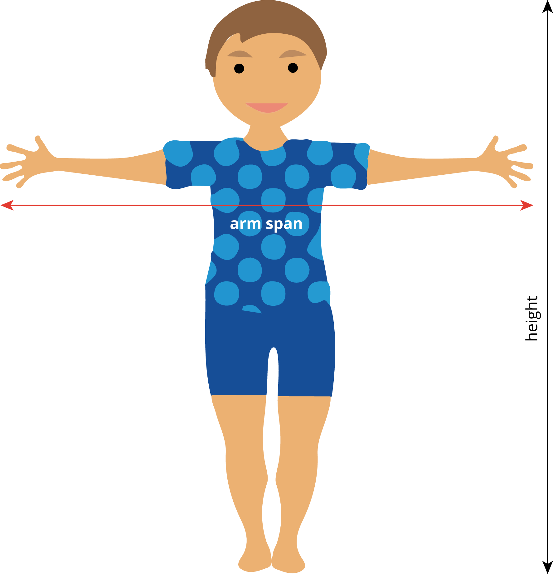
It may be helpful to demonstrate how to measure arm span as defined in the task. An image is included here to aid understanding.
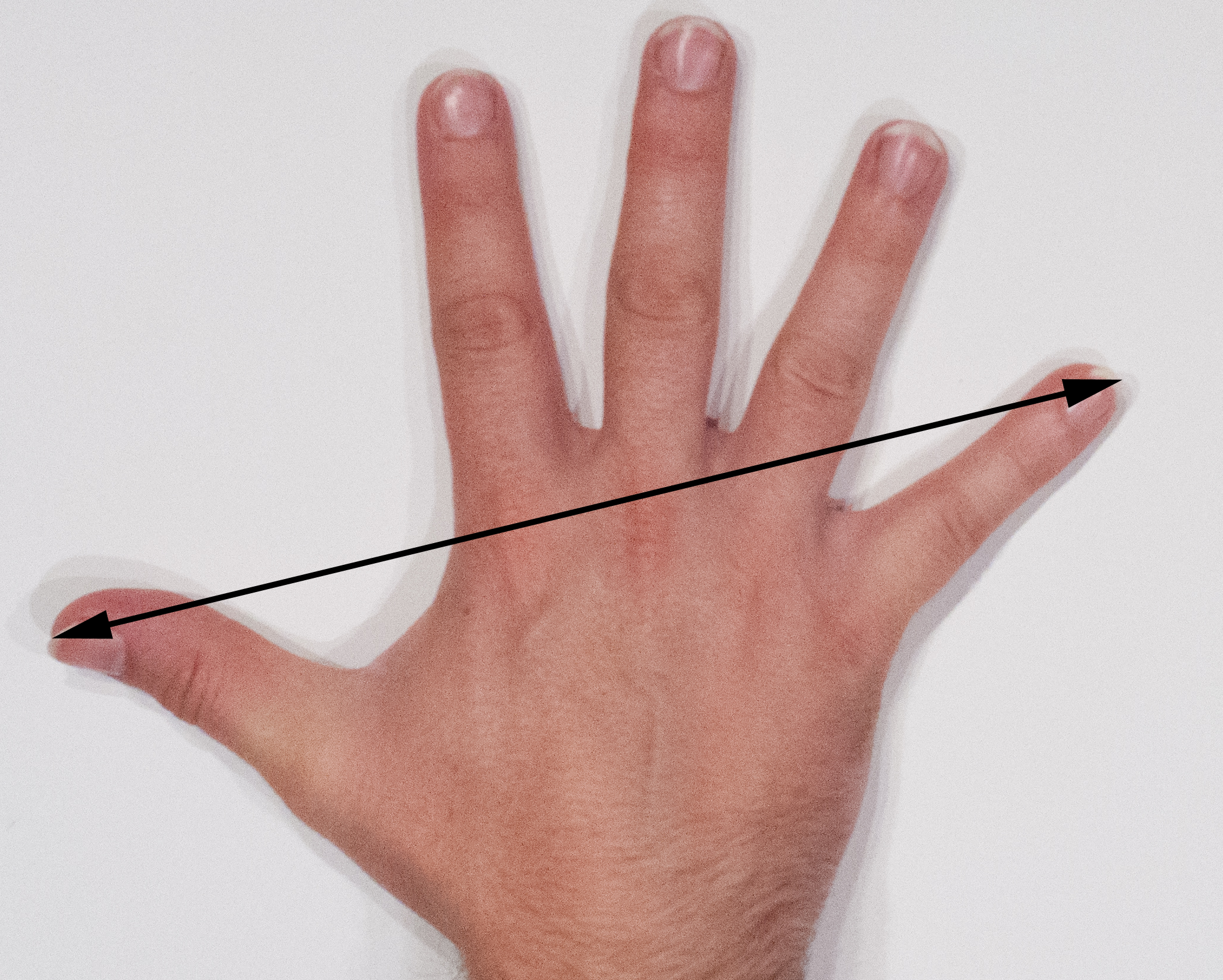
It may also be useful to demonstrate how to measure hand span as defined in the task. An image of this is also included.
Prepare a table with enough rows for the entire class to include their data for all to see. The data will be needed again in a future lesson, so it might be helpful to keep a copy digitally, on a large piece of chart paper, or something that could be brought out again later. It is important to collect this data so that the class will have enough data to look for patterns later, but the data does not need to be connected to individuals, so collecting names attached to the data is not important.
As groups complete their tables, select one student from each group to include their group's data in the table for the entire class. Each student should also have access to the class data for the next activity as well as a for a future lesson.
Supports accessibility for: Attention; Social-emotional skills
Student Facing
Are older students always taller? Do taller students tend to have bigger hands? To investigate these questions, the class will gather data.
- A person’s arm span is the distance between the tips of their index fingers, when their arms are fully spread out.
- A person’s hand span is the distance from the tip of their thumb to the tip of their little finger, when their fingers are fully spread out.
-
Each partner should:
- Measure the other partner’s height, arm span, and hand span for their right hand to the nearest centimeter.
- Record the other partner’s measurements and age (in months) in the table.
height (cm) arm span (cm) hand span (cm) age (months) partner A partner B -
One partner records the data from your table in a table of data for the entire class.
Student Response
For access, consult one of our IM Certified Partners.
Activity Synthesis
The goal for this activity is for students to see the importance of careful data collection as well as an organizational strategy for keeping up with the data as it is collected.
Consider asking some of the following questions:
- "Do you notice any patterns in the data from the table?"
- "Is the class data organized in a way that is useful for noticing patterns?" (Not likely.)
- "How could we reorganize the table to make it more useful?" (Sort from shortest to tallest or youngest to oldest.)
- "What questions do you have about the data?" (Are some of the items related to one another? Do height and hand span have any relationship?)
Design Principle(s): Support sense-making; Optimize output (for explanation)
2.3: Scatter Plots (20 minutes)
Activity
In this activity, students choose appropriate ways to display data using data that comes from the items students measured in the previous activity (MP4).
After drawing the distributions of the individual variables and then the scatter plot, students look for patterns in the data that might not have been visible in the tabular format.
Launch
Keep students in groups of 2. For the sake of time, you may tell students that groups should discuss a plan for working on problems 1 and 2, then each student can create the display individually.
Brainstorm the ways that students can display the distribution of height data. Possibilities include dot plots, histograms, and box plots. Remind students to label axes and include units of measurement (MP6).
If using the digital materials: The digital tools allow students to input the data and quickly view the difference between many graphical representations. Have students discuss the benefits of different graphs for this specific data (height).
Supports accessibility for: Organization; Conceptual processing; Attention
Student Facing
- What types of graphical representations could be used to show the class’s height measurements? Make a graphical representation of the class’s height measurements using these directions for the applet:
- Enter the class height data in column A. Note: enter only one value in each cell, just the height of each student.
- Click on the column header to highlight it.
- Select the One-Variable Analysis tool (the one that looks like a histogram), and a new frame will appear.
- Drag the window open and you will see a histogram of the data.
- Change the type of graph by choosing from the drop-down menu.
-
Make a scatter plot of the heights and hand spans of each student in your class. Enter the class height data into one column and the corresponding hand span data into the other column. The points will appear on the graph as you type them in. To see more of the graph after you have entered in the data, click the double left arrows to minimize the data view.
- Based on your scatter plot, answer these questions:
- Do taller students in your class tend to have bigger hands? Explain how you know.
- Is hand span a linear function of height? Explain how you know.
Student Response
For access, consult one of our IM Certified Partners.
Launch
Keep students in groups of 2. For the sake of time, you may tell students that groups should discuss a plan for working on problems 1 and 2, then each student can create the display individually.
Brainstorm the ways that students can display the distribution of height data. Possibilities include dot plots, histograms, and box plots. Remind students to label axes and include units of measurement (MP6).
If using the digital materials: The digital tools allow students to input the data and quickly view the difference between many graphical representations. Have students discuss the benefits of different graphs for this specific data (height).
Supports accessibility for: Organization; Conceptual processing; Attention
Student Facing
-
What types of graphical representations could be used to show the class’s height measurements? Make a graphical representation of the class’s height measurements.
-
Choose a color and use it to plot a point on the coordinate plane that represents your own height and hand span. Then, in the same color, plot a second point that represents your partner's height and hand span.
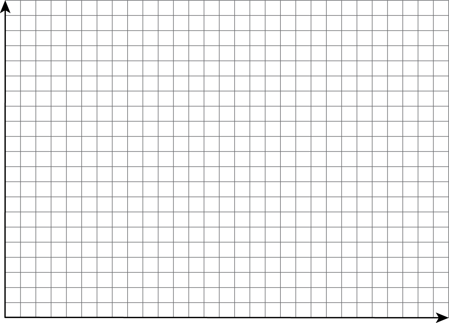
- In a different color, plot the height and hand span of each student in your class, making a scatter plot of the heights and hand spans for the entire class.
- Based on your scatter plot, answer these questions:
- Do taller students in your class tend to have bigger hands? Explain how you know.
- Is hand span a linear function of height? Explain how you know.
Student Response
For access, consult one of our IM Certified Partners.
Student Facing
Are you ready for more?
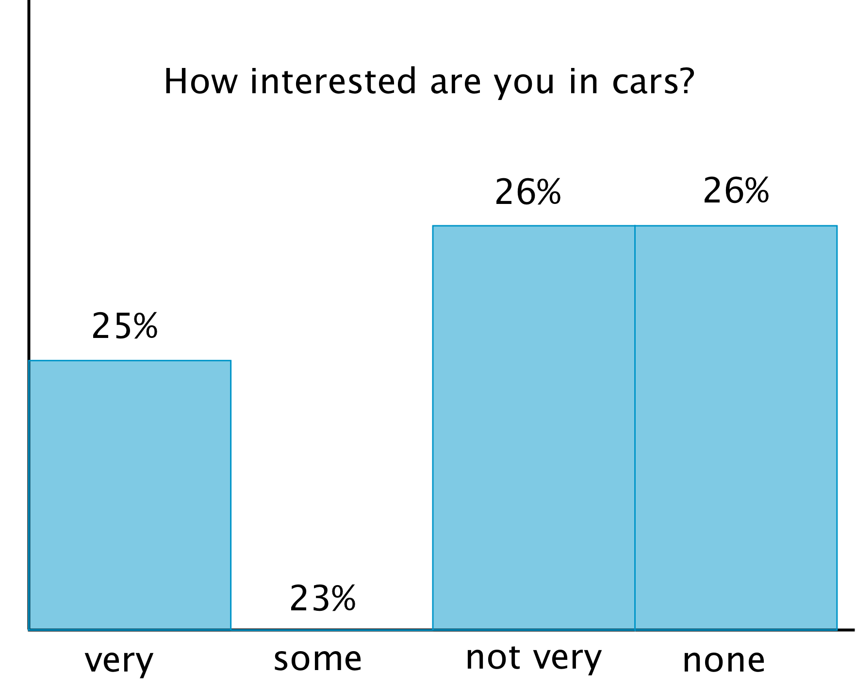
Although the data may be accurate, displaying the data incorrectly can tell the wrong story. What is wrong with each of these graphic representations of the data?

Student Response
For access, consult one of our IM Certified Partners.
Anticipated Misconceptions
Some students may struggle to find a good way to number the axes so that the data is visible, but not misleading. As students have already seen in scatter plots for this unit, it is not essential to start from 0 on a scatter plot. To accurately show the the data, ask students to find the minimum and maximum values in the data set and use those to help think about reasonable boundaries for the left, right, bottom, and top sides of the scatter plot. The increments should be chosen based on the minimum and maximum values of the boundaries.
For example, if the minimum value is 8,532 and the maximum value is 13,456, then the left side of the graph might be 8,000 or 8,500 and the right side 13,500 or 14,000. The grid divisions should not represent steps of 1 (There would be thousands of grid lines!), but rather 300 or so. These values allow all of the data points to fit without them being too clustered together and indistinguishable.
In most cases, estimates of position can be used to plot the points in a scatter plot, but using technology makes it more precise.
Activity Synthesis
The goal of the discussion is for students to explore appropriate data representations including one of the main focuses of the unit: scatter plots.
Select students to share their graphs for height measurements and their scatter plots for heights and hand spans in the class. In particular, look for students who chose to represent the data in a different way.
For example, to graph height data, students could group different heights into bins to graph with a histogram or graph each student's height individually on a dot plot.
Additionally, for the scatter plot, height could be along the \(x\)-axis and hand span along the \(y\)-axis or this could be reversed. If no students have tried these methods, mention them as a possibility. Use MLR 7 (Compare and Connect) to ask what is similar and what is different about the graph when height and hand span are on different axes.
Select a single student's information from the data and ask students to identify where that person's data is represented in each of the displays.
Make sure that students understand the distinction between representations of the distribution of a single variable (height data alone) and this new representation that contains information about two variables at once (height and hand span). Tell students that we will be using scatter plots to look at the relationship between different variables that cannot be seen as easily when we represent the distributions separately.
Design Principle(s): Maximize meta-awareness
Lesson Synthesis
Lesson Synthesis
Compare and contrast the different kinds of representations of data that students worked with in this lesson. Some represent a single categorical variable. Some a single quantitative variable. Scatter plots show the relationship between two variables. Note that we will be using scatter plots extensively in this unit to investigate the relationship between different variables in many different contexts.
To highlight the different representations students created and saw today, ask:
- "When do we use histograms or box plots to represent a data set? When do we use a scatter plot?" (Histograms or box plots are useful when displaying numerical data from a single variable. Scatter plots are more useful when looking for a relationship between two variables that produce numerical data.)
- "What does a point in a scatter plot represent?" (Two measures about a single person or object.)
2.4: Cool-down - Right Side Measurements (5 minutes)
Cool-Down
For access, consult one of our IM Certified Partners.
Student Lesson Summary
Student Facing
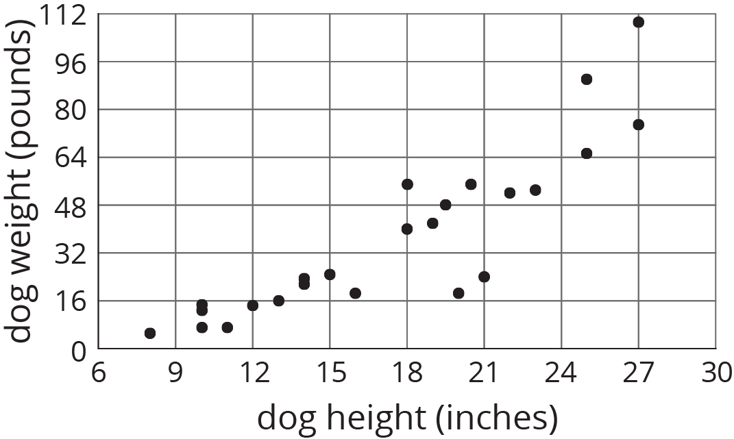
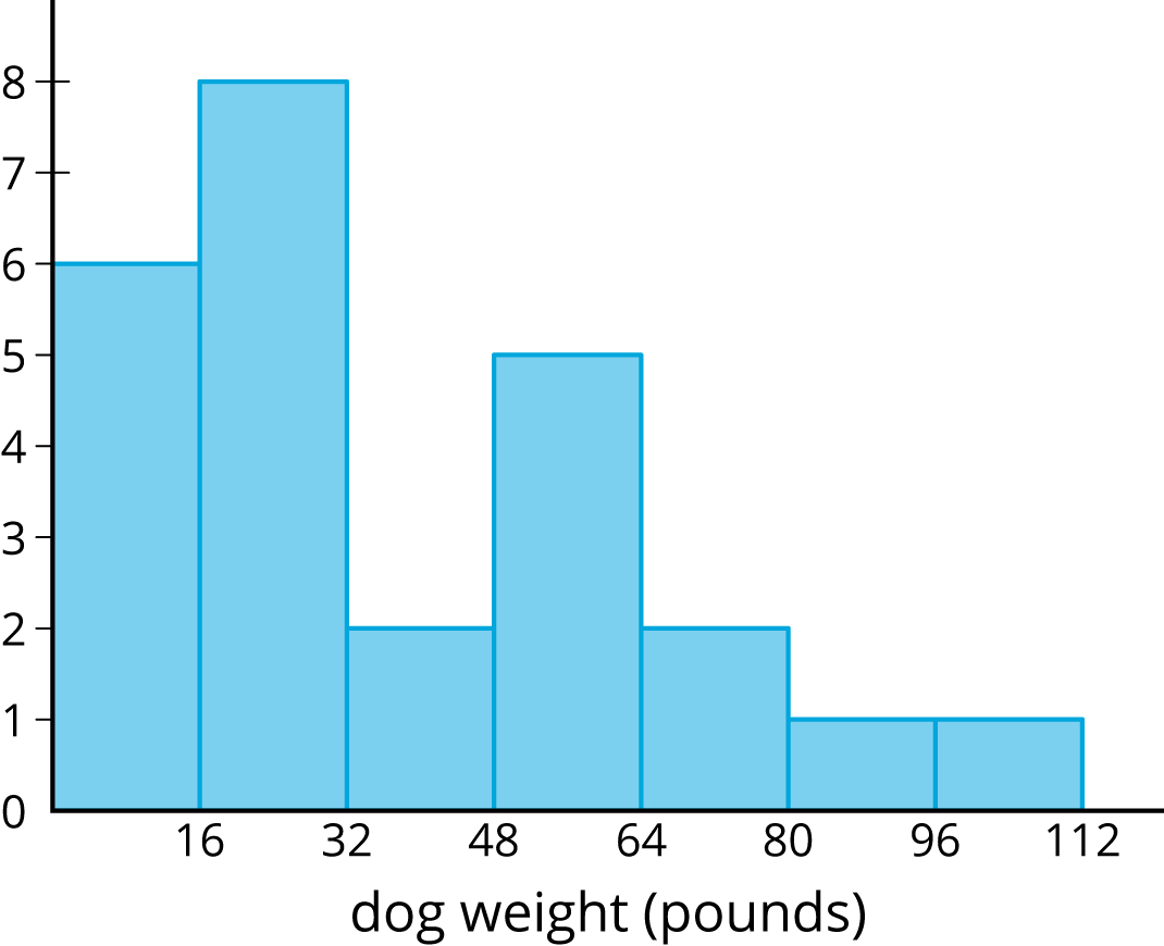
Histograms show us how measurements of a single attribute are distributed. For example, a veterinarian saw 25 dogs in her clinic one week. She measured the height and weight of each dog.
This histogram shows how the weights of the dogs are distributed.
This histogram shows how the heights of the dogs are distributed.
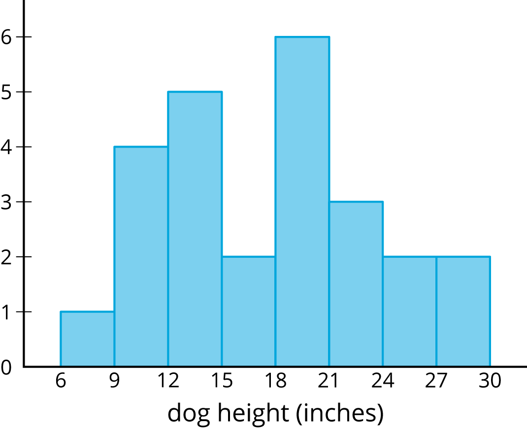
These histograms tell us how the weights of the dogs and how the heights of dogs were distributed. But, they do not give any evidence of a connection between a dog’s height and its weight.
Scatter plots allow us to investigate possible connections between two attributes. In this example, each plotted point corresponds to one of the 25 dogs, and its coordinates tell us the height and weight of that dog. Examination of the scatter plot allows us to see a connection between height and weight for the dogs.
