Lesson 4
Fitting a Line to Data
Problem 1
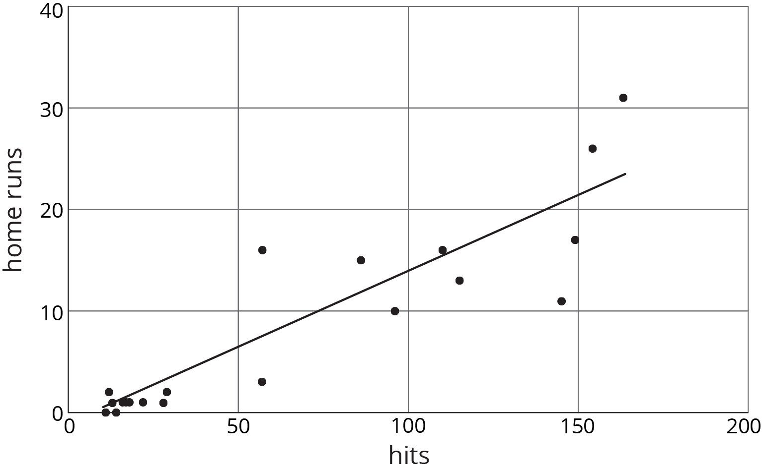
The scatter plot shows the number of hits and home runs for 20 baseball players who had at least 10 hits last season. The table shows the values for 15 of those players.
The model, represented by \(y = 0.15x - 1.5\), is graphed with a scatter plot.

Use the graph and the table to answer the questions.
- Player A had 154 hits in 2015. How many home runs did he have? How many was he predicted to have?
- Player B was the player who most outperformed the prediction. How many hits did Player B have last season?
- What would you expect to see in the graph for a player who hit many fewer home runs than the model predicted?
| hits | home runs | predicted home runs |
|---|---|---|
| 12 | 2 | 0.3 |
| 22 | 1 | 1.8 |
| 154 | 26 | 21.6 |
| 145 | 11 | 20.3 |
| 110 | 16 | 15 |
| 57 | 3 | 7.1 |
| 149 | 17 | 20.9 |
| 29 | 2 | 2.9 |
| 13 | 1 | 0.5 |
| 18 | 1 | 1.2 |
| 86 | 15 | 11.4 |
| 163 | 31 | 23 |
| 115 | 13 | 15.8 |
| 57 | 16 | 7.1 |
| 96 | 10 | 12.9 |
Solution
For access, consult one of our IM Certified Partners.
Problem 2
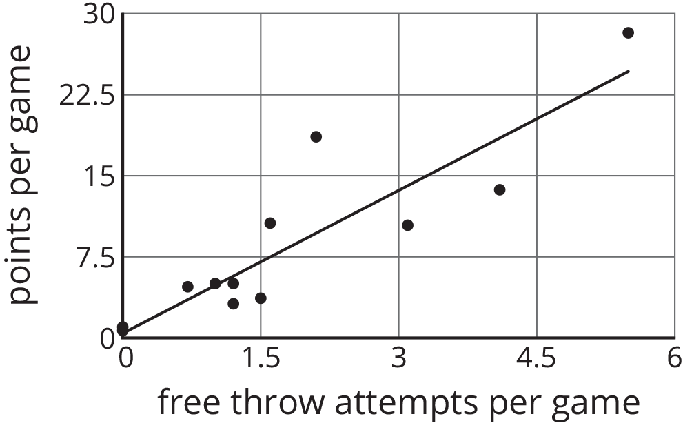
Here is a scatter plot that compares points per game to free throw attempts per game for basketball players in a tournament. The model, represented by \(y = 4.413x + 0.377\), is graphed with the scatter plot. Here, \(x\) represents free throw attempts per game, and \(y\) represents points per game.

- Circle any data points that appear to be outliers.
- What does it mean for a point to be far above the line in this situation?
- Based on the model, how many points per game would you expect a player who attempts 4.5 free throws per game to have? Round your answer to the nearest tenth of a point per game.
- One of the players scored 13.7 points per game with 4.1 free throw attempts per game. How does this compare to what the model predicts for this player?
Solution
For access, consult one of our IM Certified Partners.