Lesson 4
Fitting a Line to Data
Let’s look at the scatter plots as a whole.
4.1: Predict This
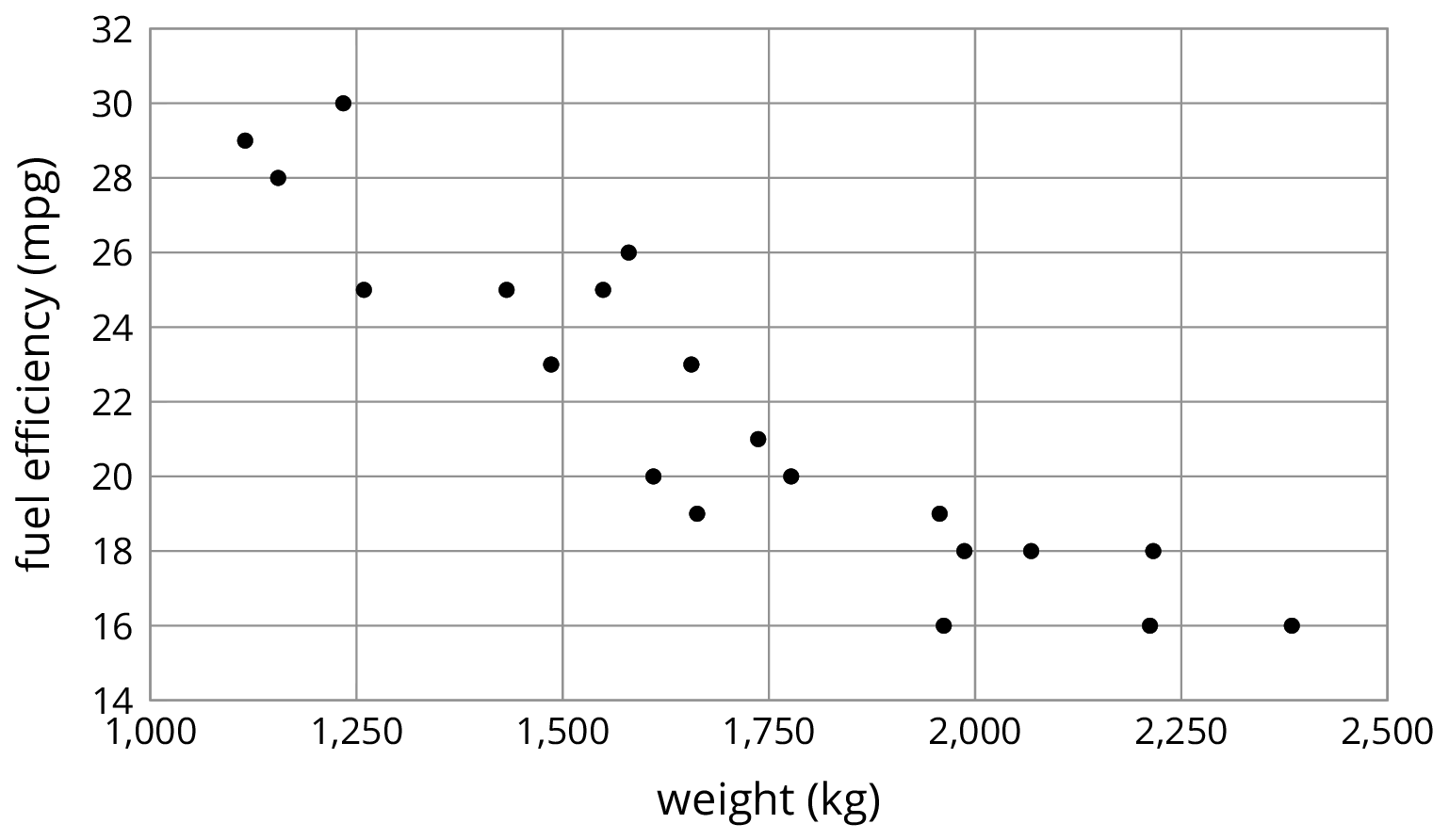
Here is a scatter plot that shows weights and fuel efficiencies of 20 different types of cars.

4.2: Shine Bright
Here is a table that shows weights and prices of 20 different diamonds.
| weight (carats) | actual price (dollars) | predicted price (dollars) |
|---|---|---|
| 1 | 3,772 | 4,429 |
| 1 | 4,221 | 4,429 |
| 1 | 4,032 | 4,429 |
| 1 | 5,385 | 4,429 |
| 1.05 | 3,942 | 4,705 |
| 1.05 | 4,480 | 4,705 |
| 1.06 | 4,511 | 4,760 |
| 1.2 | 5,544 | 5,533 |
| 1.3 | 6,131 | 6,085 |
| 1.32 | 5,872 | 6,195 |
| 1.41 | 7,122 | 6,692 |
| 1.5 | 7,474 | 7,189 |
| 1.5 | 5,904 | 7,189 |
| 1.59 | 8,706 | 7,686 |
| 1.61 | 8,252 | 7,796 |
| 1.73 | 9,530 | 8,459 |
| 1.77 | 9,374 | 8,679 |
| 1.85 | 8,169 | 9,121 |
| 1.9 | 9,541 | 9,397 |
| 2.04 | 9,125 | 10,170 |
The scatter plot shows the prices and weights of the 20 diamonds together with the graph of \(y = 5,\!520x- 1,\!091\).
The function described by the equation \(y = 5,\!520x- 1,\!091\) is a model of the relationship between a diamond’s weight and its price.
This model predicts the price of a diamond from its weight. These predicted prices are shown in the third column of the table.
- Two diamonds that both weigh 1.5 carats have different prices. What are their prices? How can you see this in the table? How can you see this in the graph?
- The model predicts that when the weight is 1.5 carats, the price will be $7,189. How can you see this in the graph? How can you see this using the equation?
- One of the diamonds weighs 1.9 carats. What does the model predict for its price? How does that compare to the actual price?
- Find a diamond for which the model makes a very good prediction of the actual price. How can you see this in the table? In the graph?
- Find a diamond for which the model’s prediction is not very close to the actual price. How can you see this in the table? In the graph?
4.3: The Agony of the Feet
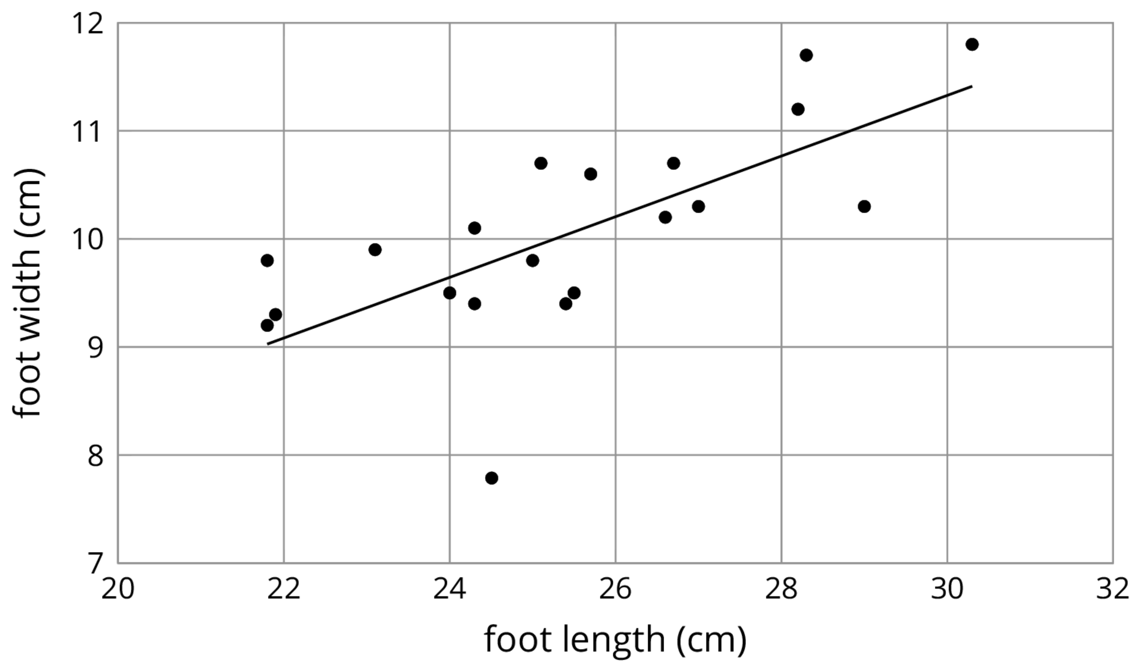
Here is a scatter plot that shows lengths and widths of 20 different left feet. Use the double arrows to show or hide the expressions list.
-
Estimate the widths of the longest foot and the shortest foot.
-
Estimate the lengths of the widest foot and the narrowest foot.
-
Click on the gray circle next to the words “The Line” in the expressions list. The graph of a linear model should appear. Find the data point that seems weird when compared to the model. What length and width does that point represent?

Summary
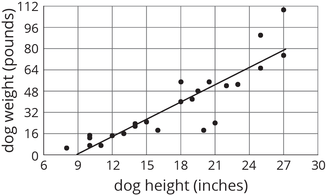
Sometimes, we can use a linear function as a model of the relationship between two variables. For example, here is a scatter plot that shows heights and weights of 25 dogs together with the graph of a linear function which is a model for the relationship between a dog’s height and its weight.

We can see that the model does a good job of predicting the weight given the height for some dogs. These correspond to points on or near the line. The model doesn’t do a very good job of predicting the weight given the height for the dogs whose points are far from the line.
For example, there is a dog that is about 20 inches tall and weighs a little more than 16 pounds. The model predicts that the weight would be about 48 pounds. We say that the model overpredicts the weight of this dog. There is also a dog that is 27 inches tall and weighs about 110 pounds. The model predicts that its weight will be a little less than 80 pounds. We say the model underpredicts the weight of this dog.
Sometimes a data point is far away from the other points or doesn’t fit a trend that all the other points fit. We call these outliers.
Glossary Entries
- outlier
An outlier is a data value that is far from the other values in the data set.
Here is a scatter plot that shows lengths and widths of 20 different left feet. The foot whose length is 24.5 cm and width is 7.8 cm is an outlier.
