Lesson 9
Looking for Associations
Lesson Narrative
In this lesson, students study categorical data displayed in two-way tables, bar graphs, and segmented bar graphs. The different graphical representations help students visualize the frequencies and relative frequencies, aiding them in making judgement about whether there is evidence of an association or not in the next lesson. While the concepts and structures in this lesson are not very complex, there are many new terms and representations, and students are given the opportunity to study them carefully so that they can make sense of them (MP1).
Learning Goals
Teacher Facing
- Calculate relative frequencies, and describe (orally and in writing) associations between variables using a relative frequency table.
- Coordinate (orally and in writing) two-way tables, bar graphs, and segmented bar graphs representing the same data.
Student Facing
Let’s look for associations in data.
Required Materials
Required Preparation
Print and cut up cards from the Matching Representations blackline master. Prepare 1 set of cards for every 2 students.
Learning Targets
Student Facing
- I can identify the same data represented in a bar graph, a segmented bar graph, and a two-way table.
- I can use a two-way frequency table or relative frequency table to find associations among variables.
Glossary Entries
-
relative frequency
The relative frequency of a category tells us the proportion at which the category occurs in the data set. It is expressed as a fraction, a decimal, or a percentage of the total number.
For example, suppose there were 21 dogs in the park, some white, some brown, some black, and some multi-color. The table shows the frequency and the relative frequency of each color.
color frequency relative frequency white 5 \(\frac{5}{21}\) brown 7 \(\frac{7}{21}\) black 3 \(\frac{3}{21}\) multi-color 6 \(\frac{6}{21}\) -
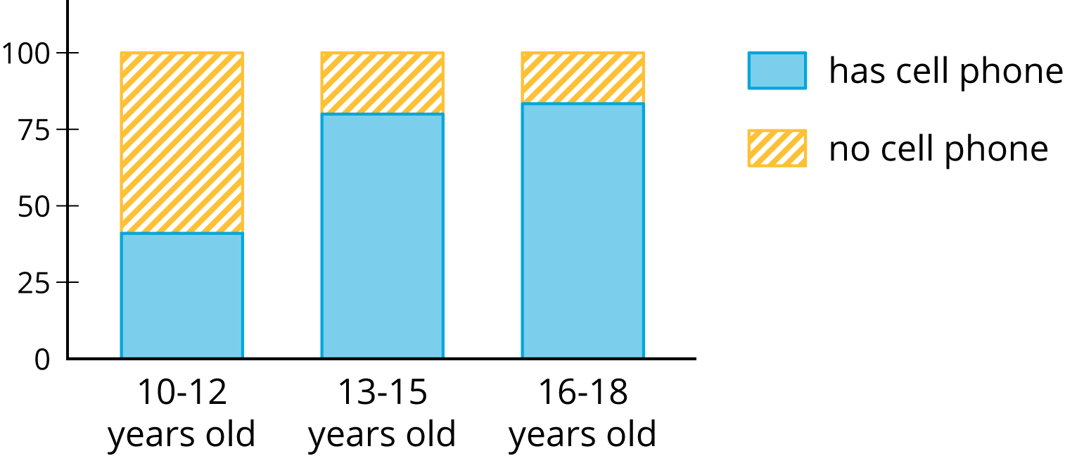
segmented bar graph
A segmented bar graph compares two categories within a data set. The whole bar represents all the data within one category. Then, each bar is separated into parts (segments) that show the percentage of each part in the second category.
-
two-way table
A two-way table provides a way to compare two categorical variables.
It shows one of the variables across the top and the other down one side. Each entry in the table is the frequency or relative frequency of the category shown by the column and row headings.
A study investigates the connection between meditation and the state of mind of athletes before a track meet. This two-way table shows the results of the study.
meditated did not meditate total calm 45 8 53 agitated 23 21 44 total 68 29 97
Print Formatted Materials
For access, consult one of our IM Certified Partners.
Additional Resources
| Google Slides | For access, consult one of our IM Certified Partners. |
|
| PowerPoint Slides | For access, consult one of our IM Certified Partners. |