Lesson 2
Plotting Data
Let’s collect and display some data about the class.
2.1: Representing Data
Lin surveyed 30 students about the longest time they had ever run. Andre asked them about their favorite color. How could Lin and Andre represent their data sets? Would they represent them in the same way? Why or why not?
2.2: Gathering Data
Are older students always taller? Do taller students tend to have bigger hands? To investigate these questions, the class will gather data.
- A person’s arm span is the distance between the tips of their index fingers, when their arms are fully spread out.
- A person’s hand span is the distance from the tip of their thumb to the tip of their little finger, when their fingers are fully spread out.
-
Each partner should:
- Measure the other partner’s height, arm span, and hand span for their right hand to the nearest centimeter.
- Record the other partner’s measurements and age (in months) in the table.
height (cm) arm span (cm) hand span (cm) age (months) partner A partner B -
One partner records the data from your table in a table of data for the entire class.
2.3: Scatter Plots
- What types of graphical representations could be used to show the class’s height measurements? Make a graphical representation of the class’s height measurements using these directions for the applet:
- Enter the class height data in column A. Note: enter only one value in each cell, just the height of each student.
- Click on the column header to highlight it.
- Select the One-Variable Analysis tool (the one that looks like a histogram), and a new frame will appear.
- Drag the window open and you will see a histogram of the data.
- Change the type of graph by choosing from the drop-down menu.
-
Make a scatter plot of the heights and hand spans of each student in your class. Enter the class height data into one column and the corresponding hand span data into the other column. The points will appear on the graph as you type them in. To see more of the graph after you have entered in the data, click the double left arrows to minimize the data view.
- Based on your scatter plot, answer these questions:
- Do taller students in your class tend to have bigger hands? Explain how you know.
- Is hand span a linear function of height? Explain how you know.
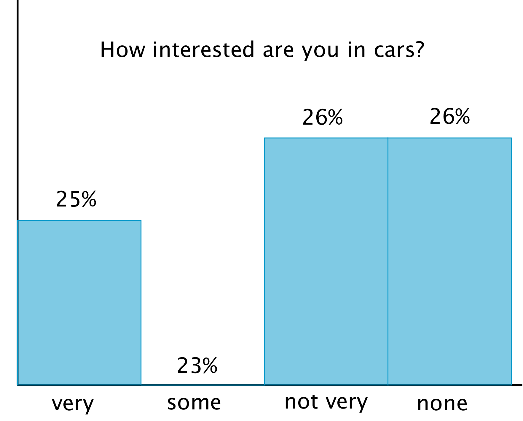
Although the data may be accurate, displaying the data incorrectly can tell the wrong story. What is wrong with each of these graphic representations of the data?


Summary
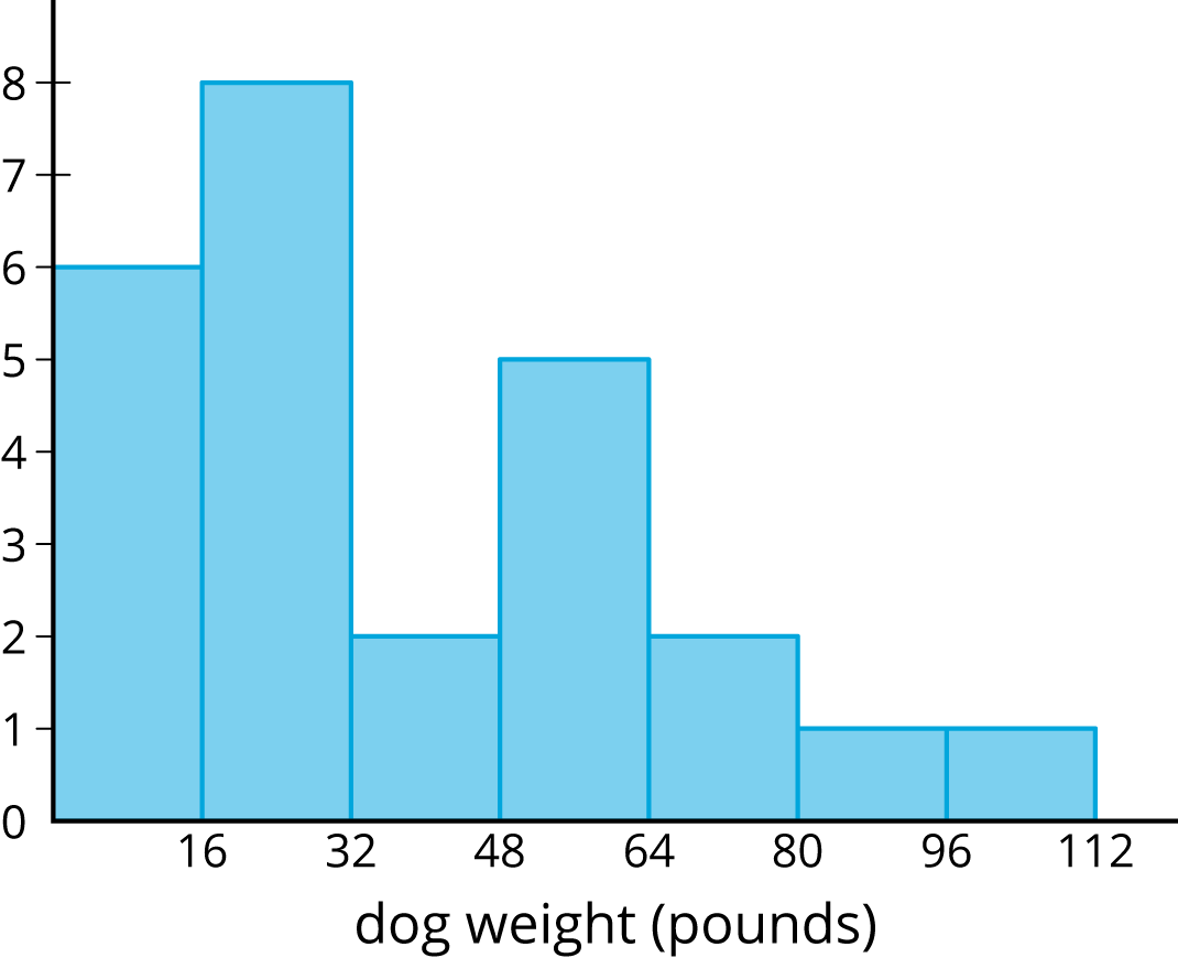
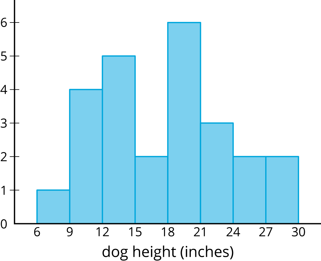
Histograms show us how measurements of a single attribute are distributed. For example, a veterinarian saw 25 dogs in her clinic one week. She measured the height and weight of each dog.
This histogram shows how the weights of the dogs are distributed.

This histogram shows how the heights of the dogs are distributed.

These histograms tell us how the weights of the dogs and how the heights of dogs were distributed. But, they do not give any evidence of a connection between a dog’s height and its weight.
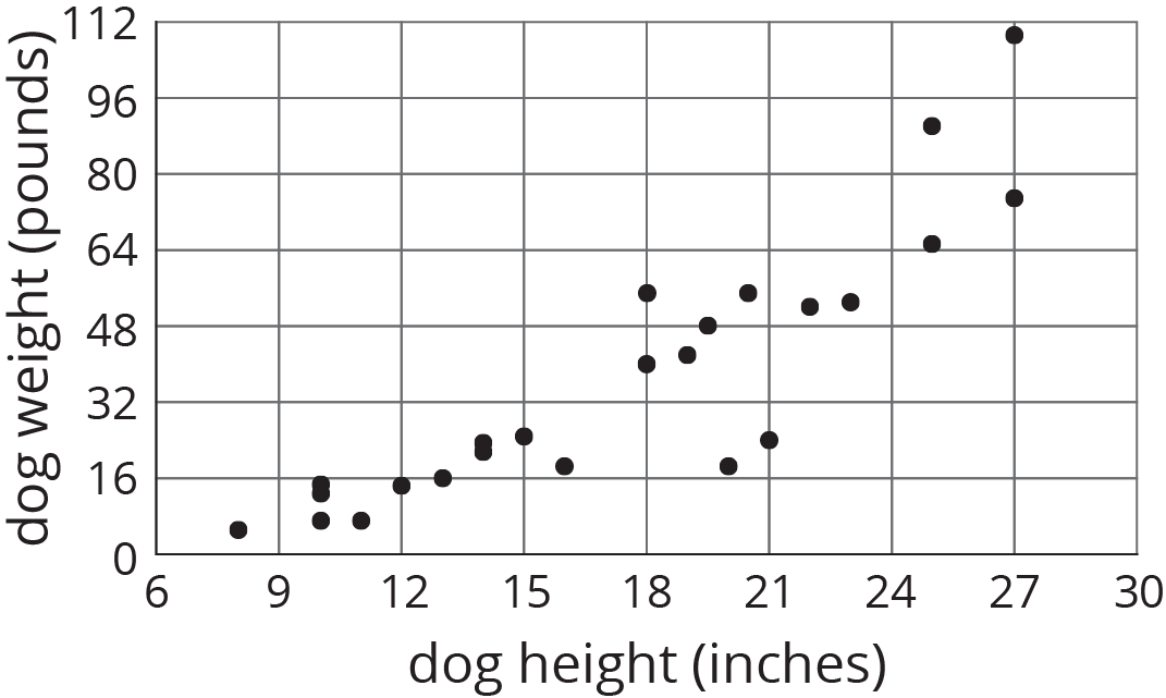
Scatter plots allow us to investigate possible connections between two attributes. In this example, each plotted point corresponds to one of the 25 dogs, and its coordinates tell us the height and weight of that dog. Examination of the scatter plot allows us to see a connection between height and weight for the dogs.

Glossary Entries
- scatter plot
A scatter plot is a graph that shows the values of two variables on a coordinate plane. It allows us to investigate connections between the two variables.
Each plotted point corresponds to one dog. The coordinates of each point tell us the height and weight of that dog.
