Lesson 8
Interpreting and Creating Graphs
8.1: Which One Doesn't Belong: Temperature Over Time (5 minutes)
Activity
This warm-up prompts students to carefully analyze and compare the properties of four graphs. Each graph represents a function relating time and temperature. No scales are shown on the coordinate axes, so students need to look for and make use of the structure of the graphs in determining how each one is like or unlike the others (MP7).
In making comparisons, students have a reason to use language precisely (MP6), especially recently learned terms that describe features of graphs.
Launch
Arrange students in groups of 2–4. Display the graphs for all to see. Give students 1 minute of quiet think time and then time to share their thinking with their small group. In their small groups, ask each student to share their reasoning as to why a particular item does not belong, and together, find at least one reason each item doesn’t belong.
Student Facing
Which graph doesn’t belong?
A

B

C

D

Student Response
For access, consult one of our IM Certified Partners.
Activity Synthesis
Ask each group to share one reason why a particular item does not belong. Record and display the responses for all to see. Encourage students to use relevant mathematical vocabulary in their explanations, and ask students to explain the meaning of any terminology that they do use, such as “intercepts,” “minimum,” or “linear functions.”
After each response, ask the class if they agree or disagree. Since there is no single correct answer to the question asking which one does not belong, attend to students’ explanations and ensure the reasons given are correct. Also, press students on unsubstantiated claims. For example, if they claim that the vertical intercept of graph C is different than all the others, ask them how they know (as none of the vertical axes have a scale).
8.2: Flag Raising (Part 1) (20 minutes)
Activity
Prior to this point, students have had multiple opportunities to interpret graphs of functions in terms of a situation. In most cases, students were given some information about the units of measurement of at least one quantity, which helped them reason about the functions being represented.
In this activity, students encounter graphs without units on either of the axes. They interpret the graphs in the context of raising a flag and make a case for whether the graphs are realistic (which may depend on the units chosen for the axes). Students also see for the first time a graph that is a vertical line and think about why this graph does not represent a function.
As students relate features of graphs to behaviors of quantities in a situation, they reason quantitatively and abstractly (MP2). In explaining and discussing why a graph is or is not realistic, students practice constructing logical arguments and critiquing the reasoning of others (MP3).
Launch
Show pictures of a flag ceremony and describe flag raising to students who might be unfamiliar with it. Consider sharing that, in some countries, students hold a flag-raising ceremony on a daily or weekly basis.
Arrange students in groups of 2. Ask students to read the task statement and look at graphs. Then, give students a moment of quiet time to think about the following questions, and then time to share their thinking with their partner. Follow with a brief whole-class discussion.
- “What might be reasonable units to use for the axes of the graphs?”
- “How do we know that each graph represents a function?”
Students are likely to suggest seconds as a reasonable unit to use for time and meters or yards as a reasonable unit for height. If these units are not mentioned, ask students about them.
Next, tell partners to take turns interpreting the graphs in the first question. Ask students to pause for a discussion before moving to the second question.
Supports accessibility for: Language; Social-emotional skills
Student Facing
A flag ceremony is held at a Fourth of July event. The height of the flag is a function of time.
Here are some graphs that are each a possible representation of the function.

A

B

C

D

E

F

-
- For each graph assigned to you, explain what it tells us about the flag.
- Decide as a group which graph(s) appear to be most realistic and which ones least realistic.
-
Here is another graph that relates time and height.

- Can this graph represent the time and height of the flag? Explain your reasoning.
- Is this a graph of a function? Explain your reasoning.
Student Response
For access, consult one of our IM Certified Partners.
Student Facing
Are you ready for more?
Suppose an ant is moving at a rate of 1 millimeter per second and keeps going at that rate for a long time.
If time, \(x\), is measured in seconds, then \(y\), the distance the ant has traveled in millimeters, is \(y=1x\). If time, \(x\), is measured in minutes, the distance in millimeters is \(y=60x\).
- Explain why the equation \(y=(365 \boldcdot 24 \boldcdot 3,\!600)x\) gives the distance traveled in millimeters over time, \(x\), measured in years.
-
Here is a graph of the equation.
- Label the axes with appropriate quantities and units.
- Does the graph look like that of a function? Why do you think it looks this way?
- Adjust the graphing window until the graph no longer looks this way. If you manage to do so, describe the graphing window that you use.
- Do you think the last graph in the flag activity could represent a function relating time and height of flag? Explain your reasoning.
Student Response
For access, consult one of our IM Certified Partners.
Launch
Show pictures of a flag ceremony and describe flag raising to students who might be unfamiliar with it. Consider sharing that, in some countries, students hold a flag-raising ceremony on a daily or weekly basis.
Arrange students in groups of 2. Ask students to read the task statement and look at graphs. Then, give students a moment of quiet time to think about the following questions:
- “What might be reasonable units to use for the axes of the graphs?”
- “How do we know that each graph represents a function?”
Give students a moment to share their thinking with their partner. Follow with a brief whole-class discussion.
Students are likely to suggest seconds as a reasonable unit to use for time and meters or yards as a reasonable unit for height. If these units are not mentioned, ask students about them.
Next, tell partners to take turns interpreting the graphs in the first question. Ask students to pause for a discussion before moving to the second question.
Supports accessibility for: Language; Social-emotional skills
Student Facing
A flag ceremony is held at a Fourth of July event. The height of the flag is a function of time.
Here are some graphs that could each be a possible representation of the function.
A
B
C
D
E
F
-
-
For each graph assigned to you, explain what it tells us about the flag.
Graph: \(\underline{\hspace{0.5in}}\)
- Decide as a group which graph(s) appear to be most realistic and which ones least realistic.
-
-
Here is another graph that relates time and height.
- Can this graph represent the time and height of the flag? Explain your reasoning.
- Is this a graph of a function? Explain your reasoning.
Student Response
For access, consult one of our IM Certified Partners.
Student Facing
Are you ready for more?
Suppose an ant is moving at a rate of 1 millimeter per second and keeps going at that rate for a long time.
If time, \(x\), is measured in seconds, then the distance the ant has traveled in millimeters, \(y\), is \(y=1x\). If time, \(x\), is measured in minutes, the distance in millimeters is \(y=60x\).
- Explain why the equation \(y=(365 \boldcdot 24 \boldcdot 3,\!600)x\) gives the distance the ant has traveled, in millimeters, as a function of time, \(x\), in years.
-
Use graphing technology to graph the equation.
- Label the axes with appropriate quantities and units.
- Does the graph look like that of a function? Why do you think it looks this way?
- Adjust the graphing window until the graph no longer looks this way. If you manage to do so, describe the graphing window that you use.
- Do you think the last graph in the flag activity could represent a function relating time and height of flag? Explain your reasoning.
Student Response
For access, consult one of our IM Certified Partners.
Activity Synthesis
Select students to explain what each graph means in the context of flag raising and give an argument as to why it is or is not realistic. Consider asking partners to illustrate their response together—one partner explaining what is happening with the flag and the other to act out the action of the flag raiser.
Discuss with students which graph is the most realistic and why. Also discuss whether using certain units of measurements would make an unrealistic graph more realistic, or vice versa. (For example, none of the graphs would be realistic if the time is measured in days or months and the height in kilometers or centimeters.)
Next, solicit some explanations as to why the vertical line does not represent a function. If not mentioned in students' explanations, bring up a key point: A vertical line can be interpreted to mean that for one particular input (3 units of time, in this case), there is an infinite number of possible outputs, therefore it cannot represent a function.
8.3: Flag Raising (Part 2) (10 minutes)
Activity
Previously, students analyzed several graphs to see if they could represent the height of a flag being raised in a ceremony. In this activity, students watch a video of a flag being raised. They sketch a possible graph to represent the height of the flag as a function of time, and then use their graphs to estimate the rate of change of the flag.
Students’ graphs do not need to be very precise, but should capture key features of the situation. To do so, students need to make some estimates. For example, they need to gauge the starting height of the flag, the height of the pole, the heights at which pauses happened, whether the flag was moving at a constant rate between the pauses, and so on. Students also need to make some decisions about the graph, for instance: the scale to use on each axis, whether the graph should be discrete or continuous, and so on. Along the way, students engage in aspects of modeling (MP4).
If desired and if possible, provide each student or each group with access to the video so students can replay the clip a few times, as needed. As students work, identify those who make different decisions for their graph and can explain their rationale. Ask them to share their work later.
If time is limited, focus work time and discussion on the graphing portion (the first question).
Launch
Tell students that they will watch a video of a flag being raised and their job is to sketch a graph that represents the height of the flag, in feet, as a function of time, in seconds. Explain to students that their graphs do not need to be precise and some estimations are required, but the graphs should reasonably capture the movement of the flag.
Before playing the video, ask students to think about what information or quantities to look for while watching the video. If possible, record and display their ideas for all to see.
Here are videos that show the same clip of a flag being raised, played back at full speed and half speed. Show one or more of the videos for all to see. Students may wish to see the slower version a few times to help them sketch a graph.
Full speed:
Half speed:
Student Facing
Your teacher will show a video of a flag being raised. Function \(H\) gives the height of the flag over time. Height is measured in feet. Time is measured in seconds since the flag is fully secured to the string, which is when the video clip begins.
- On the coordinate plane, sketch a graph that could represent function \(H\). Be sure to include a label and a scale for each axis.

- Use your graph to estimate the average rate of change from the time the flag starts moving to the time it stops. Be prepared to explain what the average rate of change tells us about the flag.
Student Response
For access, consult one of our IM Certified Partners.
Anticipated Misconceptions
Some students may have trouble starting their graphs because they don’t know what upper limits to use for the axes. Ask them to watch the video clip again and try to gather some information that may help them decide on the upper limits. Assure them that some estimation and decision making are necessary.
Activity Synthesis
Select previously identified students to share their graph and explain their drawing decisions. If time permits, display the graphs for all to see and briefly discuss:
- how the graphs are alike and how they are different
- key features such as intercepts, maximum, minimum, and intervals when the function increases, remains constant, or decreases
If time permits, invite a couple of students to share how they used their graph to estimate the flag’s average rate of change. Emphasize that the average rate of change (which would vary for different graphs) represents how fast, on average, the flag was moving from the time it started being raised until the time it reached the top of the pole.
Design Principle(s): Cultivate conversation
8.4: Two Pools (20 minutes)
Optional activity
This optional activity allows students to practice creating graphs of functions based on verbal descriptions. Students sketch graphs that could represent the heights of water in two pools, each as a function of time since the pools start to be filled.
The modeling demand in this activity is higher than in previous activities, as students are given less quantitative information and therefore need to make more assumptions and decisions (MP4). For example, they need to consider whether and how the shape and size of each pool affect the rate at which the water rises, how much longer it would take to fill the large pool compared to the small pool, how moving a hose from one pool to the other changes the graph of each function, and so on.
Students are not expected to draw precise graphs. What is more important is that the graphs of the two functions are comparatively correct and reasonable in terms of the situation, that students consider the quantities carefully, and that they can explain their decisions.
As students work, look for different assumptions and decisions students make that result in a variety of graphs. Consider asking them to share their graphs and reasoning during the whole-class discussion.
Launch
Arrange students in groups of 2. Ask students to read the activity statement and be prepared to ask any clarifying questions about the task.
After answering students’ questions, give students a few minutes of quiet time to sketch the graphs for the first situation and then time to discuss the graphs with their partner. Tell partners to discuss their assumptions about the situation and the reasonableness of the graphs based on those assumptions. Ask them to revise their graphs based on each other’s feedback.
Consider selecting a few students to share their graphs and graphing decisions before the class continues to the second and third situations. Discuss questions such as:
- “The water in both hoses flows at a constant rate. Did you assume the constant rate in one hose to be the same as the constant rate in the other hose?”
- “Did you assume that the water for the two hoses was turned on at the same time?”
- “What assumptions did you make about the shape and size of each pool? Did you assume the pools to have the same area for their base and just have different heights, or that they have different areas?”
- “What assumptions did you make about how water was rising in each pool?”
Supports accessibility for: Visual-spatial processing
Student Facing
To prepare for a backyard party, a parent uses two identical hoses to fill a small pool that is 15 inches deep and a large pool that is 27 inches deep.
The height of the water in each pool is a function of time since the water is turned on.
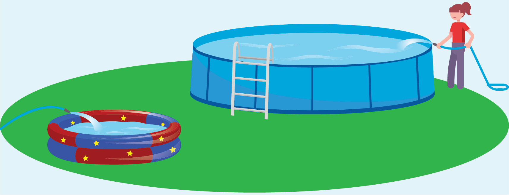
Here are descriptions of three situations. For each situation, sketch the graphs of the two functions on the same coordinate plane, so that \(S(t)\) is the height of the water in the small pool after \(t\) minutes, and \(L(t)\) is the height of the water in the large pool after \(t\) minutes.
In both functions, the height of the water is measured in inches.
- Situation 1: Each hose fills one pool at a constant rate. When the small pool is full, the water for that hose is shut off. The other hose keeps filling the larger pool until it is full.

- Situation 2: Each hose fills one pool at a constant rate. When the small pool is full, both hoses are shut off.
- Situation 3: Each hose fills one pool at a constant rate. When the small pool is full, both hoses are used to fill the large pool until it is full.
Student Response
For access, consult one of our IM Certified Partners.
Anticipated Misconceptions
Some students might mistakenly think that when the pools are “full,” the water in each pool has reached the same height. Remind students that the two pools have different heights, so it takes different heights of water to make them full.
Activity Synthesis
Invite or select students to share their graphs and the assumptions and decisions they made as they were graphing. Display graphs that correctly represent the same situation but look different because of variation in assumptions.
Discuss questions such as:
- “How would the vertical values of the two graphs compare when the pools are full?” (The vertical value of the large pool would be up to 12 inches greater than that of the small pool because the large pool is 12 inches taller than the small pool.)
- “When each pool is being filled by one hose and at the same rate, should the two graphs have the same slope? Why or why not? If not, which graph has a greater slope?” (No. The water in the smaller pool rises more quickly because the area of the pool is smaller, so the slope for that graph should be greater.)
- “How would the graph of the large pool change when one hose was moved from the small pool to the large pool? Would its slope increase, decrease, or stay the same?” (The slope of the graph for the large pool would double, because water is now rising at twice its previous rate. The graph for the small pool would stay constant, as the water is no longer increasing in height.)
Design Principle(s): Support sense-making
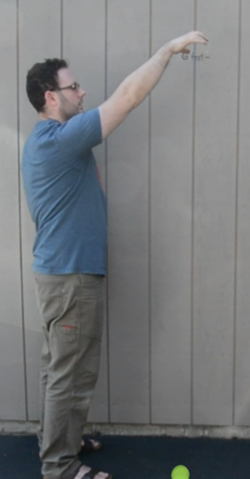
8.5: The Bouncing Ball (15 minutes)
Optional activity
This optional activity gives students another opportunity to represent the quantities in a situation with a table and a graph, identify key features of the graph, and interpret those features in terms of the situation.
Launch
The following are some videos that show the same clip of a ball being dropped, but played back at different speeds. Show one or more of the videos for all to see. Before showing the videos, ask students to think about what information or quantities to look for while watching the videos.
- At the original speed:
Video Tennis Ball Drop (Full Speed) available at https://player.vimeo.com/video/304121518. - At half speed:
Video Tennis Ball Drop (Half Speed) available at https://player.vimeo.com/video/313399597. - At quarter speed:
Video Tennis Ball Drop (Quarter Speed) available at https://player.vimeo.com/video/313399606.
If possible, allow students to replay the videos several times to help them sketch as accurate a graph as possible. Alternatively, give students individual access to the interactive applet, if available.
Design Principle(s): Optimize output (for explanation); Cultivate conversation
Student Facing
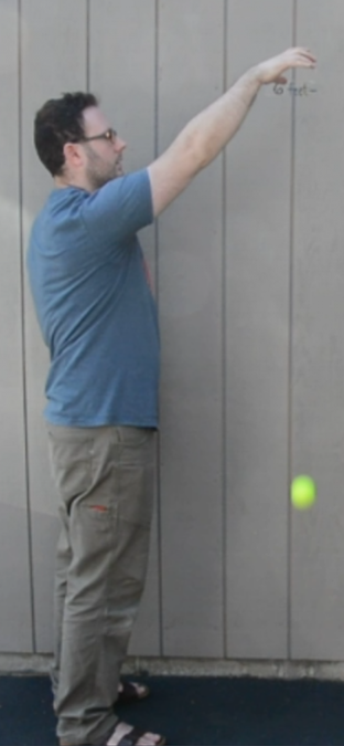
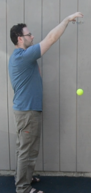
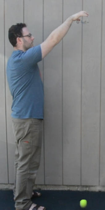
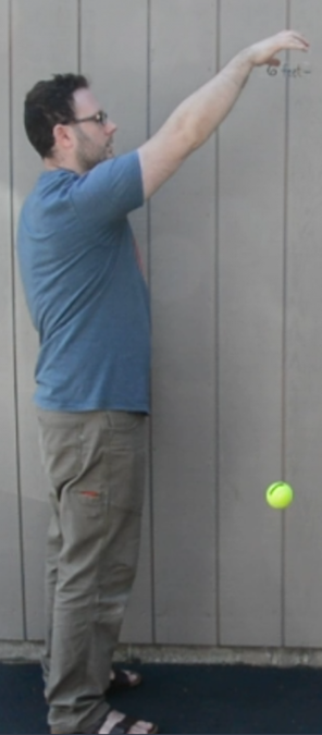
Your teacher will show you one or more videos of a tennis ball being dropped. Here are some still images of the situation.
The height of the ball is a function of time. Suppose the height is \(h\) feet, \(t\) seconds after the ball is dropped.
-
Use the blank coordinate plane to sketch a graph of the height of the tennis ball as a function of time.
To help you get started, here are some pictures and a table. Complete the table with your estimates before sketching your graph.
0 seconds
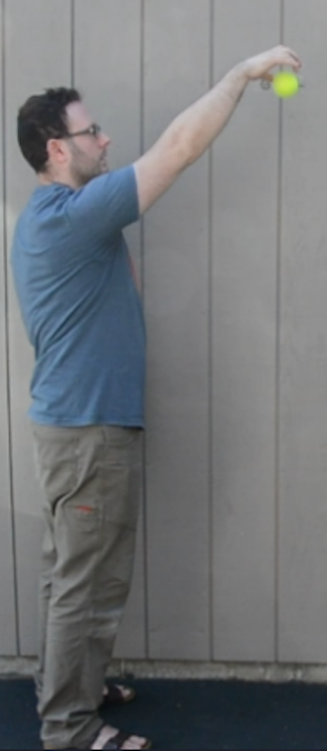
0.28 seconds
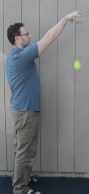
0.54 seconds
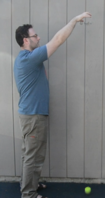
0.74 seconds
1.03 seconds
1.48 seconds
1.88 seconds
2.25 seconds
time
(seconds)height
(feet)0 0.28 0.54 0.74 1.03 1.48 1.88 2.25 
- Identify horizontal and vertical intercepts of the graph. Explain what the coordinates tell us about the tennis ball.
- Find the maximum and minimum values of the function. Explain what they tell us about the tennis ball.
Student Response
For access, consult one of our IM Certified Partners.
Student Facing
Are you ready for more?
If you only see the still images of the ball and not the video of the ball bouncing, can you accurately graph the height of the ball as a function of time? Explain your reasoning.
Student Response
For access, consult one of our IM Certified Partners.
Anticipated Misconceptions
Some students may mistake the horizontal axis on the graph to represent horizontal distance rather than time. Because the movement of the bouncing ball is primarily up and down (except toward the end, when it began rolling), these students might sketch a graph that is essentially a series of overlapping vertical segments. Ask them to revisit the input variable and what the horizontal axis represents. Then, ask them to plot some points for different values of \(t\).
Activity Synthesis
Discuss how students translated the movement of the dropped ball into a graph and on the connections between the graph and the situation. Ask questions such as:
- “Which parts of the ball’s movement did you find easier to plot more precisely? Which parts require estimating?” (The original position of the ball when it was released and the points when it hit the ground were easier to plot because they were more distinct and obvious. The points when the ball reached a peak and changed direction required a bit of estimation. The points between the peaks and the bounces were mainly estimated.)
- “In this case, the horizontal intercepts are also the minimums of the graph. Why is that?” (The ball could not have a height that is less than 0. The lowest point it could be is 0 feet.)
- “What happened to the output value, \(h\), as the input value, \(t\), increased?” (Overall, the output decreased as \(t\) increased, but there were intervals—whenever the ball bounced up—in which the height of the ball increased as time increased.)
If time permits, discuss students’ responses to the last two questions.
Lesson Synthesis
Lesson Synthesis
Representing a function with a graph requires careful attention to the behavior of the quantities in the situation. To reinforce this idea, tell students that they will observe you walking from one end of the classroom to the other, and suppose they were to graph your distance from the starting point as a function of time.
Ask students to notice any characteristics of the movement that would affect the output of this function and show up as distinct features on a graph.
Walk from one side of the classroom to the other, incorporating moves such as:
- walking at a constant rate all the way
- slowing down and speeding up
- walking one way and then turning around and walking back
- taking a few steps, stopping and standing still, and then continuing walking
- walking backward a few steps, then walking forward again
Solicit as many observations as possible about the walk. For each observation that students make, ask them how it would affect a graph of the function. For instance, students may note that slowing down and speeding up translate to shallower and steeper lines, respectively. They may also say that stopping translates to a horizontal segment on the graph, and that the longer the pause, the longer the segment.
If time permits, repeat the walking demonstration and ask students to graph the function.
8.6: Cool-down - Caught in a Tree (5 minutes)
Cool-Down
For access, consult one of our IM Certified Partners.
Student Lesson Summary
Student Facing
We can use graphs to help visualize the relationship between quantities in a situation, even if we only have a general description.
Here is a description of a hiker’s journey on a trail:
A hiker walked briskly and steadily for about 30 minutes and then took a 10-minute break. Afterward, she jogged all the way to the end of the trail, which took about 20 minutes. There, she took a 15-minute break, and then started walking back leisurely, stopping twice to enjoy the scenery. Her return trip along the same trail took 105 minutes.
We can sketch a graph of the distance the hiker has traveled as a function of time based on this description.

Even though we don’t know the specific distances she has traveled or the length of the trail, we can show in the graph some important features of the situation. For example:
- the intervals in which the distance increased or stayed constant
- how quickly the distance was increasing
- the amount of time the hiker was hiking
If we are looking at distance from the trailhead (the start of the trail) as a function of time, the graph of the function might look something like this:

It shows the distance increasing as the hiker was walking away from the trailhead, and then decreasing as she was returning to the trailhead.