Lesson 5
More Graphs of Functions
5.1: Which One Doesn’t Belong: Graphs (10 minutes)
Warm-up
The purpose of this warm-up is for students to notice and describe the features of graphs using their own language. Students will encounter a variety of graphs over the next several lessons and throughout these lessons they will gradually develop more precise language around graphs as the needs of activities dictate.
Launch
Arrange students in groups of 2–4. Display the image of the four graphs for all to see. Ask students to indicate when they have noticed one figure that does not belong and can explain why. Give students 1 minute of quiet think time and then time to share their thinking with their group. Follow with a whole-class discussion.
Student Facing
Which graph doesn’t belong?

Student Response
For access, consult one of our IM Certified Partners.
Activity Synthesis
After students have conferred in groups, invite each group to share one reason why a particular graph might not belong. Record and display the responses for all to see. After each response, ask the rest of the class if they agree or disagree. Since there is no single correct answer to the question of which graph does not belong, attend to students’ explanations and ensure the reasons given are correct.
Try to highlight the two facts that there are points with the same first coordinate and different second coordinates in graph B (which means it is not a function), the straight segments of C vs. curves of the others, and the discrete nature of D during this discussion, using whatever language students bring to it. Avoid introducing the traditional \(x\) and \(y\) names for the axes into the discussion unless students use them first. More formal vocabulary will be developed in later activities, lessons, and grades, and much of the motivation of this added vocabulary is to improve upon the somewhat clunky language we are led to use without it.
5.2: Time and Temperature (15 minutes)
Activity
The purpose of this activity is for students to begin using a graph of a functional relationship between two quantities to make quantitative observations about their relationship. For some questions students must identify specific input-output pairs while in others they can use the shape of the graph. For example, when asked for which time the temperature was warmer, students need only compare the relative height of the graph at the two different times (MP2). Similarly, students can identify another time the temperature was the same as 4:00 p.m. without actually knowing the temperature at 4:00 p.m.
Identify students who reason about the graph without identifying specific values to share during the discussion. For example, a student can identify that the temperature was highest at about 5:45 p.m. by finding the highest point on the graph without stating that that highest temperature was approximately 59\(^{\circ}\)F.
Launch
Arrange students in groups of 2. Give students 4–6 minutes of quiet work time and then time to share their responses with their partner. Follow with a whole-class discussion.
Supports accessibility for: Conceptual processing; Visual-spatial processing
Student Facing
The graph shows the temperature between noon and midnight in one day in a certain city.
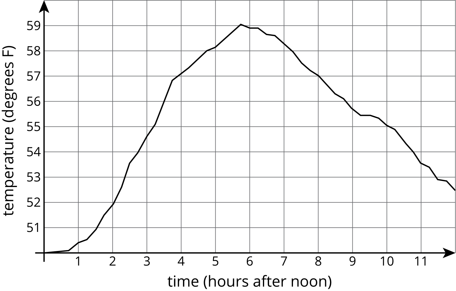
- Was it warmer at 3:00 p.m. or 9:00 p.m.?
- Approximately when was the temperature highest?
- Find another time that the temperature was the same as it was at 4:00 p.m.
- Did the temperature change more between 1:00 p.m. and 3:00 p.m. or between 3:00 p.m. and 5:00 p.m.?
- Does this graph show that temperature is a function of time, or time is a function of temperature?
- When the input for the function is 8, what is the output? What does that tell you about the time and temperature?
Student Response
For access, consult one of our IM Certified Partners.
Activity Synthesis
Display the graph for all to see during the discussion. Select a few previously identified students per problem to model how they found their answers on the displayed graph for the first five questions. If not mentioned by students, demonstrate how to find the solution to the fourth problem by either identifying the temperature values at each time and subtracting or by measuring the vertical change for each time interval.
For the final question, ask students to plot the point on their graphs if they did not do so already. Invite students to describe what the point means in the context.
If time allows, give 1 minute quite think time for groups to come up with their own question that someone else could answer using the graph. Invite groups to share their question and ask a different group to give the answer.
Design Principle(s): Support sense-making; Maximize meta-awareness
5.3: Garbage (15 minutes)
Activity
The purpose of this activity is for students to identify where a function is increasing or decreasing from a graphical representation. In the previous activity students focused more on single points. In this activity they focus on collections of points within time intervals and what the overall shape of the graph says about the relationship between the two quantities.
As students work, monitor for strategies for identifying increasing or decreasing intervals. Some strategies might be:
- finding the amount of garbage that corresponds to different years and comparing their values
- drawing line segments between discrete points and observing whether the line segment slants up or down as you move from left to right on the graph
- using a finger to show that, as you move from left to right on the graph, the function trends upward or downward
Launch
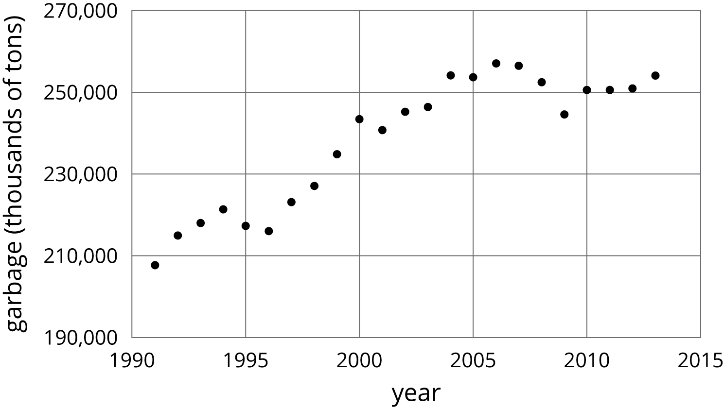
Tell students to close their books or devices (or to keep them closed). Arrange students in groups of 2. Display the first graph for all to see. if students are not familiar with time plots, explain that each point represents the value for one year starting with the point for 1991. Ask students “Does the graph show the amount of garbage produced as a function of time, or the time as a function of the amount of garbage produced?” (Amount of garbage produced as a function of time.)
Give groups 1 minute to decide on a question that the information in the graph can answer. For example, “About how much garbage was produced in 2010?” (About 250,000 thousand or 250 billion tons.) Invite groups to share their question and ask a different group to give the answer.
Tell students to reopen their books or devices and read the first problem. Ask:
- “What do the words increase and decrease mean?” (Increase means a value is going up and decrease means a value is going down.)
- “From 1999 to 2000, did the amount of garbage produced increase or decrease?” (It increased.)
- “How can you tell it increased?”
One way to answer this last question is to find the amount of garbage (about 235,000 thousand tons in 1999 and about 245,000 in 2000) and compare the values, but there are easier ways. Call upon students to articulate other methods, such as tracing from left to right with your finger and noting that your finger is traveling upwards.
Give students 3–5 minutes work time for the remaining problems. Encourage students to discuss the last question pertaining to the second graph. If partners do not agree have them work together until they come to agreement. Follow with a whole-class discussion.
Supports accessibility for: Memory; Language
Student Facing
- The graph shows the amount of garbage produced in the US each year between 1991 and 2013.
- Did the amount of garbage increase or decrease between 1999 and 2000?
- Did the amount of garbage increase or decrease between 2005 and 2009?
- Between 1991 and 1995, the garbage increased for three years, and then it decreased in the fourth year. Describe how the amount of garbage changed in the years between 1995 and 2000.
- The graph shows the percentage of garbage that was recycled between 1991 and 2013.
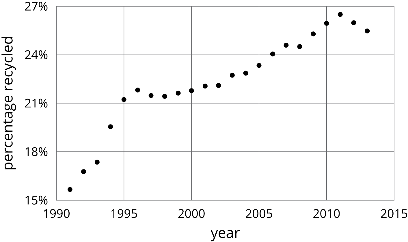
- When was it increasing?
- When was it decreasing?
- Tell the story of the change in the percentage of garbage recycled in the US over this time period.
Student Response
For access, consult one of our IM Certified Partners.
Student Facing
Are you ready for more?
Refer to the graph in the first part of the activity.
- Find a year where the amount of garbage produced increased from the previous year, but not by as much it increased the following year.
- Find a year where the amount of garbage produced increased from the previous year, and then increased by a smaller amount the following year.
- Find a year where the amount of garbage produced decreased from the previous year, but not by as much it decreased the following year.
-
Find a year where the amount of garbage produced decreased from the previous year, and then decreased by a smaller amount the following year.
Student Response
For access, consult one of our IM Certified Partners.
Anticipated Misconceptions
Students may not answer with a range of dates, they might instead list each year it increased. A list is acceptable, but be sure students see the connection between, for example, the list 1996, 1997, and 1998 and the same years stated as “from 1996 to 1998.”
Activity Synthesis
While discussing each graph, display for all to see. For the first graph, ask previously selected students to share their responses and their strategies for finding years where the amount of garbage increased or decreased. Sequence student responses in the order listed in the Activity Narrative.
Ask students to share their responses for the second graph. Close the discussion by asking “How might you describe this graph in general to someone who couldn't see it?” Invite student to share their descriptions. For example, the percentage of garbage that was recycled increased overall from 1990 to 2011, but began decreasing from 2011 to 2013.
Design Principle(s): Optimize output (for explanation)
Lesson Synthesis
Lesson Synthesis
The graph of a function tells us a story about the context it represents. Specific points on the graph connect to specific features of the situation.
Consider asking some of the following questions about the graphs from the activities to reinforce these ideas:
- “On the temperature graph, how do we find the time when it was the coolest?” (By finding the point on the graph that is the lowest.)
- “On the temperature graph, how do we find the difference between the hottest and the coolest temperatures?” (We can find the lowest and the highest points on the graph and count the difference between them using the grid or we can find the hottest temperature and subtract from it the coolest temperature. Either way the difference is about 9 degrees.)
- “Looking at the garbage production graph, how does the production before 2005 compare with the production since 2005?” (From 1990 to 2005, production was increasing. After 2005 production leveled off and seemed to decrease slightly.)
5.4: Cool-down - Diego's 10K Race (5 minutes)
Cool-Down
For access, consult one of our IM Certified Partners.
Student Lesson Summary
Student Facing
Here is a graph showing the temperature in a town as a function of time after 8:00 p.m.
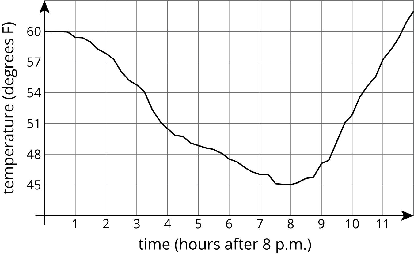
The graph of a function tells us what is happening in the context the function represents. In this example, the temperature starts out at \(60^\circ\) F at 8:00 p.m. It decreases during the night, reaching its lowest point at 8 hours after 8:00 p.m., or 4:00 a.m. Then it starts to increase again.