Lesson 7
Graphs of Proportional Relationships
7.1: Notice These Points (5 minutes)
Warm-up
This warm-up prepares students for graphing proportional relationships in the coordinate plane. They practice graphing coordinate points and notice that all points lie on a straight line.
Launch
Give students 3 minutes quiet work time followed by a whole-class discussion.
Student Facing
- Plot the points \((0,10), (1,8), (2,6), (3,4), (4,2)\).
- What do you notice about the graph?
Student Response
For access, consult one of our IM Certified Partners.
Launch
Give students 3 minutes quiet work time followed by a whole-class discussion.
Student Facing
- Plot the points \((0,10), (1,8), (2,6), (3,4), (4,2)\).
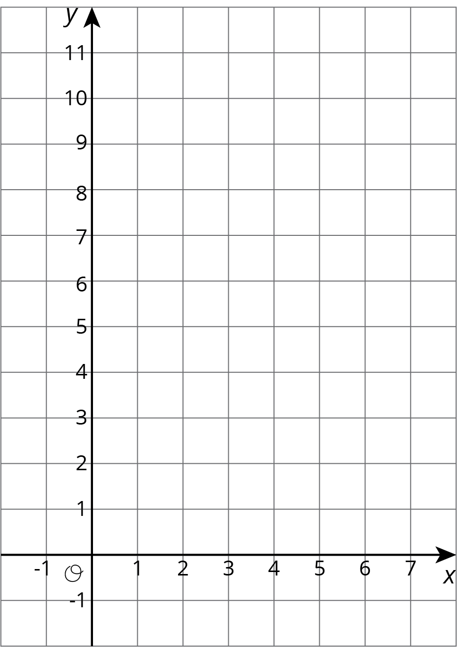
- What do you notice about the graph?
Student Response
For access, consult one of our IM Certified Partners.
Activity Synthesis
Invite students to share their observations. Ask if other students agree. If some students do not agree that the points lie on a straight line, ask which points break the pattern and give students a chance to self-correct their work.
7.2: T-shirts for Sale (10 minutes)
Activity
This introductory activity asks students to plot points using tables of values that represent scenarios familiar from previous lessons. This activity is intended as a review of the coordinate plane, its axes, and plotting ordered pairs.
Adjust this activity to 15 minutes.
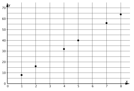
During the synthesis of this activity, display these graphs of proportional and nonproportional relationships for all to see.
Graphs of Proportional Relationships
Graphs of Nonproportional Relationships
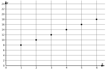
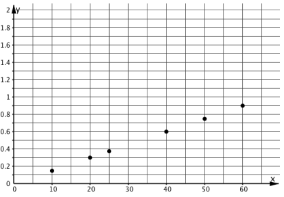
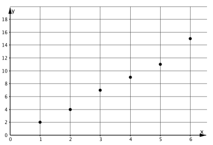
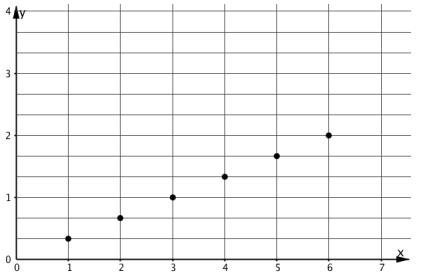
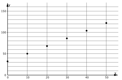
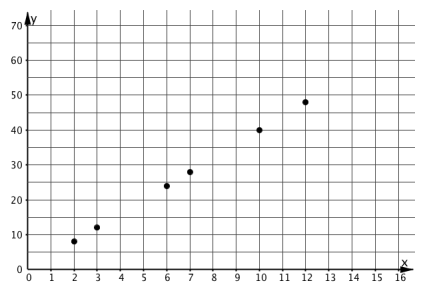
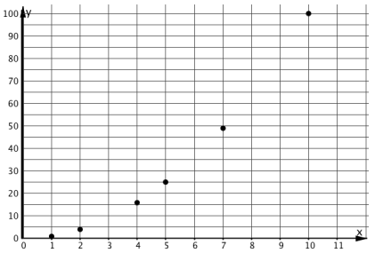
Ask students, "What properties do the graphs representing proportional relationships have?" (The points are all in a line. The line goes through the point \((0,0)\).)
If necessary, use a straightedge to show that the points are all in a line.
Introduce the word origin to refer to the point \((0,0)\) if students are unfamiliar with the term.
Launch
Arrange students in groups of 2. Provide access to rulers. Give students 5 minutes of quiet work time followed by students discussing responses with a partner, followed by whole-class discussion.
The second question reviews work from grades 5 and 6, but it is important that students understand how to plot points in the coordinate plane. Display the graph for all to see. Show students how to plot the pair from the first row in the table in the coordinate plane. Ask students to plot the remaining pairs and check with nearby students as they work. Be on the lookout for students plotting coordinates in the wrong order.
Student Facing
Some T-shirts cost $8 each.
| \(x\) | \(y\) |
|---|---|
| 1 | 8 |
| 2 | 16 |
| 3 | 24 |
| 4 | 32 |
| 5 | 40 |
| 6 | 48 |
-
Use the table to answer these questions.
- What does \(x\) represent?
- What does \(y\) represent?
- Is there a proportional relationship between \(x\) and \(y\)?
-
Plot the pairs in the table on the coordinate plane.
-
What do you notice about the graph?
Student Response
For access, consult one of our IM Certified Partners.
Launch
Arrange students in groups of 2. Provide access to rulers. Give students 5 minutes of quiet work time followed by students discussing responses with a partner, followed by whole-class discussion.
The second question reviews work from grades 5 and 6, but it is important that students understand how to plot points in the coordinate plane. Display the graph for all to see. Show students how to plot the pair from the first row in the table in the coordinate plane. Ask students to plot the remaining pairs and check with nearby students as they work. Be on the lookout for students plotting coordinates in the wrong order.
Student Facing
Some T-shirts cost $8 each.
| \(x\) | \(y\) |
|---|---|
| 1 | 8 |
| 2 | 16 |
| 3 | 24 |
| 4 | 32 |
| 5 | 40 |
| 6 | 48 |
-
Use the table to answer these questions.
- What does \(x\) represent?
- What does \(y\) represent?
- Is there a proportional relationship between \(x\) and \(y\)?
- Plot the pairs in the table on the coordinate plane.
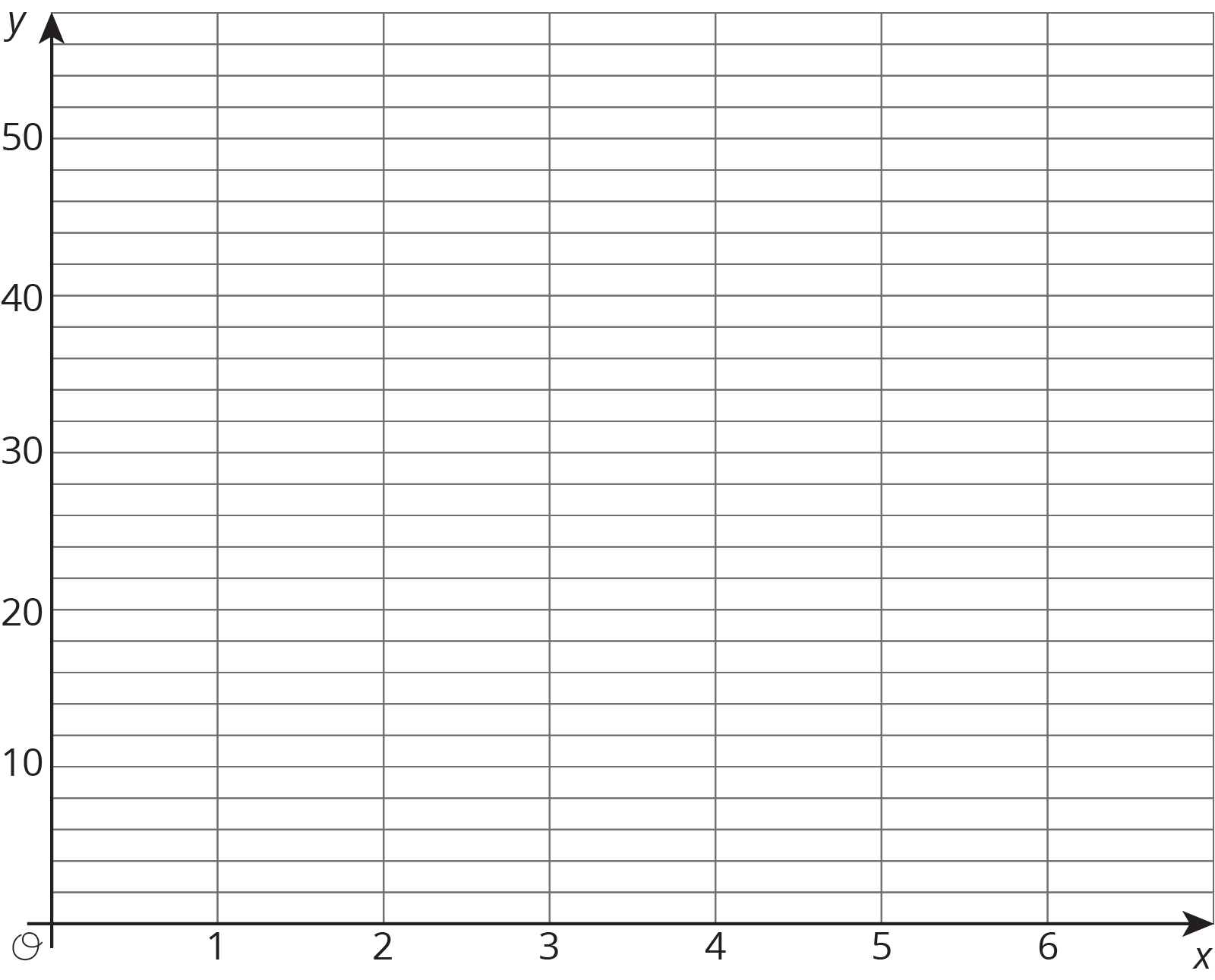
- What do you notice about the graph?
Student Response
For access, consult one of our IM Certified Partners.
Activity Synthesis
Discuss the first question if students had trouble with it.
Ask students to share their observations about the plotted points. Ask, “Could we buy 0 shirts? 7 T-shirts? 10 T-shirts? Can we buy half of a T-shirt?” Note that the graph consists of discrete points because only whole numbers of T-shirts make sense in this context; however, people often connect discrete points with a line to make the relationship more clear, even when the in-between values don’t make sense.
Ask the students, “Suppose instead of price per shirt, this graph displayed the cost of cherries that are \$8 per pound. Given that context, how should we change the graph?” Weights need not have integer values, so the graph is not restricted to discrete points. If you haven’t done so already, draw the ray starting at \((0,0)\) that passes through the points.
Design Principle(s): Support sense-making, Optimize output (for explanation)
7.3: Tyler's Walk (15 minutes)
Activity
This activity is intended to further students’ understanding of the graphs of proportional relationships in the following respects:
- points on the graph of a proportional relationship can be interpreted in the context represented (MP2)
- for these points, the quotient of the coordinates is—excepting \((0,0)\)—the constant of proportionality
- if the first coordinate is 1, then the corresponding coordinate is \(k\), the constant of proportionality.
Students explain correspondences between parts of the table and parts of the graph. The graph is simple so that students can focus on what a point means in the situation represented. Students need to realize, however, that the axes are marked in 10-unit intervals. The discussion questions are opportunities for students to construct viable arguments and critique the reasoning of others (MP3).
Launch
Arrange students in groups of 2. Give students 5 minutes of quiet work time followed by students discussing responses with a partner, followed by whole-class discussion.
Supports accessibility for: Organization; Attention
Design Principle(s): Maximize meta-awareness; Support sense-making
Student Facing
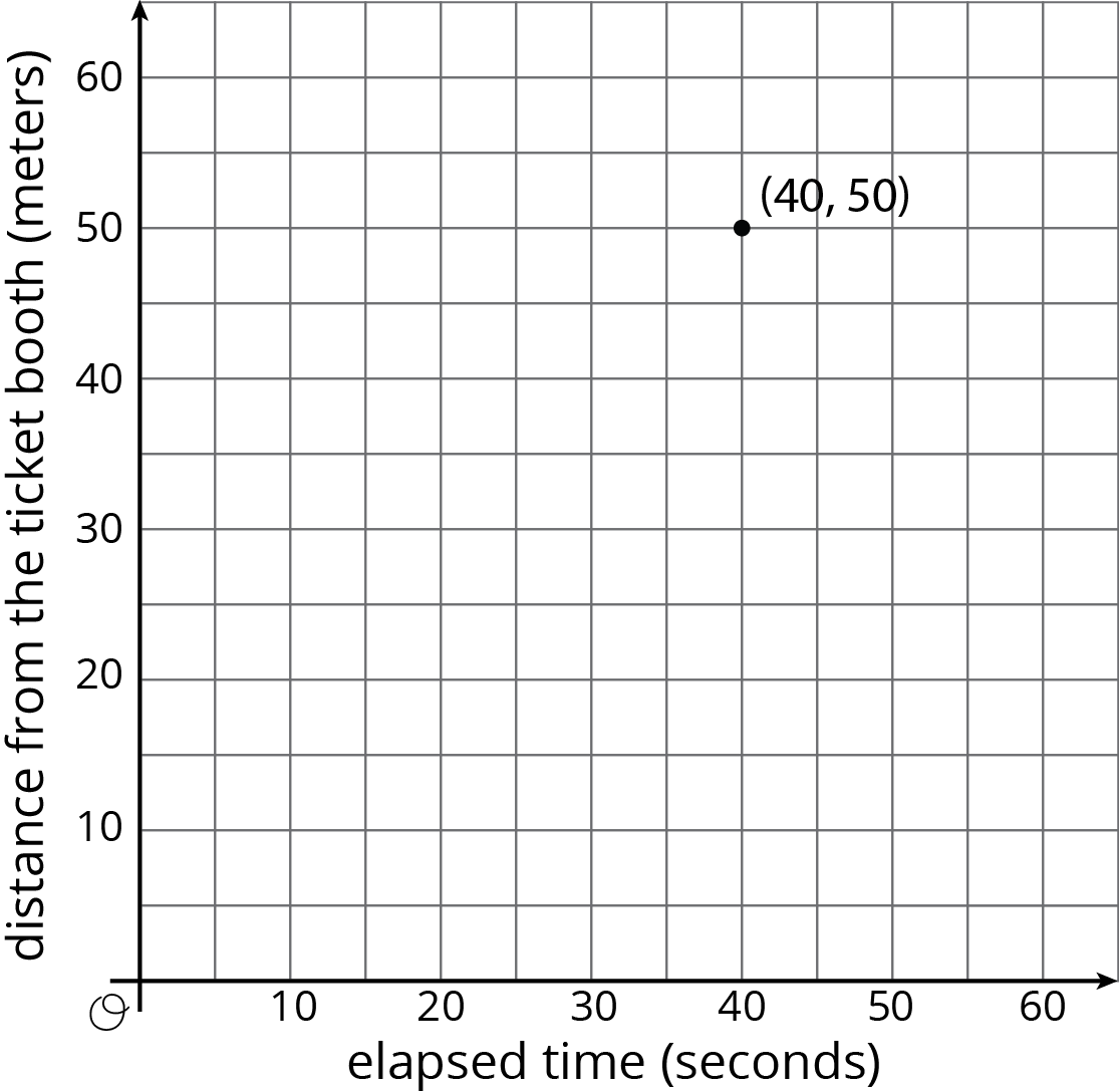
Tyler was at the amusement park. He walked at a steady pace from the ticket booth to the bumper cars.
-
The point on the graph shows his arrival at the bumper cars. What do the coordinates of the point tell us about the situation?
- The table representing Tyler's walk shows other values of time and distance. Complete the table. Next, plot the pairs of values on the grid.
- What does the point \((0, 0)\) mean in this situation?
- How far away from the ticket booth was Tyler after 1 second? Label the point on the graph that shows this information with its coordinates.
- What is the constant of proportionality for the relationship between time and distance? What does it tell you about Tyler's walk? Where do you see it in the graph?
| time (seconds) |
distance (meters) |
|---|---|
| 0 | 0 |
| 20 | 25 |
| 30 | 37.5 |
| 40 | 50 |
| 1 |
Student Response
For access, consult one of our IM Certified Partners.
Student Facing
Are you ready for more?
If Tyler wanted to get to the bumper cars in half the time, how would the graph representing his walk change? How would the table change? What about the constant of proportionality?
Student Response
For access, consult one of our IM Certified Partners.
Anticipated Misconceptions
These questions can be used for discussion or for students who need scaffolding.
- "What quantities are shown in the graph?" (Distance in meters that Tyler is from the ticket booth and time elapsed in seconds since he started walking.)
- "How far is the ticket booth from the bumper cars?" (50 meters, assuming that Tyler walked in a straight line.) This is an opportunity for attention to precision (MP6) and making explicit assumptions about a situation (MP4).
- "Do the values in your table show a proportional relationship? How do you know?" (Based on prior lessons in this unit, students should identify the relationship as proportional because for every point the unit rate is the same.)
- "What do the coordinates of the points on the graph show?" (The first coordinate gives amount of time in seconds that elapsed since Tyler started walking. Its corresponding second coordinate shows how many meters away from the ticket booth Tyler was at the corresponding time, assuming that Tyler walked in a straight line.)
Activity Synthesis
After students work on the task, it is important to discuss how the axis labels and the description in the task statement help us interpret points on the graph.
Consider asking these questions:
- "What quantities are shown in the graph?" (Distance in meters that Tyler is from the ticket booth and time elapsed in seconds since he started walking.)
- "How far is the ticket booth from the bumper cars?" (50 meters, assuming that Tyler walked in a straight line.) This is an opportunity for attention to precision (MP6) and making explicit assumptions about a situation (MP4).
- "Do the values in your table show a proportional relationship? How do you know?" (Based on prior lessons in this unit, students should identify the relationship as proportional because for every point the unit rate is the same.)
- "What do the coordinates of the points on the graph show?" (The first coordinate gives amount of time in seconds that elapsed since Tyler started walking. Its corresponding second coordinate shows how many meters away from the ticket booth Tyler was at the corresponding time, assuming that Tyler walked in a straight line.)
Ask students for the equation of this proportional relationship. Finally ask where students see \(k\), the constant of proportionality, in each representation, the equation, the graph, the table, and the verbal description of the situation.
Lesson Synthesis
Lesson Synthesis
7.4: Cool-down - Filling a Bucket (5 minutes)
Cool-Down
For access, consult one of our IM Certified Partners.
Student Lesson Summary
Student Facing
One way to represent a proportional relationship is with a graph. Here is a graph that represents different amounts that fit the situation, “Blueberries cost \$6 per pound.”
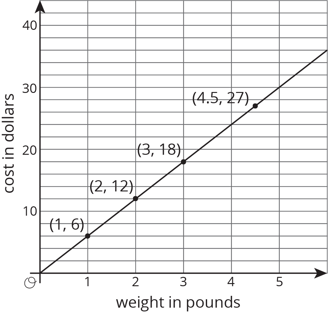
Different points on the graph tell us, for example, that 2 pounds of blueberries cost \$12, and 4.5 pounds of blueberries cost \$27.
Sometimes it makes sense to connect the points with a line, and sometimes it doesn’t. We could buy, for example, 4.5 pounds of blueberries or 1.875 pounds of blueberries, so all the points in between the whole numbers make sense in the situation, so any point on the line is meaningful.
If the graph represented the cost for different numbers of sandwiches (instead of pounds of blueberries), it might not make sense to connect the points with a line, because it is often not possible to buy 4.5 sandwiches or 1.875 sandwiches. Even if only points make sense in the situation, though, sometimes we connect them with a line anyway to make the relationship easier to see.
Graphs that represent proportional relationships all have a few things in common:
- There are points that satisfy the relationship lie on a straight line.
- The line that they lie on passes through the origin, \((0,0)\).
Here are some graphs that do not represent proportional relationships:
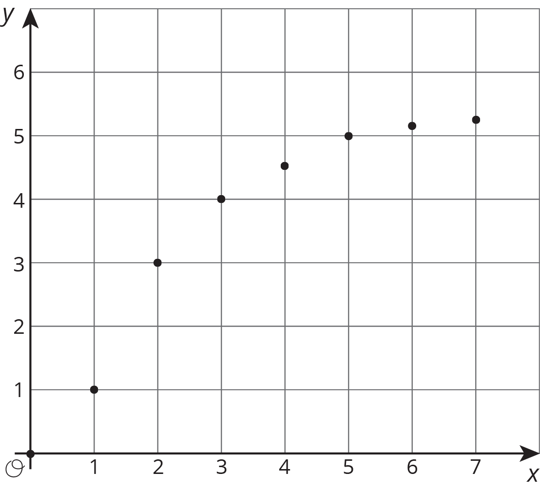
These points do not lie on a line.
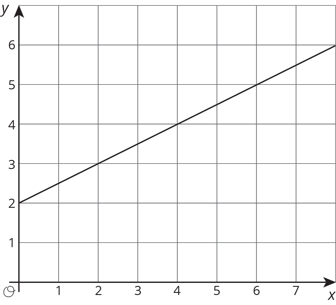
This is a line, but it doesn’t go through the origin.
Here is a different example of a relationship represented by this table where \(y\) is proportional to \(x\). We can see in the table that \(\frac54\) is the constant of proportionality because it’s the \(y\) value when \(x\) is 1.
The equation \(y = \frac54 x\) also represents this relationship.
| \(x\) | \(y\) |
|---|---|
| 4 | 5 |
| 5 | \(\frac{25}{4}\) |
| 8 | 10 |
| 1 | \(\frac{5}{4}\) |
Here is the graph of this relationship.
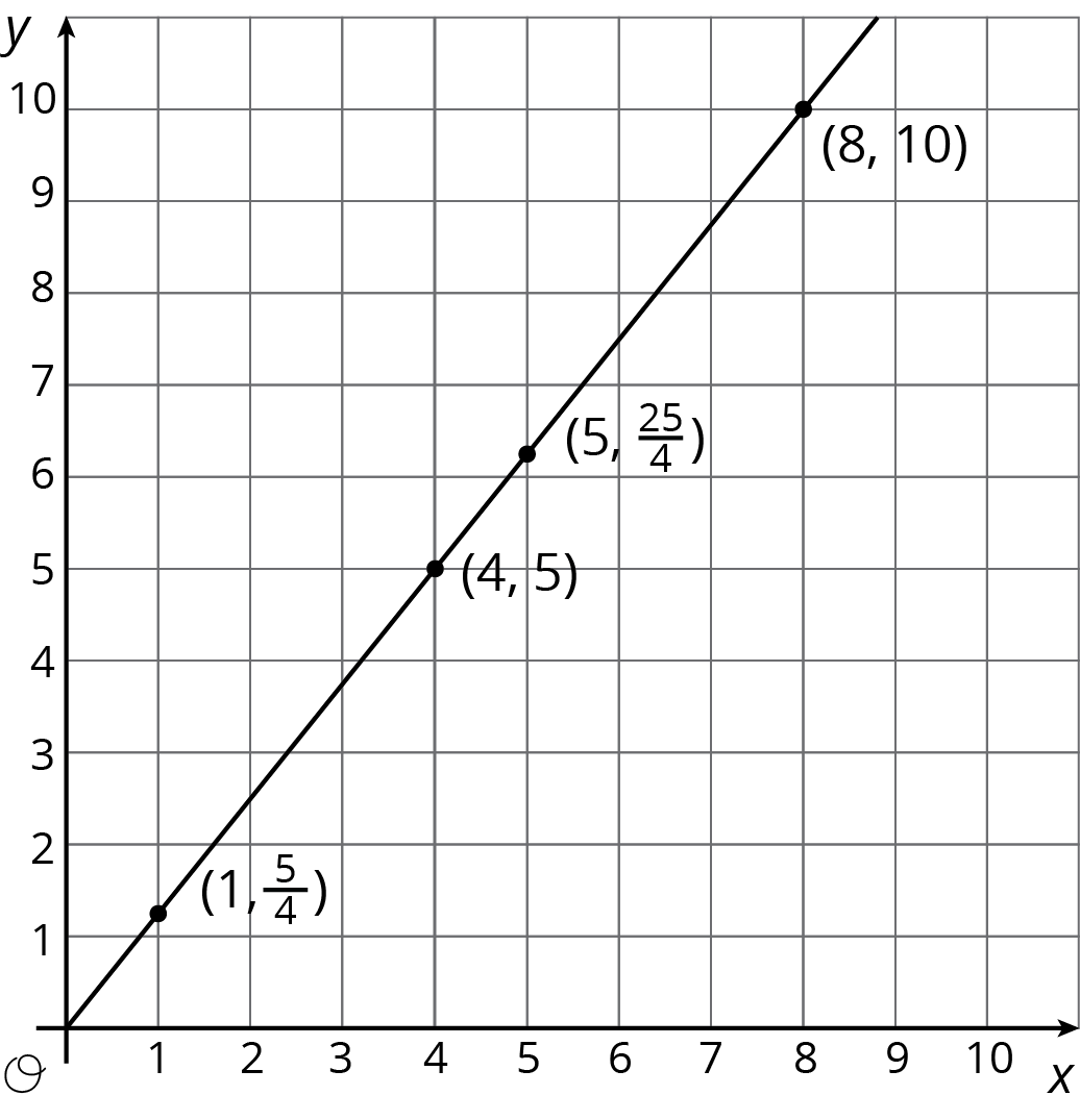
If \(y\) represents the distance in feet that a snail crawls in \(x\) minutes, then the point \((4, 5)\) tells us that the snail can crawl 5 feet in 4 minutes.
If \(y\) represents the cups of yogurt and \(x\) represents the teaspoons of cinnamon in a recipe for fruit dip, then the point \((4, 5)\) tells us that you can mix 4 teaspoons of cinnamon with 5 cups of yogurt to make this fruit dip.
We can find the constant of proportionality by looking at the graph, because \(\frac54\) is the \(y\)-coordinate of the point on the graph where the \(x\)-coordinate is 1. This could mean the snail is traveling \(\frac54\) feet per minute or that the recipe calls for \(1\frac14\) cups of yogurt for every teaspoon of cinnamon.
In general, when \(y\) is proportional to \(x\), the corresponding constant of proportionality is the \(y\)-value when \(x=1\).