Lesson 8
Using Graphs to Compare Relationships
8.1: Number Talk: Fraction Multiplication and Division (5 minutes)
Warm-up
The purpose of this Number Talk is to elicit strategies and understandings students have for multiplying and dividing fractions. These understandings help students develop fluency and will be helpful throughout this unit when students find constants of proportionality from graphs, tables, and equations. While four problems are given, it may not be possible to share every strategy. Consider gathering only two or three different strategies per problem, saving most of the time for the final question.
Launch
Display one problem at a time. Give students 30 seconds of quiet think time for each problem and ask them to give a signal when they have an answer and a strategy. Keep all problems displayed throughout the talk. Follow with a whole-class discussion.
Supports accessibility for: Memory; Organization
Student Facing
Find each product or quotient mentally.
\(\frac23 \boldcdot \frac12\)
\(\frac43 \boldcdot \frac14\)
\(4 \div \frac15\)
\(\frac96 \div \frac12\)
Student Response
For access, consult one of our IM Certified Partners.
Activity Synthesis
Ask students to share their strategies for each problem. Record and display their answers and explanations for all to see.
To involve more students in the conversation, consider asking:
- “Who can restate ___’s reasoning in a different way?”
- “Did anyone solve the problem the same way but would explain it differently?”
- “Did anyone solve the problem in a different way?”
- “Does anyone want to add on to _____’s strategy?”
- “Do you agree or disagree? Why?”
If time permits, ask students if they notice any connections between the problems. Have them share any relationships they notice.
Design Principle(s): Optimize output (for explanation)
8.2: Race to the Bumper Cars (15 minutes)
Activity
In this activity, students graph three time-distance relationships along with the one from the previous lesson, “Tyler’s Walk.” One of these is not a proportional relationship, so students must pay close attention to the quantities represented. The purpose of this activity is to give students many opportunities to connect the different features of a graph with parts of the situation it represents. In particular, they attach meaning to any point that is on a graph, and they interpret the meaning of the distance when the time is 1 second as both the constant of proportionality of the relationship and the person’s speed in the context in meters per second. Comparing different but related situations and their graphs supports students as they make sense of the situation.
Launch
Arrange students in groups of 2–3. Provide access to colored pencils and rulers.
Tell students that this activity is tied to the activity titled "Tyler's Walk" from the previous lesson. All references to Tyler going to the bumper cars come from the statements in that activity.
The digital version has an applet with options to change line colors and hide points. You may want to demonstrate the applet before students use it, perhaps graphing Tyler's data from the previous activity together. Note: the applet can graph lines, rays, or segments. Your class can decide how to represent the data.
Supports accessibility for: Visual-spatial processing
Student Facing
Diego, Lin, and Mai went from the ticket booth to the bumper cars.
1. Use each description to complete the table representing that person’s journey.
- Diego left the ticket booth at the same time as Tyler. Diego jogged ahead at a steady pace and reached the bumper cars in 30 seconds.
- Lin left the ticket booth at the same time as Tyler. She ran at a steady pace and arrived at the bumper cars in 20 seconds.
- Mai left the booth 10 seconds later than Tyler. Her steady jog enabled her to catch up with Tyler just as he arrived at the bumper cars.
| Diego's time (seconds) | Diego's distance (meters) |
|---|---|
| 0 | |
| 15 | |
| 30 | 50 |
| 1 |
| Lin's time (seconds) | Lin's distance (meters) |
|---|---|
| 0 | |
| 25 | |
| 20 | 50 |
| 1 |
| Mai's time (seconds) | Mai's distance (meters) |
|---|---|
| 0 | |
| 25 | |
| 40 | 50 |
| 1 |
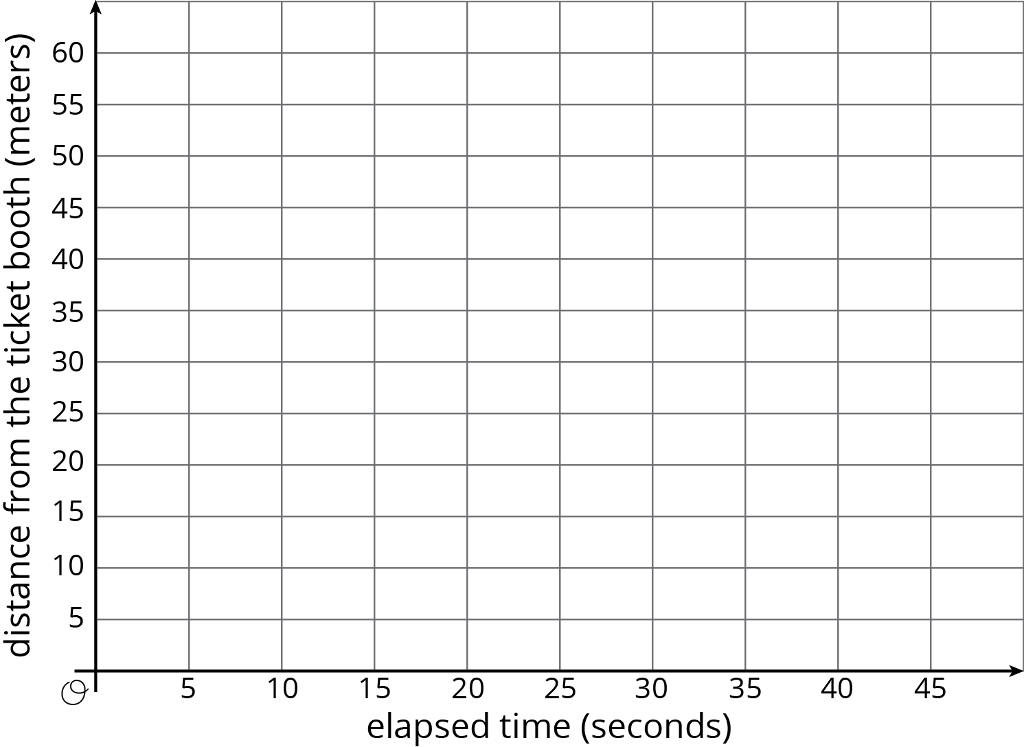
2. Using a different color for each person, draw a graph of all four people’s journeys (including Tyler's from the other day).
- Drag the names to the correct lines to label them.
- If you choose to, you can use the Paint Brush tool to change the color of each line. Select the tool, click on a color in the palette below the graph, and then click on a line. Click on the Move tool (the arrow) before changing to a new paint brush color.
- You can hide any points you create with the checkbox below the graph.
3. Which person is moving the most quickly? How is that reflected in the graph?
Student Response
For access, consult one of our IM Certified Partners.
Launch
Arrange students in groups of 2–3. Provide access to colored pencils and rulers.
Tell students that this activity is tied to the activity titled "Tyler's Walk" from the previous lesson. All references to Tyler going to the bumper cars come from the statements in that activity.
The digital version has an applet with options to change line colors and hide points. You may want to demonstrate the applet before students use it, perhaps graphing Tyler's data from the previous activity together. Note: the applet can graph lines, rays, or segments. Your class can decide how to represent the data.
Supports accessibility for: Visual-spatial processing
Student Facing
Diego, Lin, and Mai went from the ticket booth to the bumper cars.
-
Use each description to complete the table representing that person’s journey.
- Diego left the ticket booth at the same time as Tyler. Diego jogged ahead at a steady pace and reached the bumper cars in 30 seconds.
- Lin left the ticket booth at the same time as Tyler. She ran at a steady pace and arrived at the bumper cars in 20 seconds.
- Mai left the booth 10 seconds later than Tyler. Her steady jog enabled her to catch up with Tyler just as he arrived at the bumper cars.
Diego’s
time
(seconds)Diego’s
distance
(meters)0 15 30 50 1 Lin’s
time
(seconds)Lin’s
distance
(meters)0 25 20 50 1 Mai’s
time
(seconds)Mai’s
distance
(meters)0 25 40 50 1 -
Using a different color for each person, draw a graph of all four people’s journeys (including Tyler's from the other day).

- Which person is moving the most quickly? How is that reflected in the graph?
Student Response
For access, consult one of our IM Certified Partners.
Student Facing
Are you ready for more?
Write equations to represent each person’s relationship between time and distance.
Student Response
For access, consult one of our IM Certified Partners.
Activity Synthesis
Students may expect the graphs to intersect because everyone arrives at the same location. However, they did not arrive there at the same time (with the exception of Tyler and Mai). Because all characters traveled the same distance from the ticket booth and no further, the endpoints of their graphs lie on the same horizontal line \(y = 50\), that is, they have the same \(y\)-coordinate. The points will vary in position from right to left depending on the number of seconds after Tyler left the ticket booth it took each person to arrive at the bumper cars. Note this features in a whole-class discussion.
The most important goals of the discussion are to attach meaning to any point that is on a graph, and to interpret the meaning of the distance when the time is 1 second as both the constant of proportionality of the relationship and the person’s speed in the context in meters per second.
These questions may be used to facilitate the class discussion:
- "For each graph that shows a proportional relationship, what is the constant of proportionality?" (Tyler's was 1.25, Diego’s was \(1\frac23\), Lin’s was 2.5.)
- "How did you find them?" (Answers will vary, but students could have divided a \(y\)-coordinate by its associated \(x\)-coordinate.)
- "Where do constants of proportionality occur in the tables, and where do they occur on the graphs?" (They occur in the tables as the values in the second column that correspond to the value of 1 in the first column; on the graphs as the \(y\)-coordinate of points where the \(x\)-coordinate is 1.)
- "Which is the only graph that does not represent a proportional relationship?"
- "A classmate argues that Mai's graph must represent a proportional relationship, because she jogged at a steady rate. How do you answer?" (Mai's graph does not pass through the origin, so it does not represent a proportional relationship. That is, the distance she traveled is not proportional to the time elapsed. What does “time elapsed” mean? It is time elapsed since Tyler left the ticket booth. However, distance vs. time elapsed since Mai left the ticket booth until she arrived at the bumper cars is a proportional relationship.)
8.3: Space Rocks and the Price of Rope (10 minutes)
Activity
This activity is intended to help students interpret features of graphs in terms of the proportional relationships they represent. This task highlights two fundamental ideas:
- The steeper the graph, the greater the constant of proportionality.
- If the graph represents distance of an object vs. time, the constant of proportionality is the speed of the object.
Students can reason abstractly (MP2) by picking an arbitrary time and comparing the corresponding distances, or picking an arbitrary distance and comparing the corresponding times. Ideally, both of these ways of reasoning are shared in a whole-class discussion of the task because they will be needed in future work.
While students work, monitor for these approaches:
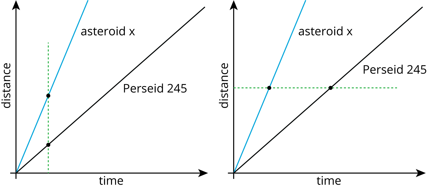
- At the same time, Asteroid x has traveled a greater distance (as in the graph with the vertical dashed line). We can’t tell exactly where 1 unit of time is on the graph, but wherever it is, we can tell that Asteroid x has covered a greater distance.

- Asteroid x takes less time than Perseid 245 to cover the same distance. See the graph with the horizontal dashed line.
- When distance is proportional to time and distance is graphed against time, the constant of proportionality represents the magnitude of the speed (unit of distance traveled per unit of time). It was shown in the previous activity that a steeper line has a greater constant of proportionality. Therefore, a line steeper than Perseid 245’s line represents a greater speed.
Launch
Keep students in the same groups of 2–3.
If using the digital activity, have students explore the applet to develop their reasoning around the following two concepts:
- The steeper the graph, the greater the constant of proportionality.
- If the graph represents distance vs. time, the constant of proportionality is the speed.
Supports accessibility for: Language; Social-emotional skills
Student Facing
-
Meteoroid Perseid 245 and Asteroid x travel through the solar system. Explore the applet to learn about the distance they had each traveled after a given time.
Is Asteroid x traveling faster or slower than Perseid 245? Explain how you know.
-
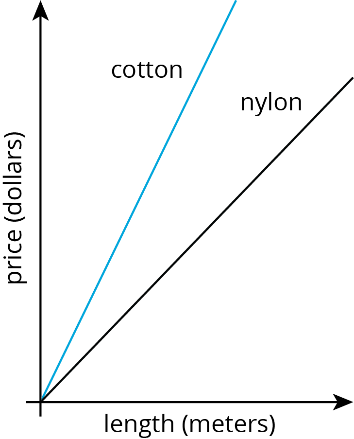
The graph shows the price of different lengths of two types of rope.

If you buy $1.00 of each kind of rope, which one will be longer? Explain how you know.
Student Response
For access, consult one of our IM Certified Partners.
Launch
Keep students in the same groups of 2–3.
If using the digital activity, have students explore the applet to develop their reasoning around the following two concepts:
- The steeper the graph, the greater the constant of proportionality.
- If the graph represents distance vs. time, the constant of proportionality is the speed.
Supports accessibility for: Language; Social-emotional skills
Student Facing
- Meteoroid Perseid 245 and Asteroid x travel through the solar system. The graph shows the distance each traveled after a given point in time.

Is Asteroid x traveling faster or slower than Perseid 245? Explain how you know.
-
The graph shows the price of different lengths of two types of rope.

If you buy $1.00 of each kind of rope, which one will be longer? Explain how you know.
Student Response
For access, consult one of our IM Certified Partners.
Activity Synthesis
It is important that students not assume “steeper always means faster,” but that they understand why it is in this case by reasoning abstractly and attending to the referents for points on the graphs. If the same relationships were graphed with distance on the horizontal axis and time on the vertical axis, a steeper line would indicate a slower speed. If the same relationships were graphed on separate axes, their scales could be different. Because the graphs share the same axes, it is implicit that comparisons between them occur relative to the same units.
Try to find students who took each approach, and invite each to share reasoning with the class. Important points to highlight are:
- A steeper graph has a larger constant of proportionality and a larger constant of proportionality will have a steeper graph. (“When you look at two graphs of a proportional relationship, how can you tell which one has a greater constant of proportionality?”)
- In a distance vs. time graph, a steeper graph indicates a greater speed. (“When you look at two distance vs. time graphs, how can you tell which represents an object traveling at a greater speed?”)
- The two graphs in question 1 can be considered from two perspectives:
- Same point in time, noting that one object has covered a greater distance. (“Which student focused on the two objects at the same moment in time? How did they know that Asteroid x was traveling faster?”)
- Same distance, noting that one object took less time. (“The other student did not focus on the same moment in time. What did they focus on in her explanation?”)
Design Principle(s): Support sense-making, Optimize output (for explanation)
Lesson Synthesis
Lesson Synthesis
It would be helpful to display the completed graph from the "Race to the Bumper Car" activity during discussion; the one that shows the distance time relationship for Tyler, Diego, Lin, and Mai’s trip from the ticket booth to the bumper cars. If the right technology is available, display this graph to facilitate discussion: https://www.desmos.com/calculator/dpthqt3sld. Lines and points can be shown and hidden by clicking the folder icons along the left side of the window. The graphed points, once turned on, can be dragged along the lines. Turn the coordinates on and off by clicking on a point. The most useful aspect of using this dynamic graph for this discussion is that the graph can be zoomed in to easily see a point when its \(x\)-coordinate is 1.
Revisit the connections made in the this activity.
- "How can we tell from the graph who had gone the farthest after 10 seconds?" (Find points of the graph with first coordinate 10 and compare second coordinate.)
- "How can we tell from the graph how long it took everybody to get to the bumper cars?" (Find the points on the graph when the second coordinate is 50.)
- "How can we tell from the graph who was moving the fastest?" (Find the constant of proportionality \(k\) by locating the point \((1,k)\), or in this case, see which graph is the steepest.)
8.4: Cool-down - Revisiting the Amusement Park (5 minutes)
Cool-Down
For access, consult one of our IM Certified Partners.
Student Lesson Summary
Student Facing
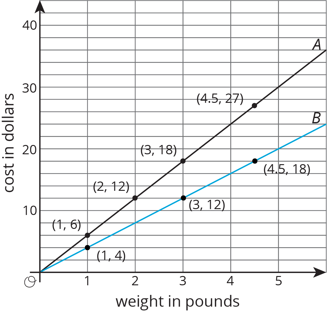
Here is a graph that shows the price of blueberries at two different stores. Which store has a better price?

We can compare points that have the same \(x\) value or the same \(y\) value. For example, the points \((2, 12)\) and \((3, 12)\) tell us that at store B you can get more pounds of blueberries for the same price.
The points \((3, 12)\) and \((3, 18)\) tell us that at store A you have to pay more for the same quantity of blueberries. This means store B has the better price.
We can also use the graphs to compare the constants of proportionality. The line representing store B goes through the point \((1, 4)\), so the constant of proportionality is 4. This tells us that at store B the blueberries cost \$4 per pound. This is cheaper than the \$6 per pound unit price at store A.