Lesson 22
Observing More Patterns in Scatter Plots
22.1: Notice and Wonder: Clustering
22.2: Scatter Plot City
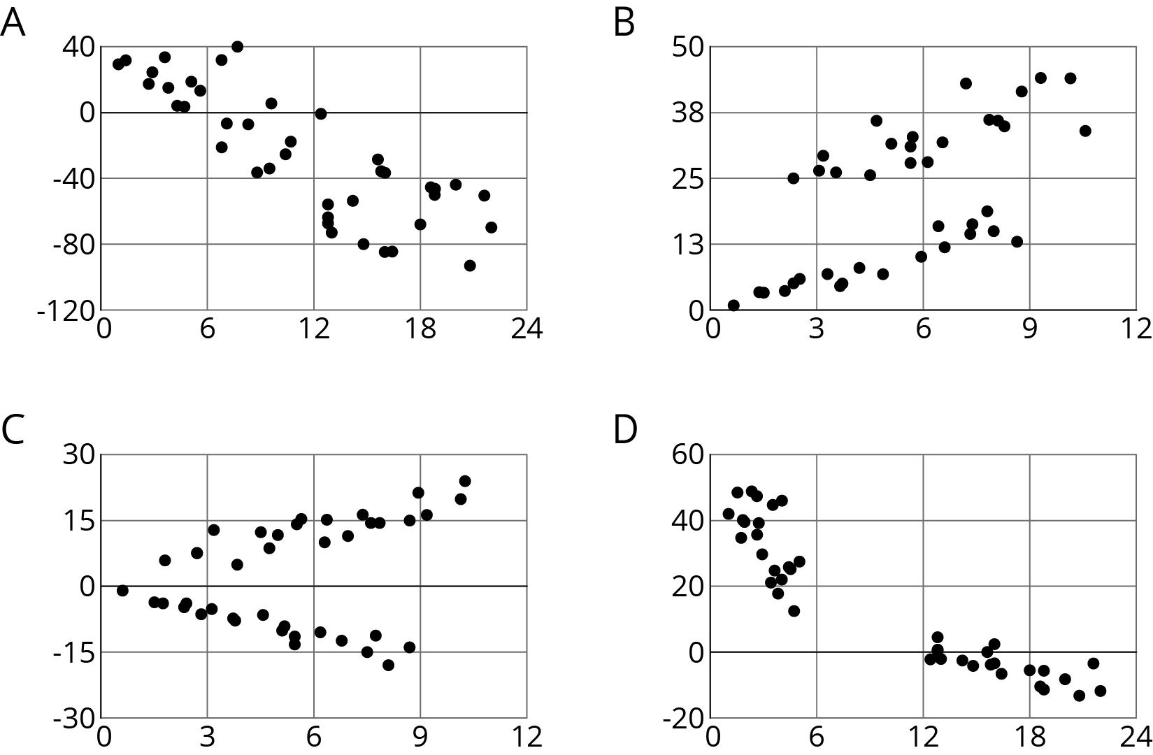
Your teacher will give you a set of cards. Each card shows a scatter plot.
- Sort the cards into categories and describe each category.
- Explain the reasoning behind your categories to your partner. Listen to your partner’s reasoning for their categories.
- Sort the cards into two categories: positive associations and negative associations. Compare your sorting with your partner’s and discuss any disagreements.
- Sort the cards into two categories: linear associations and non-linear associations. Compare your sorting with your partner’s and discuss any disagreements.
22.3: Animal Brains
Is there an association between the weight of an animal’s body and the weight of the animal’s brain?
| animal | body weight (kg) | brain weight (g) |
|---|---|---|
| cow | 465 | 423 |
| grey wolf | 36 | 120 |
| goat | 28 | 115 |
| donkey | 187 | 419 |
| horse | 521 | 655 |
| potar monkey | 10 | 115 |
| cat | 3 | 26 |
| giraffe | 529 | 680 |
| gorilla | 207 | 406 |
| human | 62 | 1320 |
| rhesus monkey | 7 | 179 |
| kangaroo | 35 | 56 |
| sheep | 56 | 175 |
| jaguar | 100 | 157 |
| chimpanzee | 52 | 440 |
| pig | 192 | 180 |
Use the data to make a scatter plot. Are there any outliers?
Experiment with the line to fit the data. Drag the points to move the line. You can close the expressions list by clicking on the double arrow.
- Without including any outliers, does there appear to be an association between body weight and brain weight? Describe the association in a sentence.
- Adjust the line by moving the green points, fitting the line to your scatter plot, and estimate its slope. What does this slope mean in the context of brain and body weight?
- Does the fitted line help you identify any other outliers?
Use one of the suggestions or find another set of data that interested you to look for associations between the variables.
- Number of wins vs number of points per game for your favorite sports team in different seasons
- Amount of money grossed vs critic rating for your favorite movies
- Price of a ticket vs stadium capacity for popular bands on tour
After you have collected the data,
- Create a scatter plot for the data.
- Are any of the points very far away from the rest of the data?
- Would a linear model fit the data in your scatter plot? If so, draw it. If not, explain why a line would be a bad fit.
- Is there an association between the two variables? Explain your reasoning.
Summary
Sometimes a scatter plot shows an association that is not linear:

We call such an association a non-linear association. In later grades, you will study equations that can be models for non-linear associations.
Sometimes in a scatter plot we can see separate groups of points.

We call these groups clusters.
People often collect data in two variables to investigate possible associations between two numerical variables and use the connections that they find to predict more values of the variables. Data analysis usually follows these steps:
- Collect data.
- Organize and represent the data, and look for an association.
- Identify any outliers and try to explain why these data points are exceptions to the trend that describes the association.
- Find n equation that fits the data well.
Although computational systems can help with data analysis by graphing the data, finding an equation that might fit the data, and using that equation to make predictions, it is important to understand the process and think about what is happening. A computational system may find an equation that does not make sense or use a line when the situation suggests that a different model would be more appropriate.
Glossary Entries
- negative association
A negative association is a relationship between two quantities where one tends to decrease as the other increases. In a scatter plot, the data points tend to cluster around a line with negative slope.
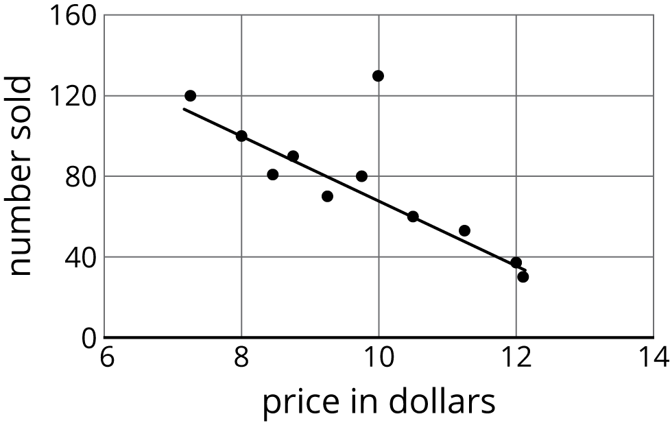
Different stores across the country sell a book for different prices.
The scatter plot shows that there is a negative association between the the price of the book in dollars and the number of books sold at that price.
- outlier
An outlier is a data value that is far from the other values in the data set.
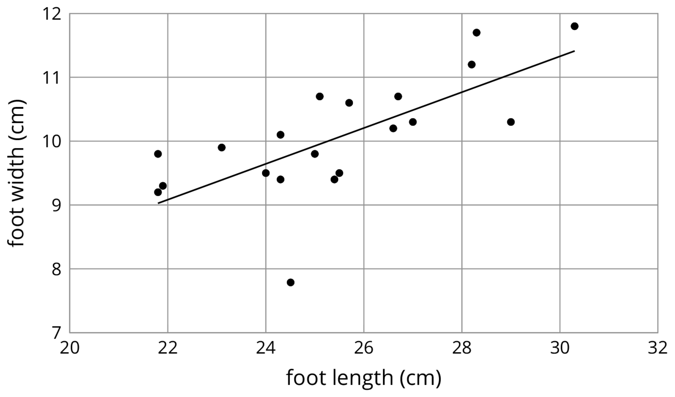
Here is a scatter plot that shows lengths and widths of 20 different left feet. The foot whose length is 24.5 cm and width is 7.8 cm is an outlier.
- positive association
A positive association is a relationship between two quantities where one tends to increase as the other increases. In a scatter plot, the data points tend to cluster around a line with positive slope.
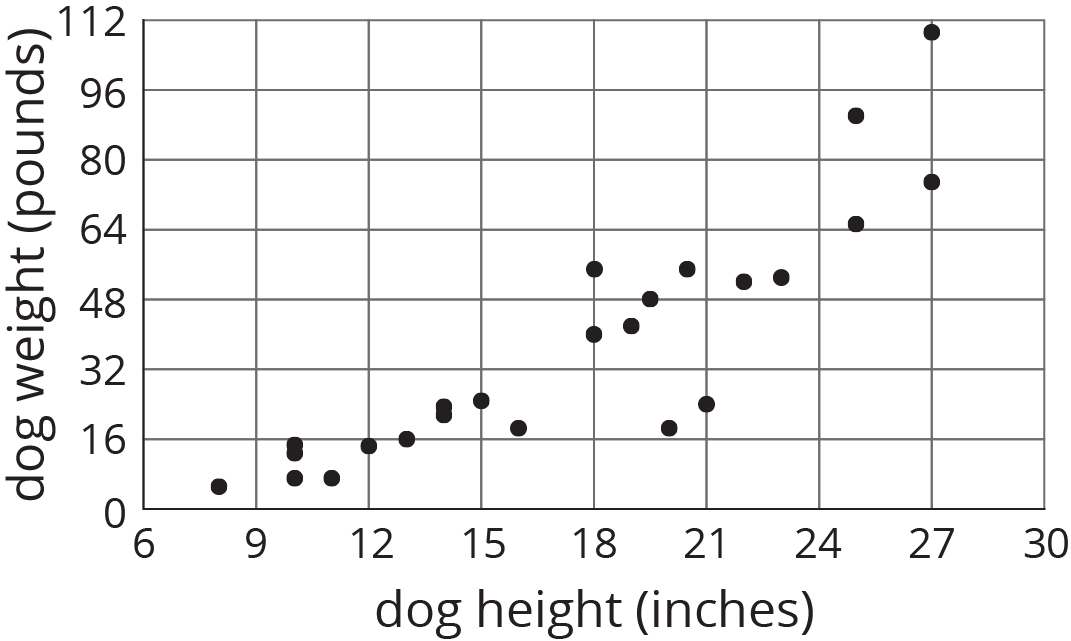
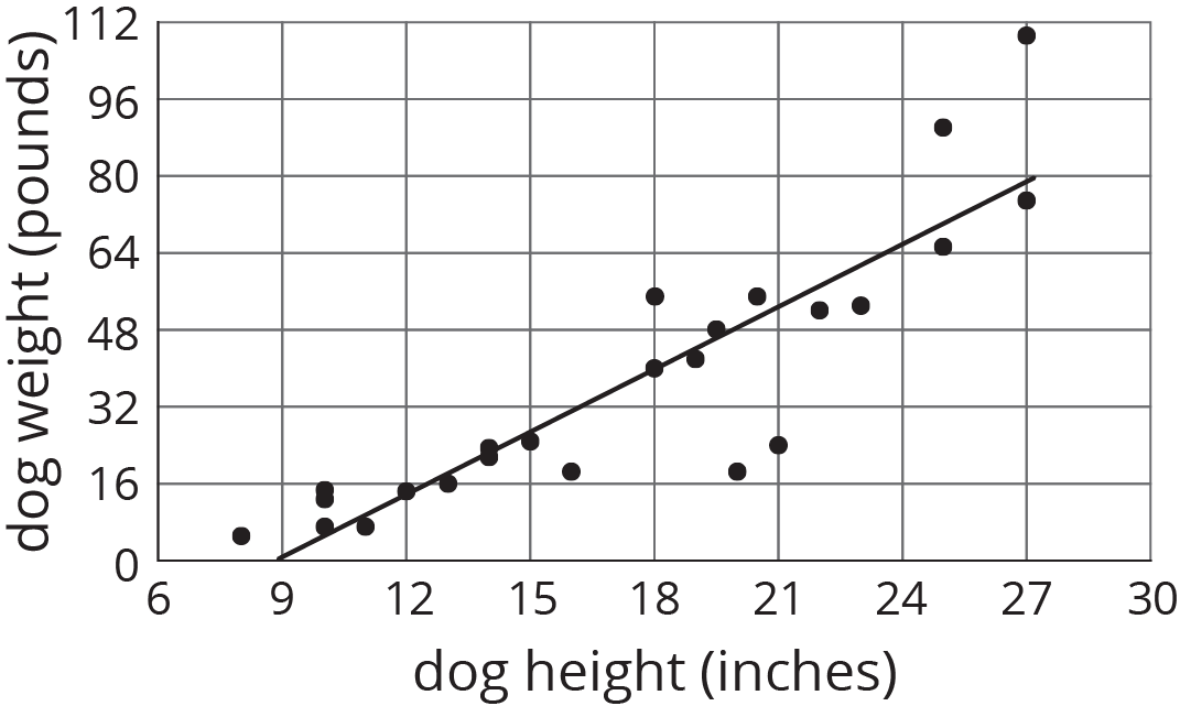
The relationship between height and weight for 25 dogs is shown in the scatter plot. There is a positive association between dog height and dog weight.
- scatter plot
A scatter plot is a graph that shows the values of two variables on a coordinate plane. It allows us to investigate connections between the two variables.
Each plotted point corresponds to one dog. The coordinates of each point tell us the height and weight of that dog.
