Lesson 2
Using Dot Plots to Answer Statistical Questions
Let's use dot plots to describe distributions and answer questions.
Problem 1
Three sets of data about ten sixth-grade students were used to make three dot plots. The person who made these dot plots forgot to label them. Match each dot plot with the appropriate label.

Problem 2
The dot plots show the time it takes to get to school for ten sixth-grade students from the United States, Canada, Australia, New Zealand, and South Africa.

- List the countries in order of typical travel times, from shortest to longest.
- List the countries in order of variability in travel times, from the least variability to the greatest.
Problem 3
Twenty-five students were asked to rate—on a scale of 0 to 10—how important it is to reduce pollution. A rating of 0 means “not at all important” and a rating of 10 means “very important.” Here is a dot plot of their responses.
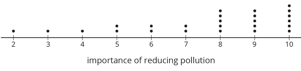
Explain why a rating of 6 is not a good description of the center of this data set.