Lesson 3
Interpreting Histograms
3.1: Dog Show (Part 1)
Here is a dot plot showing the weights, in pounds, of 40 dogs at a dog show.

- Write two statistical questions that can be answered using the dot plot.
- What would you consider a typical weight for a dog at this dog show? Explain your reasoning.
3.2: Dog Show (Part 2)
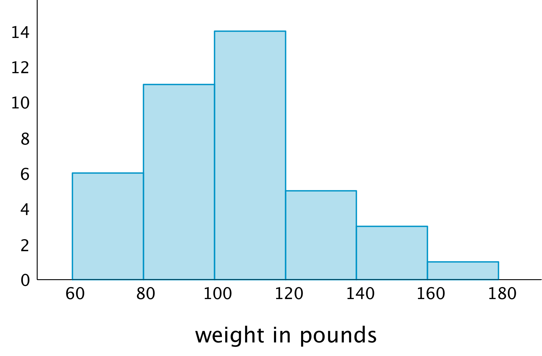
Here is a histogram that shows some dog weights in pounds.

Each bar includes the left-end value but not the right-end value. For example, the first bar includes dogs that weigh 60 pounds and 68 pounds but not 80 pounds.
-
Use the histogram to answer the following questions.
-
How many dogs weigh at least 100 pounds?
-
How many dogs weigh exactly 70 pounds?
-
How many dogs weigh at least 120 and less than 160 pounds?
-
How much does the heaviest dog at the show weigh?
- What would you consider a typical weight for a dog at this dog show? Explain your reasoning.
-
-
Discuss with a partner:
-
If you used the dot plot to answer the same five questions you just answered, how would your answers be different?
-
How are the histogram and the dot plot alike? How are they different?
-
3.3: Tall and Taller Players
Professional basketball players tend to be taller than professional baseball players.
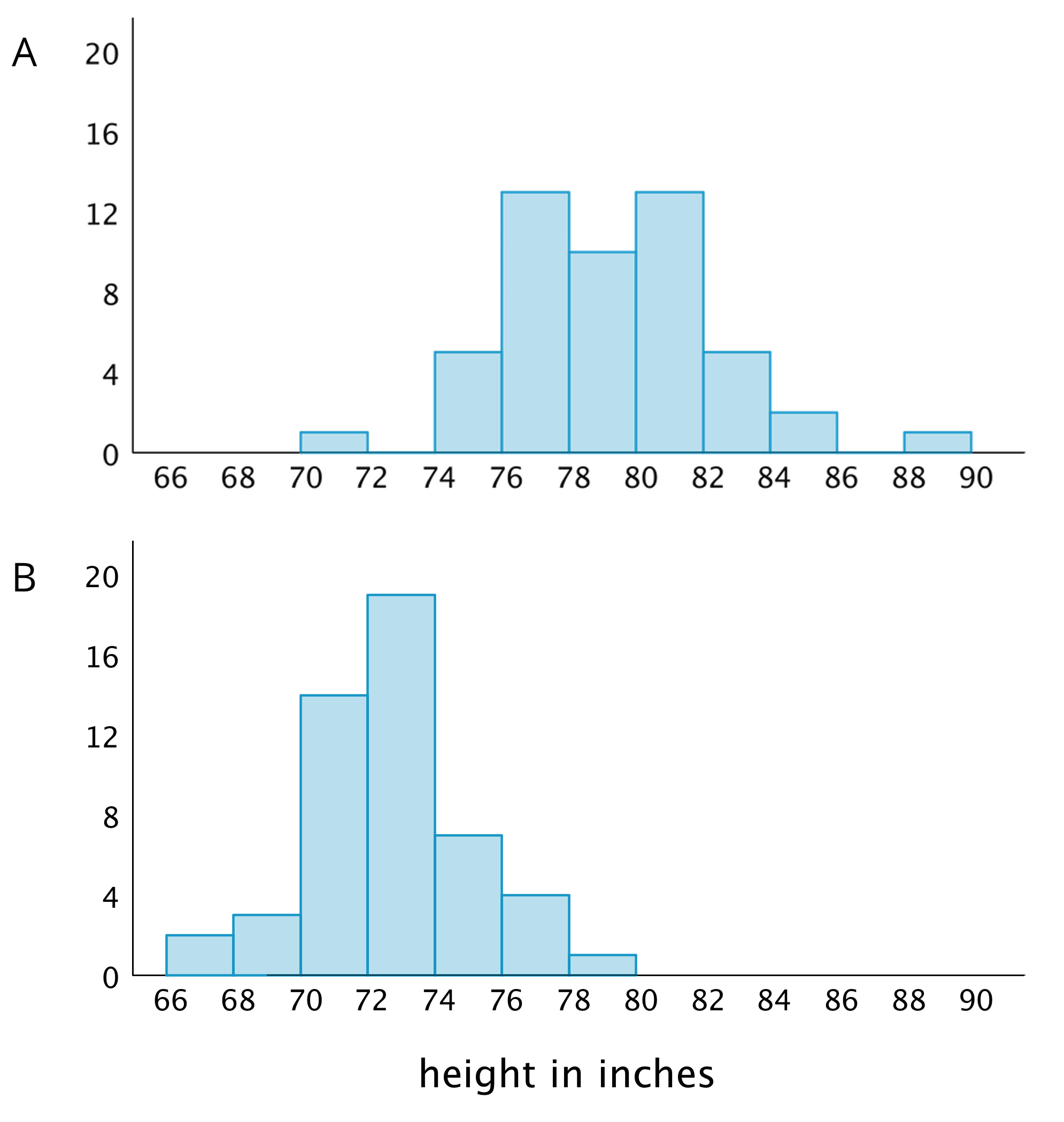
Here are two histograms that show height distributions of 50 male professional baseball players and 50 male professional basketball players.
- Decide which histogram shows the heights of baseball players and which shows the heights of basketball players. Be prepared to explain your reasoning.

- Write 2–3 sentences that describe the distribution of the heights of the basketball players. Comment on the center and spread of the data.
- Write 2–3 sentences that describe the distribution of the heights of the baseball players. Comment on the center and spread of the data.
Summary
In addition to using dot plots, we can also represent distributions of numerical data using histograms.
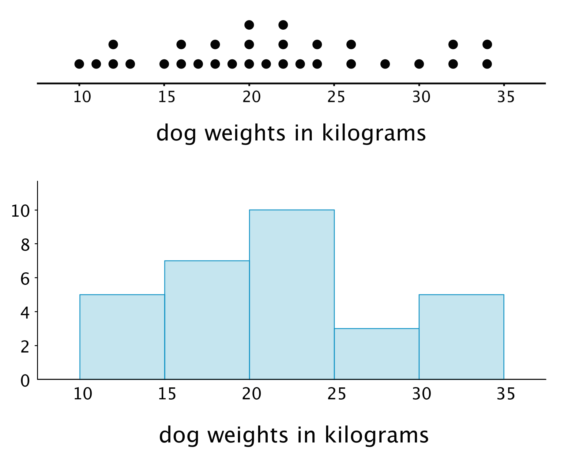
Here is a dot plot that shows the weights, in kilograms, of 30 dogs, followed by a histogram that shows the same distribution.

In a histogram, data values are placed in groups or “bins” of a certain size, and each group is represented with a bar. The height of the bar tells us the frequency for that group.
For example, the height of the tallest bar is 10, and the bar represents weights from 20 to less than 25 kilograms, so there are 10 dogs whose weights fall in that group. Similarly, there are 3 dogs that weigh anywhere from 25 to less than 30 kilograms.
Notice that the histogram and the dot plot have a similar shape. The dot plot has the advantage of showing all of the data values, but the histogram is easier to draw and to interpret when there are a lot of values or when the values are all different.
Glossary Entries
- center
The center of a set of numerical data is a value in the middle of the distribution. It represents a typical value for the data set.
For example, the center of this distribution of cat weights is between 4.5 and 5 kilograms.
- distribution
The distribution tells how many times each value occurs in a data set. For example, in the data set blue, blue, green, blue, orange, the distribution is 3 blues, 1 green, and 1 orange.
Here is a dot plot that shows the distribution for the data set 6, 10, 7, 35, 7, 36, 32, 10, 7, 35.
- frequency
The frequency of a data value is how many times it occurs in the data set.
For example, there were 20 dogs in a park. The table shows the frequency of each color.
color frequency white 4 brown 7 black 3 multi-color 6 - histogram
A histogram is a way to represent data on a number line. Data values are grouped by ranges. The height of the bar shows how many data values are in that group.
This histogram shows there were 10 people who earned 2 or 3 tickets. We can't tell how many of them earned 2 tickets or how many earned 3. Each bar includes the left-end value but not the right-end value. (There were 5 people who earned 0 or 1 tickets and 13 people who earned 6 or 7 tickets.)
- spread
The spread of a set of numerical data tells how far apart the values are.
For example, the dot plots show that the travel times for students in South Africa are more spread out than for New Zealand.


