Lesson 10
Measures of Center
These materials, when encountered before Algebra 1, Unit 1, Lesson 10 support success in that lesson.
10.1: Estimation: Lamp Post (5 minutes)
Warm-up
The purpose of an Estimation warm-up is to practice the skill of estimating a reasonable answer based on experience and known information, and also help students develop a deeper understanding of the meaning of standard units of measure. It gives students a low-stakes opportunity to share a mathematical claim and the thinking behind it (MP3). Asking yourself, “Does this make sense?” is a component of making sense of problems (MP1), and making an estimate or a range of reasonable answers with incomplete information is a part of modeling with mathematics (MP4).
Launch
The first few times using this routine, ask students to explain the difference between a guess and an estimate. The goal is to understand that a guess is an answer without evidence, whereas an estimate is based on reasoning using the available information.
Display the image for all to see. Ask students to silently think of a number they are sure is too low, a number they are sure is too high, and a number that is about right, and write these down. Tell students that the lamp post’s height should be in relation to the person’s height. If students ask, confirm that this is the same person in the photo from the previous lesson (whose height was revealed to be 6 feet or 72 inches). Then, write a short explanation for the reasoning behind their estimate.
Student Facing
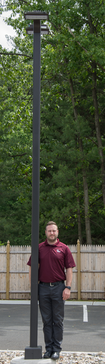
How tall is the lamp post?
- Record an estimate that is:
too low about right too high - Explain your reasoning.
Student Response
For access, consult one of our IM Certified Partners.
Activity Synthesis
Ask a few students to share their estimate and their reasoning. If a student is reluctant to commit to an estimate, ask for a range of values. Display these for all to see in an ordered list or on a number line. Add the least and greatest estimate to the display by asking, “Is anyone’s estimate less than \(\underline{\hspace{.5in}}\)? Is anyone’s estimate greater than \(\underline{\hspace{.5in}}\)?” If time allows, ask students, “Based on this discussion, does anyone want to revise their estimate?” Then, reveal the actual value and add it to the display (15 feet). Ask students how accurate their estimates were, as a class. Was the actual value inside their range of values? Was it toward the middle? How variable were their estimates? What were the sources of error? Consider developing a method to record a snapshot of the estimates and actual value so students can track their progress as estimators over time.
10.2: Balance Point (20 minutes)
Activity
The purpose of this activity is for students to think about the mean of a data set as the balance point of a distribution. Students should arrive at the balance point by mentally thinking about the point where the distribution would balance. This activity prepares students to recognize the relationship between mean and median based on the shape of the distribution in a later lesson.
This activity works best when each student has access to the digital applet because students will benefit from seeing the relationship in a dynamic way. If students don't have individual access, projecting the applet would be helpful during the synthesis.
Launch
Ensure each student has access to a device and the applet. Invite students to experiment with how the applet works. How is the applet like the meter stick with the pennies? Demonstrate the applet for all to see, and place the dots along the number line in positions corresponding to where the pennies were on the meter stick: 1, 1, 1, 2, 2, 3, 3, 5, 5, 7. Show that placing the open blue dot (like your finger) at 5 causes the number line to be imbalanced when released, but moving the open blue dot to 3 causes the number line to balance. Invite students to use the applet to answer the quesitons in the task.
Student Facing
Navigate to https://www.geogebra.org/m/HHy53Nfj
- For each data set, move the points in the applet so that the data set is represented. Then, move the balance point to where you predict it to be. Release the bar to see if you were correct. Continue until you find the balance point.
- 5, 6, 6, 7, 7, 7, 7, 8, 8, 9
- 0, 0, 8, 8, 9, 9, 9, 9, 9, 9
- 0, 2, 2, 3, 3, 3, 4, 4, 9, 10
- Compute the mean and the median for each data set. What do you notice?
Student Response
For access, consult one of our IM Certified Partners.
Launch
Demonstrate to students how to find the balance point of a data set, using pennies and a meter stick. Here is a data set: 30 cm, 30 cm, 30 cm, 40 cm, 40 cm, 50 cm, 50 cm, 70 cm, 70 cm, 90 cm. Write the data set for all to see, then place pennies along the meter stick. Each penny represents an occurence of a number, so there should be 3 pennies at 30 cm, 2 pennies at 40 cm, and so on. Tell students that the balance point is the place where you could rest the meter stick on your finger, and it would balance. Poll the class to ask where they think this point is. Demonstrate that the balance point is at 50 cm, and ask students how you might have figured that out. (You could also demonstrate that another point is not the balance point, but be aware that the pennies will fall off the meter stick.)
Display the image for all to see.

Poll the class to collect estimates for the balance point. (The actual balance point is 4.5.)
Student Facing
For each graph, estimate the balance point. The balance point is where you think the number line would balance. Record your balance point on the graph with a \(\Delta\) symbol. Then, calculate the mean and median for each data set.


Student Response
For access, consult one of our IM Certified Partners.
Activity Synthesis
The goal of this activity is for students to discover that the balance point is another way to think about the mean, and that there is a relationship between measures of center and the shape of the data distribution.
Display the image from the Launch again and ask, “How could we determine the actual balance point for this distribution?” (Find the mean of all the values represented in the dot plot.)
Here are sample questions to promote class discussion:
- “How are the balance points in the skewed examples different from the symmetric example?” (The balance point of the symmetric example is in the center, but the balance point of the skewed examples are not.)
- “What measure does the balance point represent?” (The mean)
- “What conclusions can you draw about measures of center and data distribution shapes?” (When the data distribution is symmetric, the mean and median will be equal and in the center of the distribution. When the distribution is skewed with a long tail off to one side, the mean may not be equal to the median.)
10.3: Mean vs. Median (15 minutes)
Activity
The purpose of this activity is for students to practice making a distinction between which measure of center is more representative of a data set. For each problem, students answer questions about the mean and median and determine which number seems more representative of the given data. This will prepare students for a later lesson when students have to recognize the relationship between a data distribution shape and measures of center.
Student Facing
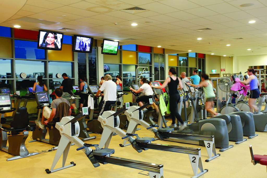
When people join a gym, they are assessed on their fitness by doing several exercises. The results are given as a score between 1 and 100 with 100 representing peak fitness for the person’s age. The gym claims they can improve scores for members after only 2 months.
After 2 months, 11 people are assessed again, and the number of points they improve on in the assessment is shown in the dot plot.

- What is the mean improvement among these members?
- What is the median?
- Which measure of center is a better representation of the members’ improvement? Explain your reasoning.
Student Response
For access, consult one of our IM Certified Partners.
Activity Synthesis
Discuss how students determine which measure of center is the better representation. Here are sample questions to promote class discussion:
- “How did you decide which measure is a better representation of the data set?” (I thought about which number summarized the data set better.)
- “If you were on the marketing team for this gym, which measure of center would you use? What might you write on an advertisement stating this fact?” (The mean makes it sound like people improved more than the median, so I would use the mean. I might write, "An average member of our gym improved their score on a fitness test by 10 points in just 2 months!")
- “What are some patterns you noticed throughout the lesson between the distribution shapes and measures of center?” (The symmetric data tend to have the mean and median equal near what is typical for the data set, while skewed data often has a mean that is not.)
- “How does this skill of determining which measure of center is a better representation help you analyze a data set?” (This skill allows me to better analyze a data set because I have to think about how the data set is affected by extremes and how the shape of the data may change the measures of center.)