Lesson 15
Where Are We Eating?
These materials, when encountered before Algebra 1, Unit 1, Lesson 15 support success in that lesson.
15.1: Estimation: Marathon Runner 2 (5 minutes)
Warm-up
The purpose of an Estimation warm-up is to practice the skill of estimating a reasonable answer based on experience and known information, and also to help students develop a deeper understanding of the meaning of standard units of measure. It gives students a low-stakes opportunity to share a mathematical claim and the thinking behind it (MP3). Asking yourself, “Does this make sense?” is a component of making sense of problems (MP1), and making an estimate or a range of reasonable answers with incomplete information is part of modeling with mathematics (MP4).
Launch
Display the image for all to see. Ask students to silently think of a number they are sure is too low, a number they are sure is too high, and a number that is about right, and write these down. Then, write a short explanation for the reasoning behind their estimate. Students need to know the length of the marathon (26.2 miles) and that 225 minutes have passed for the runner to make it to mile 20.
Student Facing
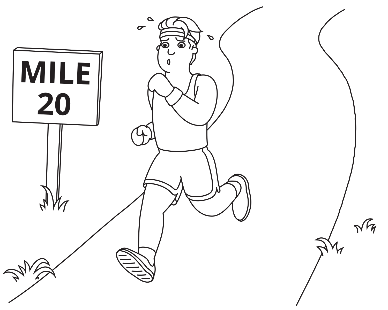
How long will it take the marathon runner to finish the marathon?
- Record an estimate that is:
too low about right too high - Explain your reasoning.
Student Response
For access, consult one of our IM Certified Partners.
Activity Synthesis
Ask a few students to share their estimate and their reasoning. If a student is reluctant to commit to an estimate, ask for a range of values. Display these for all to see in an ordered list or on a number line. Add the least and greatest estimate to the display by asking, “Is anyone’s estimate less than \(\underline{\hspace{.5in}}\)? Is anyone’s estimate greater than \(\underline{\hspace{.5in}}\)?” If time allows, ask students, “Based on this discussion, does anyone want to revise their estimate?” Then, reveal the actual value and add it to the display (294.75 minutes). Ask students how accurate their estimates were, as a class. Was the actual value inside their range of values? Was it toward the middle? How variable were their estimates? What were the sources of error?
15.2: Groups of Runners (15 minutes)
Activity
Students practice conceptualizing the distribution shapes of situations. In this activity, emphasis should be placed on students’ justification for their matches.
Student Facing
These distributions represent marathon times for different groups.
A

B

C

- Which display is most likely to represent the marathon times for people aged 20–30? Explain your reasoning.
- Which display is most likely to represent the marathon times for every tenth person to cross the finish line? Explain your reasoning.
- Which display is most likely to represent the marathon times for people aged 40–50? Explain your reasoning.
Student Response
For access, consult one of our IM Certified Partners.
Activity Synthesis
Select students to share their solutions and reasoning. Here are sample questions to promote class discussion:
- “Describe the shape of each distribution.” (Display A is a skewed right distribution. Display B is approximately bell-shaped. Display C is approximately uniform.)
15.3: Where Are We Eating? (20 minutes)
Activity
In this activity, students extend their thinking about distribution shapes to using the shape to justify making a decison from a set of repesentations. In previous lessons, students matched distribution shapes to situations. Students practice applying the situations when they choose a representation and are able to eliminate the others. This activity prepares students to compare specific measures of several distribution shapes in a later lesson.
Student Facing
Restaurant A

Restaurant B

Restaurant C

Restaurant D

Each histogram represents the number of star ratings for a different restaurant. The ratings range from 0–4, with 0 representing a very poor experience and 4 representing an excellent experience. For each question, explain your reasoning.
- Which restaurant do reviewers like the most?
- Which restaurant do reviewers like the least?
- Which restaurant received mostly mixed reviews?
- Which restaurant would you choose to try?
Student Response
For access, consult one of our IM Certified Partners.
Activity Synthesis
Discuss how students use the data distribution shapes to choose their answers. Here are sample questions to promote class discussion:
- “How did you determine at which restaurant you would eat?” (I thought the restaurant with the highest ratings is the one at which I would want to eat.)
- “How can you tell which restaurant has the best ratings?” (I can tell which one has the best ratings by looking for the histogram with the greatest frequency of 4 or 4-star ratings indicated by tall bars on the right side of the histogram.)
- “How does shape influence your decisions?” (Shape influences my decisions because as I am looking for the amount of ratings, I am looking at how tall the bars are on each histogram. The skewed histograms show me that reviewers tend to agree that the restaurant is either very good or very bad. The uniform shape shows me that the restaurant has an equal amount of each rating, which might mean the experience is somewhat random. The bimodal shape shows me that reviewers are split on the restaurant, with some rating the quality very good while others are rating it as very poor.)