Lesson 16
Compare & Contrast
These materials, when encountered before Algebra 1, Unit 1, Lesson 16 support success in that lesson.
16.1: Math Talk: Measuring Up (5 minutes)
Warm-up
The purpose of this Math Talk is to elicit strategies and understandings students have for determining distances on a ruler. These understandings help students develop fluency and will be helpful later in the Algebra lesson when students will need to be able to use distances like these to collect data.
Launch
Display one problem at a time. Give students quiet think time for each problem and ask them to give a signal when they have an answer and a strategy. Keep all problems displayed throughout the talk. Follow with a whole-class discussion.
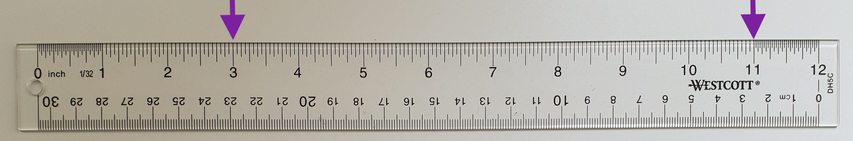
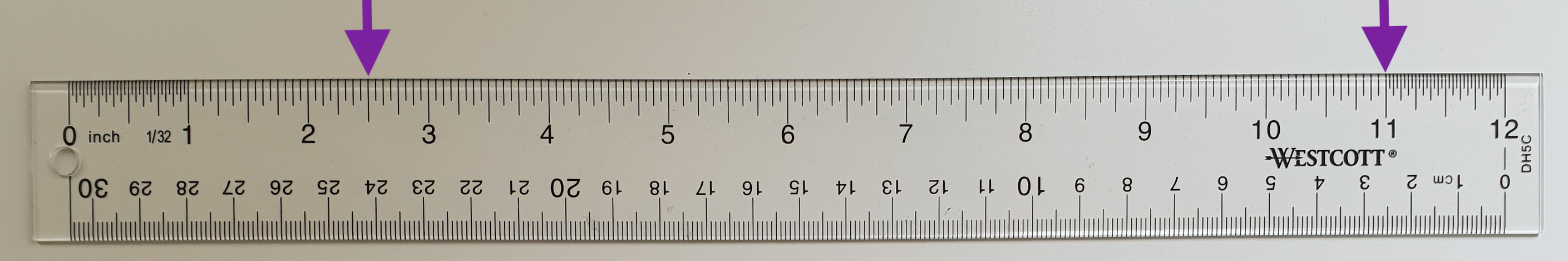
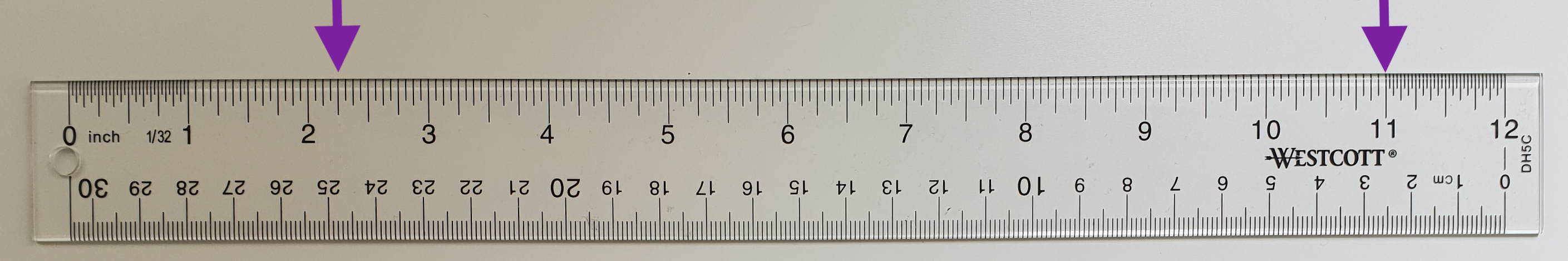
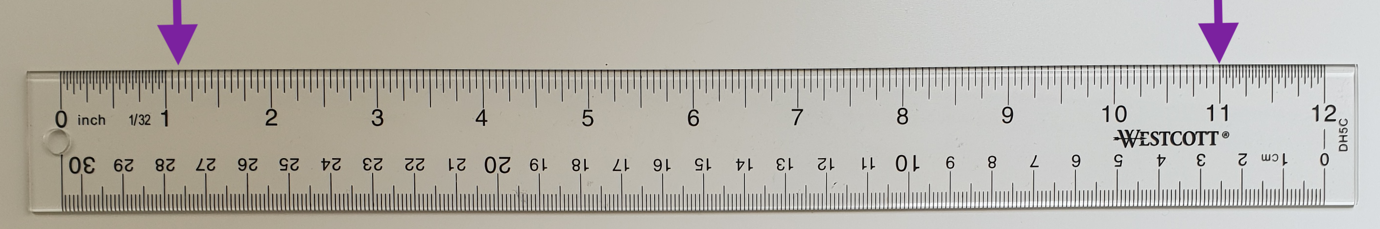
Student Facing
What is the distance between the markings?
Student Response
For access, consult one of our IM Certified Partners.
Activity Synthesis
Ask students to share their strategies for each problem. Record and display their responses for all to see. To involve more students in the conversation, consider asking:
- “Who can restate \(\underline{\hspace{.5in}}\)’s reasoning in a different way?”
- “Did anyone have the same strategy but would explain it differently?”
- “Did anyone solve the problem in a different way?”
- “Does anyone want to add on to \(\underline{\hspace{.5in}}\)’s strategy?”
- “Do you agree or disagree? Why?”
16.2: Compare & Contrast (10 minutes)
Activity
The goal of this activity is for students to practice comparing two data sets that are both represented with a box plot. Students will use two box plots to interpret the data sets and, as they answer the questions, they will have to compare the data sets. This will prepare students for a later lesson because they will interpret their own data sets after they have collected the data and created representations of them.
Launch
Remind students to answer the questions based on the information they can gather from the box plots. For example, students should not calculate the mean when asked about measures of center, because these representations do not show individual data points.
Student Facing
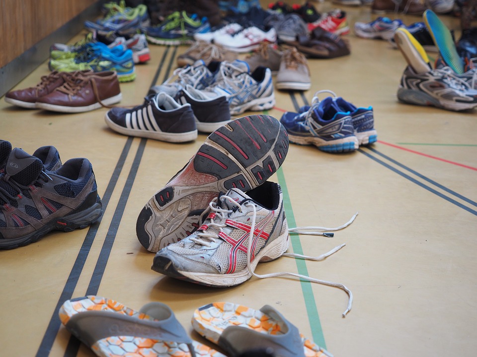
Here are the shoe sizes from two cohorts in the military.
Cohort A:

Cohort B:

- Is there any overlap between the two data sets? Explain your reasoning.
- Which cohort has more variability?
- Does at least one person from cohort A have a bigger shoe size than someone from cohort B? Explain your reasoning.
- Compare the measures of center.
Student Response
For access, consult one of our IM Certified Partners.
Activity Synthesis
Discuss how students used the graph to help analyze the data. Here are sample questions to promote class discussion:
- “What does it mean for data sets to overlap?” (It means that numbers from one data set fall between numbers from the other data set.)
- “What are ways to determine and compare variability?” (You can calculate the range, interquartile range, or standard deviation. To answer question 2, you have to compare the two measures of variability and see which one is higher.)
- “Are there other data displays that you think would have made analyzing this data easier?” (Yes, if we used a dot plot, we would know more about variability, because we could calculate the standard deviation, too.)
16.3: Compare & Contrast Continued (25 minutes)
Activity
The goal of this activity is for students to combine the skills they have learned throughout the unit. Students create graphical representations of data, calculate important measures, and compare two data sets. This will prepare students for the accompanying Algebra lesson when they will use a data set to create a graphical representation and interpret the data by answering questions.
Student Facing
Here are the shoes sizes of some grade 9 and grade 12 students.
Grade 9 shoe sizes:
- 6
- 8
- 6.5
- 7.5
- 7
- 6.5
- 9
- 6
- 8.5
- 7.5
- 8
- 10
- 11
- 8
- 9
Grade 12 shoe sizes:
- 10
- 9
- 10.5
- 8.5
- 10
- 9
- 9.5
- 8
- 8
- 11
- 9
- 9.5
- 11
- 10.5
- 8.5
- Create a box plot, dot plot, or histogram to represent both sets of data.
- Describe the distribution shapes.
- Complete the table.
mean median IQR standard deviation grade 9
shoe sizesgrade 12
shoe sizes - Does one grade’s shoe sizes have more variation than the other? Explain how you know.
- Compare the measures of center for the two sets of shoe sizes.
- Do the distributions overlap? Use the data display you created to explain how you know.
Student Response
For access, consult one of our IM Certified Partners.
Lesson Synthesis
Lesson Synthesis
The goal of this lesson is for students to practice all the skills they have acquired throughout the unit. Students should know how to collect, represent, interpret, analyze, and compare data. Discuss how these skills have developed and how to use them in the future. Here are sample discussion questions:
- “How do you choose which graphical representation is the best to display the data set?” (I think about what types of things I want to be able to see about the data set. If I am looking for distribution shapes, histograms and dot plots will be a better choice than box plots.)
- “What is the most challenging aspect of working with data? What can you do to make this easier?” (Doing correct calculations is the most challenging. To make this easier, I can use technology, double check my work, and keep practicing doing the calculations.)
- "When comparing data sets, why is it important to display all data sets with the same type of representation?” (Depending on what you want to compare about the data sets, it is easier to see similiarities and differences between the same type of representation.)