Lesson 3
Interpreting Histograms
3.1: Dog Show (Part 1) (5 minutes)
Warm-up
The purpose of this warm-up is to connect the analytical work students have done with dot plots in previous lessons with statistical questions. This activity reminds students that we gather, display, and analyze data in order to answer statistical questions. This work will be helpful as students contrast dot plots and histograms in subsequent activities.
Launch
Arrange students in groups of 2. Give students 1 minute of quiet work time, followed by 2 minutes to share their responses with a partner. Ask students to decide, during partner discussion, if each question proposed by their partner is a statistical question that can be answered using the dot plot. Follow with a whole-class discussion.
If students have trouble getting started, consider giving a sample question that can be answered using the data on the dot plot (e.g., “How many dogs weigh more than 100 pounds?”)
Student Facing
Here is a dot plot showing the weights, in pounds, of 40 dogs at a dog show.

- Write two statistical questions that can be answered using the dot plot.
- What would you consider a typical weight for a dog at this dog show? Explain your reasoning.
Student Response
For access, consult one of our IM Certified Partners.
Activity Synthesis
Ask students to share questions they agreed were statistical questions that could be answered using the dot plot. Record and display their responses for all to see. If there is time, consider asking students how they would find the answer to some of the statistical questions.
Ask students to share a typical weight for a dog at this dog show and why they think it is typical. Record and display their responses for all to see. After each student shares, ask the class if they agree or disagree.
3.2: Dog Show (Part 2) (10 minutes)
Activity
This activity introduces students to histograms. By now, students have developed a good sense of dot plots as a tool for representing distributions. They use this understanding to make sense of a different form of data representation. The data set shown on the first histogram is the same one from the preceding warm-up, so students are familiar with its distribution. This allows them to focus on making sense of the features of the new representation and comparing them to the corresponding dot plot.
Note that in all histograms in this unit, the left-end boundary of each bin or bar is included and the right-end boundary is excluded. For example, the number 5 would not be included in the 0–5 bin, but would be included in the 5–10 bin.
Launch
Explain to students that they will now explore histograms, another way to represent numerical data. Give students 3–4 minutes of quiet work time, and then 2–3 minutes to share their responses with a partner. Follow with a whole-class discussion.
Student Facing
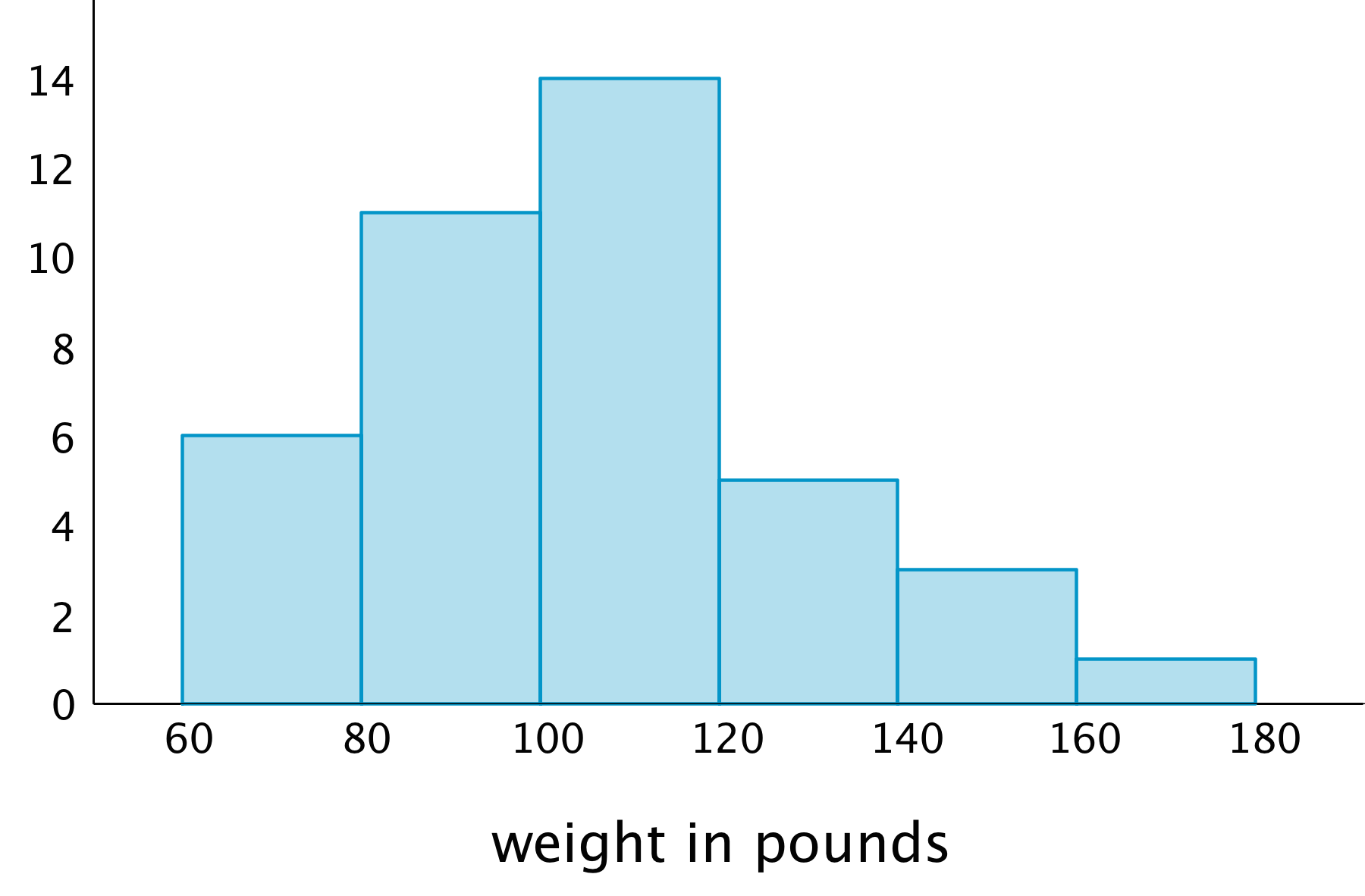
Here is a histogram that shows some dog weights in pounds.

Each bar includes the left-end value but not the right-end value. For example, the first bar includes dogs that weigh 60 pounds and 68 pounds but not 80 pounds.
-
Use the histogram to answer the following questions.
-
How many dogs weigh at least 100 pounds?
-
How many dogs weigh exactly 70 pounds?
-
How many dogs weigh at least 120 and less than 160 pounds?
-
How much does the heaviest dog at the show weigh?
- What would you consider a typical weight for a dog at this dog show? Explain your reasoning.
-
-
Discuss with a partner:
-
If you used the dot plot to answer the same five questions you just answered, how would your answers be different?
-
How are the histogram and the dot plot alike? How are they different?
-
Student Response
For access, consult one of our IM Certified Partners.
Activity Synthesis
Ask a few students to briefly share their responses to the first set of questions to make sure students are able to read and interpret the graph correctly.
Focus the whole-class discussion on the last question. Select a few students or groups to share their observations about whether or how their answers to the statistical questions would change if they were to use a dot plot to answer them, and about how histograms and dot plots compare. If not already mentioned by students, highlight that, in a histogram:
- Data values are grouped into “bins” and represented as vertical bars.
- The height of a bar reflects the combined frequency of the values in that bin.
- A histogram uses a number line.
At this point students do not yet need to see the merits or limits of each graphical display; this work will be done in upcoming lessons. Students should recognize, however, how the structures of the two displays are different (MP7) and start to see that the structural differences affect the insights we are able to glean from the displays.
Supports accessibility for: Memory; Language
Design Principle(s): Support sense-making; Maximize meta-awareness
3.3: Tall and Taller Players (10 minutes)
Activity
Now that students have some experience drawing and interpreting histograms, they use histograms to compare distributions of two populations. In a previous activity, students compared the two dot plots of students in a keyboarding class—one for the typing speeds at the beginning of the course and the other showing the speeds at the end of the course. In this activity, they recognize that we can compare distributions displayed in histograms in a similar way—by studying shapes, centers, and spreads.
Launch
Arrange students in groups of 2. Give students 4–5 minutes of quiet work time and 1–2 minutes to share their responses with a partner.
Supports accessibility for: Language; Social-emotional skills
Student Facing
Professional basketball players tend to be taller than professional baseball players.
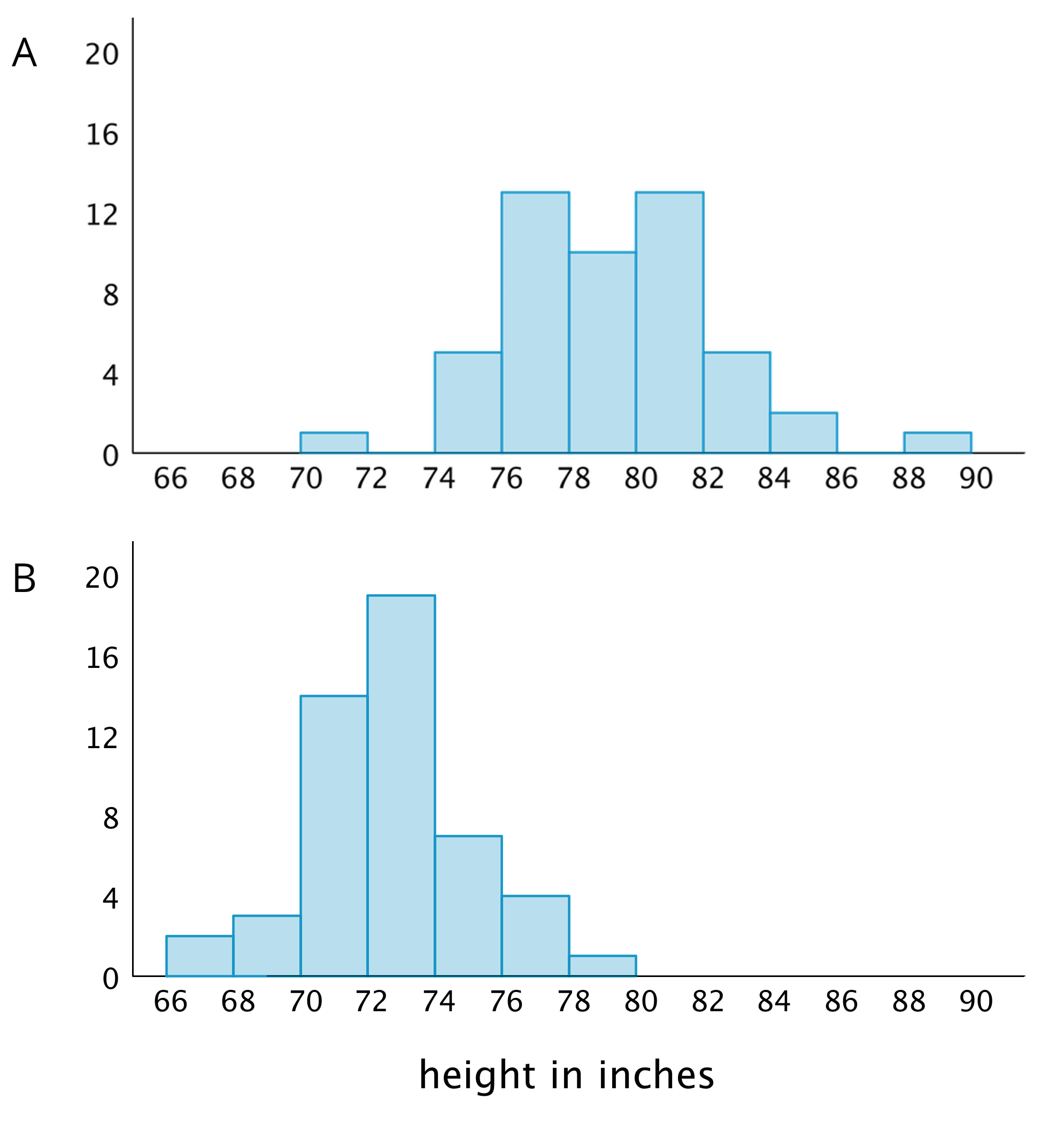
Here are two histograms that show height distributions of 50 male professional baseball players and 50 male professional basketball players.
- Decide which histogram shows the heights of baseball players and which shows the heights of basketball players. Be prepared to explain your reasoning.

- Write 2–3 sentences that describe the distribution of the heights of the basketball players. Comment on the center and spread of the data.
- Write 2–3 sentences that describe the distribution of the heights of the baseball players. Comment on the center and spread of the data.
Student Response
For access, consult one of our IM Certified Partners.
Activity Synthesis
Select a few students to share their descriptions about basketball players and baseball players. After each student shares, ask others if they agree with the descriptions and, if not, how they might revise or elaborate on them. In general, students should recognize that the distributions of the two groups of athletes are quite different and be able to describe how they are different.
Highlight the fact that students are using approximations of center and different adjectives to characterize a distribution or a typical height, and that, as a result, there are variations in our descriptions. In some situations, these variations might make it challenging to compare groups more precisely. We will study specific ways to measure center and spread in upcoming lessons.
Design Principle(s): Optimize output (for explanation); Maximize meta-awareness
Lesson Synthesis
Lesson Synthesis
Once we have a histogram drawn, we can use it to answer some questions about a data set.
- “How would you describe a typical weight for this group of dogs?” (Dogs in this group typically weigh around 20 to 25 kilograms)
- “What can we say about the spread of the dog weights based on this histogram?” (There is a fairly wide range of weights represented from around 10 kilograms up to a little over 30 kilograms.)
- “In general, what information does a histogram allow us to see? How is it different from a dot plot?” (A bigger picture of the distribution is shown in the histogram, but some of the detail is lost when compared to a dot plot. For example, this histogram does not show the weight of any individual dogs.)

3.4: Cool-down - A Tale of Two Seasons (5 minutes)
Cool-Down
For access, consult one of our IM Certified Partners.
Student Lesson Summary
Student Facing
In addition to using dot plots, we can also represent distributions of numerical data using histograms.
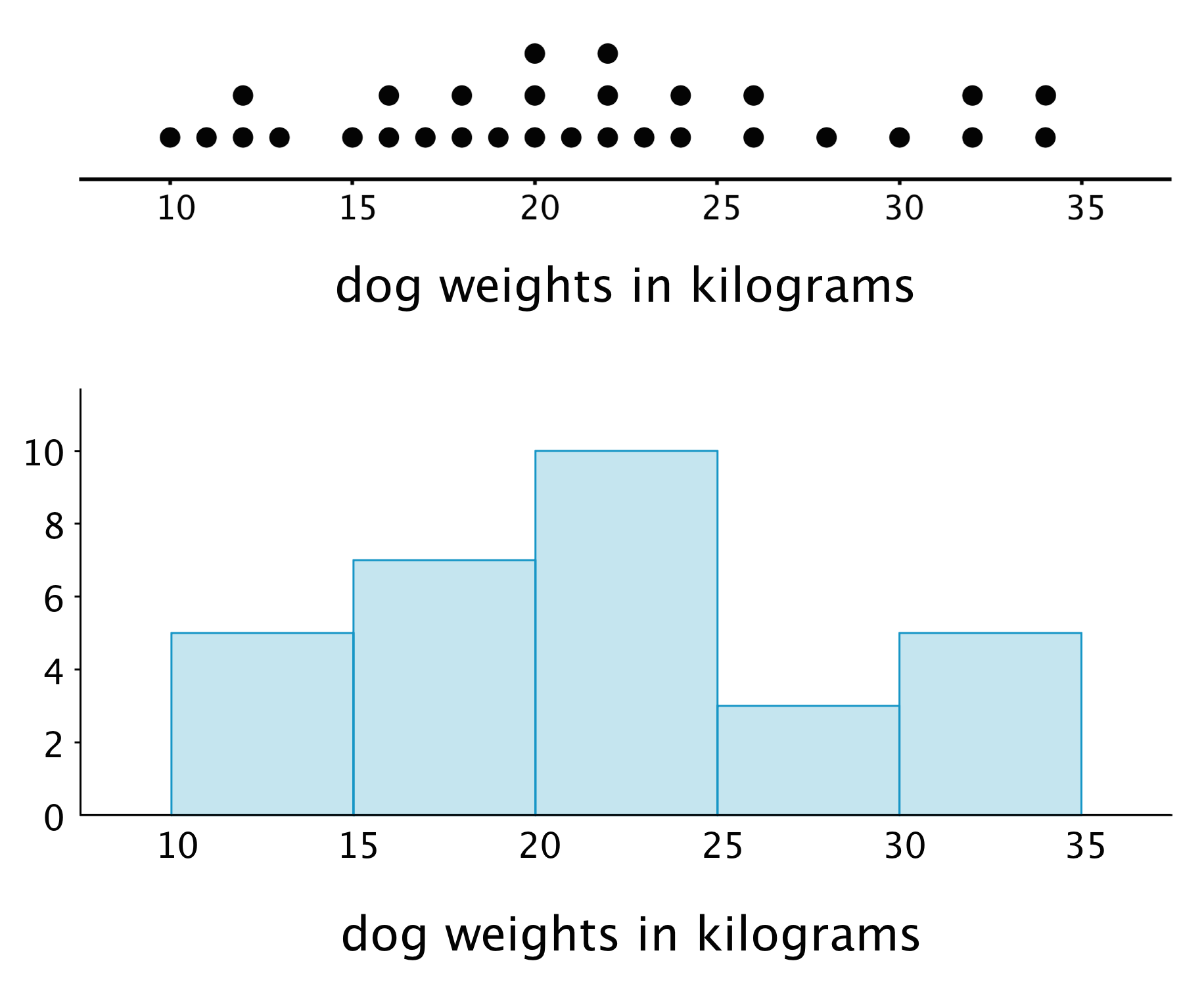
Here is a dot plot that shows the weights, in kilograms, of 30 dogs, followed by a histogram that shows the same distribution.

In a histogram, data values are placed in groups or “bins” of a certain size, and each group is represented with a bar. The height of the bar tells us the frequency for that group.
For example, the height of the tallest bar is 10, and the bar represents weights from 20 to less than 25 kilograms, so there are 10 dogs whose weights fall in that group. Similarly, there are 3 dogs that weigh anywhere from 25 to less than 30 kilograms.
Notice that the histogram and the dot plot have a similar shape. The dot plot has the advantage of showing all of the data values, but the histogram is easier to draw and to interpret when there are a lot of values or when the values are all different.