Lesson 5
How Crowded Is this Neighborhood?
5.1: Dot Density (5 minutes)
Optional activity
In this activity, students compare dot densities when dots are uniformly distributed. The squares are sized so that students can compare dot density in large and small squares by drawing a partition of the larger square into four smaller squares and comparing the number of dots in squares of the same size. In the next activity, the dots are not uniformly distributed, so students need to think more about the meaning of “dots per square inch.”
Launch
Display the image of the four squares with dots. Invite students to share what they notice and what they wonder.
Give students 5 minutes of quiet work time followed by whole-class discussion.
Student Facing
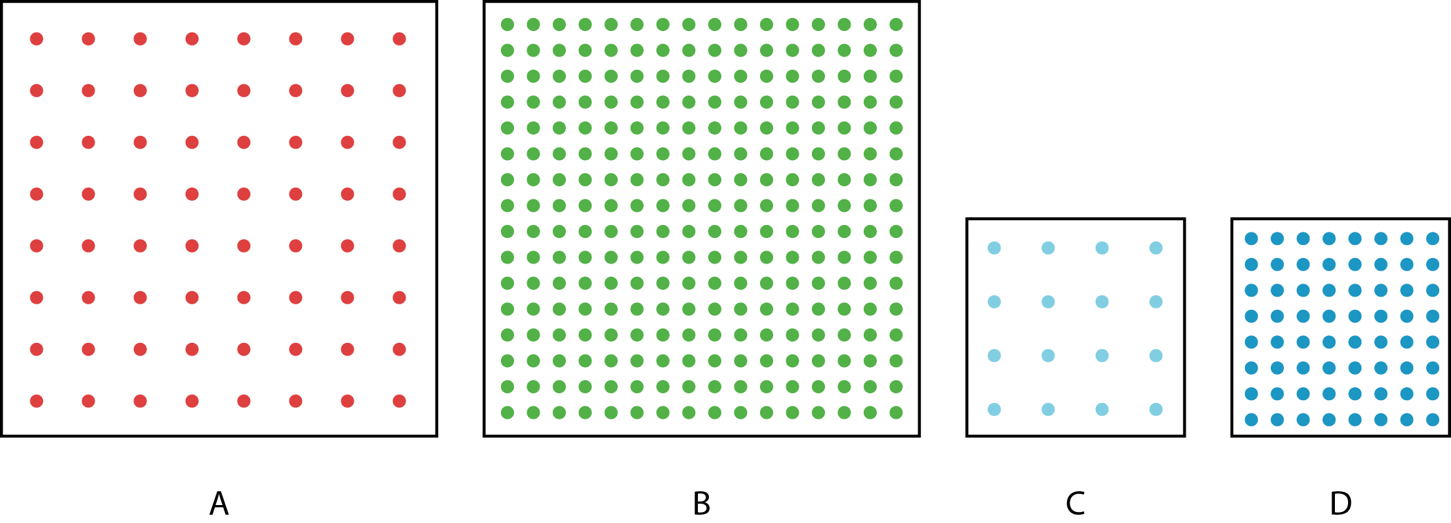
The figure shows four squares. Each square encloses an array of dots. Squares A and B have side length 2 inches. Squares C and D have side length 1 inch.
-
Complete the table with information about each square.
square area of the square
in square inchesnumber
of dotsnumber of dots
per square inchA B C D -
Compare each square to the others. What is the same and what is different?
Student Response
For access, consult one of our IM Certified Partners.
Anticipated Misconceptions
Some students might not understand what the last column in the table is asking them for. Remind them that the word per means “for each” or “for one.”
Activity Synthesis
Invite students to share what is similar and what is different about the arrays.
Define density as “things per square inch,” in this case dots per square inch. Demonstrate the correct use of “dense” and “density” by saying things like:
- “The green dots in Square B are more densely packed than the red dots in Square A and the blue dots in Square C.”
- “The density of the red dots in Square A and the blue dots in Square C is the same.”
If students haven’t noted it already, point out that the large square A can be partitioned into four smaller squares. Each has an array of red dots identical (except for the color) to the array of blue dots in Square C. The same is true for Squares B and D.
Design Principle(s): Support sense-making
5.2: Dot Density with a Twist (10 minutes)
Optional activity
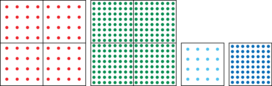
In this activity, the dots are distributed uniformly in the first square but not in the second square:
However, these dots are drawn so it is not too hard to see that if they were redistributed, each square inch would have 8 dots:
The fact that we have 8 dots per square inch means that if we distributed the dots uniformly throughout the square in the right way, we would see 8 dots in each square inch. This prepares students to be able to interpret the constant of proportionality in the next two activities when working with actual houses per square mile or people per square kilometer. When we speak of “500 houses per square kilometer,” we can think of this as, “If we took all of the houses in the region and spread them out uniformly, then we would see 500 houses in every square kilometer.”
Launch
Display the image of the two squares with dots. Ask students to describe what is the same and what is different about these squares.
Give students 2–3 minutes of quiet work time, followed by 4–5 minutes of partner work time and whole-class discussion.
Supports accessibility for: Organization; Attention
Design Principle(s): Cultivate conversation; Maximize meta-awareness
Student Facing
The figure shows two arrays, each enclosed by a square that is 2 inches wide.
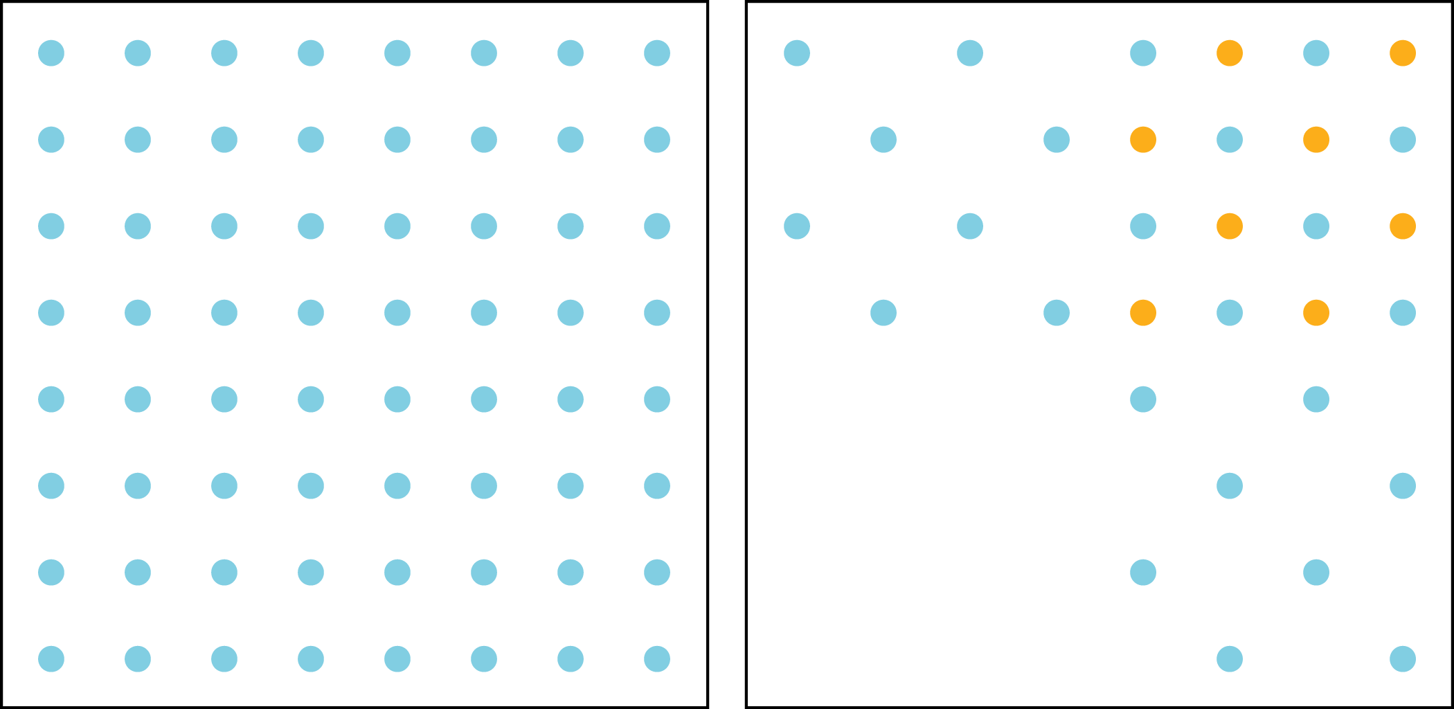
- Let \(a\) be the area of the square and \(d\) be the number of dots enclosed by the square. For each square, plot a point that represents its values of \(a\) and \(d\). Start by choosing an appropriate scale for each axis, using the sliders to adjust the intervals.
-
Draw lines from \((0, 0)\) to each point. For each line, write an equation that represents the proportional relationship.
-
What is the constant of proportionality for each relationship? What do the constants of proportionality tell us about the dots and squares?
Student Response
For access, consult one of our IM Certified Partners.
Launch
Display the image of the two squares with dots. Ask students to describe what is the same and what is different about these squares.
Give students 2–3 minutes of quiet work time, followed by 4–5 minutes of partner work time and whole-class discussion.
Supports accessibility for: Organization; Attention
Design Principle(s): Cultivate conversation; Maximize meta-awareness
Student Facing
The figure shows two arrays, each enclosed by a square that is 2 inches wide.
- Let \(a\) be the area of the square and \(d\) be the number of dots enclosed by the square. For each square, plot a point that represents its values of \(a\) and \(d\).

-
Draw lines from \((0, 0)\) to each point. For each line, write an equation that represents the proportional relationship.
-
What is the constant of proportionality for each relationship? What do the constants of proportionality tell us about the dots and squares?
Student Response
For access, consult one of our IM Certified Partners.
Activity Synthesis
The goal of this discussion is for students to make sense of the constant of proportionality in the case where the dots are not uniformly distributed. Invite students to share their interpretations of the constants of proportionality.
Consider asking questions like:
- “Why is one of the constants of proportionality larger than the other? How can we see this in the picture of the squares?” (There are more dots in the same area.)
- “What are the units of the constants of proportionality?” (The number of dots per square inch).
Students will have more opportunities to think about this when working on the activities that follow.
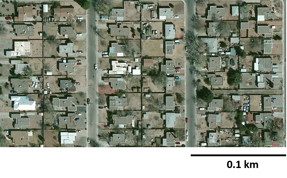
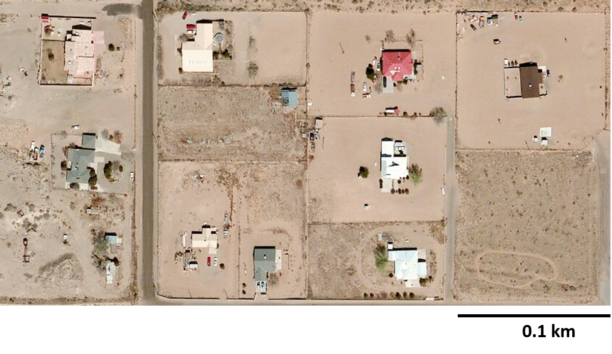
5.3: Housing Density (15 minutes)
Optional activity
This activity starts to transition students from arrays of dots to real-world objects distributed over the surface of Earth. This task concerns housing density, which is very similar to dot density. The two images in the activity have the following properties:
- It is fairly easy to distinguish the houses and not too tedious to count them all.
- The scale of the images is similar, but the size of each image is not the same, nor is the number of houses in each image.
- In the first image, the houses look fairly uniformly distributed, and in the other, they look less uniformly distributed but not to the point that it is hard to interpret the image.
This task can be customized to any location, for example different neighborhoods in your city. Care should be taken in selecting the images to include noticeably different housing densities and easy-to-count houses.
Launch
Give students 5 minutes of quiet work time followed by partner and whole-class discussion. Provide access to four-function calculators.
Supports accessibility for: Memory; Conceptual processing
Student Facing
Here are pictures of two different neighborhoods.
This image depicts an area that is 0.3 kilometers long and 0.2 kilometers wide.
This image depicts an area that is 0.4 kilometers long and 0.2 kilometers wide.
Student Response
For access, consult one of our IM Certified Partners.
Anticipated Misconceptions
Some students may struggle interpreting the decimal numbers in the activity. A length of 0.1 km is \(\frac{1}{10}\) of a kilometer. This means that 10 of these lengths will make a kilometer.
Students are accustomed to an area (of a rectangle) being numerically bigger than its length or width. Ask students to think about multiplication of fractions: a square that is \(\frac12\) inch by \(\frac12\) inch has area \(\frac14\) square inch because four \(\frac12\) inch by \(\frac12\) inch squares compose a square inch.
Activity Synthesis
Poll students’ answers for the two densities. Invite students to share their reasoning. Consider asking the following questions:
- One number is a lot bigger than the other. How can we see this in the images? (There are a lot more houses on the same area.)
- You only counted 48 houses in the first image but you say that there are 800 houses per square kilometer. Why is that happening? (The area in the image is just a fraction of a square kilometer. If we looked at a square kilometer with the same density, there would be 800 houses in it.)
- Some of you said that there are 112.5 houses per square kilometer in the second neighborhood. How can there be half houses? (If we had an image with an area of 2 square kilometers, there would be 225 houses in the image, or if they are uniformly distributed, the image might contain a part of a house.)
If desired, display this image to help students make sense of their answers.
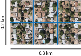
The map shows a rectangle 0.3 km by 0.2 km. This means that any one of the six squares is 0.1 km by 0.1 km, which has area 0.01 square kilometer.
If you lined up 10 of these, you would have a strip 1 km long. 10 of these strips would make a square 1 km by 1 km; that is, 1 square kilometer. Now it’s clear that it takes 100 of these small squares to make a square kilometer, so the small square indeed has area \(\frac{1}{100}\) of a square kilometer. In fact, there are 8 houses in this square, so if the entire square kilometer were filled the same way, there would be 800 houses.
5.4: Population Density (15 minutes)
Optional activity
The purpose of this activity is to introduce the concept of population density. One added step going from houses in a neighborhood to people in a location is the fact that people do not stay at a fixed spot but rather move around. In this activity, students make sense of what it means to say there are 42.3 people per square kilometer in some location.
This activity gives some information about New York City and Los Angeles and ultimately asks students to decide which city is more crowded. Students may benefit from a demonstration of situations that feel more crowded vs. less crowded.
In the data for this task, people are given in “blocks” of 1000 people. It’s perfectly fine to make up a new unit customized to the situation, even if it doesn’t have an official name. This is a more sophisticated use of nonstandard units. In earlier grades, nonstandard units tend to be the length of a paper clip, or the length of your shoe. When dealing with any units, it’s important to list the units: in the heading of a table, in labels for the axes of a graph, or in writing numbers.
Launch
Arrange students in groups of 2–4. Provide access to calculators.
Consider demonstrating situations that feel more crowded or less crowded by having a certain number of students stand in an area. “What would you have to do to feel more crowded with the same number of people?” (Stand in a smaller space, which would require people to stand closer to each other.) “Less crowded?” (Take up more space, so that people are farther apart.) Then, mark off a region on the classroom floor with tape. Ask some students to stand inside it, and then ask, “What would make the space feel more crowded?” (If more people stood in the same space.) “Less crowded?” (Fewer people.)
If desired, provide some background information about New York City and Los Angeles and display satellite images:
- New York City is the U.S. city with the largest population. The city has five parts (called boroughs): Manhattan, Brooklyn, Bronx, Queens, and Staten Island. In Manhattan, most people live in apartment buildings, many in high-rises. In the other boroughs, many people also live in single-family houses. Staten Island is quite different, almost suburban.
- Los Angeles is the U.S. city with the second largest population. Although there are some high-rise apartment buildings, many people live in single-family houses, and many of these houses are single-story.
Give students 5 minutes of quiet work time, followed by small-group and whole-class discussion.
Supports accessibility for: Memory; Language
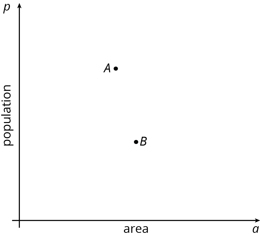
Student Facing
- New York City has a population of 8,406 thousand people and covers an area of 1,214 square kilometers.
- Los Angeles has a population of 3,884 thousand people and covers an area of 1,302 square kilometers.
-
The points labeled \(A\) and \(B\) each correspond to one of the two cities. Which is which? Label them on the graph.
-
Write an equation for the line that passes through \((0, 0)\) and \(A\). What is the constant of proportionality?
-
Write an equation for the line that passes through \((0, 0)\) and \(B\). What is the constant of proportionality?
- What do the constants of proportionality tell you about the crowdedness of these two cities?
Student Response
For access, consult one of our IM Certified Partners.
Student Facing
Are you ready for more?
-
Predict where these types of regions would be shown on the graph:
-
a suburban region where houses are far apart, with big yards
-
a neighborhood in an urban area with many high-rise apartment buildings
-
a rural state with lots of open land and not many people
-
-
Next, use this data to check your predictions:
place description population area (km2) Chalco a suburb of Omaha, Nebraska 10,994 7.5 Anoka County a county in Minnesota, near Minneapolis/St. Paul 339,534 1,155 Guttenberg a city in New Jersey 11,176 0.49 New York a state 19,746,227 141,300 Rhode Island a state 1,055,173 3,140 Alaska a state 736,732 1,717,856 Tok a community in Alaska 1,258 342.7
Student Response
For access, consult one of our IM Certified Partners.
Anticipated Misconceptions
Be on the lookout for these areas of potential difficulty:
- Thinking that the numbers on the \(p\)-axis represent people, rather than thousands of people.
- Trying to find the exact values given, rather than approximating or rounding.
- Trouble adapting concepts or skills from graphing proportional relationships to this more complex situation.
If students have difficulty understanding numbers that are expressed in units of 1,000, they may need either some scaffolding or adequate time to talk about what these numbers mean. Alternatively, the numbers can be given in terms of the more familiar millions, in which case the population densities will require some extra effort to understand.
Activity Synthesis
Invite some students to display their graphs and equations for all to see. Ask all students if they agree or disagree and why. Once students agree, focus on the meaning of the constants of proportionality and what they tell us about the crowdedness in the two cities.
Consider asking the following questions:
- “Why did you choose point A to represent New York City?” (New York City has more people per square kilometer than Los Angeles, so New York is more crowded than Los Angeles.)
- “What does the constant of proportionality tell us about the crowdedness in the two cities?” (Even though people aren’t distributed uniformly throughout the cities, we might say that if we were to distribute everyone who has an address in the city uniformly throughout the city, then there would be about 6,900 people in every square kilometer in NYC and about 3,000 people in every square kilometer in LA.)
Design Principle(s): Optimize output (for comparison); Maximize meta-awareness