Lesson 1
Organizing Data
Let’s find ways to show patterns in data
1.1: Notice and Wonder: Messy Data
Here is a table of data. Each row shows two measurements of a triangle.
| length of short side (cm) | length of perimeter (cm) |
|---|---|
| 0.25 | 1 |
| 2 | 7.5 |
| 6.5 | 22 |
| 3 | 9.5 |
| 0.5 | 2 |
| 1.25 | 3.5 |
| 3.5 | 12.5 |
| 1.5 | 5 |
| 4 | 14 |
| 1 | 2.5 |
What do you notice? What do you wonder?
1.2: Seeing the Data
Here is the table of isosceles right triangle measurements from the warm-up and an empty table.
| length of short sides (cm) | length of perimeter (cm) |
|---|---|
| 0.25 | 1 |
| 2 | 7.5 |
| 6.5 | 22 |
| 3 | 9.5 |
| 0.5 | 2 |
| 1.25 | 3.5 |
| 3.5 | 12.5 |
| 1.5 | 5 |
| 4 | 14 |
| 1 | 2.5 |
| length of short sides (cm) | length of perimeter (cm) |
|---|---|
- How can you organize the measurements from the first table so that any patterns are easier to see? Write the organized measurements in the empty table.
- For each of the following lengths, estimate the perimeter of an isosceles right triangle whose short sides have that length. Explain your reasoning for each triangle.
- length of short sides is 0.75 cm
- length of short sides is 5 cm
- length of short sides is 10 cm
In addition to the graphic representations of data you have learned, there are others that make sense in other situations. Examine the maps showing the results of the elections for United States president for 2012 and 2016. In red are the states where a majority of electorate votes were cast for the Republican nominee. In blue are the states where a majority of the electorate votes were cast for the Democrat nominee.
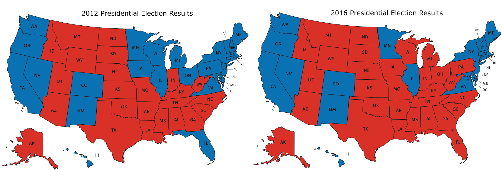
- What information can you see in these maps that would be more difficult to see in a bar graph showing the number of electorate votes for the 2 main candidates?
- Why are these representations appropriate for the data that is shown?
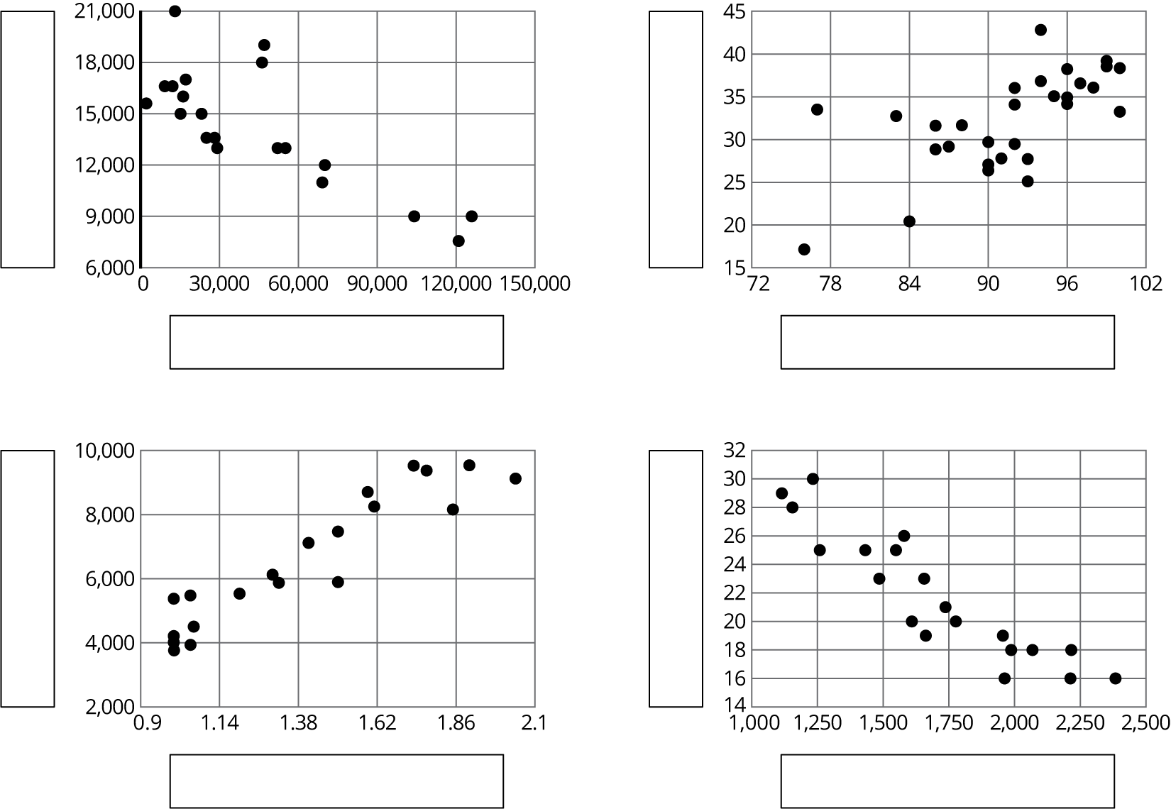
1.3: Tables and Their Scatter Plots
Here are four scatter plots. Your teacher will give you four tables of data.
- Match each table with one of the scatter plots.
- Use information from the tables to label the axes for each scatter plot.
Summary
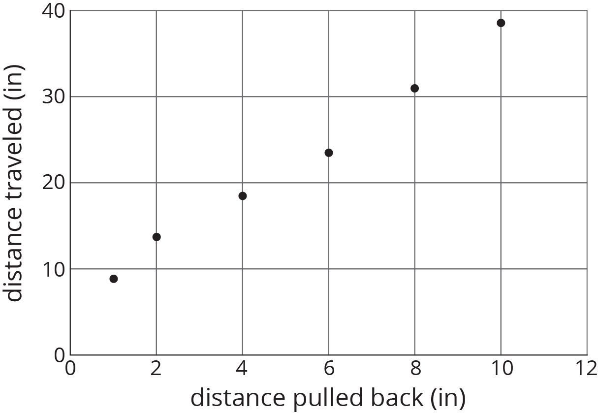
Consider the data collected from pulling back a toy car and then letting it go forward. In the first table, the data may not seem to have an obvious pattern. The second table has the same data and shows that both values are increasing together.
Unorganized table
| distance pulled back (in) | distance traveled (in) |
|---|---|
| 6 | 23.57 |
| 4 | 18.48 |
| 10 | 38.66 |
| 8 | 31.12 |
| 2 | 13.86 |
| 1 | 8.95 |
Organized table
| distance pulled back (in) | distance traveled (in) |
|---|---|
| 1 | 8.95 |
| 2 | 13.86 |
| 4 | 18.48 |
| 6 | 23.57 |
| 8 | 31.12 |
| 10 | 38.66 |
A scatter plot of the data makes the pattern clear enough that we can estimate how far the car will travel when it is pulled back 5 inches.
Patterns in data can sometimes become more obvious when reorganized in a table or when represented in scatter plots or other diagrams. If a pattern is observed, it can sometimes be used to make predictions.
Glossary Entries
- scatter plot
A scatter plot is a graph that shows the values of two variables on a coordinate plane. It allows us to investigate connections between the two variables.
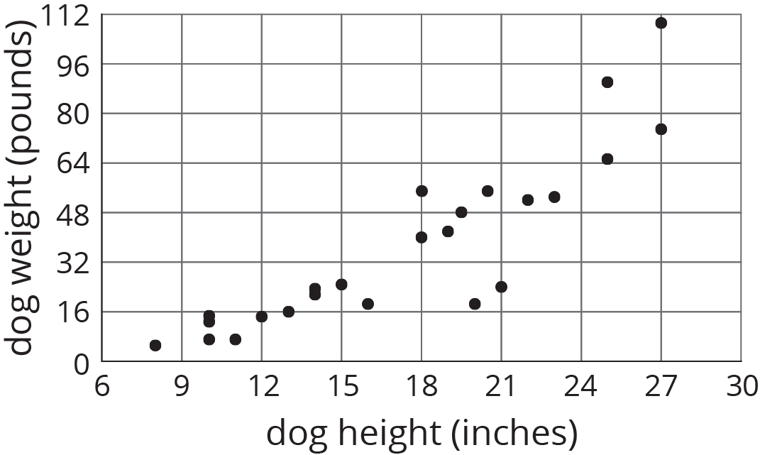
Each plotted point corresponds to one dog. The coordinates of each point tell us the height and weight of that dog.