Lesson 11
Comparing and Contrasting Data Distributions
11.1: Math Talk: Mean (5 minutes)
Warm-up
This is the first math talk activity in the course. See the launch for extended instructions for facilitating this activity successfully.
The purpose of this Math Talk is to expand students’ strategies for finding a mean beyond following an algorithm to reasoning that the mean of the values in a symmetric data set is the middle value. The third item is designed to illustrate that this technique only works for symmetric data sets. These understandings help students develop fluency and will be helpful later in this lesson when students will need to use symmetry to match a mean to the distribution.
This Math Talk provides an opportunity for students to notice and make use of the symmetric structure (MP7) of the values to determine the mean. While participating in these activities, students need to be precise in their word choice and use of language (MP6).
Monitor for students who:
- use the standard algorithm for finding mean (sum and divide)
- use the symmetry of the data set
Launch
This is the first time students do the math talk instructional routine, so it is important to explain how it works before starting.
Explain the math talk routine: one problem is displayed at a time. For each problem, students are given a few minutes to quietly think and give a signal when they have an answer and a strategy. The teacher selects students to share different strategies for each problem, and might ask questions like “Who thought about it a different way?” The teacher records students' explanations for all to see. Students might be asked to provide more details about why they decided to approach a problem a certain way. It may not be possible to share every possible strategy for the given limited time; the teacher may only gather two or three distinctive strategies per problem.
Consider establishing a small, discreet hand signal that students can display to indicate that they have an answer they can support with reasoning. This signal could be a thumbs-up, a certain number of fingers that tells the number of responses they have, or another subtle signal. This is a quick way to see if the students have had enough time to think about the problem. It also keeps students from being distracted or rushed by hands being raised around the class.
Display one problem at a time. Give students quiet think time for each problem and ask them to give a signal when they have an answer and a strategy. Keep all problems displayed throughout the talk. Follow with a whole-class discussion.
Supports accessibility for: Memory; Organization
Student Facing
Evaluate the mean of each data set mentally.
27, 30, 33
61, 71, 81, 91, 101
0, 100, 100, 100, 100
0, 5, 6, 7, 12
Student Response
For access, consult one of our IM Certified Partners.
Anticipated Misconceptions
If students struggle to use symmetry as a method for finding the mean, consider asking them to find the mean for the values: 1, 2, 3, 4, 5.
Activity Synthesis
Ask students to share their strategies for each problem. Record and display their responses for all to see. To involve more students in the conversation, consider asking:
- “Who can restate ___’s reasoning in a different way?”
- “Did anyone have the same strategy but would explain it differently?”
- “Did anyone solve the problem in a different way?”
- “Does anyone want to add on to __’s strategy?”
- “Do you agree or disagree? Why?”
Although all correct methods for solving for the mean are valid, highlight the use of symmetry in the data. In previous lessons, students learned that symmetric distributions have a mean in the center of the data. When symmetry is present, it can be used to quickly discover the mean.
Design Principle(s): Optimize output (for explanation)
11.2: Describing Data Distributions (15 minutes)
Activity
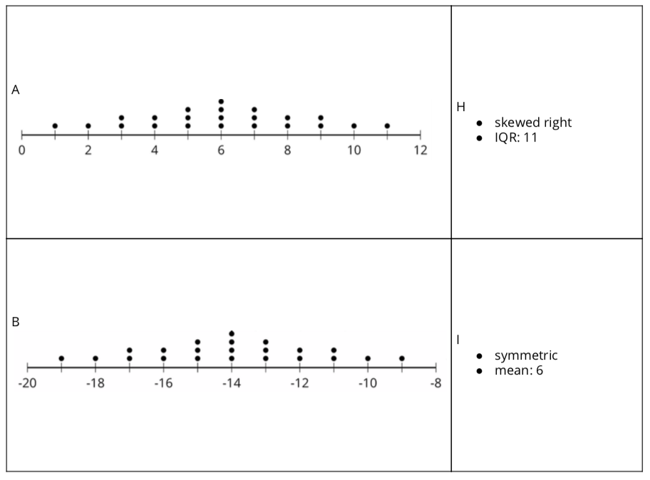
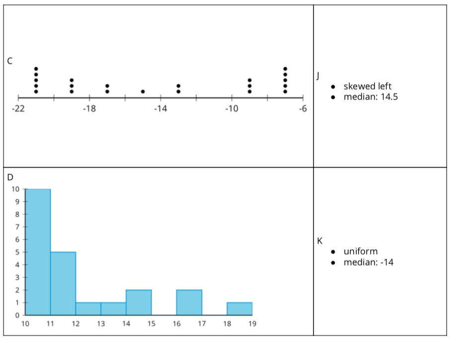
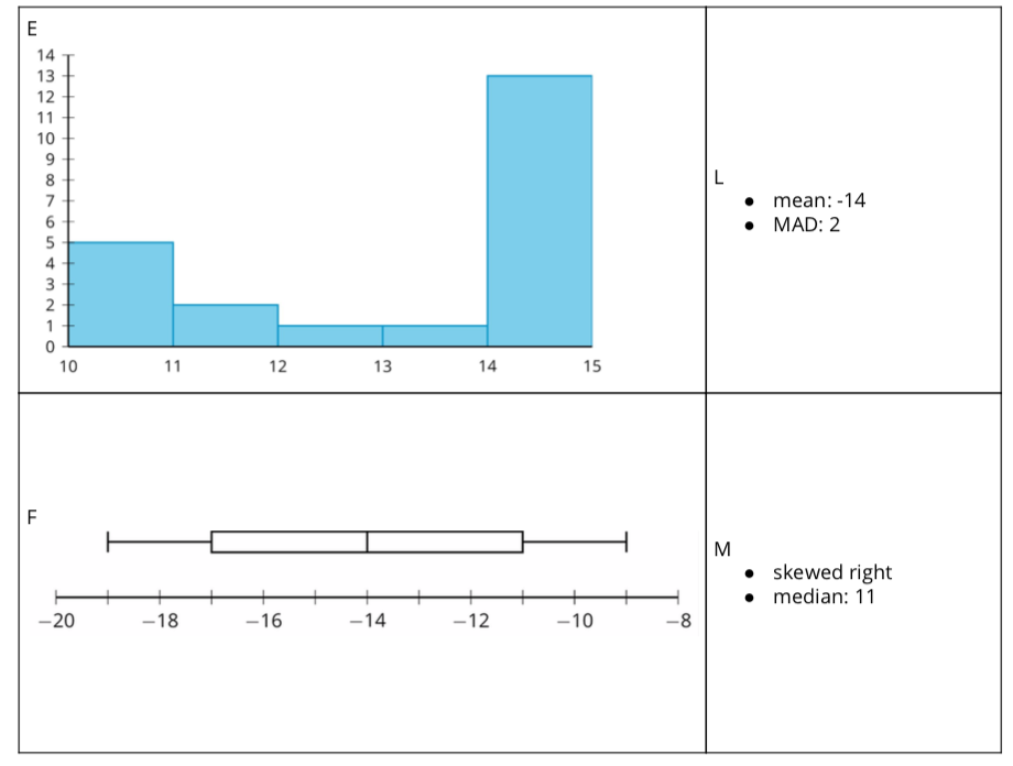
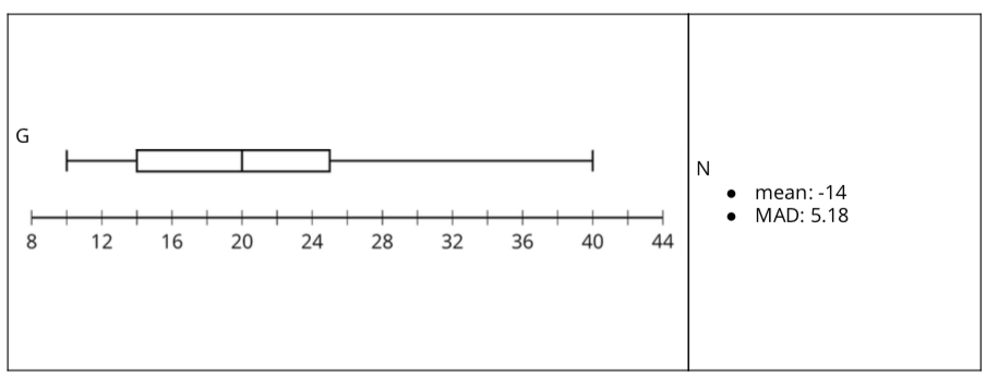
In this activity students take turns with a partner matching data displays with distribution characteristics and determine what measure of center is most appropriate for the data. Students trade roles explaining their thinking and listening, providing opportunities to explain their reasoning and critique the reasoning of others (MP3).


Launch
Arrange students in groups of 2. Demonstrate how to set up and and find matches. Choose a student to be your partner. Mix up the cards and place them face-up. Point out that the cards contain either a data display or a written statement. Select one of each style of card and then explain to your partner why you think the cards do or do not match. Demonstrate productive ways to agree or disagree, for example, by explaining your mathematical thinking or asking clarifying questions. Give each group a set of cut-up cards for matching. Ask students to pause after completing the matching for a whole-class discussion. Give students five minutes to work the second question then pause for a whole-class discussion.
Tell students that the appropriate measure of center may not be the one given on the cards.
Supports accessibility for: Social-emotional skills; Organization; Language
Student Facing
- Your teacher will give you a set of cards. Take turns with your partner to match a data display with a written statement.
- For each match that you find, explain to your partner how you know it’s a match.
- For each match that your partner finds, listen carefully to their explanation. If you disagree, discuss your thinking and work to reach an agreement.
- After matching, determine if the mean or median is more appropriate for describing the center of the data set based on the distribution shape. Discuss your reasoning with your partner. If it is not given, calculate (if possible) or estimate the appropriate measure of center. Be prepared to explain your reasoning.
Student Response
For access, consult one of our IM Certified Partners.
Activity Synthesis
Much discussion takes place between partners. Once all groups have completed the matching, discuss the following:
- “Which matches were tricky? Explain why.” (The box plot in row 6 was tricky because I had to use process of elimination to figure out that it was the one that was uniform.)
- “Did you need to make adjustments in your matches? What might have caused an error? What adjustments were made?” (Yes. I realized that I thought incorrectly that skewed left meant that most of the data was on the left. However, I learned that skewed left means that there is data to the left of where most of the data is located.)
- “Can you determine the median using only a histogram? Why or why not?” (No, but you can determine the interval that contains the median.)
- “Can you determine if a distribution is uniform from a box plot? Why or why not?” (No. You can determine that the data could possibly be symmetric based on the distribution of the five number summary, but beyond that you would not be able to know that the data is uniform using only a box plot.)
The purpose of the second part of the activity is to discuss the relationship between mean and median based on the shape of the distribution and to make the connection to measures of variability. Ask:
- “If the mean is the appropriate measure of center, should we use the MAD or the IQR to measure variability?” (MAD)
- “If the median is the appropriate measure of center, should we use the MAD or the IQR to measure variability?” (IQR)
11.3: Visual Variability and Statistics (10 minutes)
Activity
This activity prompts students to compare variability in several data sets by analyzing the distributions shown on box plots and dot plots. Some students may reason about variability by observing the shapes and features of the data displays. Others may try to quantify the variability by finding the IQR from each box plot, or by estimating the MAD from each dot plot. Look for students who approach the task quantitatively.
Launch
Arrange students in groups of 2. Give students five minutes to work through the questions then pause for a whole-group discussion.
Student Facing
Each box plot summarizes the number of miles driven each day for 30 days in each month. The box plots represent, in order, the months of August, September, October, November, and December.
- The five box plots have the same median. Explain why the median is more appropriate for describing the center of the data set than the mean for these distributions.
- Arrange the box plots in order of least variability to greatest variability. Check with another group to see if they agree.
- The five dot plots have the same mean. Explain why the mean is more appropriate for describing the center of the data set than the median.
- Arrange the dot plots in order of least variability to greatest variability. Check with another group to see if they agree.
Student Response
For access, consult one of our IM Certified Partners.
Student Facing
Are you ready for more?
-
These two box plots have the same median and the same IQR. How could we compare the variability of the two distributions?
-
These two dot plots have the same mean and the same MAD. How could we compare the variability of the two distributions?
Student Response
For access, consult one of our IM Certified Partners.
Anticipated Misconceptions
Students may have forgotten what variability means or which statistic to use to determine the variability in a data set. Refer them to previous work or ask them what measure is useful in determining a data set's tendency to have different values.
Activity Synthesis
The purpose of this discussion is to make the connection between the shape of the distribution and the use of either IQR or MAD to quantify variability. Another goal is to make sure students understand that a greater value from IQR or MAD means greater variability. Display the box plots in order of variability with the IQR included, and then display the dots plots in order of variability with the MAD included.
IQR: 20

IQR: 40

IQR: 40

IQR: 50

IQR: 60

MAD: 0

MAD: 1.12

MAD: 1.56

MAD: 2.22

MAD: 2.68

The IQR for the data in distributions A through E are {40, 60, 50, 40, 20} and the MAD for the data in distributions F through J are approximately {1.56, 1.10, 2.68, 2.22, 0}. Here are some questions for discussion:
- “What are the IQR and MAD measuring?” (They are measuring the spread or variability of the data)
- “Which plots were the most difficult to arrange?” (The dot plots were more difficult because it was easy to find the IQR for the box plots.)
- “Do the orders given by the IQR and MAD match your order?” (Yes, except for the box plots A and D which had the same IQR and I didn’t know how to arrange them.)
- “What do you notice about the values for IQR and MAD?” (The values for the MAD were higher than I thought except for distribution J. I did not know that the MAD could be equal to zero.)
- “What advantages are offered by using IQR and MAD versus visual inspection?” (The IQR and MAD are values that can be easily sorted.)
If some students already arranged the plots using IQR or MAD you should ask them, “Why did you choose to arrange the plots by IQR or MAD?” (I knew that IQR and MAD were measures of variability so I used them.)
Supports accessibility for: Language; Organization
Lesson Synthesis
Lesson Synthesis
In this lesson, students investigated variability using data displays and summary statistics.
- “One data set’s measure of center is best represented by a median of 7 and another data set by a median of 10. How would you determine which data set has greater variability?” (You calculate the IQR. Whichever one has a larger IQR is more variable.)
- “How do you determine which of two roughly symmetric distributions has less variability?” (You calculate the MAD. Whichever one has a lower MAD has less variability.)
- “What does it mean to say that one data set or distribution has more variability than another?” (The appropriate measure of variability for one data set is greater than the other. Using a data display, one distribution is more spread apart than the other.)
11.4: Cool-down - Which Menu? (5 minutes)
Cool-Down
For access, consult one of our IM Certified Partners.
Student Lesson Summary
Student Facing
The mean absolute deviation, or MAD, is a measure of variability that is calculated by finding the mean distance from the mean of all the data points. Here are two dot plots, each with a mean of 15 centimeters, displaying the length of sea scallop shells in centimeters.


Notice that both dot plots show a symmetric distribution so the mean and the MAD are appropriate choices for describing center and variability. The data in the first dot plot appear to be more spread apart than the data in the second dot plot, so you can say that the first data set appears to have greater variability than the second data set. This is confirmed by the MAD. The MAD of the first data set is 1.18 centimeters and the MAD of the second data set is approximately 0.94 cm. This means that the values in the first data set are, on average, about 1.18 cm away from the mean and the values in the second data set are, on average, about 0.94 cm away from the mean. The greater the MAD of the data, the greater the variability of the data.
The interquartile range, IQR, is a measure of variability that is calculated by subtracting the value for the first quartile, Q1, from the value for the the third quartile, Q3. These two box plots represent the distributions of the lengths in centimeters of a different group of sea scallop shells, each with a median of 15 centimeters.


Notice that neither of the box plots have a symmetric distribution. The median and the IQR are appropriate choices for describing center and variability for these data sets. The middle half of the data displayed in the first box plot appear to be more spread apart, or show greater variability, than the middle half of the data displayed in the second box plot. The IQR of the first distribution is 14 cm and 10 cm for the second data set. The IQR measures the difference between the median of the second half of the data, Q3, and the median of the first half, Q1, of the data, so it is not impacted by the minimum or the maximum value in the data set. It is a measure of the spread of the middle 50% of the data.
The MAD is calculated using every value in the data while the IQR is calculated using only the values for Q1 and Q3.


