Lesson 2
Using Dot Plots to Answer Statistical Questions
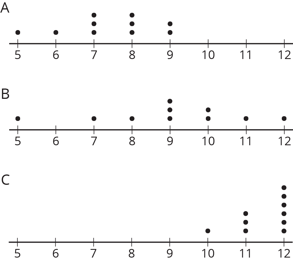
Problem 1
Three sets of data about ten sixth-grade students were used to make three dot plots. The person who made these dot plots forgot to label them. Match each dot plot with the appropriate label.
Solution
For access, consult one of our IM Certified Partners.
Problem 2
The dot plots show the time it takes to get to school for ten sixth-grade students from the United States, Canada, Australia, New Zealand, and South Africa.

- List the countries in order of typical travel times, from shortest to longest.
- List the countries in order of variability in travel times, from the least variability to the greatest.
Solution
For access, consult one of our IM Certified Partners.
Problem 3
Twenty-five students were asked to rate—on a scale of 0 to 10—how important it is to reduce pollution. A rating of 0 means “not at all important” and a rating of 10 means “very important.” Here is a dot plot of their responses.
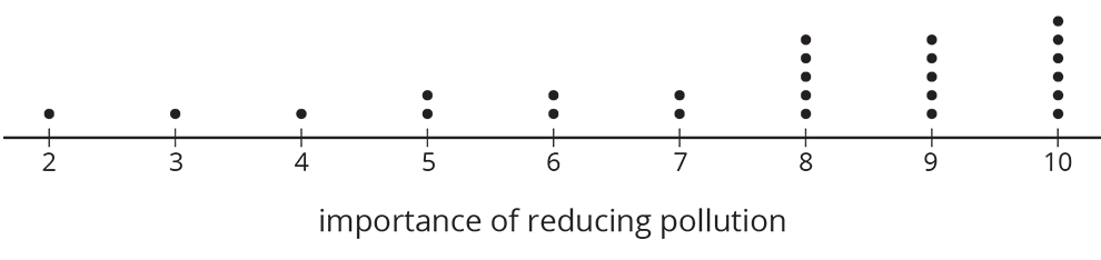
Explain why a rating of 6 is not a good description of the center of this data set.
Solution
For access, consult one of our IM Certified Partners.