Lesson 5
Plotting the Weather
Let’s construct a model.
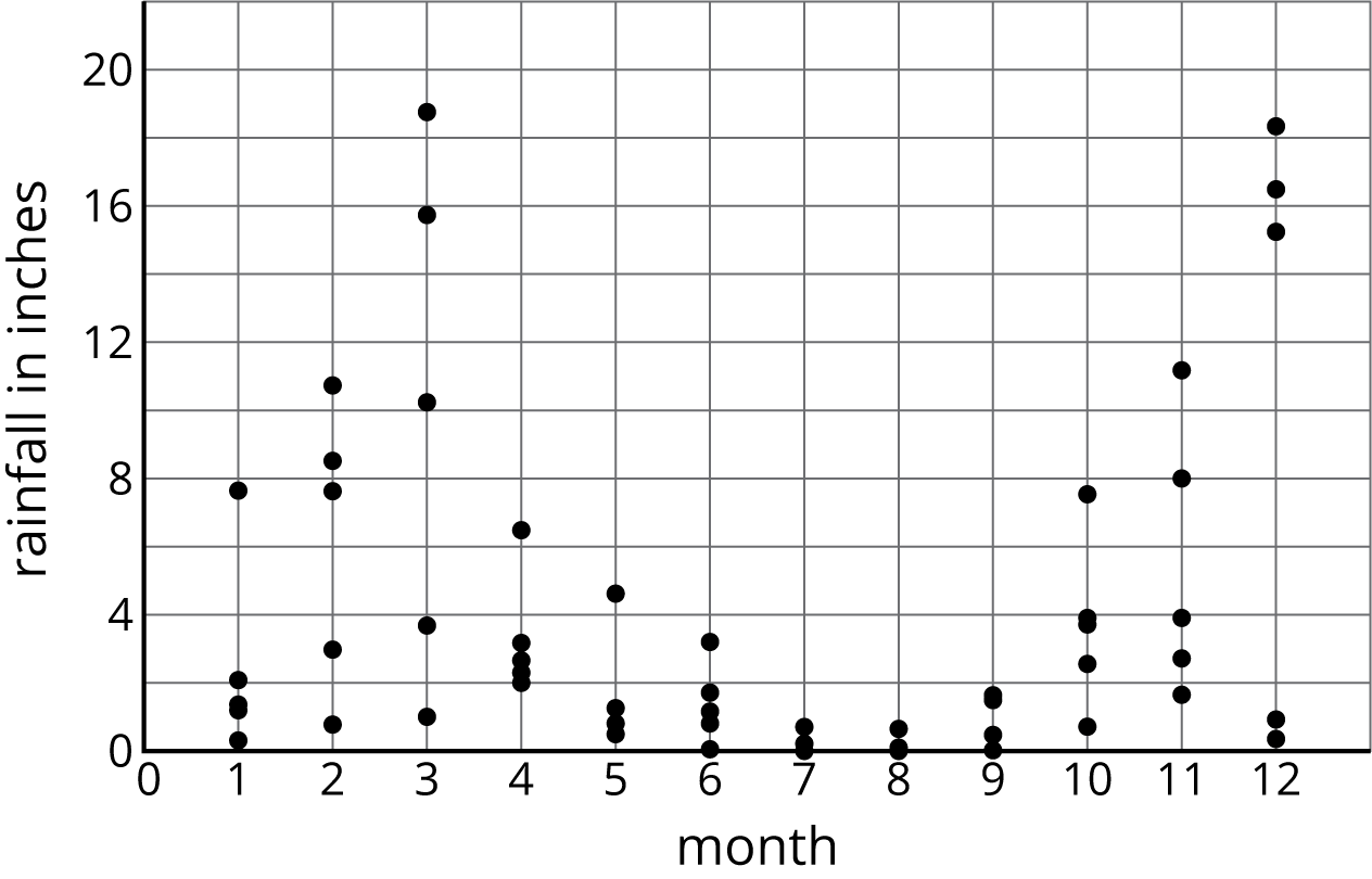
5.1: California Rain
What do you notice? What do you wonder?
5.2: Data Snooping
The table shows the average high temperature in September for cities with different latitudes. Examine the data in the table.
| city | latitude (degrees North) | temperature (degrees Fahrenheit) |
|---|---|---|
| Atlanta, GA | 33.38 | 82 |
| Portland, ME | 43.38 | 69 |
| Boston, MA | 42.22 | 73 |
| Dallas, TX | 32.51 | 88 |
| Denver, CO | 39.46 | 77 |
| Edmonton, AB | 53.34 | 62 |
| Fairbanks, AK | 64.48 | 55 |
| Juneau, AK | 58.22 | 56 |
| Kansas City, MO | 39.16 | 78 |
| Lincoln, NE | 40.51 | 77 |
| Miami, FL | 25.45 | 88 |
| Minneapolis, MN | 44.53 | 71 |
| New York City, NY | 40.38 | 75 |
| Orlando, FL | 28.26 | 90 |
| Philadelphia, PA | 39.53 | 78 |
| San Antonio, TX | 29.32 | 89 |
| San Francisco, CA | 37.37 | 74 |
| Seattle, WA | 47.36 | 69 |
| Tampa, FL | 27.57 | 89 |
| Tucson, AZ | 32.13 | 93 |
| Yellowknife, NT | 62.27 | 50 |
- What information does each row contain?
- What is the range for each variable?
- Do you see an association between the two variables? If so, describe the association.
5.3: Temperature vs. Latitude
-
Make a scatter plot of the data.

-
Describe any patterns of association that you notice.
- Draw a line that fits the data. Write an equation for this line.